Gilt and Pleasure
Draw a flower, carefully unfurling its petals. Follow the line of its sinuous stem, adding tendrils to its flow, extending and multiplying their curves, sprouting a bud here and a leaf exactly there. Repeat, with loose wrist and elegant variation, and an ornament is born. Surely making and looking at them an innocent even natural, pleasure?
Hardly. Over the centuries, the use of ornament (and its fraternal twin decoration, used here interchangeably) has waxed and waned. Perhaps it’s the association of pleasure with guilt; or of surface beauty with superficiality or even deception, but ornament’s street rep has always been uneven. Understanding the roots of the modern hostility to it, and its survival as an indelible, civilisational instinct — its Deep Design— may allow the modern man and woman an escape from this binary and the burden of history.
Over the centuries, the use of ornament (and its fraternal twin decoration, used here interchangeably) has waxed and waned…Understanding the roots of the modern hostility to it, and its survival as an indelible, civilisational instinct.
It took modernity to bring the argument against adornment to its present position, near the centre of high design discourse. The opposition to it acquired a moral tone by the mid 19th century.
In Great Exhibition of 1851, the world’s first trade fair, the products on display were flayed by reformist critics, and one called out their being “covered with…cornucopia harvests from the vegetable kingdom.” Many made it to “Examples of False Principles in Decoration”, an exhibit at what became the V&A Museum in London. In 1908, architect Adolf Loos’ enormously influential, and vehement essay, revealingly titled “Ornament and Crime” declared it “a degenerative tendency”, and taking credit, by 1930, for “saving Mankind” from ornament by turning it into “a sign of inferiority”.
There are several strands to the opposition to ornamentation, not always moral, made by design criticism. The age of modern design is also the age of manufacture, implying productivity and efficiency by the economics thinking brought about after Adam Smith. A structural rationalism that emerged in Europe, which stressed standardisation also contributed to opposing ornament. (The French standardised typefaces and tried to geometrise them, for instance). This view makes decoration superfluous, a sign of excess and waste.

(L) The Great Exhibition Opening, May 1851, (R) The Michael D. Eisner Building, Michael Graves
Yet the industrial revolution did not erase ornament, for ornament reminds us that a product is special, a sign of a good life. Instead, industry enabled the mass replication of ornament, albeit with some compromise of quality, giving access to ornamented products to classes that did not have them. Today, it’s difficult to conceive the social ordering role that ornament played for millennia in so many cultures—the type of ornament signified status, and regulated the decorations on the houses they built and the clothes they wore, by what are called sumptuary laws. By making ornamentation about money rather than status, industry and capitalism loosened the class grip on ornament.
A structural rationalism that emerged in Europe, which stressed standardisation also contributed to opposing ornament… yet the industrial revolution did not erase ornament, instead it enabled the mass replication of ornament, albeit with some compromise of quality.
In the 20th century, the ideological successors and companions of Loos, like the Bauhaus and Ludwig Mies van der Rohe, created the international style. What Loos saw as an impediment to progress and evolution was lifted. An unadorned style became a norm, as standing for a universal notion of good taste. Its moral charter shifted from democratising ornament to seeing it as inauthentic and false.
The International style’s lasting influence created a world where we use ‘clean’ as high design value, almost a design essential. But ask: if ornamentation is a civilisational instinct, how did the unadorned fundamentalism of the International style escape being a bare cupboard, bereft of sensuousness? One answer is that ornamentation, no longer subject to sumptuary laws, nevertheless retained the idea of the sumptuous.
The International style’s lasting influence created a world where we use ‘clean’ as high design value, almost a design essential.
A new sumptuousness, facilitated by media, advertising and architecture, taught us a universal language of perfection. We learned to see beauty in planes of material: the grain of wood; the reflectivity of glass, the polish of steel, the textures of concrete and plastic. As the architect Le Corbusier put it: “Modern decorative art is not decorated.” Again money, not class, decides access. Less signifies luxury, with expensive materials, while ornament occupies a spectrum from middle class domesticity to vulgarity, creating a new, inverted system of class signification.
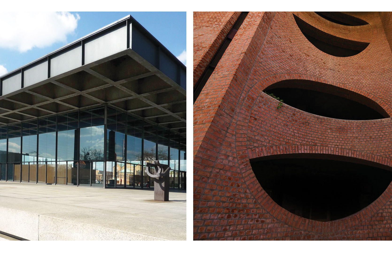
(A more leftist stance would reject ornament as a conveying a false recreation of a pre-modern ideal, but would be in broad agreement. Perhaps it would replace concrete with brick, ala Louis Kahn’s IIM Ahmedabad building and CP Kukreja’s JNU.)

(L-R) The New National Gallery in Berlin, Ludwig Mies van der Rohe; IIM Ahmedabad Building, Louis Kahn
The modern pushback against the banishment of ornamentation and decoration does not refute all of modernism. It may integrate decoration into structural features, like a building with superfluous non-structural columns. Its use of decoration might be humorous, ironic or camp. Its agenda might to be to promote multiculturalism, or appropriate other cultures.
In graphic design, the computer makes possible an elaborate visual style that replaces laborious detail: fine lines and elaborate geometries abound. Products enjoy new materials, and techniques. Apple’s laptops feature an aluminium chassis carved from a single block of metal, by water jets. Precision replaces fine workmanship as the source of embedded value in the adorned object, and positions the whole solid as an ornament, rather than just its surface. 3D printers and computer aided visualisation, at any scale, permits the realisation of forms that would have been impossible to make or conceive not some decade ago.

(L-R) Beijing National Stadium, also known as the Bird’s Nest; 3-D printed cup, Shapeways
The best way to navigate these waters is to view modern design as a pastiche; a set of containers in which anything can go. Surface decoration and solid three-dimensional form can live in holy incompatibility. All these opens the doors of the mind to decoration. In another way, it may be best to realise that modernity is not a point of arrival or a destination, nor a type of progress, but yet another wrinkle in an unending story.
view modern design as a pastiche; a set of containers in which anything can go. Surface decoration and solid three-dimensional form can live in holy incompatibility. All these opens the doors of the mind to decoration.
____________________
First published in a slightly modified form ‘Gilt and Pleasure’ in Business Standard, 8 December in Deep Design, a fortnightly column by Itu Chaudhuri.

