Inside Story: Packaging Secret Temptation Deodorant Series
 icd studio / 24 May 2017 / inside stories
 Secret Temptation is a female grooming brand by McNroe. It markets contemporary fragrances aimed at young teenage girls. The brand launched its products in the market in the year 2007, and added a few more variants over the years. In 2016, there was a felt need for a brand refresh, to meet the changing trends and expectations of its users. It started a phase out exercise and as a first step, it continued with 5 popular variants, out of 9, and introduce 3 new variants to the range.

The original set of 9 variants
Brief
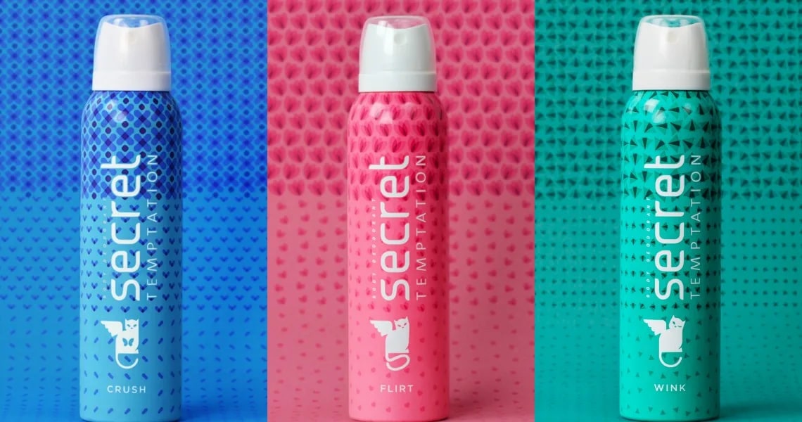
The design of the new variants to evolve from the broad design logic followed by the continuing variants of the old range, to be able to visually fit into the family and exude similar signals when showcased together on the shelf. But, the new variants were to be distinct to be registered as new additions, and develop a visual language which will pave the way for future variants. As it was planned for a Summer launch the variants needed to exude cues like light, fresh, bright, working in consonance with the youthful variants names selected by the client; Crush, Wink, Flirt, a story of young love which the design needed to express. The client also shared that the variant name recall was very poor in this category and purchases were made mainly through colour ( Example: I want the purple can) and therefore the each of the new variants should be recalled by a single colour.
Study
The existing range showcased a consistent visual logic followed by the range —
- two-coloured cans (one-third and two-thirds of the can)
- geometrical lines and shapes as graphic style
- cat mnemonic which expressed the variant name
- bright can colours for great shelf throw and easy recall
But exceptions existed. The old range was designed in two phases by two different agencies and some dissimilarities existed between some of the variants.
- Blast, which was the odd one out didn’t follow the linear line pattern followed by the others and was more connected with its variant name by expressing a visual blast.
- The two-coloured logic followed by all the cans had its own exceptions. While Passion (Red) and Romance (Purple) used its two colours from the same family, Play (Blue and Pink), and Mystery (Pink and Orange) used contrasting yet consistent colours. And Blast (Pink and Black) was an outlier in all respects

The to-be continued 5; Blast, Play, Mystery, Passion and Romance
Design Explorations
Design explorations attempted to understand the varying degrees of extensions and evolution one could take with the design routes and to assess how far we’re willing to travel from the existing set. There were two main criteria that needed to be decoded for the new variants.
- Colour logic
- Pattern style
We underwent two design exploration rounds —
ROUND I Drawing from the existing set, round 1 presented options which were extension of the old design but still followed the core design principles of the existing set in the market.
Colour logic It was a challenge to introduce distinct, memorable and recognisable colours for the new variants as the commonly known colours were already being used by the existing variant set. We decided to opt for lighter colours for the new cans and presented:
- Option 1: Evolving from Play and Mystery, showed a greater divergence between the top and bottom colours.
- Option 2: Evolving from Romance and Passion had a greater convergence between the top and bottom colours.

Option 1, greater divergence between the top and bottom colours.

Option 2, greater convergence between the top and bottom colours.
Pattern Styles The existing set followed a pattern style of dense to lighter linear elements travelling from the top to the bottom of the can. The darker colour dominated the top while the lighter colour was at the bottom. Extending a similar linear elements logic we showed six new patterns over a spectrum.
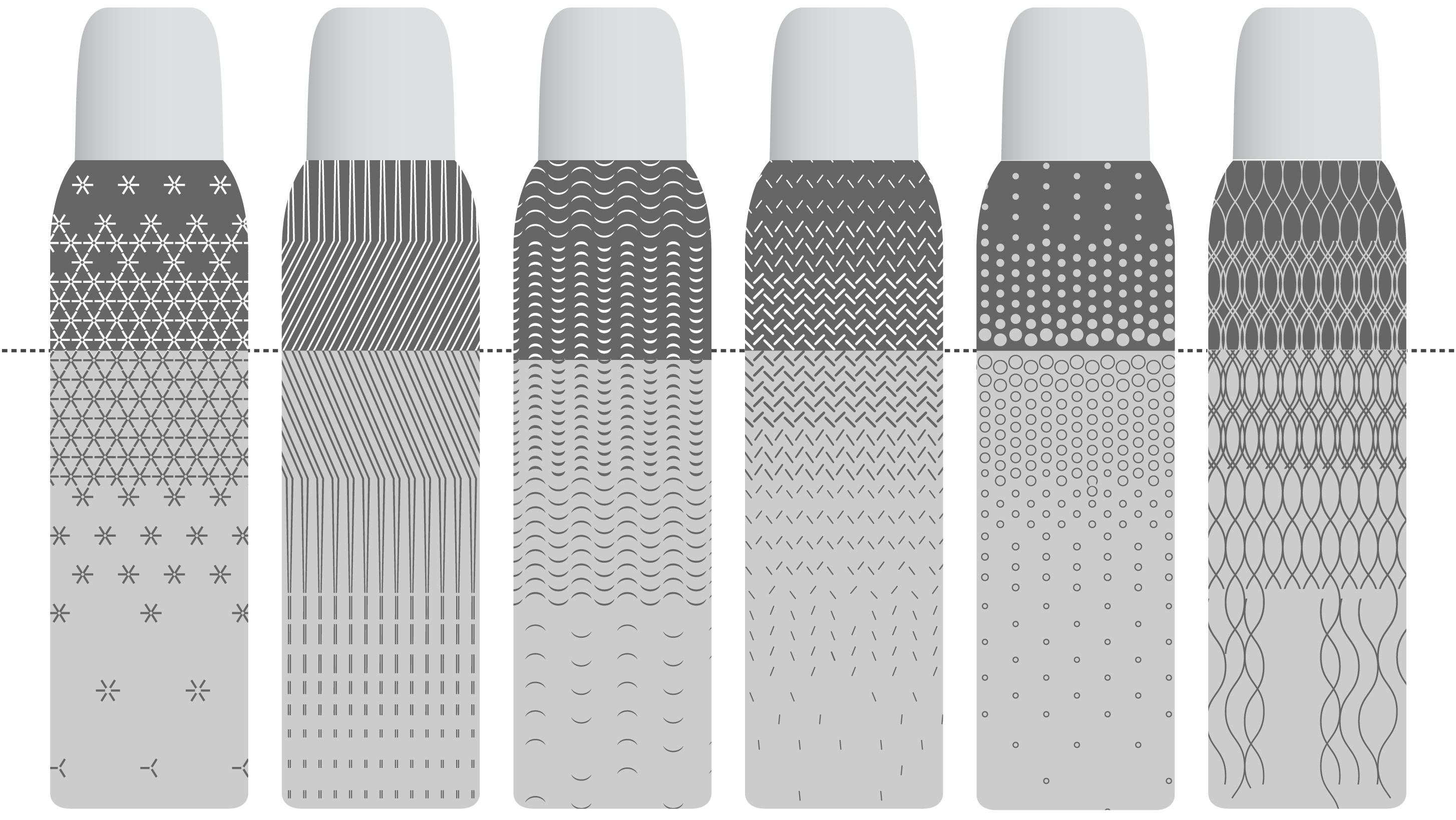
Six linear pattern styles for the new variants extended from the old set
We also played with the brand identifier, the cat mnemonic. The Secret Temptation cat is expressive of its variant name. We presented 6 cat mnemonics for the three variants; the final choices were Crush (cat with butterfly in its stomach), Flirt (cat with a tilted head and naughty tail) and Wink (the winking cat).

Explorations with the Cat mnemonics
Take away The client moved further away from the existing set and decided to not merely extend the visual design but evolve it by moving away from the established look. The presented set seemed too close to the old range, with the new round we wanted to introduce new elements in the design.
ROUND II We moved away from the established look, the extension mindset was replaced with evolution. We had more freedom to experiment with patterns, colours and lettering. New possibilities came up with varying degrees of evolution. We felt the existing range was cheerful, bright, and youthful indeed but lacked energy, had toned down femininity and was, maybe, too young for the target audience.
Colour logic Two more routes of colour options which played with various combinations and were light, summery and fresh.
- Option 3: We moved away from white lettering followed by the range and experimented with dark lettering which allowed us to play with lighter colours which worked well with summer and freshness. It also opened up the possibility of a yellow can which wouldn’t have been possible earlier due to lack of contrast with the white lettering.
- Option 4: We experimented with a white range, with a coloured top and bottom white. It exuded elegance, went with Summer cues that the client desired to associate with the new variants and also did well on shelf throw.

Dark lettering and light coloured cans

White coloured cans, with coloured top and bottom white

Spectrum depicting degrees of design evolution, starting with linear styles and moving towards recognisable shapes and patterns
Take away The client decided to choose the colour logic of lighter can colours and white lettering. It considered the white coloured range to be a little mature for its intended user group. In pattern options, it decided to go ahead with the route which presented recognisable shapes on the can, like moths, bees, flowers, little elements that a young girl associated with romance.
Design Development
We went through a couple of rounds to finalise the colour and pattern options of the three variants. During this stage, we continued discussions on a yellow can. Though we felt that the white brand lettering of the chosen route created less contrast with the yellow background for legibility but the client wanted to take it to production to take the final call owing to the differentiation it’ll make on the shelf.
We also presented more shapes for the three cans. While the previous round had patterns like flowers, moths and lips. We also presented: bumblebees, kisses, and blossom for a final selection of the patterns style.
Final take away The patterns selected were moth, flower and blossom. And all the four colour options were to be taken forward.

Choices of shapes of kisses, bees and blossoms as pattern styles

The final selected patterns to be taken to the next stage of artwork making for test printing production
Design Refinements
We worked to achieve uniformity across all three variants and worked in detail on each variant to develop unity of graphic style. We had to make sure that as a unit of three, these form a group and do not have variations amongst each other.
The patterns had to look uniformly denser and lighter, the break between the dense and the lighter parts had to happen at the same heights, and the colour variations had to match across all three.
Adjustments were made to make sure that no one can looks any noisier, or lighter than the other.
We worked on the back of pack information including texts like mandatories, usage caution, addresses and the like. Reference images of how the final cans will look, front and back, were sent to the client for approval before test printing.

The breaks between the lighter and denser parts of the can had to happen at the same heights
Take away Client approved all the references and also parked decision on the yellow can, which was to be based on the test print results.
Production
We went through two rounds of production. Round 1 was test-printing which showed the first look of the printed design on aluminium cans and helped identify variations and gaps that existed between the screen images and the final printed samples. We also tested the yellow can in this phase.

Matching colour specs of the printed samples with the given Pantone shades
Based on test print results, the yellow can was rejected as it made the brand name too light in contrast and modifications and alterations were taken up to ensure conformity of colour specs and patterns of the printed samples to the screen images.

Variation in the petal colours of the printed cans

Conformity of equal breaks in the cans
We shared revised artworks and round 2 of test printing was conducted which had a desirable outcome and received final approval from our team, and the final cans were printed based on these artworks.

The final set in the market with the new variants