
Numb and Number
 icd studio / 14 May 2018 / deep design
 We live in the age of data: we marvel at it, fret over it and depend on it. To an unprecedented degree, data, or observations that can be counted, is the boss of our factual universe. Own the data and you own the conversation.
Further, sight trumps the senses, and we live in the era of media and images (exposed to exponentially more than in any earlier age), visualised data ought to be better still, to instruct, explain and persuade. With the hopeful rise of a design culture in companies, storytelling with data, the intersection of two buzzwords, is an admired persuasive technique in the boardroom. And embedded in the popular culture.
Yet such data visualisations were a feature of the Enlightenment, blooming in the 18th and 19th centuries and achieving ubiquity in the media age of the 20th. They sprang not from designers (who hadn’t yet been ‘invented’), nor the draughtsmen who drew them but from the creative imagination of scholars, practitioners, and activists.
The 18th century scientist-philosopher Joseph Priestley, who discovered oxygen, probably invented the modern graphical timeline with his work on the lives on learned men. But argument, rather than education drove others. By 1800, William Playfair (“engineer, political economist and scoundrel”) had created the language of economics and statistics graphics: the bar, pie and other elements, but also more complex figures arguing for lower taxes. John Snow’s 1854 London map locating cholera cases made the case for an extended water supply.
In 1858, Florence Nightingale, famous as a campaigner for hospital and home sanitation, created the ‘rose’ diagram. Its wedges quantify the causes of death in the Crimean war, and showed that infection killed more men than did war wounds. The graphic was key to her campaign, leading to sanitary reforms, and winning funding to the cause (diverting it from scientific research was one of her political achievements). Over the next 60 years, life expectancy rose and infective mortality fell sharply. A life-saving rose.
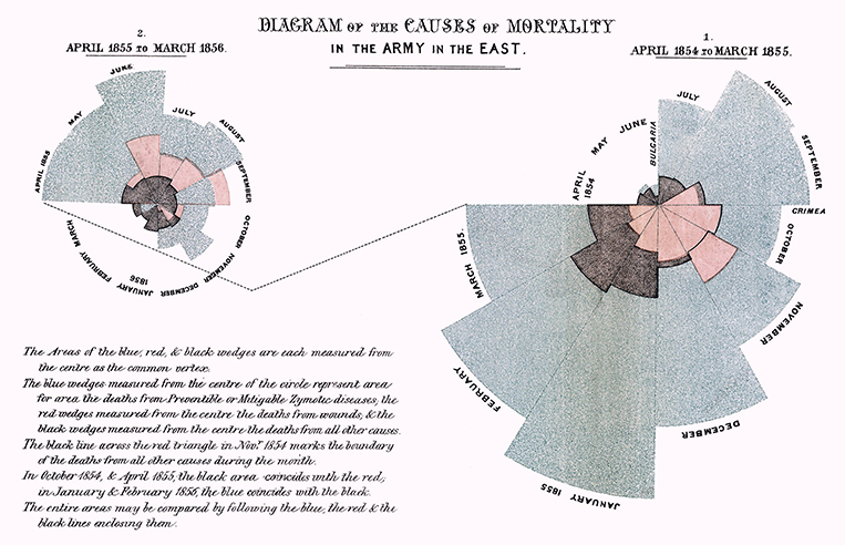
Florence Nightingale’s ‘rose’ diagram in 1858. Its wedges quantify the causes of death in the Crimean war, and showed that infection killed more men than did war wounds.
These works are unsurpassed both for the influence they had on policy when they were published but also because they are imitated and reprised a century and a half later. I think they switched on a light in our consciousness, letting us ‘get’ how data and graphic communication can combine. Data visualisation has become a professional sub-speciality within graphic design.
In our times, Edward Tufte, a social scientist and statistician dominates the discourse in the field with brilliant analysis, rich scholarship and provocative argument, delivered through beautiful self produced books, lectures and amplified by a Yale University position. His arguments represent both a polemic, and an ethic for the craft. Tufte insists on integrity, never exaggerating the highlighted effect. But also on compactness: data should reveal the maximum, in the least area that will allow reading, using the least non-data area, and even the least non-data ink. Violating these rules leads to ‘chartjunk’.
In the best examples, many from the late 19th and early 20th centuries, the data pattern becomes visually self-apparent, especially when viewed from a distance, as picture from which features leap. Consider a contour map, whose lines represent areas of equal height. Closer lines mean sharper slopes. It takes little effort to spot peaks (also, aptly, known as saliences) plains and valleys, while accurately reflecting height and position.
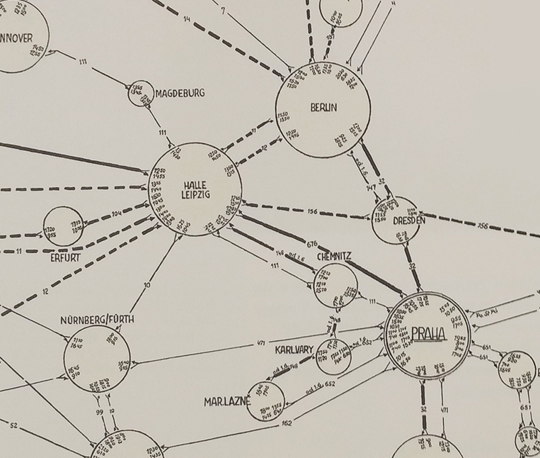
E.R Tufte’s Czechoslovakia Air Route Map (1933), a complex network of routes brought together with flight times and identification numbers
This approach can apply to all sorts of data, such as time-dependent data on a railway schedule. But they thrive, like Tufte’s favourite examples, on dense, complex data sets. The more detail, the better (To simplify, add detail, says Tufte). Also on multi-variate data. Minard’s 1859 classic piece on Napoleon’s disastrous 1812 Russian campaign, lauded by Tufte as the best ever information graphic maps geography, longitude, temperature and the thinning line shows the drastically shrinking army.
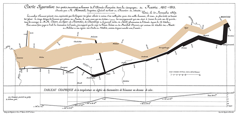
Charles Joseph Minard’s 1869 graphic showing Napoleon’s disastrous Russian campaign of 1812-13
It’s a severe, worthy ethic, but not the last word on the subject. For one, Tufte prizes neutrality, advising restraint on the urge to conclude: let the data speak. This may be a false ideal. Every representation has its own differentiated emphasis.
But more urgently, the communicator is concerned with message, not mere data. Florence Nightingale’s wedges graph, ignored by Tufte, uses areas rather than lengths to represent the mortality figures: impact, not fairness is her goal. The reasons for the ‘Rose’ shape are somewhat technical, but wedges certainly aren’t the most direct way to show the data. They overlap, and hide some data. Close to the chartjunk line?
Her collaborator, the statistician William Farr, like his Queen at the time, declared himself ‘not amused’. “We do not want impressions, we want facts…the dryer the better.” he advised. But Nightingale hoped for people to see what they might not read: It was an appeal, not an evaluation.
Nigel Holmes’ graphic for Time (pictured) flagrantly crosses the chartjunk line, using humour, emotion and a bit of leg to draw readers to notice and respond. Tufte is scornful; we are delighted.
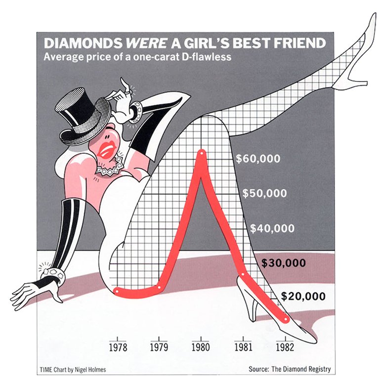
“Diamonds Were a Girl’s Best Friend.” Chart by Nigel Holmes in “A Gem That Lost Its Luster,” Time 120, no. 9
Meanwhile, information graphics (in trade slang, ‘data viz’) have become a pop graphic trend. Information has become a style. Posters of beautiful visualisations abound, until you look closer: the shapes are gratuitous, the data contrived or deliberately frivolous. It’s as if we have so much data that we are bored by it. Newspapers use them as a form of replacement for continuous text, apparently for the attention-starved. Data becomes ever more plentiful by orders of magnitude, and interactive data visualisations ever more powerful. The purposeful, meaningful and ingenious graphic becomes rarer (see www.gapminder.org for an exception). Yet the talent is evident. It’s the purpose that seems absent.
____________________
First published in a slightly modified form ‘Numb and Number’ in Business Standard, 28 April, in Deep Design, a fortnightly column by Itu Chaudhuri.