University Logos: What’s Changed And Why It Matters
 icd studio / 10 September 2016 / deep design
 In India, the notion of the brand is both nascent and spreading at a gallop. States, NGOs, government bodies, spiritual leaders, cricket teams, and other once-unlikely entities are starting to receive marketing attention, so the brand is never far behind. It’s the new orthodoxy.
University brands, an oxymoron in India until the 1990s, are a fascinating example. They are numerous, often very old, and slow to change, and display, like species, many stages of evolution. This is reflected in their visual identities.
Of course, there’s much more to a brand than the logo, which is only the tip of the brand’s iceberg, so to speak. But it is a tell-tale sign of how an organisation sees itself, and the face it wants to show.
Deep Design reveals the interplay of symbol and reality and the invisible hand of evolution. We shall consider two epochs, the shift (in India) occurring in the late 20th century.
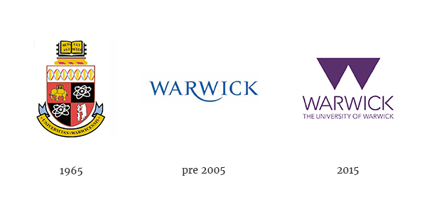
For 150 years, university identities followed an internationally prescribed code. The words seal, insignia or emblem come to mind. A circular typographic arrangement, or the ever-present shield serves as a container. The contents picture symbols of learning, or subjects of study. Shields, divided in a medieval manner, allow a set of images, rather than a unitary symbol.
For 150 years, university identities followed an internationally prescribed code
Like Olympic games symbols up to 1952, they were more traditional than the period warranted, and designed to look like authoritative insignia of learning (with Indian or other local inflections). This applied even when universities displayed modernity in other ways, like architecture. IIM Ahmedabad is housed in a famed modernist masterpiece, but its logo defers to the code: a Mughal arch and tendrils.

Privatisation is the lens through which the evolution of university identity, visual and non-visual is understood. Let’s use 1995 as a convenient year, when the first private university was notified. There are now over 200.
Privatisation is the lens through which the evolution of university identity, visual and non-visual is understood.
University identities after 1995 are visibly different from their forbears. There’s more variety and individuality, and some modernist simplification. The best attempts look more like modern logos, not insignia. Look, no privatisation! Case solved?
Not entirely. Many, like Amity (a prototypical private university) sport logos that reek strongly of the older code. And even in the previous age, there were privately funded and managed colleges and universities (BITS Pilani, for example). The name Ivy League (ivy climbing up those centuries-old stone walls), brands a club of old, influential universities that retain links to their heritage identities, a code imitated by several US universities.

So are university logos explained as effectively by period (design fashion), and imitation, as by private ownership? To gain more nuance than these hardy perennial explanations provide, we must return to the founding concept of the university, which is the archetypal ideal that we hold in our minds.
The oldest (let’s call them Classical) universities predate modern states though they enjoyed royal and religious support. A community of wise men, either proven or incipient seekers, self-governed, with their own rules, traditions and arcana, and free from excessive oversight. Often monastic in origin and spirit, joined by the pursuit of knowledge, for its own sake.
The oldest universities are often monastic in origin and spirit, joined by the pursuit of knowledge, for its own sake.
Modern states preserved the essentials of this arrangement, even for private universities in the new nation of America. These old universities approximate classical ones (and receive state support with minimal oversight).
The post-private university or PPU (a new phenomenon needs a new label) differs on many of these dimensions. It no longer lurks in the shadows of the state, but feels the harsh glare of competition, not of ideas, but for customers. Global rankings objectivise and hijack the meaning of institutional quality.
The post-private university feels the harsh glare of competition, not of ideas, but for customers.
For the first time, the university must be marketed. It is a product with a proposition for customers (students, donors, and faculty). In many PPUs, students rather than pursuing knowledge for its own sake, are buying a career. ROI calculations are openly made.
Its superboss may be an ‘edupreneur’ who exhorts a Chief Marketing Officer to achieve explicit business objectives. Annual ad spends may top Rs. 50 cr. Crucially, the PPU is managerially run, like a corporation, and thus not entirely collegially governed. (On the plus side, some academic staff may much better paid).
It’s natural then, that the university’s logo needs to maximise visibility, memorability, compactness and attractiveness, that is, more like a modern logo rather than a seal. It is an object of universal, accessible appeal, not a depiction of an immovable ideal. It’s corporate identity, and in some cases, literally so.
Despite this pressure to market and brand, the identities of many Indian PPUs, unlike their Western cousins, are ungainly vestiges of colonial codes or confused hybrids. Not for want of funds, but of vision.
Most PPUs start with a deficit of reputation. The logo (along with copious built infrastructure, in some cases) attempts to compensate by evoking antiquity. It’s an attempt to brand by association with the classical university and channel its trust, authenticity and experience.
Too few have the confidence to assert a fresh path, by conspicuous investment in wise men, or a long term program of excellence.
Two exceptions, among others, are Ashoka and Nalanda, who have made the former investment. I mention them because their names place them in ancient antiquity, rather than in the colonial past, and their identities are coherent with modernity.
It’s not inconceivable that these post-private pressures will apply to classical universities, who may compete for funds if not for students’ fees, as in the West.
University brands need to forget markers of antiquity, and express the values which make the old fellows relevant in modern times.
A university draws its credibility from research that seeks the truth on subjects of unchanging and ancient interest. That’s a philosophical standard that is universal, permanent and non-differentiable. University brands need to forget markers of antiquity, and express the values which make the old fellows relevant in modern times. Adopting a few of those values will be differentiation enough.
______________________
First published in a slightly modified form ‘Branding, to a degree’ in Business Standard, 10 September, in Deep Design, a fortnightly column by Itu Chaudhuri.