Background
Open, a general interest weekly, differed from other weeklies by not fixating on the headline news, but commenting on it and alerting the globally minded, intelligent Indian to important non-mainstream matters. Its content spans politics, culture and lifestyle; supplying (often) opinionated, argumentative writing.
Brand
In our synthesis, Open espouses ideas as central to journalism. It seeks independent positions that can swim against the journalistic current. It prefers to provoke rather than reassure. Despite its recent intellectual support to the ruling party, it retains this feature. Our work began with comparative research, and influenced content strategy.
Design
Open’s design frames its signature content with an assertive, uncompromising persona. The headline typeface is sculpted, muscled and idiosyncratic without distracting the reader. Together with the conscious use of alignment and white space, a dynamic arrangement with bold contrasts is achieved.
At the level of ‘the book’, distinct identities to the front, middle and back sections, make the offerings more obvious, rather than presenting a smooth spectrum. The front has newsy, short-form reading, with a unique contents section embedded inside it, followed by a middle that has the main features content and a back of the book with special interest sections, like books, gadgets and science.
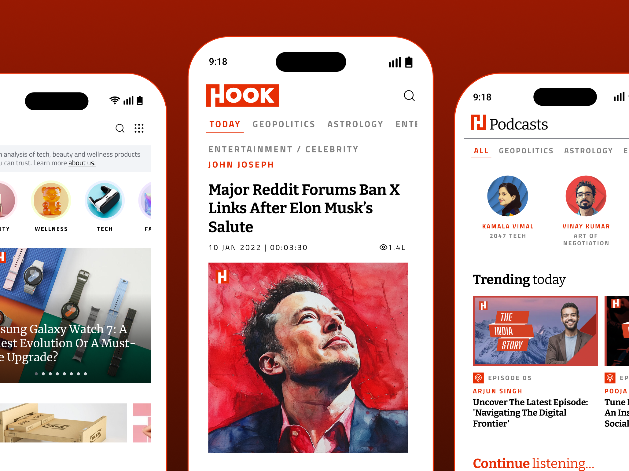
The website for Open followed next. It’s designed with the web-safe typographic schemes available at the time. We worked with the editors to achieve a categorisation of the content that is based on type rather than topical bucket (politics/business/sport). The article pages are designed with a plethora of devices that offer multiple exits to other stories within the website. Special attention is paid to archived stories. The robust design continues to work well even though the web has changed drastically since.
the one-stop weekly print and web magazine for accurate reporting, sensible opinions and interesting reviews
Open, a general interest weekly, differed from other weeklies by not fixating on headline news, but commenting on it and alerting the globally minded, intelligent Indian to important non-mainstream matters in politics, culture and lifestyle.

open’s design frames its signature content with an assertive, uncompromising persona
The headline typeface is sculpted, muscled and idiosyncratic without distracting the reader. Together with the conscious use of alignment and white space, a dynamic arrangement with bold contrasts is achieved.


distinct identities to the front, middle, and back sections make the offerings more prominent
The front has newsy, short-form reading, with a unique contents section embedded inside it. This is followed by a middle that has the main features content and the back of the book has special interest sections, like books, gadgets and science.


a robust website design that continues to hold strong
Content categorisation is based on type rather than topical buckets (politics/business/sports). Article pages are designed with a plethora of devices that offer multiple exits to other stories within the website. Special attention is paid to archived stories.

Partner-in-charge, Creative Director, Art Director Itu Chaudhuri | Design Development Richa Bhargava | Project Year 2009 | Project Duration 9 months
UI/UX Director & Concept Lisa Rath | UI Development Avantika Agarwal | External development & Maintenance Srijan Technologies | Project Year 2010 | Project duration 9 months