Is it time to bury the logo?
Everyone loves a logo, or loves to hate one. Designing logos is the most easily understood example of the graphic designer’s work. Among the additions to visual culture since the 19th century, the logo ranks with television and cinema. Stand in Tokyo’s Ginza or New York’s Times Square and you will be overrun by them; in India, we experience a booming town through the sprouting of familiar logos on its streets.

Ginza building, Tokyo
Yet the logo is under attack. Dead, say bolder commentators, or irrelevant, say the more nuanced: it is a product of evolution, and eligible for extinction. The London designer Simon Manchipp found them “a hangover from old-school thinking… an old-fashioned approach to differentiating”.
Ironically, to the extent that this view is valid, the logo is under threat from the same processes that made it so successful in the first place. Though logos are ancient in the sense of marks that denoted community (the cross, the shaivite tripundara or the swastika), the modern logo is a creation of trade, media and transportation.
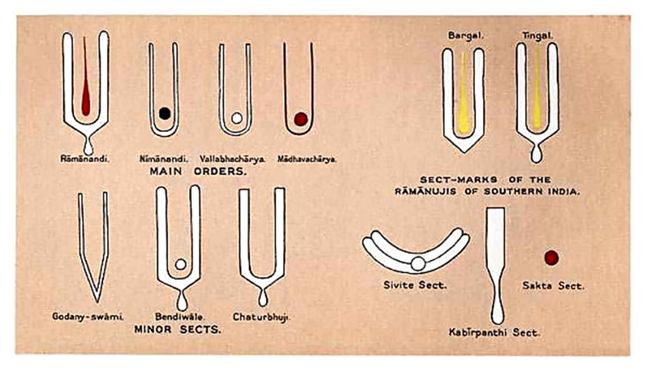
Tilakas worn by Vaishnavities
Trade and modern transportation ended local monopolies: suddenly, the village washing-soap maker was competing with imports from another district, and needed more than his initials on the product. Traders (wholesalers and retailers), being closer to the eventual customers, had bullying rights over manufacturers. These gents fought back with differentiated products, now with ‘maker’s marks’, regaining control over the customer and thus, terms of trade. These marks became the modern brand logo. (The tussle continues; the behemoth Amazon is a retailer).
Advertising speeded and sharpened the change in the design of these marks to answer the need for visibility, compactness and differentiation. It’s easy to make too little of the difference between these new logos and, say, the coats-of-arms and heraldry of earlier centuries. Those early marks served to identify, a deliberate act accomplished by reference to convention. In the modern mark, recognition, a more spontaneous form of knowing, along with ownability and recall, that marketer’s favourite, are additionally necessary.
Those early marks served to identify. In the modern mark, recognition, along with ownability and recall
By the middle of the 20th century, the power of the visual trademark was firmly acknowledged, and the forerunners of the modern brand consulting firms were born. The logo became big business, a store of both value as well as meaning. This is where things started to change.
This turn in the logo’s fortunes was linked to the evolution of the language of marketing, and then a new understanding of the brand, approximately in the last quarter of the 20th century. The brand was now not just the name of the business, but an evocation of new ideas—benefits, values, promises and other more or less emotional fragments, tied by association to its name and other ‘signifiers’, like the logo. Oh, and It had a personality, like a human.
The logo’s fortunes was linked to the evolution of the language of marketing, and then a new understanding of the brand
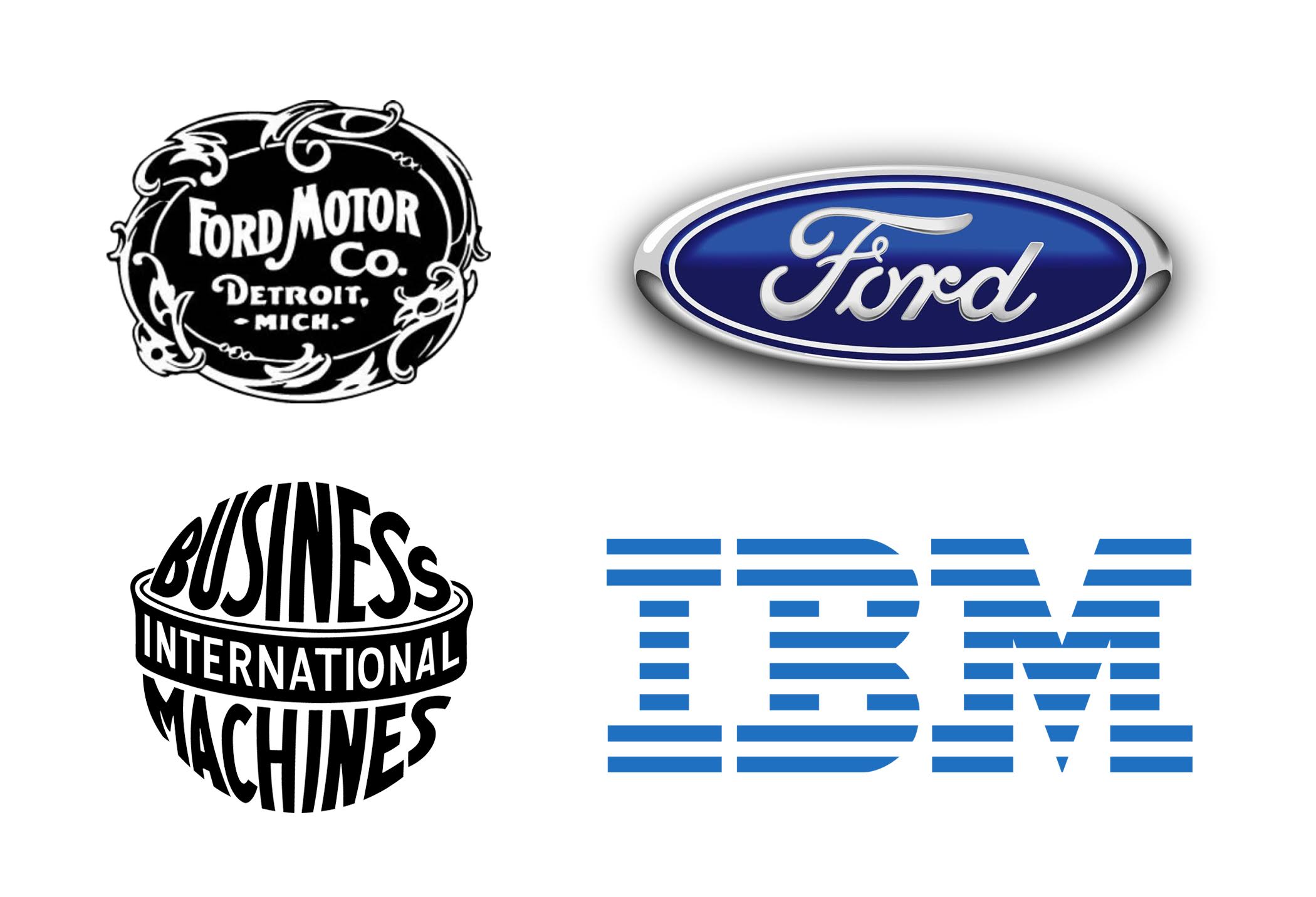
Old vs new logos: IBM and Ford
This bundle was, said the gurus, at once embedded in the product or business and also, separately, an abstraction, capable of being explicitly managed, and concretised at will, into an entirely different product, again a late 20th century phenomenon. It gave rise to a new notion of the corporate brand, now as progenitor of brands, and thus to the concept of brand architecture. Also, the brand could also now be separately valued as an asset.
This complexity now required the logo to distil this bundle of properties, and made it a strategic decision: big business for consultants.
But this wasn’t all. New, geographically dispersed brands, including the modernised corporate brand (so went the thinking) now needed a consistent visual appearance, implemented via a centrally mandated visual system: a set of graphic assets, such as colours, and typefaces and added graphics, governed by rules for correct usage.
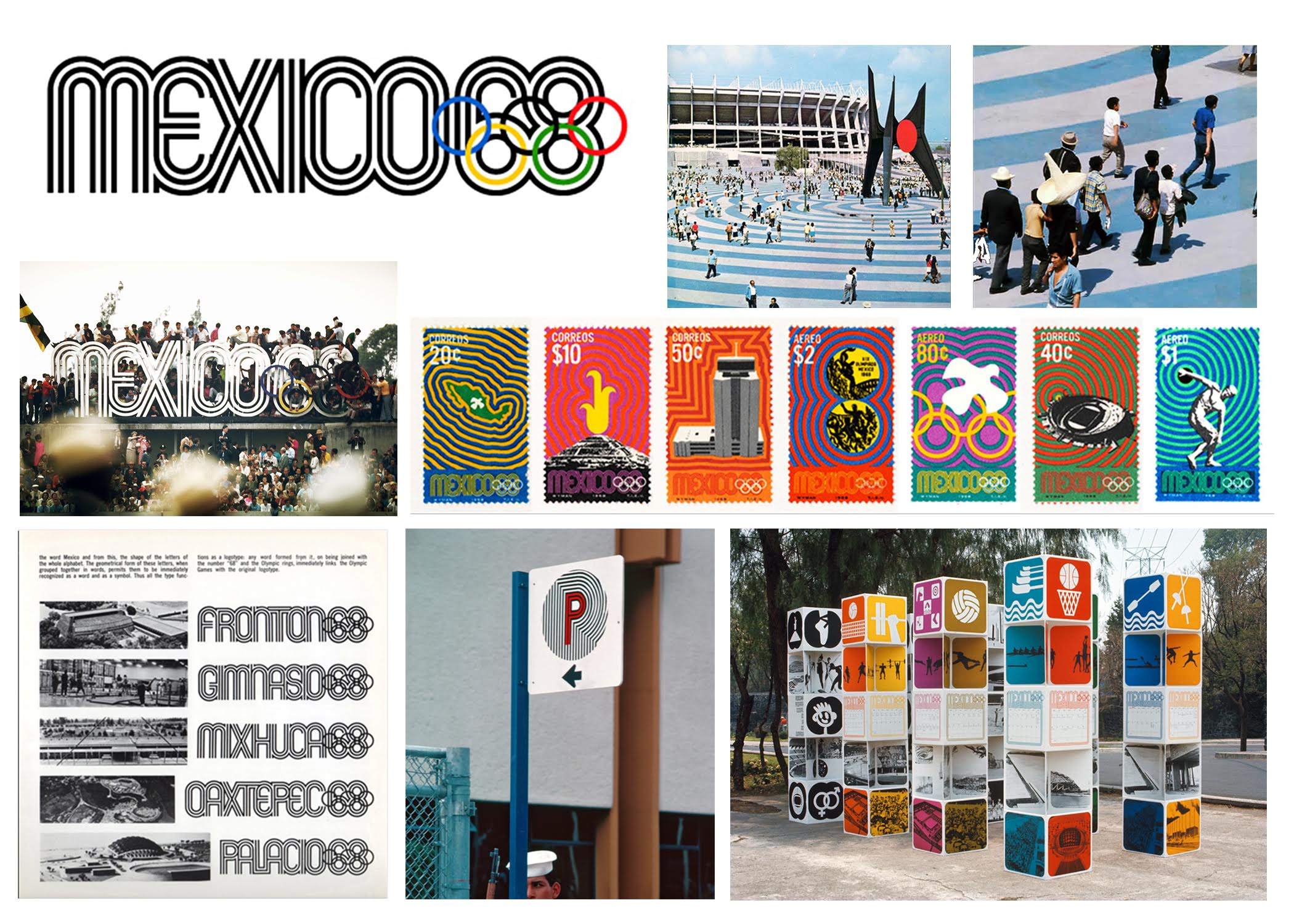
Mexico 68 Olympics visual system
Crucially, corporate and other brand owners were convinced that these visual systems were also central to the bundle of associations that made up its brand, this new, mystically powerful lever. In other words, not just visually consistent but ideationally and emotionally linked—enter another new word, coherent.
Over the next decades, these visual systems grew in sophistication and ingenuity. In addition to ensuring recognition, they now cover the style of imagery, and the mood of the communications, across product design, retail spaces, advertising and more. Often not rigidly consistent like their forebears, they may go by names like ‘brand world’ or ‘experience’. The argument: sufficiently well executed, brand worlds obviate the need for a logo, while still delivering a powerful whiff of the brand, so to speak.
These visual systems grew in sophistication and ingenuity. Sufficiently well executed, brand worlds obviate the need for a logo, while still delivering a powerful whiff of the brand
There’s another strand to the anti-logo argument. Logos, by themselves, have no meaning, but derive it from the businesses they mark. Mercedes’ three-pointed star gets its value from the consistently admired cars it sits atop, not the other way around. So why bother with the hype and fuss of designing them to distil the brand into the logo?
We can see these as a clash between two notions: brand as experience, vs brand as a symbol. Deep Design believes that the brand-as-symbol perspective is under-appreciated. Symbols, as carriers of identity are inseparable from human life, from tribe to kingdom, ancient to modern. And all aspects of brand experience—even the taste of Johnny Walker whisky—whisper to our identity (and are thus signs). Taste is sensory, but also associative, and there’s neurological evidence for this: it just tastes better with the label.
Second, symbols such as logos focus organisational and social energies, by substituting a physical thing for an idea that must be defended, in war or in peace. Most of all, a logo can travel from the bonnet of a Mercedes car to an advertisement, and trigger the same feelings with incredible economy of time and space. Of course, there’s no doubt that it’s a part of a ‘brand world’.

The ‘Apple’ experience; the store, advertisement, campaigns and the products
But why design them, if any old logo will do? Because it’s easier to build an association when the logo’s content encourages it. Laboratory-reared monkeys have been trained to ignore snakes and fear flowers, but it’s far harder to do than the converse.
It’s easier to build an association when the logo’s content encourages it
Does the logo rank with television? Just look out of the window: far from a burial, the party is in full swing.
______________________
First published in a slightly modified form ‘Is it time to bury the logo?’ in Business Standard, 18 February, in Deep Design, a fortnightly column by Itu Chaudhuri.

