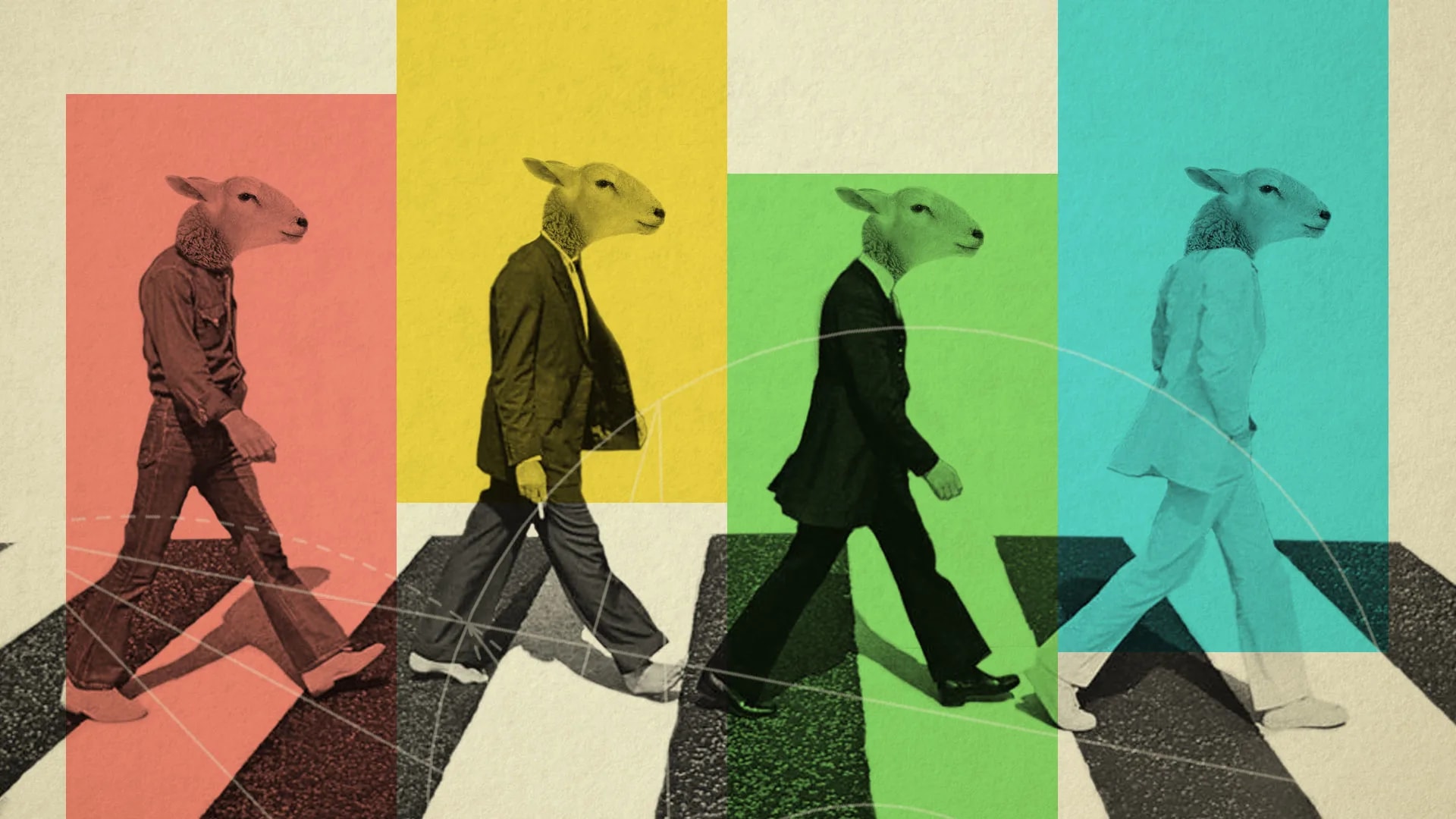
Trending: The World In A Shade Card
It’s a modern, seasonal disease. The new year brings with it a thick flow of trend forecasts, cheery and sweeping, and we read them with the forgiving spirit that the holiday season demands. For Deep Design, it seems foolhardy to indulge, yet churlish to desist, so here’s a holiday smoothie on trends themselves.
Some trend forecasts, such as those in fashion, are meant to be self-fulfilling. The great and big among the fashion industry make them. Thus buyers know what colours and styles to buy, and retailers know what to stock. The media is in it at the start, happy to report what the well-dressed citizen will be wearing. The consumer, she of the clued-in, independent mind, is eager to conform: it’s only fitting. Paris/Milan/Mumbai know best; empty shelves help no one.
The communications industry, unlike those that stock things, doesn’t face the risk of empty shelves. Yet trends there surely are. The dozen or so portfolios and the artfully designed CVs that our office reviews monthly give a clear view into what the bottom of the food chain has been eating. A set of colour palettes, a certain taste in typefaces, and a tendency to gratuitously quantify, in order to contrive a graph to replace text (give yourself a 75% hardworking score, or three and a half stars).
But unlike fashion, there’s no Big Design, no dominant source heavily invested in the forecast. Pantone, a widely used colour communication system, comes closest to announcing trends, along with paint manufacturers who try to drum up interest in their new shades, a hue and cry, if you will. For the most part, these graphic trends result from simple imitative impulses. This may account for the relative stability of these design trends.
But common to all trend forecasts, and trend commentating, is the theorising that identifies and proposes the driving currents. Inevitably, large, global turns of politics and their economic, social and cultural facets are called out as driving forces: Brexit, Trump and unless you are observing a news fast (another micro-trend) you know the rest. Deep Design, too, has indulged early and often, such as linking the discontents behind the rise of the US prez to those boosting the rise of Patanjali long before the final elections, not to imply direct link but to speculate on a similar mood driving both.
common to all trend forecasts, and commentating, is the theorising that identifies and proposes the driving currents. Inevitably, large, global turns of politics and their economic, social and cultural facets
Anti-globalisation and nationalism are the most familiar labels applied to this phenomenon. Commentators hear the voices of groups who feel ‘disenfranchised’, speaking with eerie simultaneity across continents. These voices have exhausted their patience with the ruling intelligentsia, and abhor its factual (or specious, or false), well-articulated utterances: better a mis-spelled, ‘feeling’ untruth that promises action, than an unproductive, pedantic truth. Going further: a suspicion of democracy, technocracy, complexity and balance, and the citified, corporate or university culture that spawns them; a yearning for viscerally inspired gestures. (Other strands omitted for brevity).
The trends forecasts that respond to these may be summarised (in a post-truth kind of way!) as a return to roots and basics; a preference for imperfection; the recycled; rough and natural finishes (call them unfinishes). The broad theme: authenticity.
The magazine Digital Arts purveys several forecasts, summarised here (Deep Design’s additions in brackets). Pantone’s Colour of the Year is Greenery 15-0343, to represent ‘fresh beginnings’ complemented by earth and mineral tones, and upcycled materials. Primary colours (from flags, and nationalism) remain in force. Expect packaging to be literally and otherwise transparent, to convey authenticity of provenance. (add: bucolic-ness and humanity). Photography, it says, will be more ‘real’ in terms of the human subjects, with emotion (add: imperfect skin) getting extra marks. The trend towards active, sports-inspired wear continues (cementing the general trend towards informality).

Dove’s Real Beauty Campaign
Despite the smell of truth about the causes that drive these trends, designers (which includes communicators, marketers and policy makers) should continue to take the trends themselves with a grain of ethically-produced, iodide-rich, rock or sea salt.
designers (which includes communicators, marketers and policy makers) should continue to take the trends themselves with a grain of ethically-produced, iodide-rich, rock or sea salt.
For one thing, many of these trends are old and long running. Look at restaurants that have opened in the last ten years in your metropolis, and note how similar many of the trends you spot in the concept and the design of the space. Exposed air conditioning ducts, cocktails in jam jars (Deep Design’s pet peeve), rope, rough hewn wood, local produce and food fusion. And watch for authentically brush drawn lettering on menus, coming soon to a grubhouse near you.

Pantone colour of the year 2017, Jam jars a trending sight in the restaurant space
Further, trend forecasts are popular because they feed our confirmation biases; many may well have other less (or more) obvious causes, preventing a proper understanding. Several trends run concurrently, and play out differently depending on cultures (defined by geography and age).
Long-term trends, or movements, may exert a more strategic force on your next interaction with whatever you are designing, whether it’s a policy, product or communication. But it’s best to be ‘post-trend’—being alive to the babel of the conversations going on in the world without being in a hurry to isolate any one signal, is the golden path.
Long-term trends may exert a more strategic force with whatever you are designing. But it’s best to be alive to the babel of the conversations without being in a hurry to isolate any one signal, is the golden path.
This means paying attention to the invisible drivers behind the trends. For example, the most valuable lesson from post-truth is an ancient one: that the tendencies of people to think through the filter of their identities, anxieties, and pride trump all others. In this state, they will ignore ‘good design’ as a source of meaning. That’s what Trump’s diabolically plain election identity conveyed—nothing—which may have resonated with his voters as authentic, much better than the professionally designed, pointing-ahead, promise-laden ‘H’ from a Capitol-ist they didn’t trust.
Happy new (old) year, anyway.

Hillary and Trump’s election campaign logos
______________________
First published in a slightly modified form ‘The World In A Shade Card’ in Business Standard, 4 February, in Deep Design, a fortnightly column by Itu Chaudhuri.

