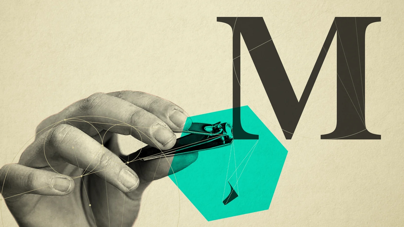
Sans and Sensibility
 icd studio / 11 March 2019 / deep design
 Here’s the news from typography, for the world: little things can count for a lot.
In the logo and fashion design commentariat, much press has been devoted to the recent and clear trend of established, iconic fashion companies rebranding themselves with plain, sans-serif lettering, moving away from the classic forms of Roman, serif letters. A defection to an enemy country!
At first glance this hardly matters to our lives, and can be dismissed as designerly passion. But it may tell us something about how we relate to visual branding, among the most defining features of the landscape of modernity—just look around you. The Deep Design of the issue requires us to interpret and appreciate the hype, consider some explanations, and calm some fevers. And stir a sprig of speculation in to the pot.
The littlest of these little things is the serif—those little feet at the ends of letters in some typefaces of Latin alphabets like English. Even the smallest serif effectively alters the appearance of the letter. These typefaces, also called serifs, have dominated printed communication for 400 years. You are reading one such typeface (on the paper, not on the website).
the serif—those little feet at the ends of letters in some typefaces of Latin alphabets like English
Typefaces without these serifs, or ‘sans-serifs’, or just ‘sans, tend to dominate screens. I wrote this on a computer, viewing my words in Arial, a typeface typophilic snobocrats love to hate. They first appeared in the 1700s, but only really found their stride in the 20th century.
Apart from the serif itself, serif typefaces are also distinguished by an obvious thick-to-thin variation in their strokes, known by the trade term ‘contrast’. Sans-serifs have very little contrast, as if the letter were drawn with a single line, giving it the name ‘lineal’ in the trade.
With this primer, let’s look at these examples.
These great fashion brands originated in the Old World of Europe. They were led by individual creators who lent it their vision and name, which bore connections to aristocracy. Those identities, and the lettering they wore, came from a high-ceilinged world of pedigree, tradition and antiquity, the kind of place where a butler announced your presence upon placing, on his salver, a calling-card (the ancestor of the business card ritual).
These great fashion brands originated in the Old World of Europe. They were led by individual creators who lent it their vision and name, which bore connections to aristocracy.
That’s why the arrival of Calvin Klein on the scene marked a distinctly American, or New World gatecrashing. In 1979, its logo represented a distinctly New York flavour, with its geometric sans serif typeface breaking away from the modern fashion lettering code, influenced by Harper’s Bazaar and Vogue mastheads. So perhaps these new logos also acknowledge the end of an European reign and bow to a new internationalism.

(L) Vogue, Harper’s Bazaar, (R) Calvin Klein’s evolution
The new brands also convey the end of a lineage: As Jean-Noel Kapferer puts it, a true brand is born when its creator dies. A new label also satisfies the obsessive need to be in the conversation, to signal the arrival of a new creative boss, and a break from the past. In this sense, the new sans-serif lettering washes away the brand’s past, leaving a clean canvas for its future. Neutrality is in play, to open new doors to the mind.
It wasn’t a sudden realisation of age that drove the change, a quality many modern brands wear proudly. For one, not all the lettering has aged. Burberry’s could be quite serviceable today. Balenciaga’s was already a sans-serif, but morphed into a serif typeface that’s unexceptional to the point of anonymity. YSL retired its quirky lettering, already a sort of modern design classic, for another bog-standard sans in a black square: more Silicon Valley startup than to Parisian couture.
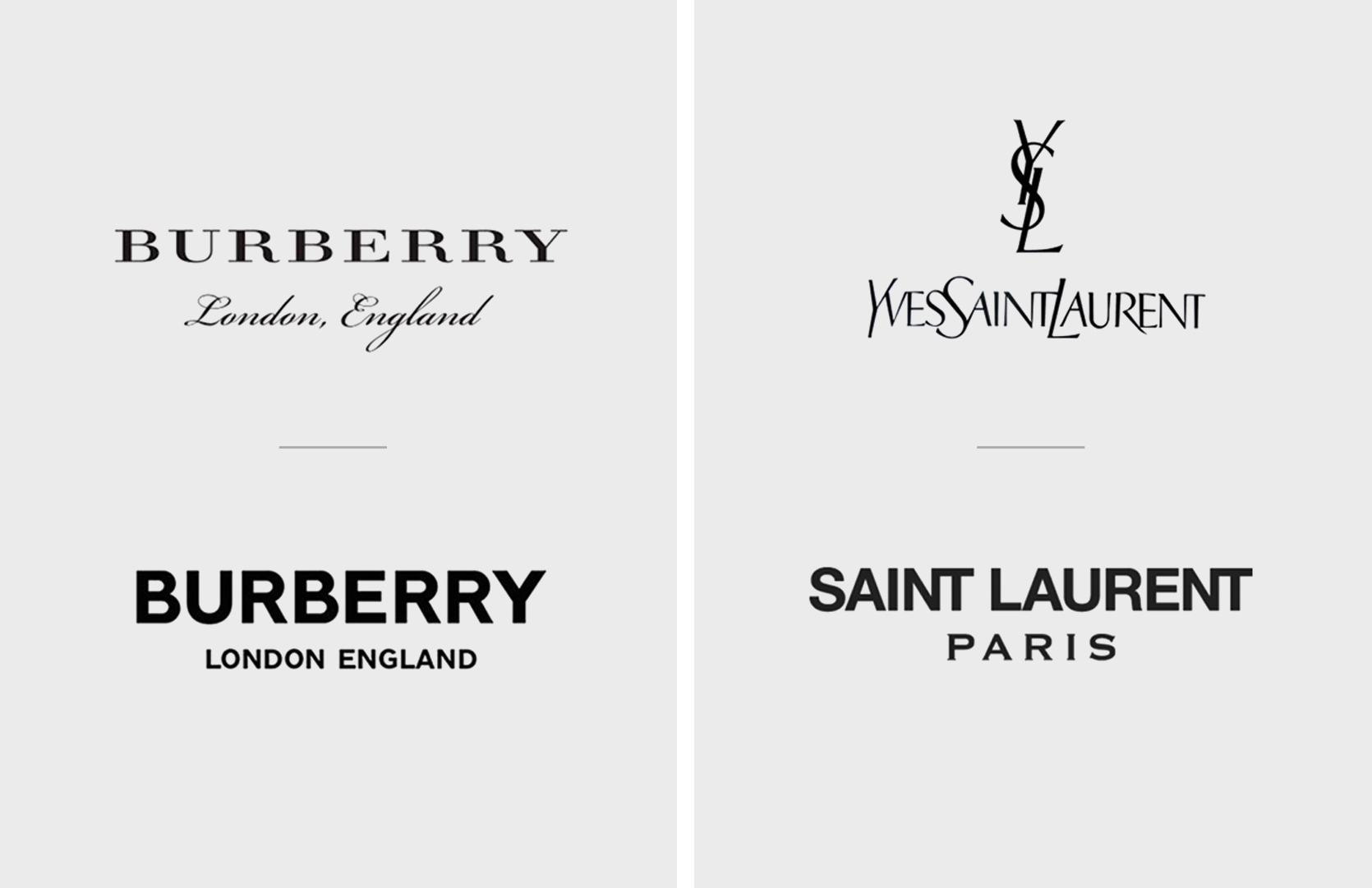
(L) Burberry’s rebrand, (R) Yves Saint Laurent’s change to Saint Laurent
A functionalist explanation is their superior rendering in digital media. But their suitability for lower (though rapidly increasing) resolution screens makes more sense when one considers how the modern fashion brand makes money.
For these brands, the large volume sales of ready to wear, T shirts, shoes, and accessories offsets the low-volume and high cost business of couture, ramp shows and new collections: design, R&D and publicity cost a lot. Lineal lettering reproduces well on canvas, plastic, and leather things, where the logo’s presence earns a clear premium (20%, according to one brand)
A neutral brandmark allows for greater range: the old Balmain logo may not sit well on a T-shirt. The neutrality of these letterforms, stripped away of their distinguishing detail, is an advantage.
Further, these spin-offs are less crucial to the brand’s expression, and accordingly can bend more to popular trends and wearability. A neutral brandmark allows for greater range: the old Balmain logo may not sit well on a T-shirt. The neutrality of these letterforms, stripped away of their distinguishing detail, is an advantage.
Indeed this neutrality is also at the root of the philosophy that underlies modernism in design. This is the notion of modern design as a container rather than a design in itself, able to host any stylistic variation.
More generally, the modernism that these logos wear may also be part of a democratising process for brands. With the internet ensuring the death of authority as a marketing position, more brands attempt to invoke the regular-guy archetype and don’t talk down to us. Brands need to engage with contemporary ethical issues in the way shown by Benetton (yes, in a sans). In like vein, the distaste for overblown consumerism has moved from the trendy sidelines to a more mainstream thing.
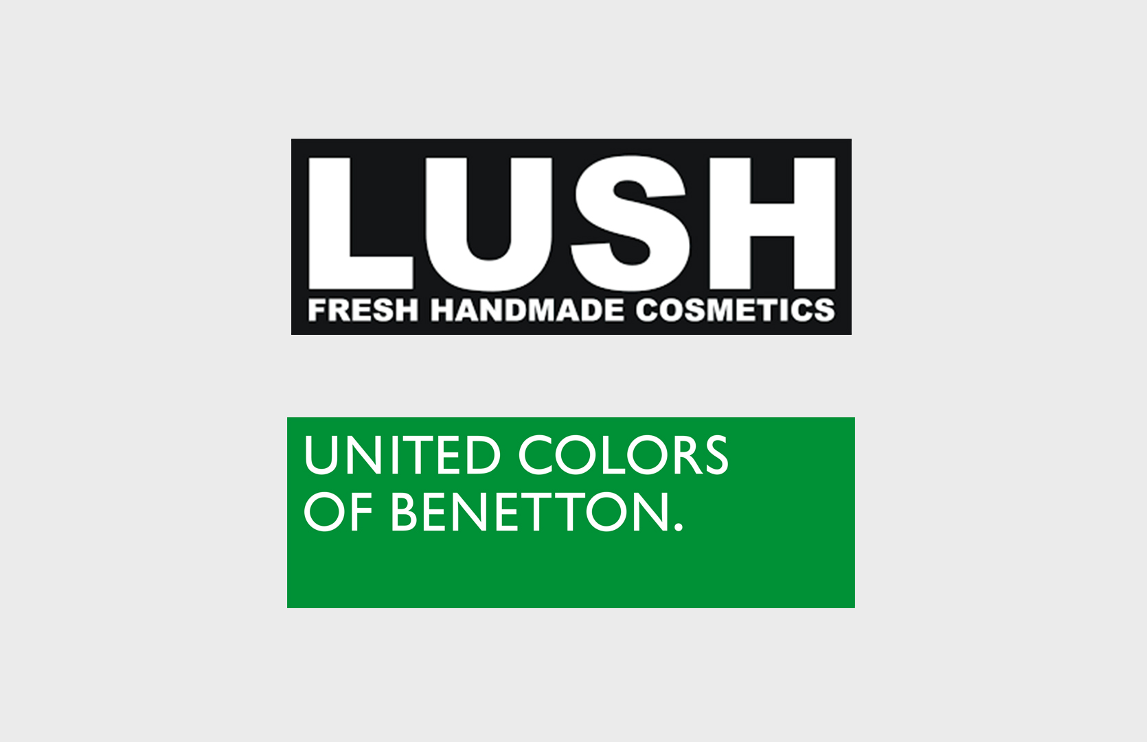
Lush, United Colors of Benetton
These new logos also signal the declining importance of a single, unitary mark to brands that rely so much on controlling the spaces where they sell. Products must make a mark on their own, and the logo adorns it, rather than carry the burden of encapsulating all the brand’s meaning. Homogeneity is a risk. Finally, decoupling the logo from the brand’s heritage also disengages it from continuity, and more rapid reinvention will be the order of the day. Not such a little thing.
____________________
First published in a slightly modified form ‘Little Typefaces Matter Much’ in Business Standard, 18 February in Deep Design, a fortnightly column by Itu Chaudhuri.