We, the Undersigned
“The trouble with you creative fellows,” said VSOP (Very Superior Old Person), “is that you think brand only means advertising, or synthesising emotions to sell your widgets.”
I’d sought advice on Brand India for an article, and sat across chutney sandwiches and coffee in the understated lounge of the lushly landscaped International Information Centre. I protested that no, I didn’t think so, and wasn’t in advertising. But VSOP, a retired bureaucrat of Great Standing, and known to be “an acquired taste”, was in spate.
My colleagues in government, VSOP went on, weren’t, or aren’t, so different from you. For them too, branding means campaigns for some Yojana or other, but nothing wrong with that, I suppose.
Like Brand India, I said brightly, hoping to get him back on subject.
Brand India, said VSOP, is all very well as an externally directed concept to drive investment, exports and tourism, but what about its citizen-facing form? It should be not about advertisements, but about advertising product excellence through government. And rational.
I interrupted him to reveal my confusion. Not advertisements, but advertising? About product?
Consider, said VSOP, India as a very large service brand, with three service verticals: legislative, judiciary and executive, and with subsidiary brands known as states. This brand’s, or organisation’s goals are cohesion, competence and assurance. Assurance implies that functioning well includes being seen to do so.
A uniform is functional, symbolic and emotional at once
Being seen to do so, repeated VSOP, holding a sandwich like a triangular icon, is branding, in its most fundamental sense. It flows from the concept of kingdoms, through their armies and monopoly of power, muted into modern executive authority, including central banks and mints.
An army’s systems of visible marking—signs, ranks, uniforms—are not separate from its operative processes and culture. Each enables the other. It’s the ultimate branded organisation. A uniform is functional, symbolic and emotional at once: an officer is said to disgrace or honour his vardi.
Not quite uniforms, said VSOP, but similar in effect would be a visual identity and communications standard, for governmental Brand India, and all its organisations and services. Citizens should know who is in charge, with certainty, and what they can expect.
Suppose, said VSOP patiently, you were to implement such a standard, what would you see?

An authentic sign makes its owner more visible, and thus accountable.
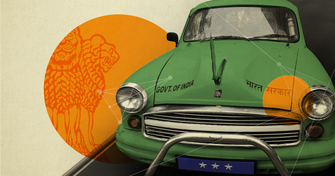
Small, everyday examples would be proof of percolation. The hand-painted ‘On Government Duty’, sign on a government vehicle conveys improvisation, not competence. So is the sign bearing my MP’s name, on the street outside my residence: is it mandated, or is this my MP’s legislative impunity? Parliamentary branding would make it clear. An unmistakable and unfakeable sign, or none.
Subtle effects flow from this. An authentic sign makes its owner more visible, and thus accountable. Isn’t this basic to branding? VSOP looked up, waiting for me to disagree, and continued.
Courts would have standardised, distinct, high quality identification signs outside, and inside, standardised directional signage. Airports rely on standard “walkthroughs” and signage, so why not all government offices that deal with public traffic? A system of visual identity needs logic and consistency to be read and function better.
All ministries use the Ashokan four-lion national symbol, but look at the meaningless variations in lettering, proportion and arrangement! Ministries would have one identity, as would their organisations. All their publications would fall under a typology, with systematised design and content guidelines, suited to each purpose. They would be appealing, bright, illustrated, plentiful and recognisable.
My colleague TN Seshan once compared an election to a disorderly wedding hall. Ministry websites too—where do I begin? And each one needs to be learnt like a new language.
State symbols use the national emblem idiosyncratically
Ministry websites would have clear zones, such as for the ministry’s priorities (under the government of the day), citizen services, and for businesses and other audiences. So too for programmes, departments, and organisations. How to get an appointment, where to park. They would have an identical architecture. And look approachable and be mobile friendly.
The best part would be, said VSOP dropping his voice conspiratorially, that some missing pieces would get implemented just because they were required to be communicated.
State symbols use the national emblem idiosyncratically. Some look like ministries, some dispense with the emblem, and some look like royal crests. My symbols would follow a scheme that allows for regional expression within a national structure. A federal design! (this made VSOP chuckle at his own words).
Forms would be simplified, standardised and made usable. Software would automate their production for those not yet online. Why not allow downloads or even sell them in post offices or shops till then? Symmetrical to the Right to Information, is the government’s Duty to Communicate as a part of its definition of excellence. It takes, and shows, commitment, and the ability to conceive, plan and orchestrate. Government excels at these—when it wants to.
My geek grandson, calls this UX (user experience) for government. I like that: citizen experience, however partial. And software can enable, centralise and even fool-proof a lot of this. Political will, do you say? We have a strong PM, an enthusiastic and skilled communicator, which is perhaps his strongest suit(VSOP said it like this). A small department under the PMO would cover every limb of government, and three years would be enough to make a huge dent.
And what about officers and their behaviour towards the public, I asked. Codes, and training?
At this, VSOP turned his gaze to the fountains playing outside, and a long silence followed.
This article first appeared in the 16th July issue of Business Standard under the column ‘Deep Design’ by Itu Chaudhuri.

