You Don’t Absolutely Love Your Vernacular Newspaper
First, the news. At a recent WPP conference, sponsor Rajasthan Patrika (the group that owns the popular daily of the same name) challenged participants to make ‘Hindi cool’. Storyboard editor Anant Rangaswami judged their efforts, not favourably; but his insightful piece argues that we should invert cause and effect. If Hindi newspapers invested in design, he says, Hindi would look cooler; and Hindi publications would get the increased advertising rates commensurate with their robust readership growth, while their English confrères continue to increase their ad rates despite feeble, none or negative growth.
We have said the same thing, (barring the astute ad rate analysis) when talking to Hindi language news publishers. Hindi newspapers (and magazines, and in other Indian languages) look distinctly second class. We have also met urban readers who identify, say, the Times of India as the paper they read, and mention Dainik Bhaskar, for example, as their second paper—only when pointedly asked. That’s not recall, it’s an admission. What’s going on in new, assertive, proud-of-my-culture India?
Demand or Supply?
Perhaps design is too ‘high’ up on a Maslow-type pyramid of a hierarchy of needs.
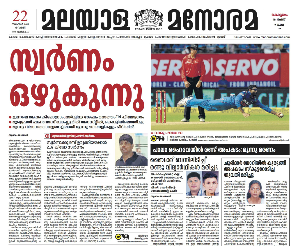
On the demand side, perhaps design is too ‘high’ upon a Maslow-type pyramid of a hierarchy of needs, that is, it’s a luxury and not a need. Or, dispiritingly, readers have just got used to how their broadsheets/Berliners look, and won’t/can’t vote with their wallets for design in the way that hostages start to sympathise with their kidnappers. So design may be low hanging fruit for Hindi newspapers, but something’s keeping it from being gleefully plucked. The usual suspects of cost and talent do not apply, at least for the larger publications. For example, the Telugu newspaper Sakshi (below), and the Malayala Manorama boast re-designs by Garcia Media, a leading international newspaper design consultant, surely top-dollar assignments.

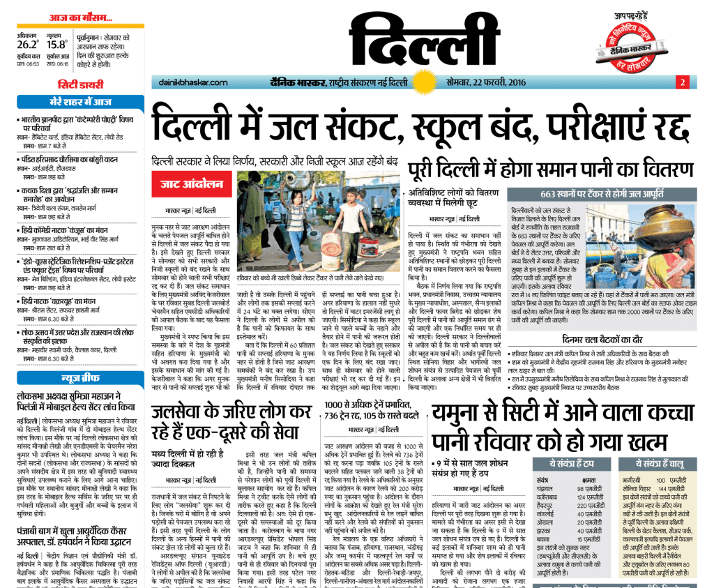
Next up is Dainik Bhaskar (a city page shown here), without the top talent such as the Southern heavies managed. You decide which the better designed is. But I am sure neither meet the smell test when you put them aside a major English daily.

I’m Just the Type
If you agree with these examples, let me advance a theory about why. Not that this is the only problem; but ask a designer and you get a design problem.
My theory relates to a supply side issue, specifically, to Indian language newspaper typography. It’s a technical argument, but easy to follow with some elementary exposure. If typography isn’t your thing, this is a clear rupees and paisa argument for why it should be.
If you’re a designer, it’s not quite what you think—perhaps you share the lazy perception that “there aren’t any good font options in Hindi”. Not only is that untrue, ‘good’ isn’t the problem.
It’s Headline News
One big area in which language papers suffer is that headlines don’t stand out enough from the body of the story.
One big area in which language papers suffer is that headlines don’t stand out enough from the body of the story, thus failing to guide the eye and provide the contrast that is basic to a good page.
A principal reason for that, in turn, is that Indian languages lack effective headline typefaces suitable for newspaper or magazine use. The demands of a headline typeface for newspapers in any language are distinct. The commonalities are weight and compactness. A somewhat economical fit (characters per unit length of line) helps too.
Then there’s a certain news-feel too; a character that the Bhaskar’s headline typeface certainly lacks, but I won’t detail that here. Suffice to say that publishers have to choose from headline typefaces better suited to advertising, which are fanciful or otherwise unsuitable, or use the editorial ones which lack weight and compactness.
Size Matters, But Weight Matters More
The average language newspaper page is severely content starved.
Accordingly headlines stand out only by making them larger. Their exaggerated size helps only up to a point, and worse, consumes space that stories (or content, to use the dominant jargon) should occupy. Indeed, the average language newspaper page is severely content starved, in part because some Asian languages take more space than Latin (Malayalam and Tamil do, while Hindi and Marathi use less space than English, according to Sarang Kulkarni, founder of White Crow, a typeface design firm focusing on Indian scripts), and the weakness of the headline unit exacerbates the situation.
Vertical Compaction and its Consequences
In addition, some Asian languages present the unique problem that they are to an extent ‘vertical’, with vowel modifiers and conjunct consonants that appear above and below the line, making vertical compaction difficult when stacked headlines are in use (below). This contributes further to the general effect of an insufficiently bold headline unit.

The problem of vertical compaction also leads to a low word count in setting the body of the article, and a considerably less knitted-together texture (notice that the words textile, texture and text have the same root).
Newspaper designers know that the balance between economy and legibility is a key consideration for many publishers.
Newspaper designers know that the balance between economy (words per unit area, or content per gram of paper, to put it money-wise) and legibility is a key consideration for many publishers. A favourable balance depends more on efficient vertical compaction rather than on horizontal economy (narrow letters, given by characters per unit length), because newspaper design (convention?) requires narrow columns, thus short lines, and many more line breaks than would appear if the same text were set in a novel or textbook (if that’s not intuitive, trust me, it’s true).
The problems of vertical compaction are much less severe for Latin scripts. Besides, type designers in Latin scripts have tackled the economy/legibility question for body typefaces explicitly; and likewise for the issues that headlines must address. Latin scripts also allow setting in capital letters, which can provide extreme compaction and weight for extra emphasis.
Not Just ‘Good’
It’s not so much about ‘good’ typefaces in Indian languages: at least two firms, White Crow and Indian Type Foundry (ITF) do stellar work, as do a couple of British firms, and several Indian type designers. It’s just that it’s not clear that they have addressed this specific need.
Below comes the Kannada daily Prajavani, which appears on the ITF client list, and whose headline typeface was reportedly designed by Peter Bilak, a well-known type designer, when he was part of that firm. (Underlining again that talent, Indian and foreign is not the issue). The Prajavani front page immediately benefits from the extra weight of the typeface. Even though the design hews strongly to the traditional pattern, and doesn’t, in my opinion, go nearly far enough to address the headline problem, or give the brand a distinctive visual asset, it’s still had a positive impact on the paper.

The Malayala Manorama (below) has a masthead and a top section that is an advance on the lettering standard we see on mastheads. It’s an excellent pointer to a route that the headline typeface could have taken. Go below the extra large primary headline (a staple of the Manorama style) and you can see the headlines struggling to stand out, even though it sports few above-the-fold stories (more stories would exacerbate the problem).

The Opportunity
What we need is to start with the typeface; address the problems of both headline and body typefaces in Indian scripts. Headline typefaces should have ‘snap’ and variety, stand out sharply from their surroundings, have a number of weights. Body typefaces next, alongside a layout system that enables a good texture in the body of the story, with adequate word density and a temperament and character appropriate to news presentation.
To not let appearance hold back Indian language newspapers.
The goal is to design pages that clearly guide the eye; but equally to project a modern appearance in Hindi or Gujarati or whatever; to not let appearance hold back Indian language newspapers from being on par with good English publications (and websites), and enticing advertisers to pay better rates. It’s true that a colourful, busy look (as Dr Mario Garcia, the founder of Garcia Media points out) is what Indian newspapers want, but these are not automatically at war with clarity and good design. Typefaces that can promote clearer emphasis, and function well, can be great weapons. Type designers know what to do: it’s for the owner-publishers to step up. Time to make Hindi cool.


