Prodapt: adopting a new stance through design
 icd studio / 18 July 2022 / inside stories
 Our client Prodapt, a software service provider to the world’s leading telcos, wants to rebrand itself in order to sell to a better class of customer and attract the best talent.
Potential clients and employees look for certain traits in a partner/employer. We put them on a spectrum.
Our designs will have to reflect these traits.
As a guiding principle, we are seeking an elevation of Prodapt’s voice–written and visual. A tasteful amplification of Prodapt’s place in its industry and the world.
Through conversations with key stakeholders, we have built our understanding of Prodapt’s services, its customers and the business impact it delivers.
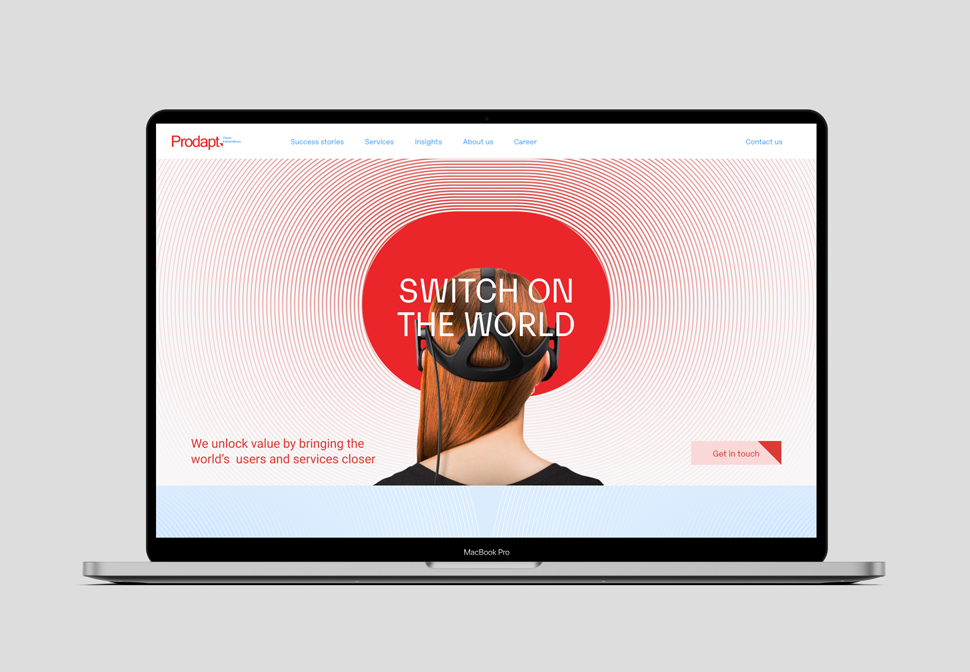
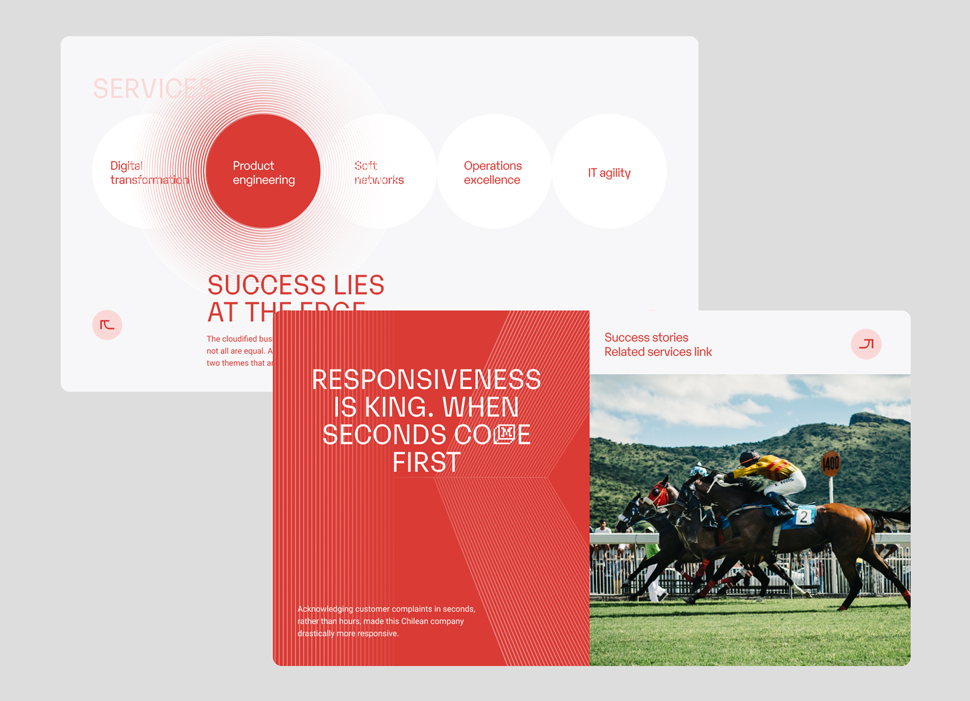
We realize that Prodapt’s work goes beyond just modernizing legacy (in telecom). It allows digital service providers to connect with their end users. It brings Netflix to your home, makes your Zoom meetings possible. Working on telecom is just a means to this end.
It doesn’t work for telcos, rather, on telcos for everyone else. It solves connectivity at scale.
It switches on the world, for you.
A simple and intuitive expression of Prodapt’s purpose, and by extension, its personality.
Sharp. Ambitious. Future-focussed. Mature but not boring. Edgy but not frivolous. A domain expert who can see the bigger picture.
By this point, we know what we want our designs to say. It is now time to get to the drawing board.
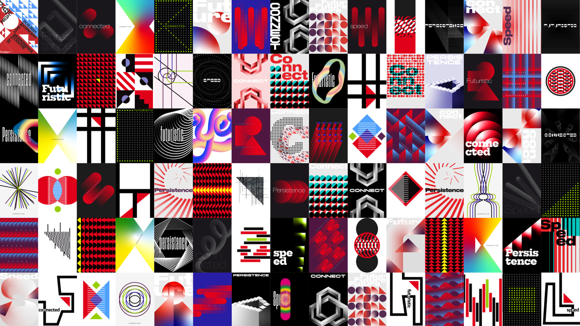
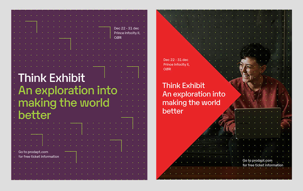
A wall of posters
We’re designing a website but we started with poster design. Why? Because we didn’t want to be boxed in by the idea of a website and get lost in the pages, folds, sections, UI, UX and the like. These could wait, just for now.
Triangulating it in
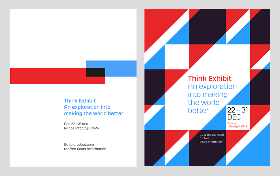
Prodapt’s inverted right triangle (part of its logo that we’ve inherited) has caught our attention. Its outline, partial or complete, scaled up or down, multiplied or interlocked, is easily extendable. Combined with dots, or on their own, these triangles could form grids–the building blocks of any telecom network and thus valid proxies for connectivity, which is the domain Prodapt wishes to own.
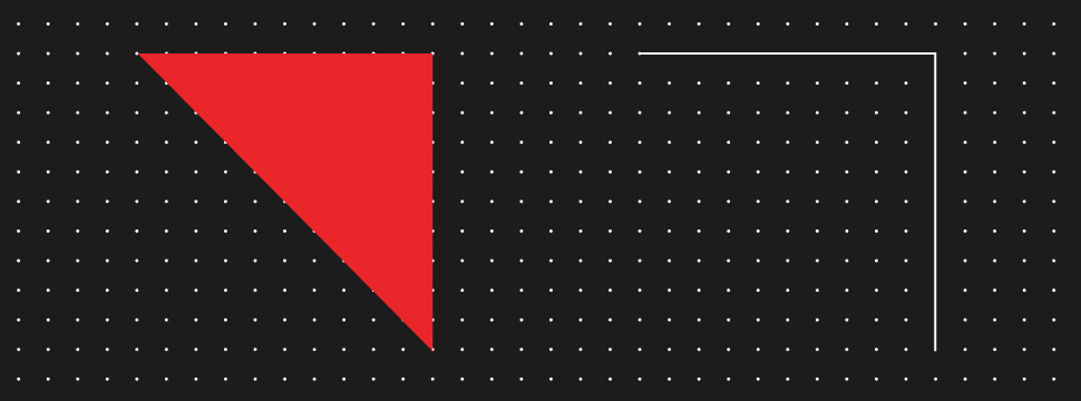
Directly derived from the brand’s identity, this route feels organic. And it seems to communicate the brand’s personality well too (remember sharp, ambitious, future-focussed).
Here are some explorations.
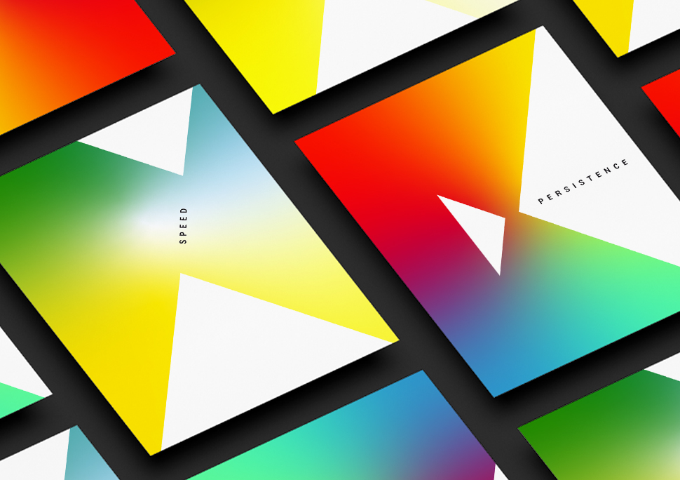
Everything checks out. We can see a visual system in the making. But we don’t want to stop just yet.
A glitch in the matrix
Our second route harks back to the era of dial-up internet and landline phones–precursors to today’s superfast 5G networks and smartphones. Typically glitchy, these old ambassadors of connectivity inspire us to come up with a more offbeat visual aesthetic.
Rectangles and squares, overlapping as they please, or flying solo, mimic glitches in a connection.
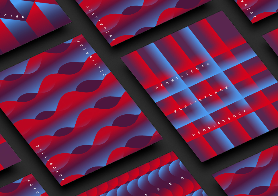
The idea holds promise. Extensions look interesting and impart a different, more daring character to Prodapt.
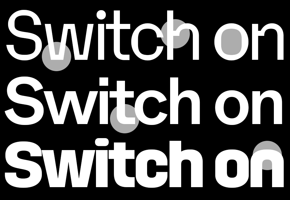
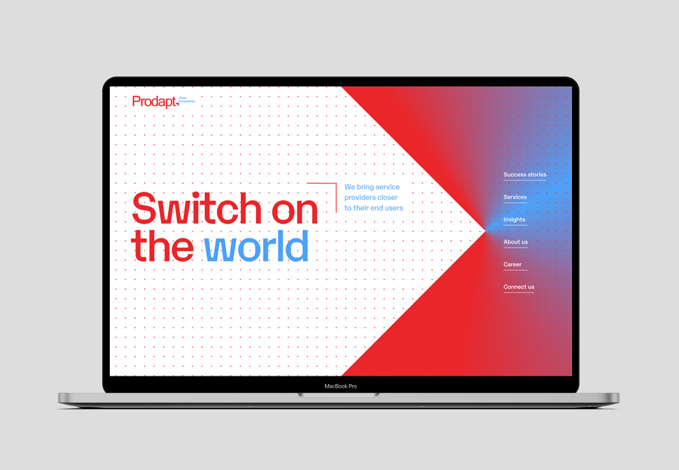
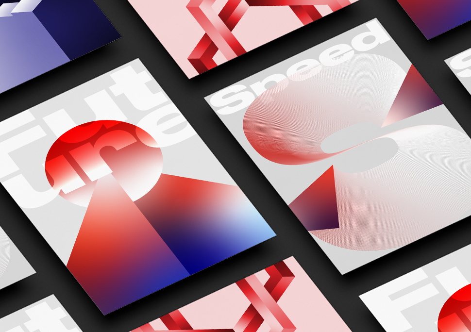
Switching it up
Dwelling on the power of a switch has given us our third route. With only a press, a switch changes how we experience life. Press one on the wall, and you have light and wind at your disposal. Press one online, and you can talk to someone a thousand miles away, or send them a message. Press one and switch on the world.
And what happens at the press? Invisible waves travel through lengths we cannot imagine, through media we cannot see, all in the span of an instant. The connected world in which we live, and which Prodapt wants to own, functions through these switches and waves. Lets amplify that visually.
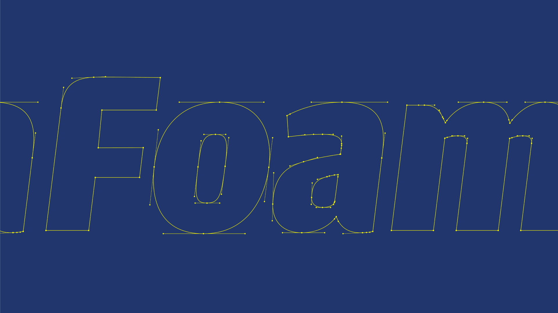
Apart from colours and graphic elements, type is a powerful tool capable of radically altering the perception of a brand. In Prodapt’s case, we want the typeface to inspire trust and confidence, while signaling modernity and new age-ness.
Our candidates are Karelia, ABC Whyte and HongKong. Karelia is a post-contemporary sans serif with a subtle mechanistic flavour. Its square counterforms make it a good display font, whereas the horizontal connections, the flat tops, the squarish counters—solve legibility problems in small sizes, making the face equally effective in running text. Whyte offers smooth transitions but also exhibits an overall contemporary sharpness, a feature that grows more intense with each weight. HongKong is a large, futuristic-style sans serif family. The family’s lighter weights feel nice and loose in text, while the heavier weights are spaced more tightly. All three are great fonts for the tech industry.