Sheela Foam identity: a legacy of leadership
 icd studio / 21 July 2022 / studio diaries
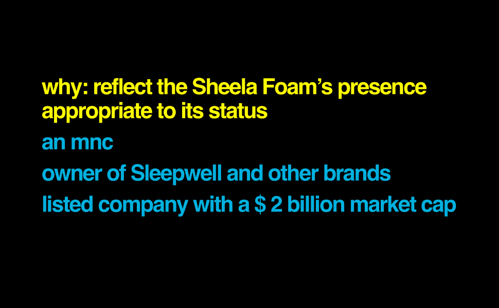
Sheela Foam Ltd is India’s biggest foam manufacturer, a $2 billion publicly traded company with operations spanning Asia, Europe and Australia.
Sleepwell, its flagship consumer comfort product brand is a household name in the country.
A female founder-led enterprise, Sheela Foam has led the foam industry for the past 30 years out of the 50 years of its existence, an envious legacy for any company.
They’ve led the industry through innovations in PUF manufacturing, state of the art plants and deep material science knowledge acquired through the years.
Sheela Foam has the legitimacy, it is the foam establishment in the country.
But the leadership at Sheela Foam felt that the identity in its current form didn’t live up to the rich legacy and strature of Sheela Foam—decades of experience, leading contemporary consumer brands and cutting edge R&D prowess.
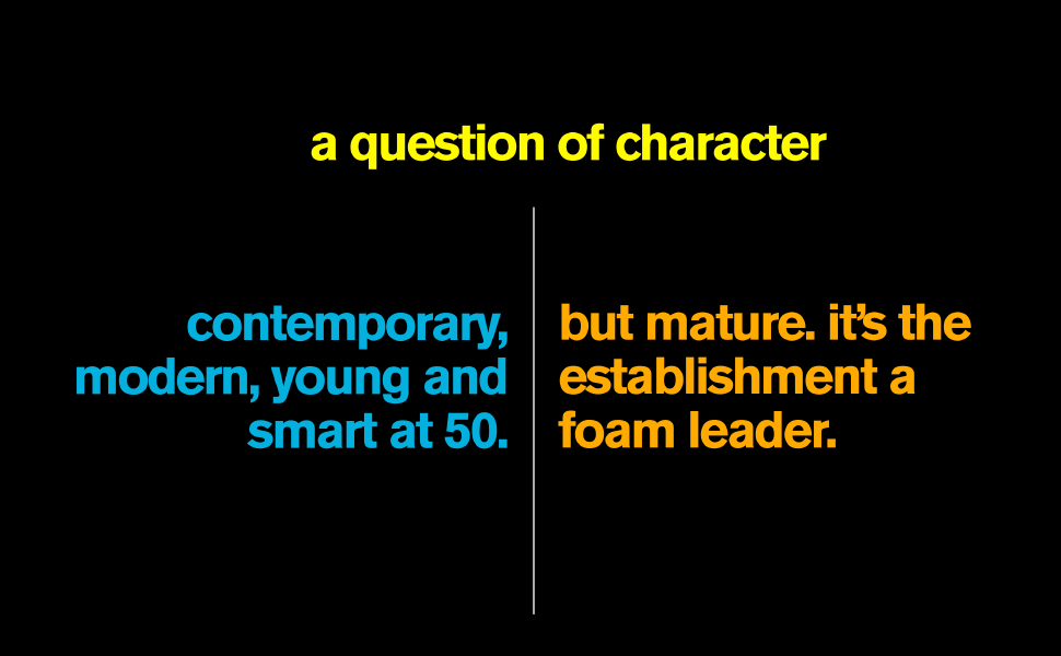
Sheela Foam needed an update—it had to come across as a modern, confident but graceful leader of the comfort industry.
We realised it had to be a balancing act. A marriage of modernity and legacy.
Here’s how we’re trying to bring this apparent duality closer in our explorations:
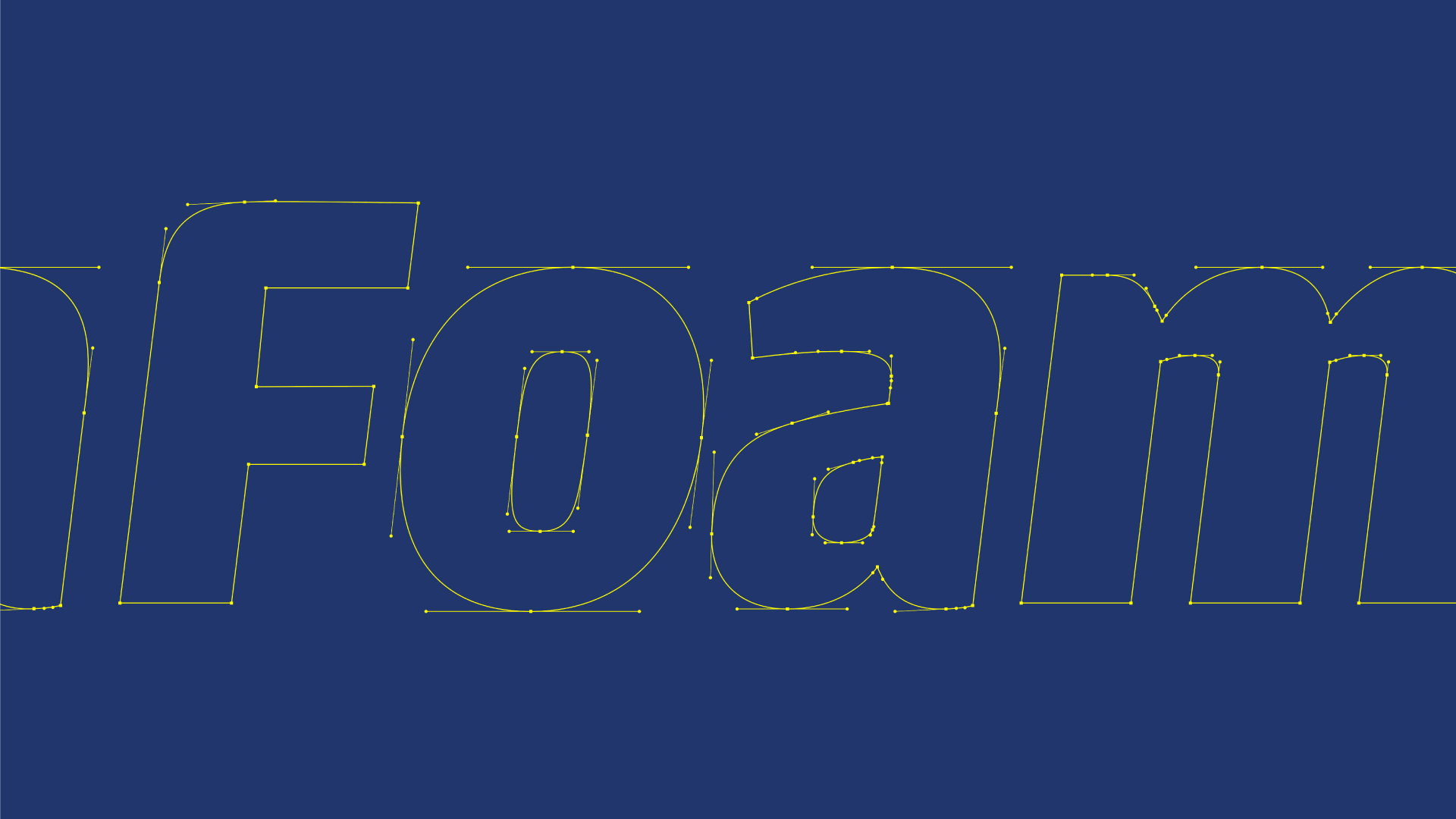
New lettering, inspired from the past
Sheelafoam’s old logo is where we started.
The idea of the new ‘S’ lettering was sparked from Sheela Foam’s current logo. An inspiration, more than an extension—modern, yet reminiscent of the past and the legacy. A nod to the journey so far.
Serif and sans serif: exploring both types
While the ‘S’ is where it all starts, all other characters also draw inspiration from the form inspired by the logo. We’re exploring Serif and Sans Serif options.
Here again we’re working to bring seeming dualities closer—subtlety and assertion. Dynamism and stability. Soft and industrial.
We want to accurately reflect Sheela Foam’s character and make the name register on the many interfaces it interacts with the world—in company communications, media releases and product qualifiers to name a few.
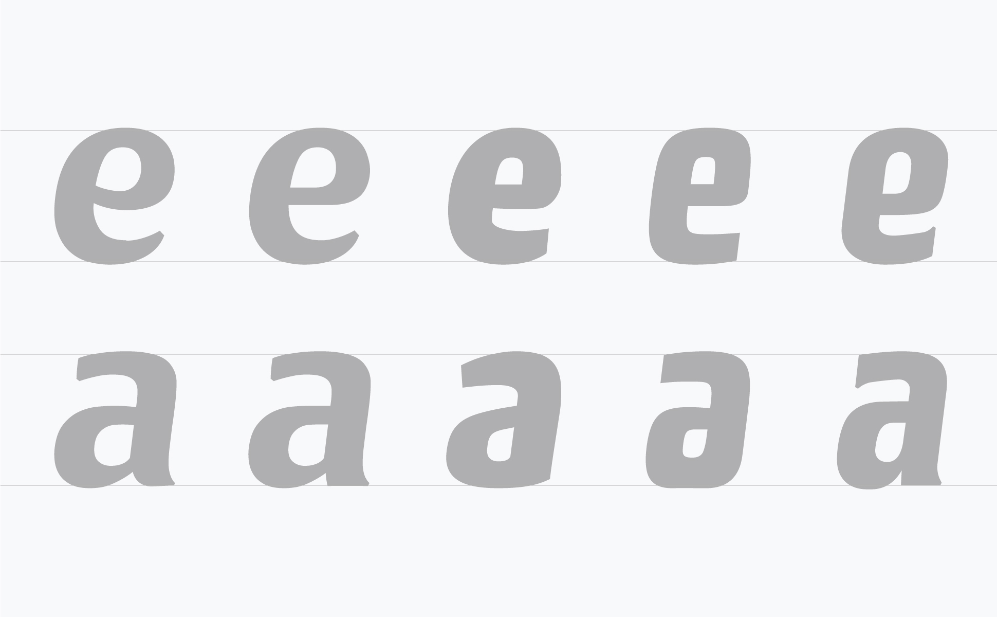
Serifs are detailed and ornate in their construction and appearance—lending sincerity and formality to the overall design.
But our serifs are subtle, not exaggerated, deliberately balanced to tone down the sharpness for a softer, calmer perception of the company.
We wanted to carry Sheela Foam’s heritage forward but also stand apart as a modern enterprise, working at the cutting edge of technology. Sans Serifs held promise.
Sans Serifs are modern, more functional and minimal. These are on the industrial and functional side of the spectrum—lean, sharp and more business-like.
Our sans serif explorations were squarish and heavy in shape and form—stable and robust. But they had a softness built into them with rounded corners and tapered terminals.
Also, look closely and you will spot how the letters mimic the shape of carved blocks of foam. There is a certain fullness or fluffiness if you will.
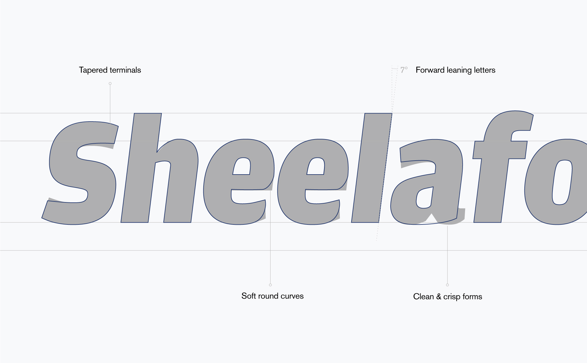
In addition, we’re trying options with varying letter thickness, curvatures and forms, in search of the right mix of legacy and modernity. Forward leaning letters hint at the pace of Sheela Foam’s progress, the innovation-driven future and its dynamic character.
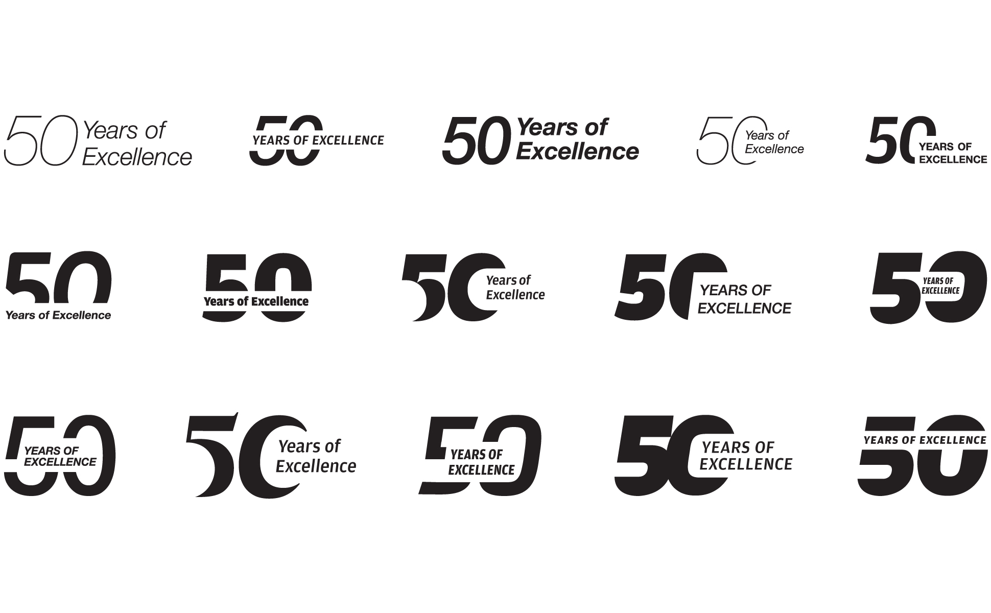
Half a century of excellence
As part of the identity, we’re designing a unit to commemorate 50 years of Sheela Foam. The unit has to sit well with the primary Sheela Foam logo and reflect the same stance—sleek, mature and modern.
We’re trying different typefaces, text placement positions and varying type weights to come up with a menagerie of options.
The logo: an elegant evolution
For a company of Sheela Foam’s size and stature preserving continuity is important. We understand that a radical redesign will be disruptive and undesirable.
So, our explorations stayed in familiar territory but cleaner lines, finer curves and crisper forms add up to more than a sum of their parts to give the new options a more modern, refined stance vis-a-vis the old logo.