rungta’s food packaging: grabbing eyeballs in a crowded category
 icd studio / 16 December 2022 / inside stories
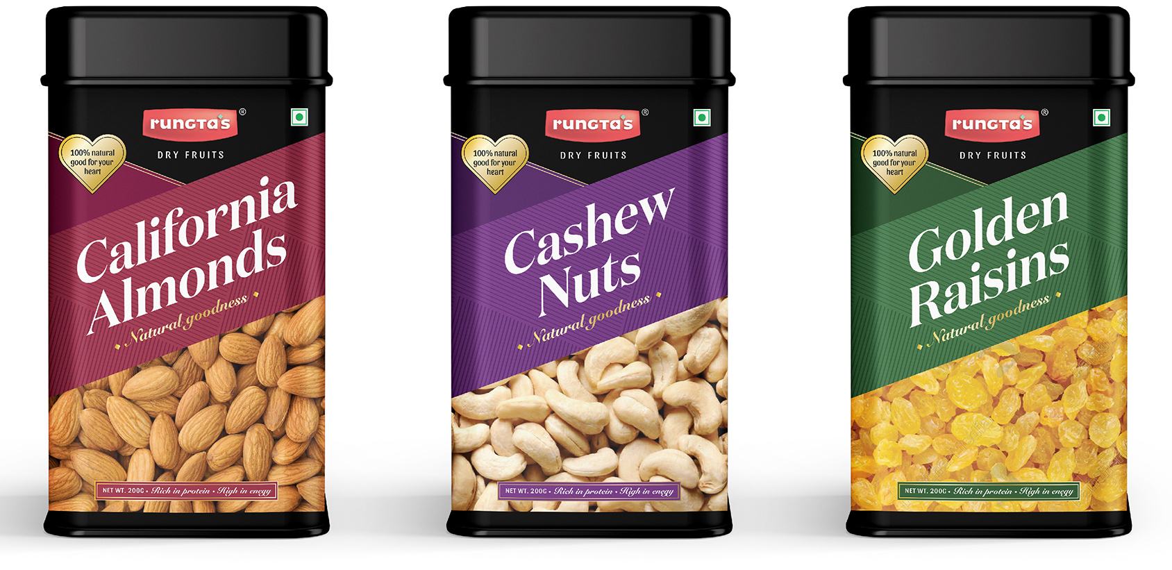
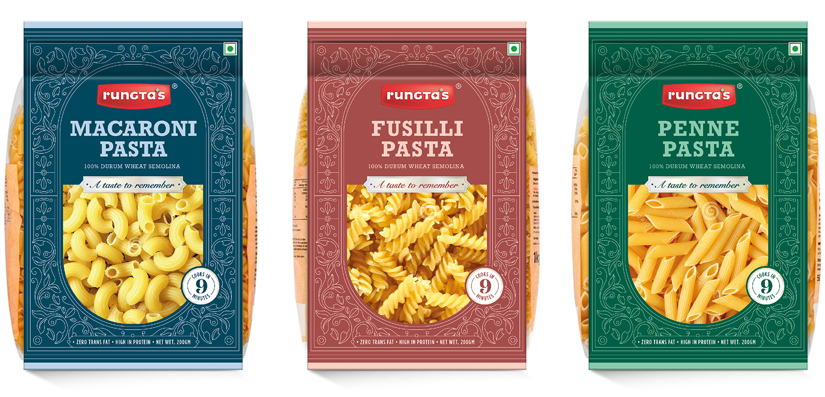
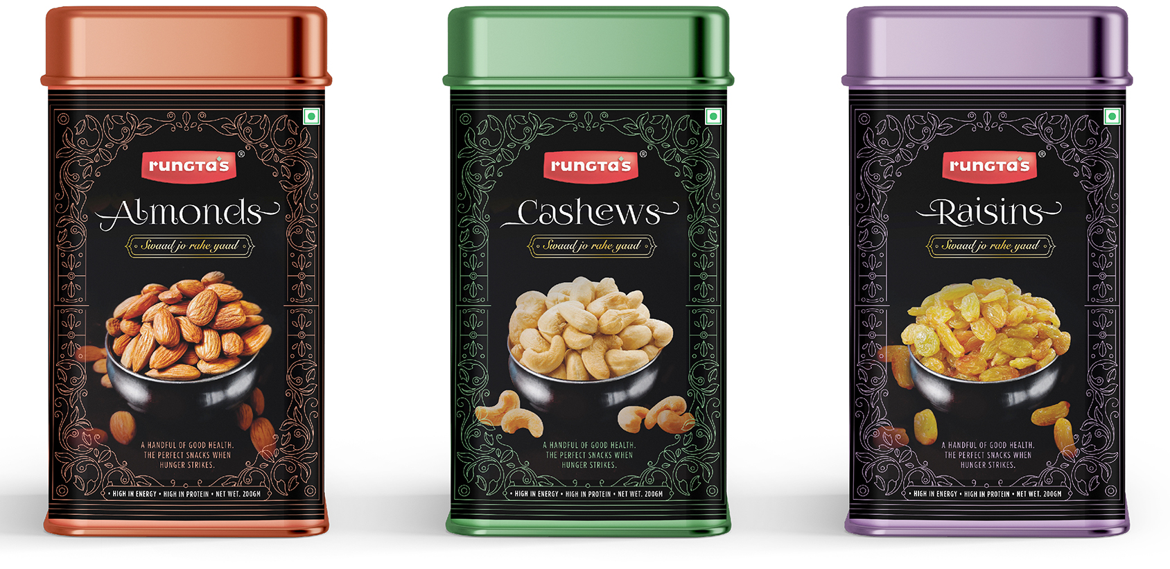
 Long-time client Rungta’s wants to enter the packaged foods category. We have been asked to design packs for three products—namkeen, pasta and dry fruits.
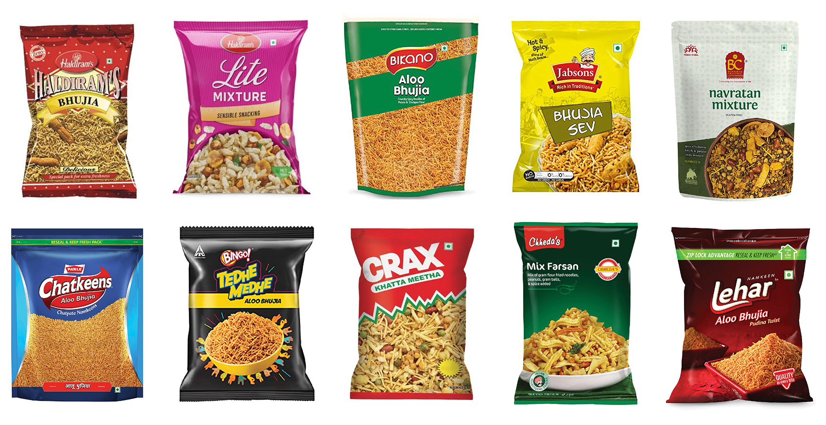
The category is crowded with a diverse range of pack designs. It’s an all-out fight for share of eye.
When it comes to pack architecture, there seem to be multiple approaches out there. Everyone is playing by their own rules.
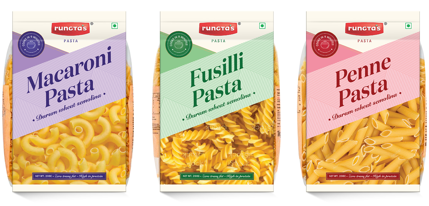
When designing for a new entrant, like this client, our challenge is to balance going for distinction against adhering to category codes.
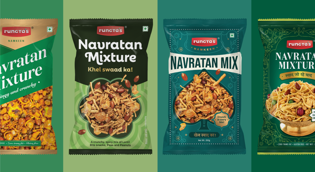
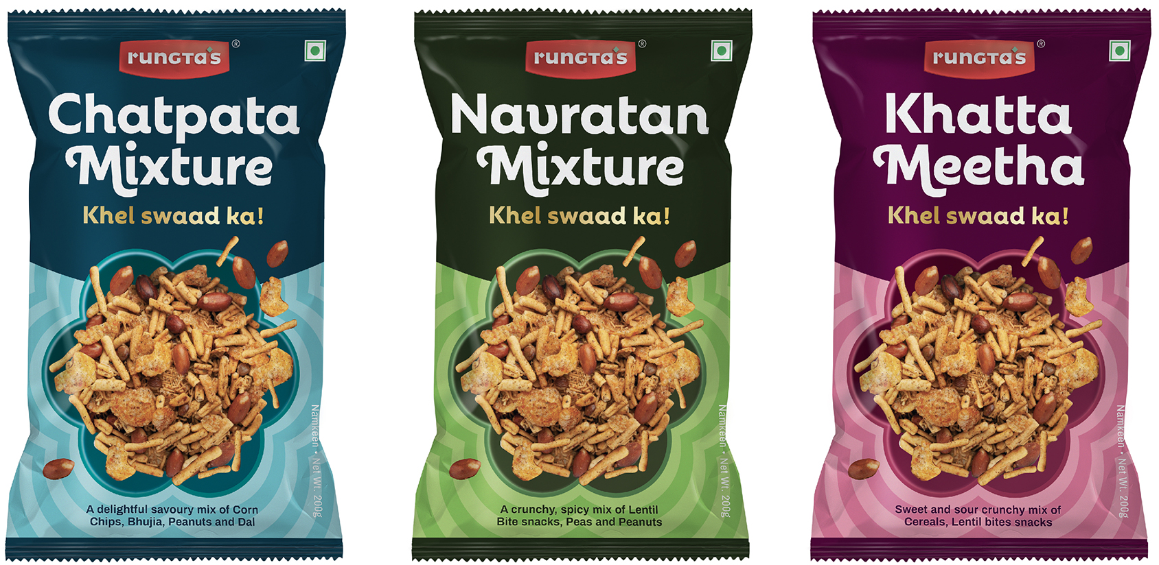
plating rituals
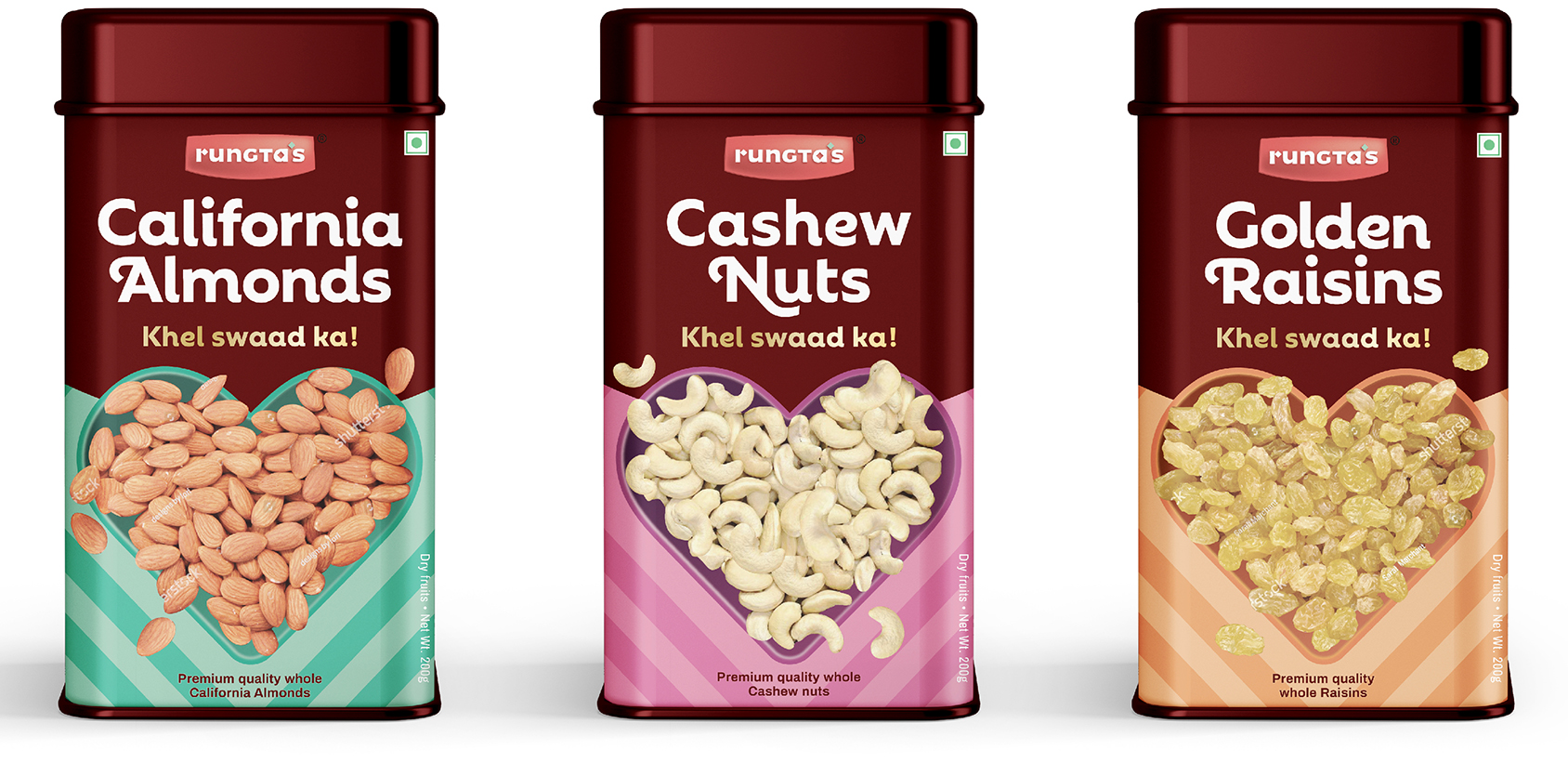
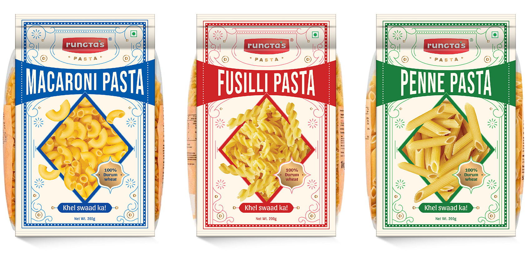
In India, food consumption often comes with a set of rituals around it. Plating is a big one. Let’s capitalise on this behaviour and associate each product with a unique plate shape?
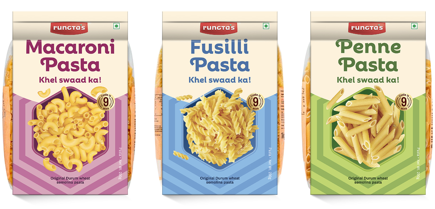
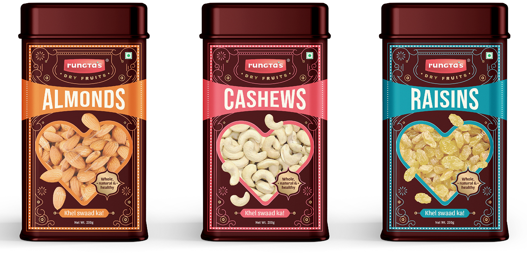
Side by side, we are also exploring different materials. Should the pasta pack have a transparent swath to help you spot your favourite type (penne, fusilli or macaroni)? How about tin cans for dry fruits to signal premium-ness and trust?


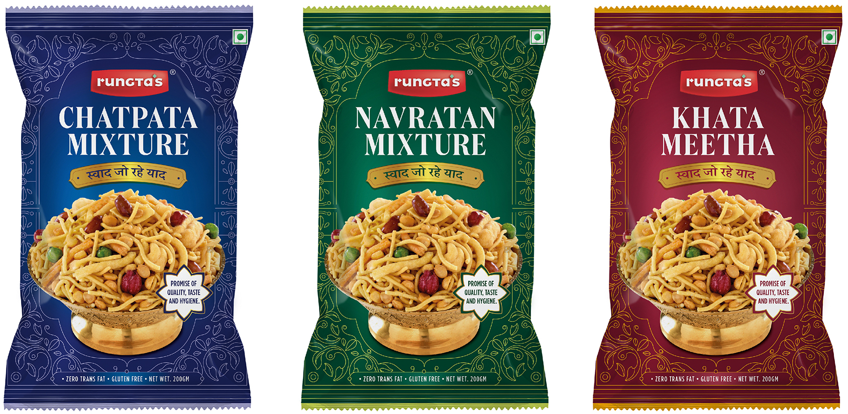
deck of snacks
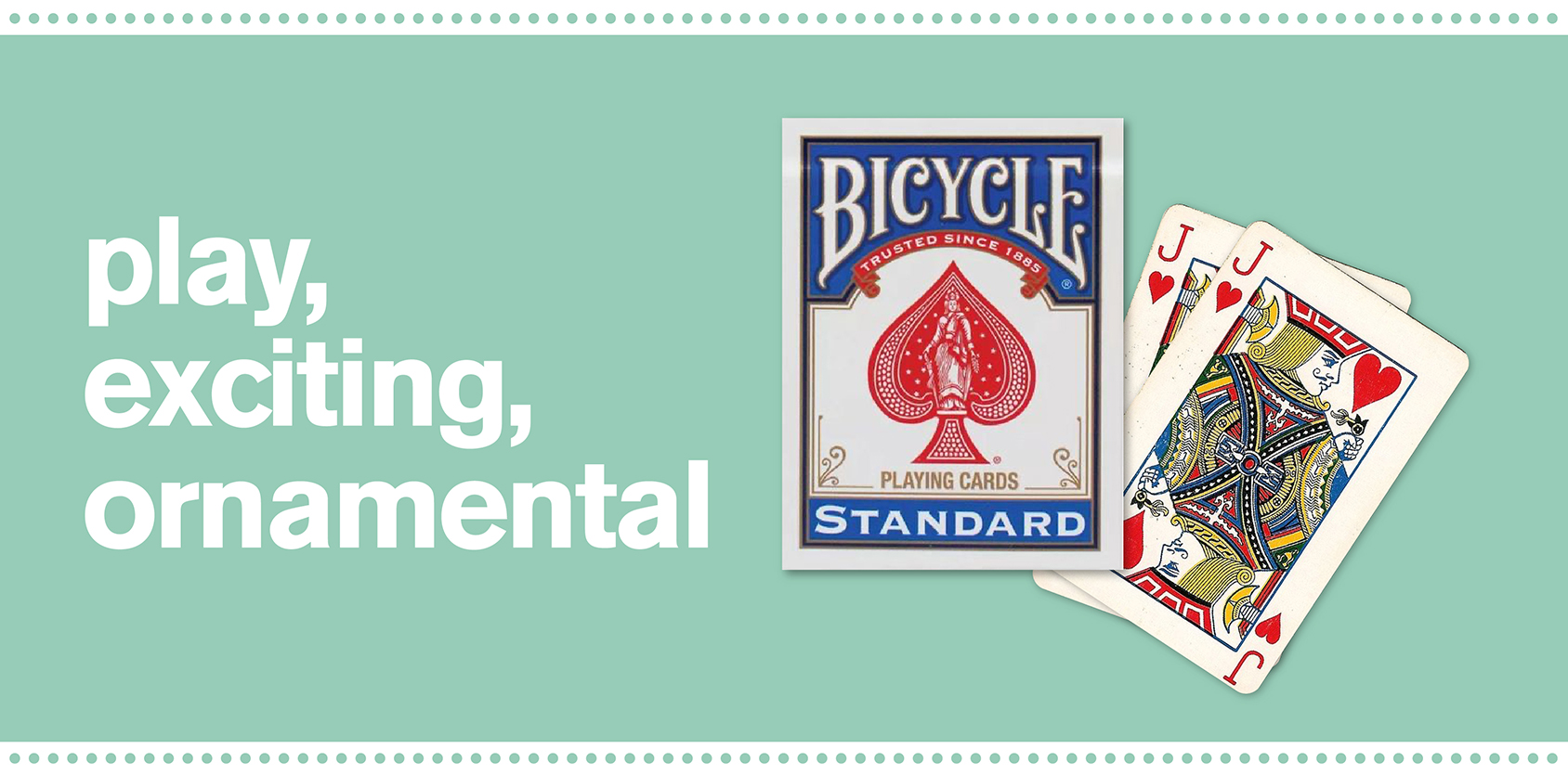
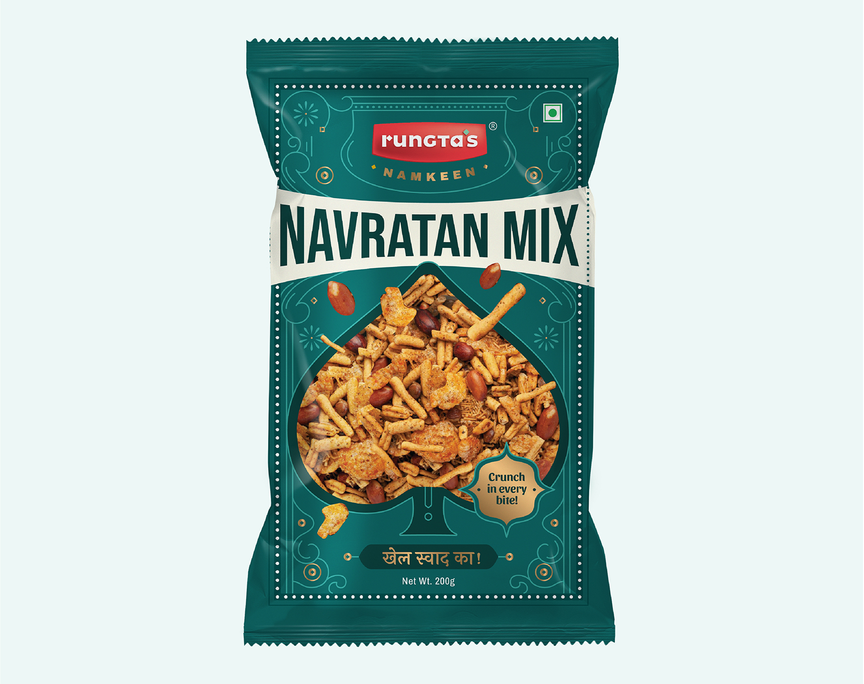
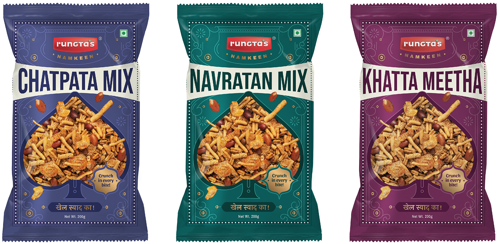
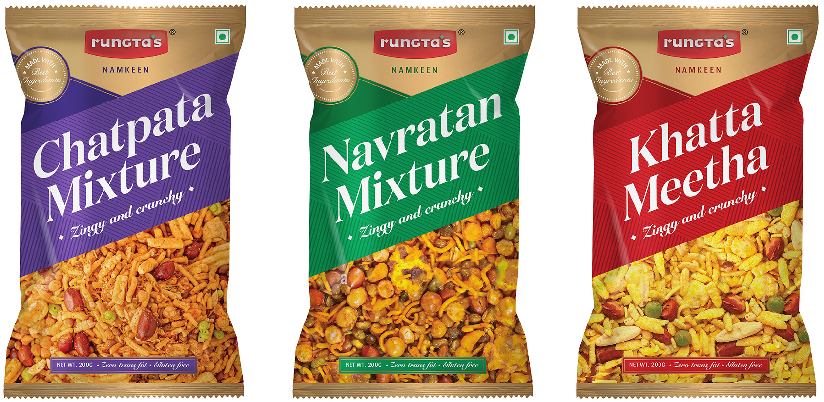
Ever wondered why a pack of navratan mix or aloo bhujia is the perfect companion for those endlessly long teen patti nights? Card games and snacks make a hit pair! We are inspired by the ornate motifs on these cards and applying them in our designs. It’s fun!

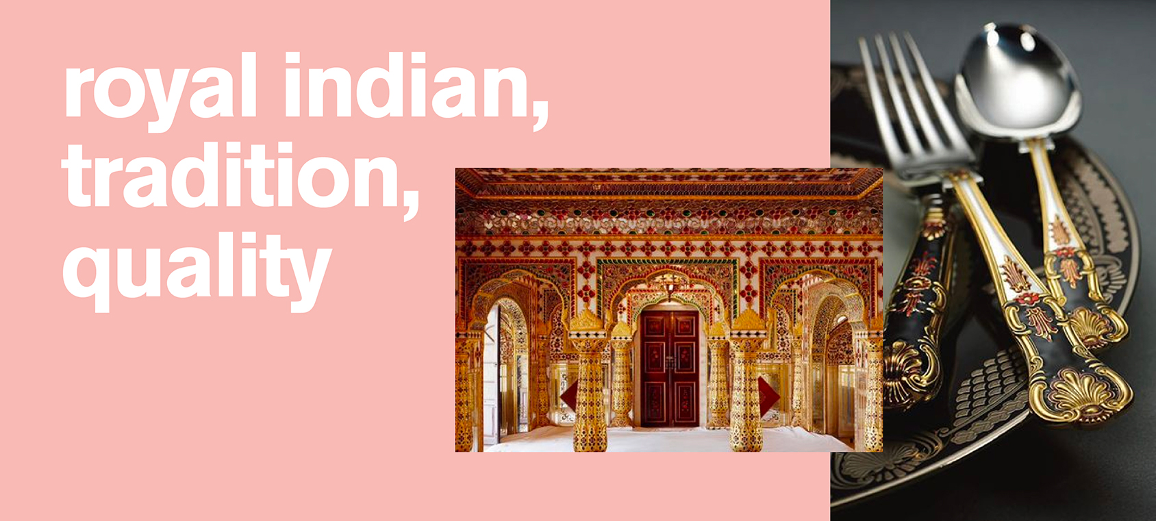
parampara, gunvatta aur vishwas
(परंपरा, गुणवत्ता और विश्वास: tradition, quality and trust)
What are the on-pack visual cues in this category that inspire trust and signal quality? Enter the gold badge proclaiming the use of best ingredients. Also, heavy type and straight lines. Together, they evoke reliability, tradition and standards.

regal matters
India’s mughal tradition has left an indelible mark on its food habits. The mughals’ lavish and extravagant way of life survives in their architecture, and their art. The kitchenware too! A rich repository of styles for us to explore!

Please note: The fonts and images used here are for the explorations stage for representation purposes. The rights of commercial usage have not been purchased.