AlchemLife packaging: making medicine packs effective
 icd studio / 20 December 2022 / inside stories
 AlchemLife makes plant derived medicines. It draws on the 75 year experience of its parent, Alchem International, a leading manufacturer of plant actives, the compounds responsible for the healing properties.
Distancing itself from the loosely defined ‘natural’ or ‘ayurvedic’ category with questionable efficacy.
AlchemLife’s medicines are stacked and sold from the same shelves in pharmacies as other pharma drugs.
The challenge here is to make the packs blend in and stand apart, at the same time. Appear as a legitimate ‘alternative’ (a proven one).
We designed their website to embody and communicate the brand pathos and felt that the same should be translated on the packaging too, for consistency and greater recall.


In addition, the design had to follow mandatory guidelines on the type size ratio of ingredients and product names, among other constraints—a tight space and a lot to convey.
We wanted a harmonious, effective confluence of two opposing forces—nature and science on the pack.
Clarity, added emphasis on the ingredients and a consistent design across products were the major client asks.
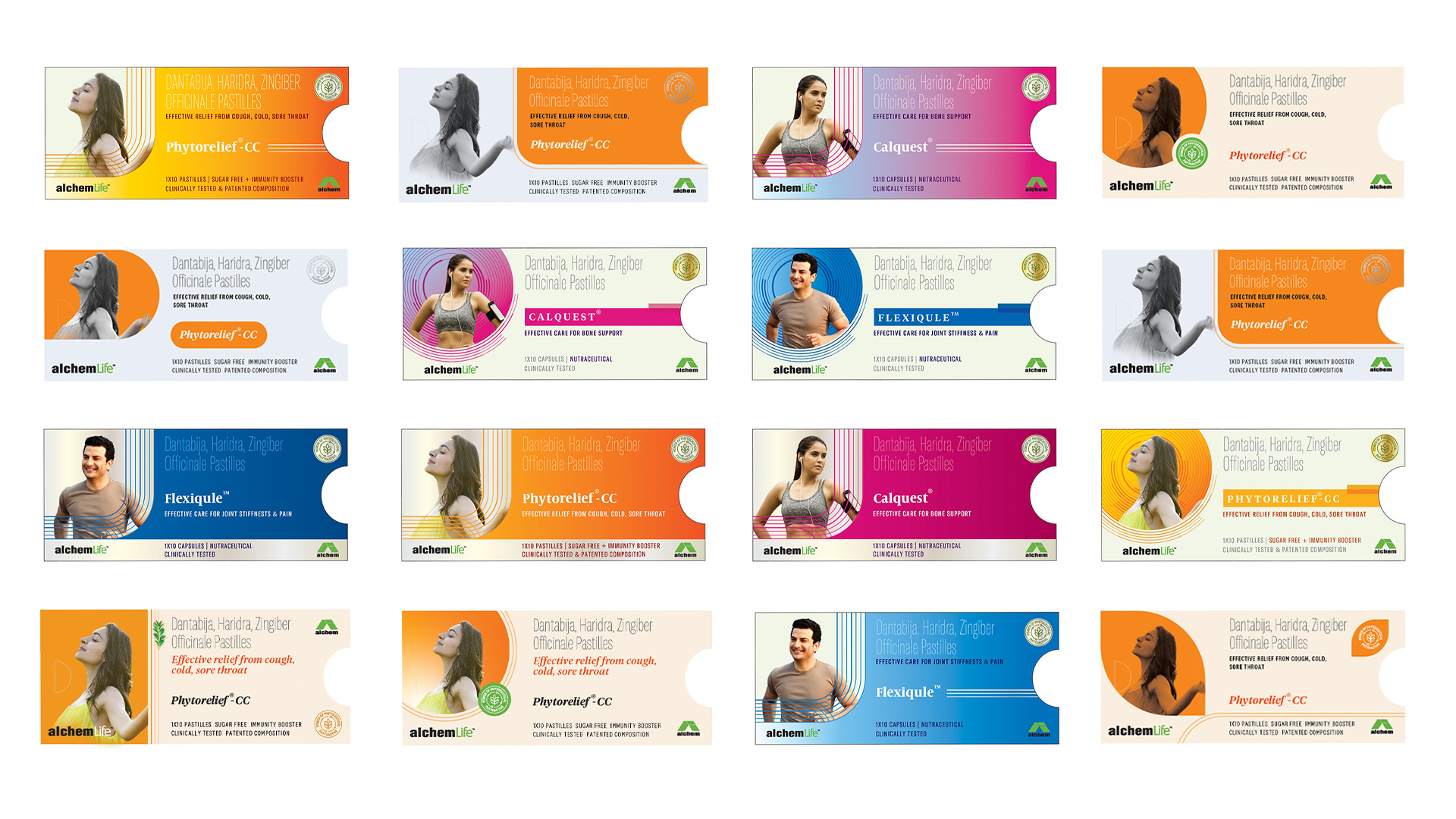
At this point, we began our explorations, starting with the pack architecture, a wireframe of sorts. The packs carry substantial information, and they have to do this with clarity in a tight space.

We plotted everything that needed to be said on a blueprint of the pack—the ingredients came first, followed by the product name. Brand elements, benefits and other information followed.
The architecture ticked all mandatory checkboxes. Brevity and readability took precedence over everything else, at this stage at least.


We chose hard working, highly readable fonts.
Distinctive and ownable, the fonts worked well when stacked and didn’t trade clarity for economy of space.
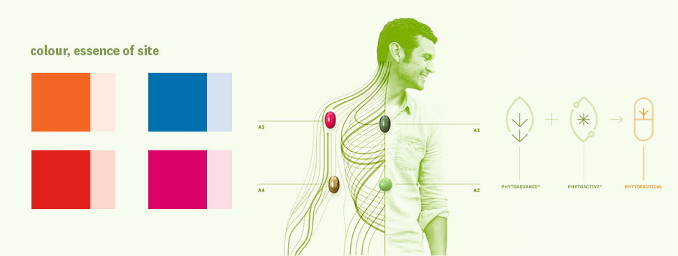
A visual library of colours, images and illustrations inspired by the website was developed, for use at the detailing stage.
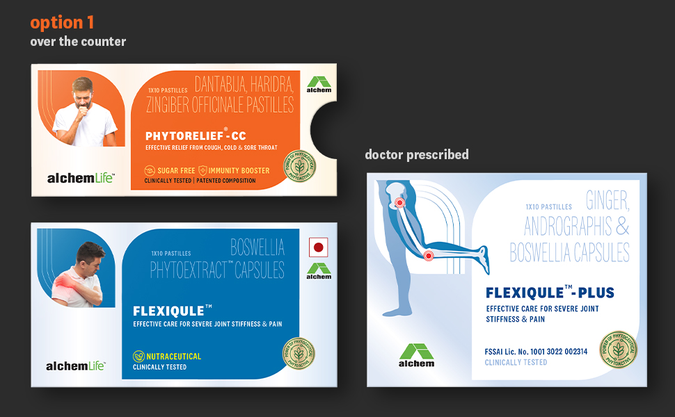
AlchemLife makes both, over the counter and doctor prescribed medicines.
They had to be positioned distinctively.
Differentiating OTC and prescription-only
Images of regular people, placed in memorable, smooth forms on the OTC packs lent them a certain sense of familiarity and trust.
Visual memory precedes names in medicines, especially in OTC products.
Vivid colours and forms brought better shelf throw for easier recall and better recognisability.
The prescription products had a more medicinal feel to them, closer to the website—in illustrations and the intentional sparseness, giving them a mature, more serious look.
The leaf
The first route had the ‘leaf’ as an inspiration.
We were careful not to stray into the ‘herbal category’, not overdoing the leaves. The scientific character is retained.

The pod
For the second route we choose a soft, flowing ‘pod’ as the primary form.
A promise of protection is embedded into it. Bright colours and an interplay of images and illustrations bring it to life.
Here too, the OTC products have the desired visual recall value and the prescription variants, adequate assuredness.

The cross
The ‘cross’, a ubiquitous symbol of healthcare, was employed in the third route.
We tried softening the edges and a sweeping motion to find the right balance of ‘science’ and ‘nature’.
If you look closely, all three forms are soft, and flowing but have a studied, considered demeanour.

Healing green
Another route, with multiple image background colour combinations set in a green space was tried out to improve the shelf throw and bring the designs closer to the website.

We tried this out on multiple SKUs of AlchemLife product portfolio.


Please note: The fonts and images used here are for the explorations stage for representation purposes. The rights of commercial usage have not been purchased.