Background
Wild Stone Sense, a perfume for the unsighted, was introduced on World Disability Day to bring the joy of great perfumes to the visually impaired. We were asked to bring the campaign idea to life with a pack.
We set about designing a pack that could bring the thrill of experiencing a new fragrance as close as possible for both the sighted and unsighted.
Strategy
We wanted to create something that would amplify the campaign—connecting sighted people and making them feel a part of the initiative.
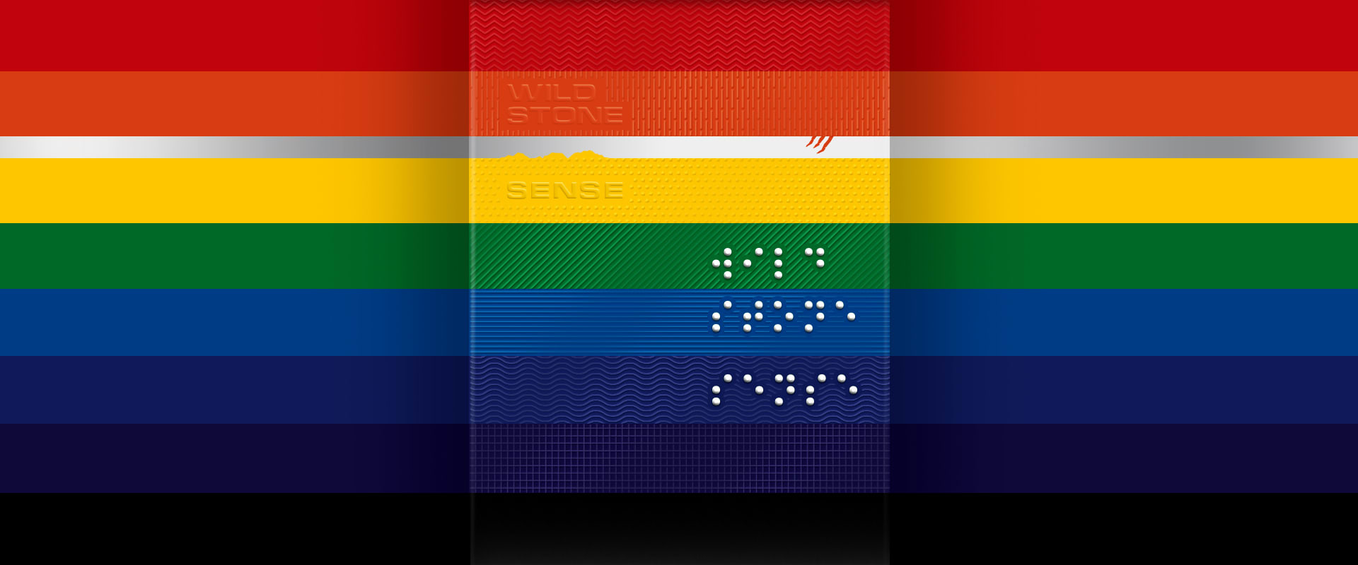
A twist on the senses through textures and text forces empathy boldy. The only text on the pack can be felt but not seen. Braille is the only lettering visible—intentionally irony is used to drive the point home.
The full spectrum of colours celebrate—not just observe the day.
Design
A design which could be experienced by both worlds in full. “Sense (smell, touch, sound) for the unsighted = Sight for the sighted”.
The pack stimulates sight and touch simultaneously—bright colour bands are used— each of the 7 colours of the spectrum and every band is overlaid with a different spot UV texture. Letting the unsighted ‘sense’ the colour spectrum.
The variant name “Wild Stone Sense” is lightly embossed into the pack, it has to be felt to be read while it is simultaneously played up through deep embossing in braille, the only visible text form on the entire box—a twist that switches senses—further reducing the gap between the two worlds.
Overall, the pack reflects a carnival-like mood— a departure from the sombre displays of empathy and solidarity associated with World Disability Day. The pack is an emphatic and empathetic celebration of the senses.
a celebration of the senses
Wild Stone ‘Sense’ was introduced on the occasion of World Disability Day. A perfume for the non-sighted. The pack design celebrates the gift of the senses—a departure from the sombre displays of solidarity observed around such occasions
texture and text enable empathy
A spectrum of textures was created parallel to the colour bands to enable the visually impaired to sense each colour. The braille text is played up using deep embossing to further level the playing field between the two worlds.
partner-in-charge & creative director itu chaudhuri | design concept itu chaudhuri, ashok dey | design development ashok dey | alternate design concept prashant gaikawad, niloy kundu | project duration 1 month