Photo books are more than photos
 icd studio / 14 September 2022 / studio diaries
 Ask designers and they would agree that editorial design projects are more labour of love than commercial work. Of these, photo books hold a special place in our hearts.
We’re careful about the subjects we work with on these projects. Over the years we’ve turned down more requests for ‘coffee table books’ than we would like to admit. We like a story. If we can’t see one, design is a chore.
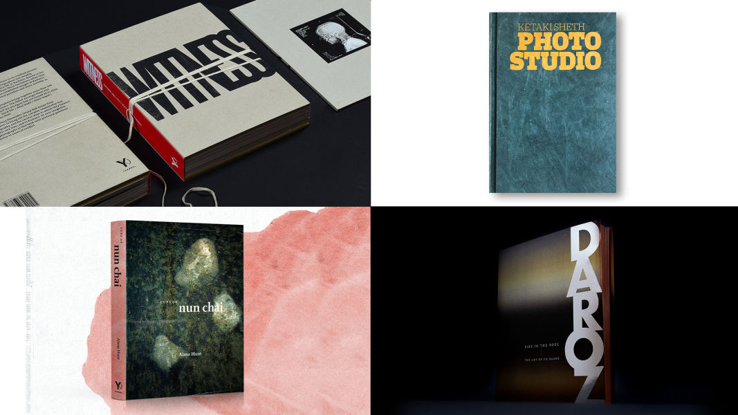
A recent review of a photobook that we designed, Witness (Yaarbal 2017) by Tanvi Mishra, was published in a special issue of the Take on Art magazine. Tanvi talks about the role that the design and the layout have played in shaping the narrative of the book and how it drives the reading experience.
 Further, she says, ‘Witness is a book that forces the reader to engage with its materiality—its sheer weight commands attention and commitment, the turn of the page and the opening of gatefolds an active intent to piece together a story that may not always appear as it seems’.
It is discerning readers and observers like Tanvi Mishra that keep us going.
 The review got us thinking about our approach to designing books, books that sit at the intersection of a photo exhibit, a piece of literature and an art object.
The reader should commune with not just flip through the book. That is what these books are meant for—inspire reflection and conversations.
For the reader, Witness is a document that puts together the fragments of the troubled lives and struggles of the Kashmiri people. Carefully edited images reveal the ‘new normal’ that’s often overlooked in the news. The design is evocative but does not stray into being overtly sentimental—in keeping with the journalism that the images represent.
 The physical form of the book suggests a casefile, tied together with a cloth tape, as if to collect and preserve for memory a bundle of evidence of the conflict, over the decades of 1986–2016.
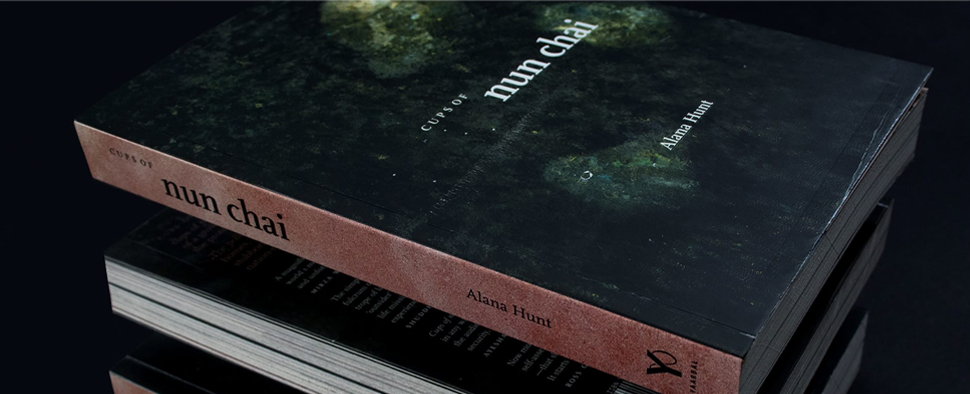 Kashmir, thanks to our friendship with activist-filmmaker-publisher Sanjay Kak is ever present in the studio. We designed another book on Kashmir, Cups of Nun Chai, in collaboration with author Alana Hunt and Sanjay’s imprint Yaarbal.
It starts with a cup of tea, the Kashmiri Nun Chai.
 An unremarkable, but unmissable ritual. But a couple of things make it different. It’s made with pink salt. It also has a social aspect, becoming a cup over which Kashmiris commune, exchanging news, sorrows and gossip.
The text records Alana’s simple act of speaking with 118 people over 118 cups of nun chai. A shot of each of the 118 nun-chais marks each conversation, a reminder of the grief and personal loss, and transforms into a unique, and personal memorial of civilian deaths in Kashmir.
The book blurs the lines of an artwork and a human record: a means of personal remembrance, and to be referenced, and studied as a historical text. The design reflects the poignancy of the conversations.
The book is stained ‘pink’ taking after the distinct colour of the tea, the unifying thread of these conversations. The cover pictures the salt, essential in making nun chai, made to appear like water washing over stones, a symbol of the valley.
 The layout blends the personal and public lens to Kashmir. A collection of newspaper scans, advertisements calling out for peaceful protests around the state, breaks with details of the dead. A cup of nun-chai marks each conversation. A reminder of their grief and personal loss, and transforms into a unique, and personal memorial of civilian deaths in Kashmir.
As noted by Tanvi in her Witness review, the character of the photobook is influenced not just by the interplay between text and photography but by a combination of production and design choices—the type of paper, the typography, the cover material, the weight of the object in your hand. The same principles are at play in Nun Chai as well.
Design and production choices add up to create an artefact that’s more than a piece of text with pictures.
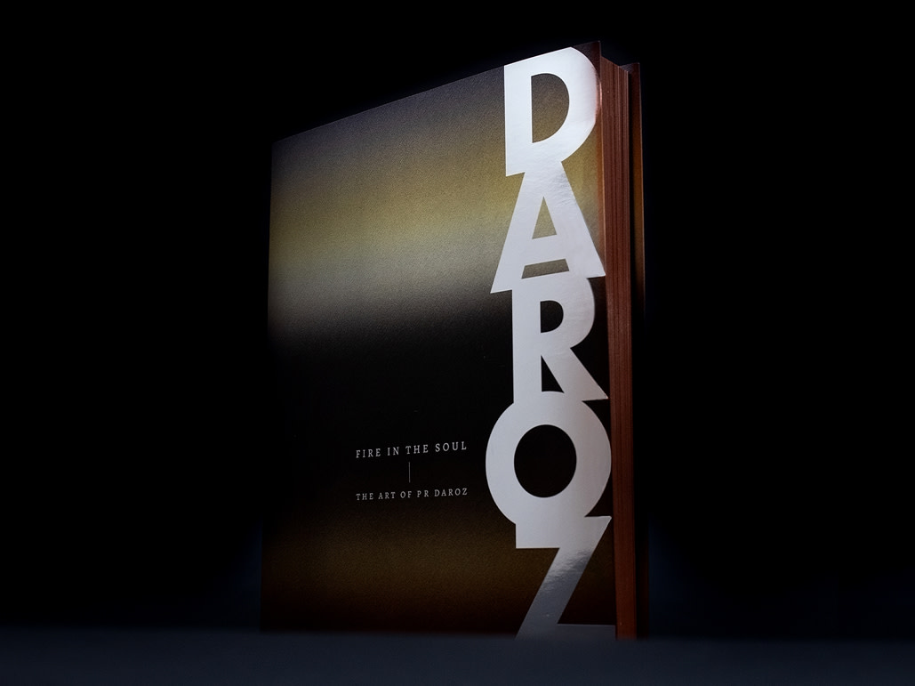
 This process can also be seen in the explorations for Fire in the Soul, a photo book that chronicles the artistic journey and diverse oeuvre of PR Daroz, the eminent ceramic artist.
Through these same considerations we add meaning to the physical object. Here, we wanted the book to be seen as a Daroz art piece, with elements borrowed from his creative phases over the years.
 The book is heavy and substantial—much like Daroz’s art. The reader’s interaction with Daroz’s art and elements begins at the cover. The cover lettering is sculptural and monumental. Its texture and colours seem to have the natural variance typical of pottery.
 Collaborating with artists gives you a sense of freedom; there is mutual trust and involvement in the project.

We’ve designed a book for another artist, the photographer Ketaki Sheth.
Her book, Photo Studio (PHOTOINK, 2018) straddles the line between documentary photography and art. It records the vanishing photo studios of India and also a way of recording oneself.
Over three years, Ketaki explored 65 photo studios across India, most of them in a dilapidated state, capturing her experiences. We designed a book of her pictures.
With Ketaki’s unconventional approach to documenting photo studios, we did not want the book to be another ‘classic photobook’: a neutral, transparent, orderly display that emulates a ‘white-cube’ gallery experience, hushed and respectful.

We turned Photo Studio into an object to be experienced rather than a bare vehicle for images, using a series of devices that pulls the reader in, engaging more than just their sight.
The images are cropped, and repeated, made to span pages immersing the reader in the photo studio world. Tipped-in glossy prints—like in an album, a glass negative with a positive overlay, as if in film—engage the reader’s sense of touch. They force the reader to pause, look beyond the page into the past.
We insisted on carrying her voice with the photographs. Almost forcing her to write teasing, quasi poetic fragments of text, guiding readers on their journey across photo studios from all over India.

So, the next time you see a heavy photobook in a drawing room, tastefully placed in a corner—pick it up, flip through it and feel its weight—the weight of its meaning, the weight of its place in time, the weight of the thoughts it carries.