
PR Daroz: How a life in clay takes shape
 itu chaudhuri / 17 November 2021 / studio diaries
 We are designing a book on the life and art of PR Daroz, the renowned ceramic artist.
He works at the very edge of the Indian ceramic art scene—expanding the field through his experiments with clay and porcelain.
A book for an artist—someone who appreciates and understands the value of experimentation and exploration deeply. We couldn’t be happier.
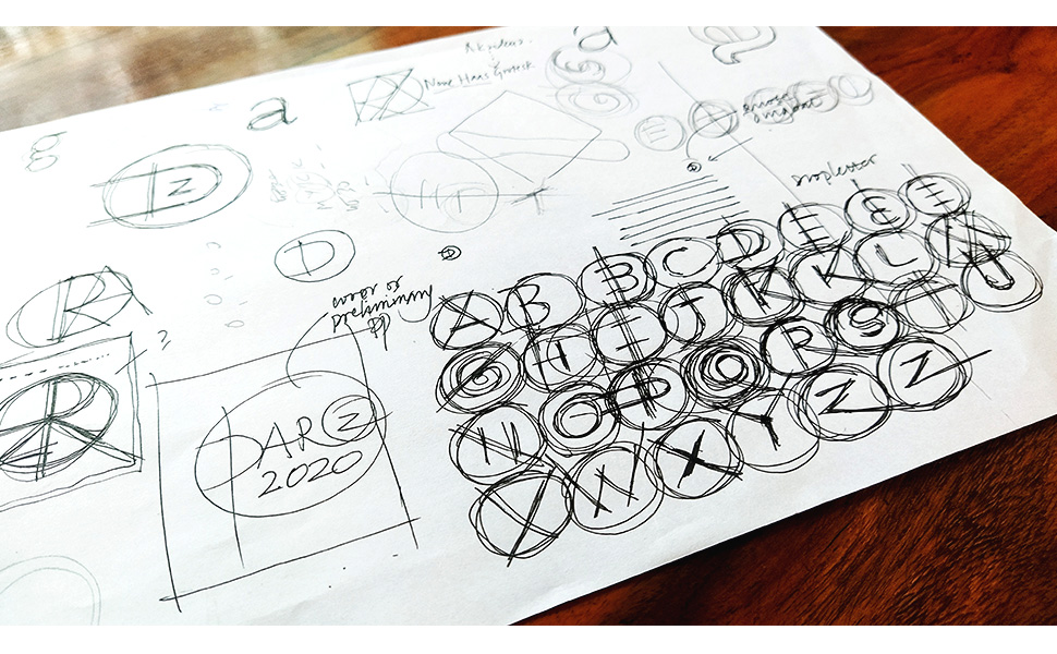
We’ve been experimenting and playing on multiple fronts—covers, fonts, paper, separators and signatures. It’s been challenging and fun.
Let’s take you on a tour:
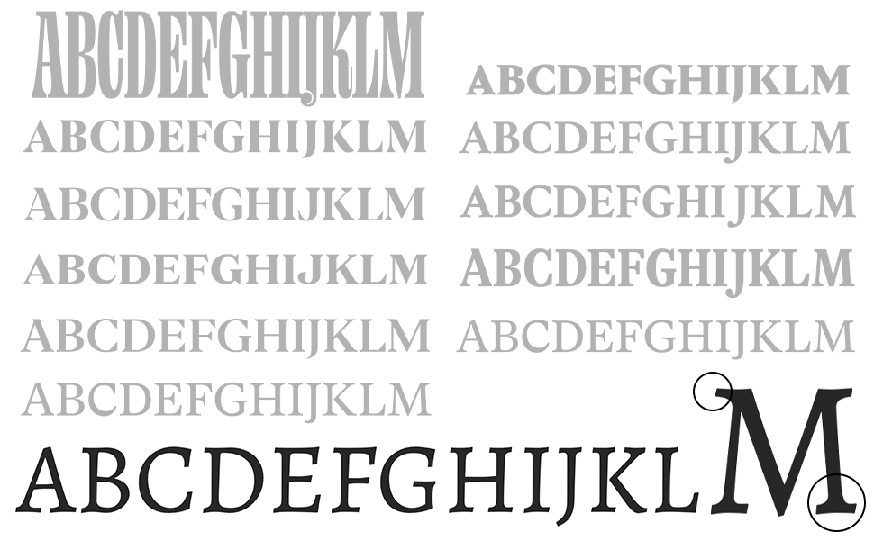
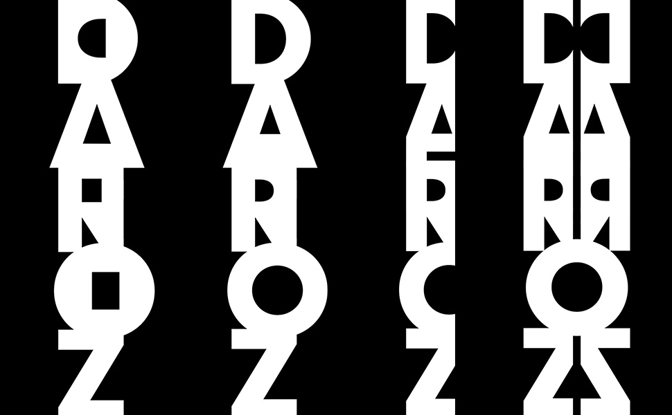
We printed over 50 typefaces. We were looking for a font that looks crafted, humanistic and engraved—just like the kaarigari of Indian art.
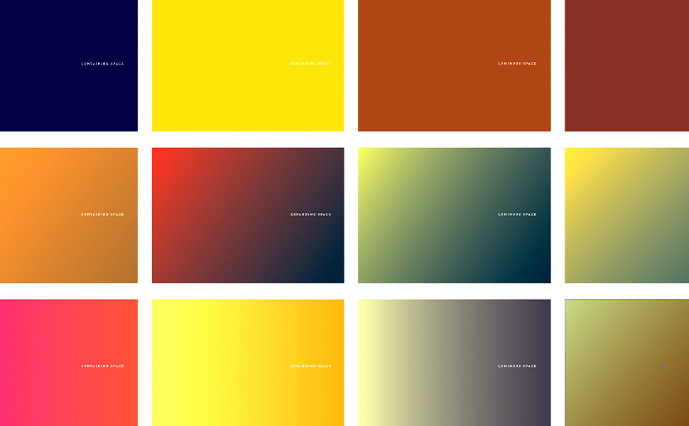
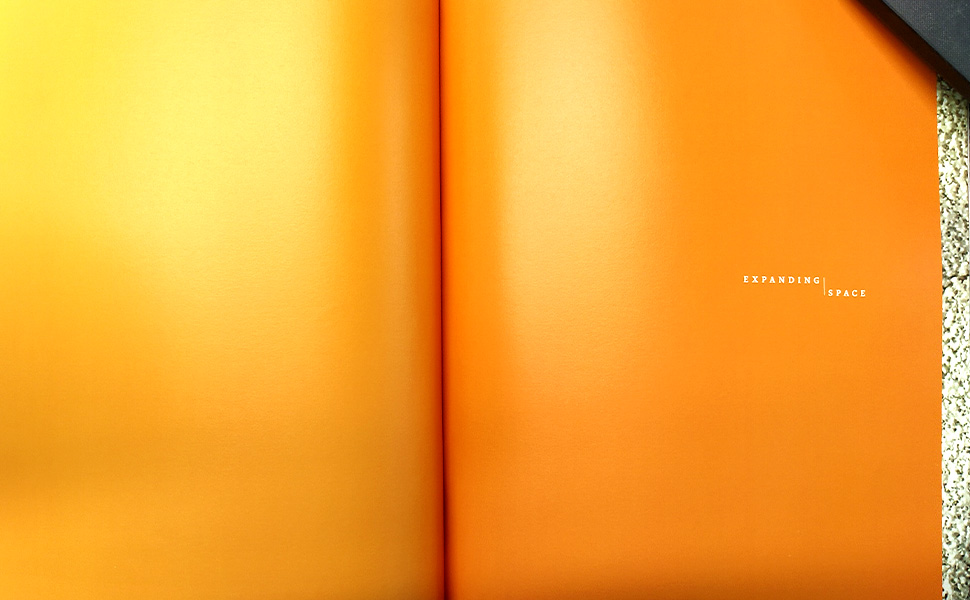
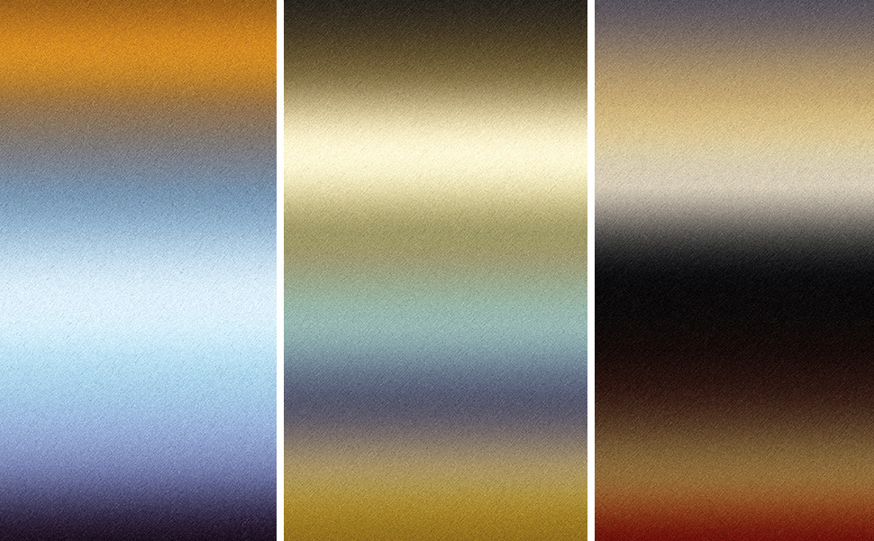
The book has chapters on the life of the artist, each about a different stage in his evolution. Separators segregate the chapters. We experimented with vibrant colours, picked up from his pieces, to give powerful starts to the chapters.
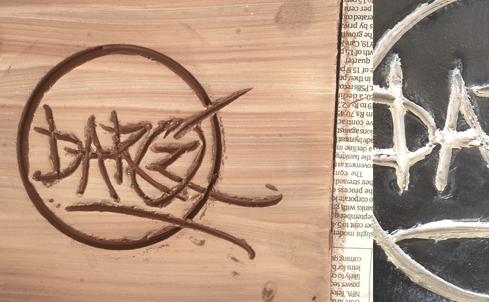
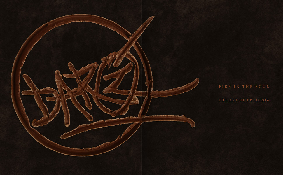
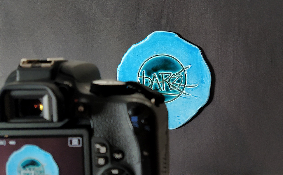
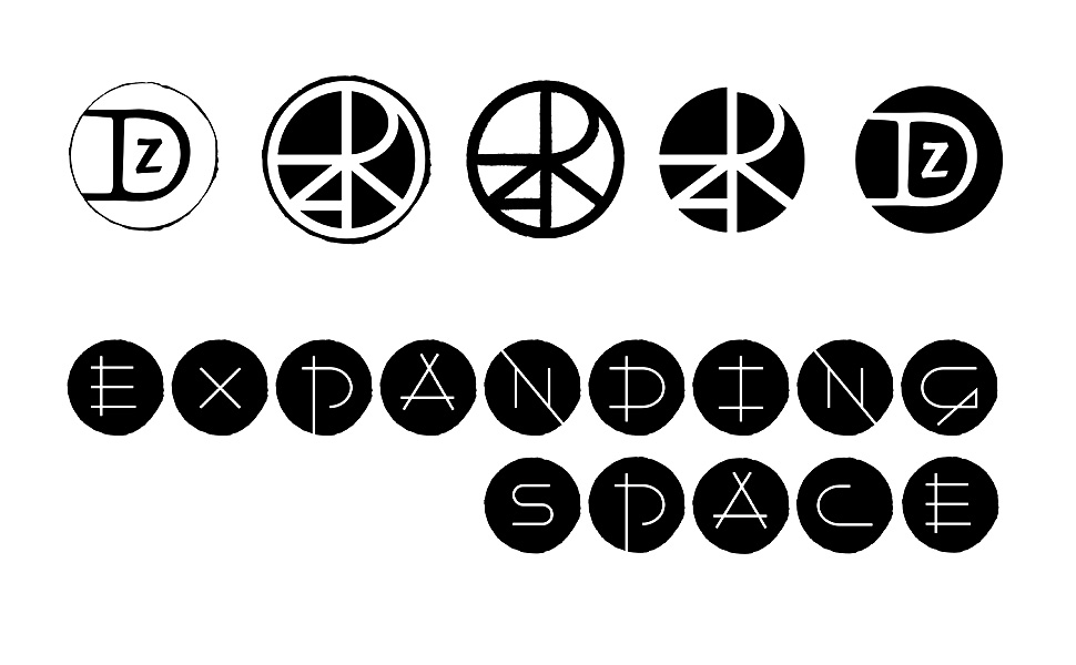
An artist’s signature is everything to them. It’s their identity, a stamp of authenticity, an expression of his personality. Every artwork of Daroz carries it, so it was only obvious that this book would have it too.
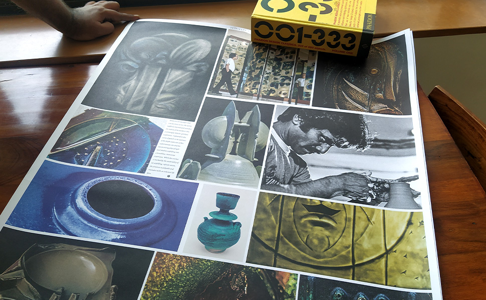
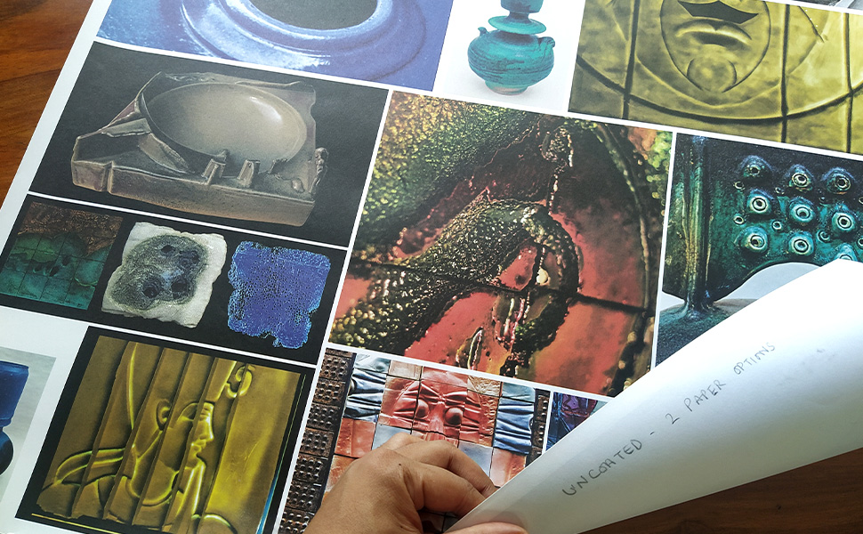
Paper is to a book what clay is to a pot. We went on a paper hunting trail—looking for the perfect material that could bring his art alive.
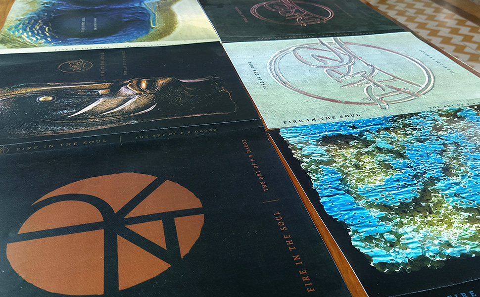
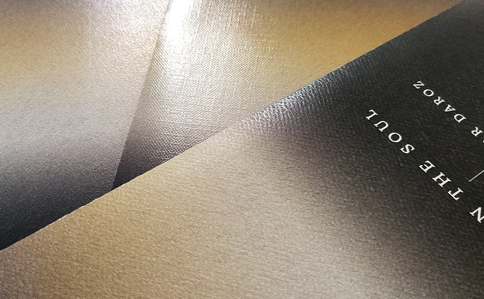 The cover is the face of a book. We explored infinitely here—inspired from his pieces; we tried metallic effects—a nod to the artist’s use of the same in his work. We wanted a book that has a larger-than-life feel, is experimental and expresses itself beautifully, some things that are close to the artist’s heart.
