Background
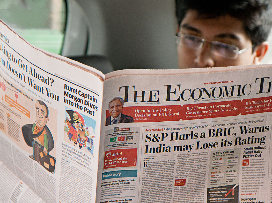
For long, The Economic Times has been the highest readership financial daily, and also defined readers’ expectations of the category. In the 1990s, it pioneered the introduction of non-business content. It later experimented with a populist tone, with humorous pitching of headlines and caricatures perched atop the masthead.
Problem
Changes aimed at attracting first time readers of financial papers, who tended to bypass ET for a rival daily, were carried out on the fly and lacked a holistic product view. New devices and legacy elements clashed uneasily, making it appear inchoate.
Strategy
Our conversations with younger readers suggested no yearning for an ostensibly younger looking paper. Instead a contemporary, well-organised, highly readable design that respected their reading habits would serve old faithfuls and new readers alike.
Design
The design objective was thus to restore harmony and order and ‘look the leader’. Headline fonts were paired, one for the serious side of its image and another for its less formal side. The body font was selected for maximum economy without sacrificing legibility, after careful comparison of candidates.
The graphics style was totally reworked to eliminate illustrated clutter, and staff encouraged, via example, to present conclusions in titles rather than just label the data. Headlines and subheads were pitched to read more simply and directly.
A colour palette was introduced across all the sections. New sections were given mini-identities. The slugs were turned into a clear family. Finally, a library of icons was developed, to be set within headlines, to create a sense of arousal. In the words of the client, “ET is a much stronger product and the design is a big part of it”
order and clarity for India’s leading financial newspaper
Economic Times, the financial daily with the highest readership, defined readers’ expectations of the category for a long time. Changes aimed at attracting first time readers, who tended to bypass ET for a rival daily, were carried out on the fly and lacked a holistic view. ICD was asked to redesign the newspaper.
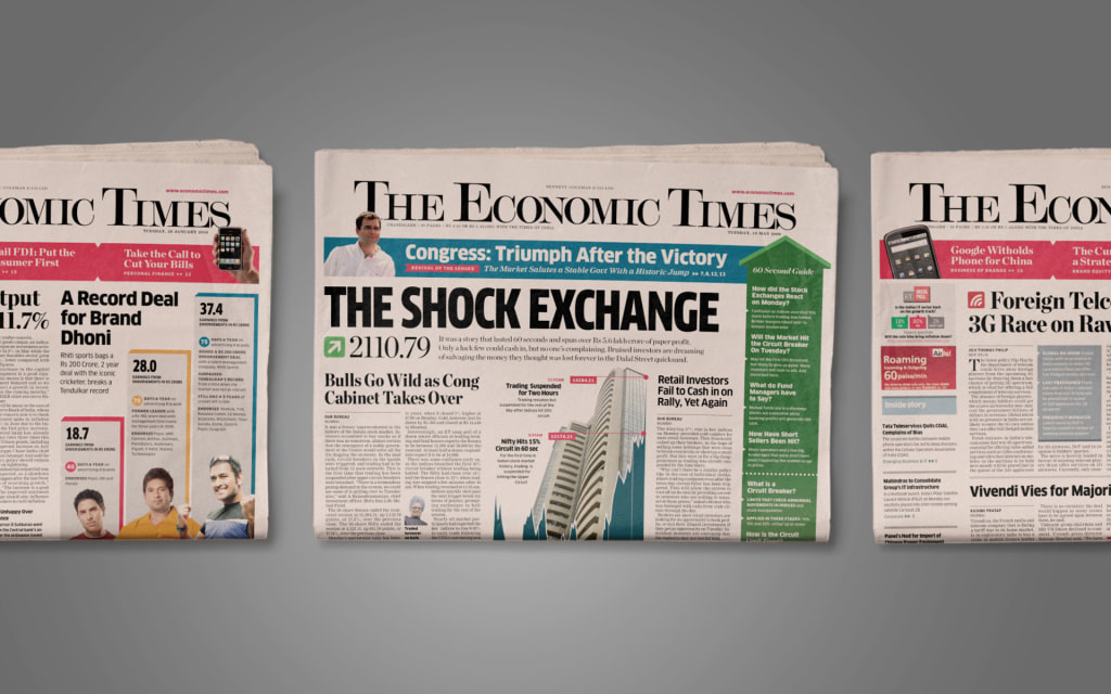
not younger looking but well-organised and contemporary
Conversations with younger readers suggested no yearning for an ostensibly younger looking paper. Instead, a contemporary, well-organised, highly readable design that respected their reading habits would serve old faithfuls and new readers alike.
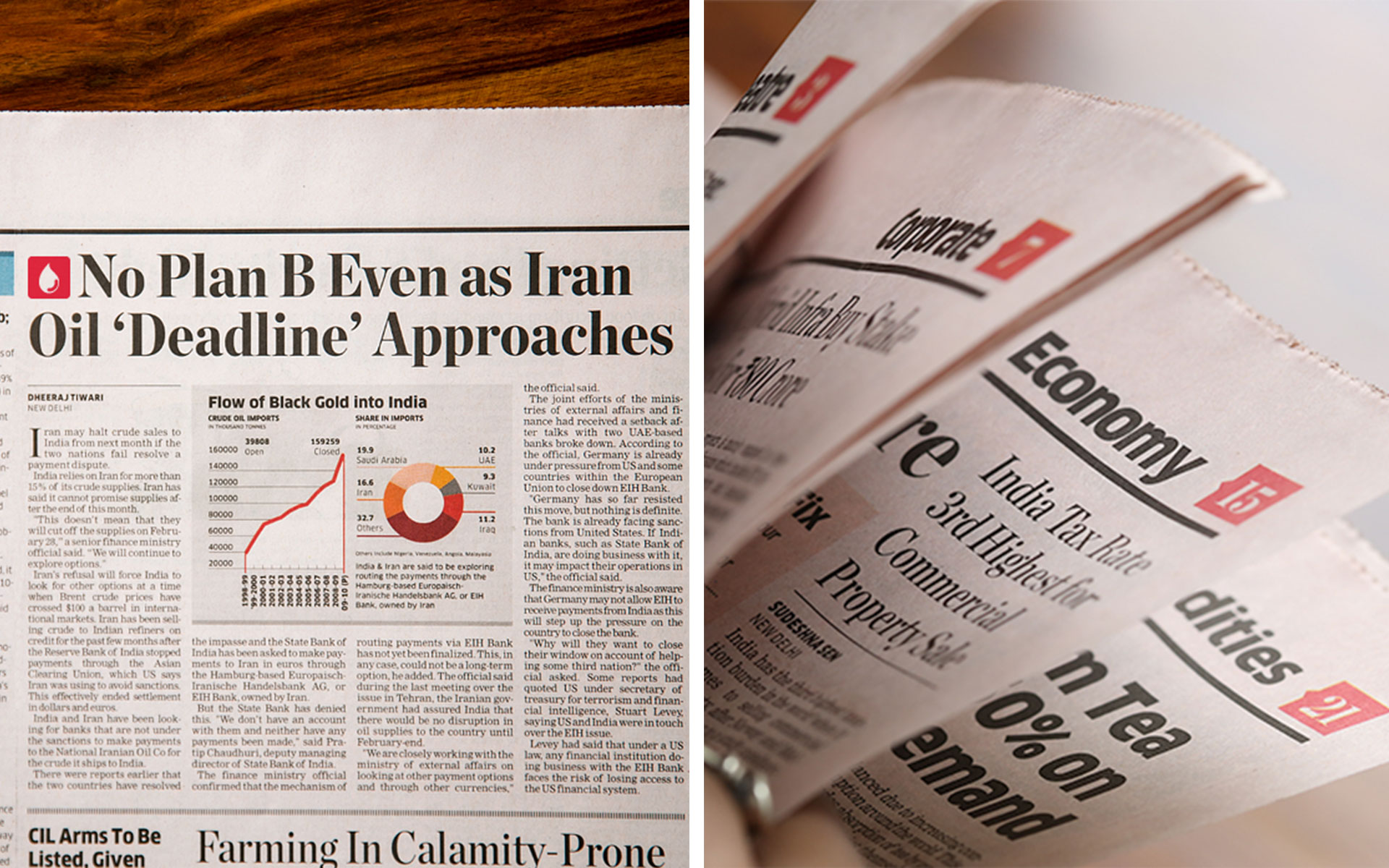
restore harmony and order, and ‘look the leader’
Headline fonts were paired, one for the serious side of its image and another for its less formal side. The body font was selected for maximum economy, along with legibility. Graphics style was reworked to eliminate illustrated clutter. Headlines and subheads were pitched to read more simply and directly, presenting conclusions.

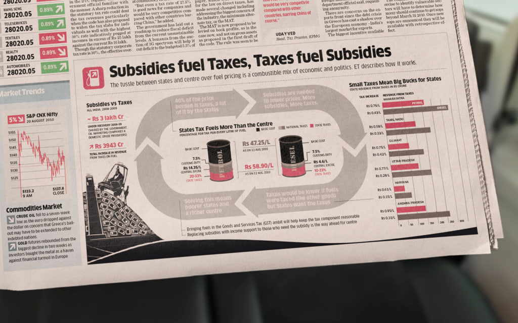
a clear family, with new mini-identities
A colour palette was introduced across all sections. New sections were given mini-identities and the slugs were turned into a clear family. A library of icons was developed, to create a sense of arousal. In the words of the client, “ET is a much stronger product, and the design is a big part of it.”
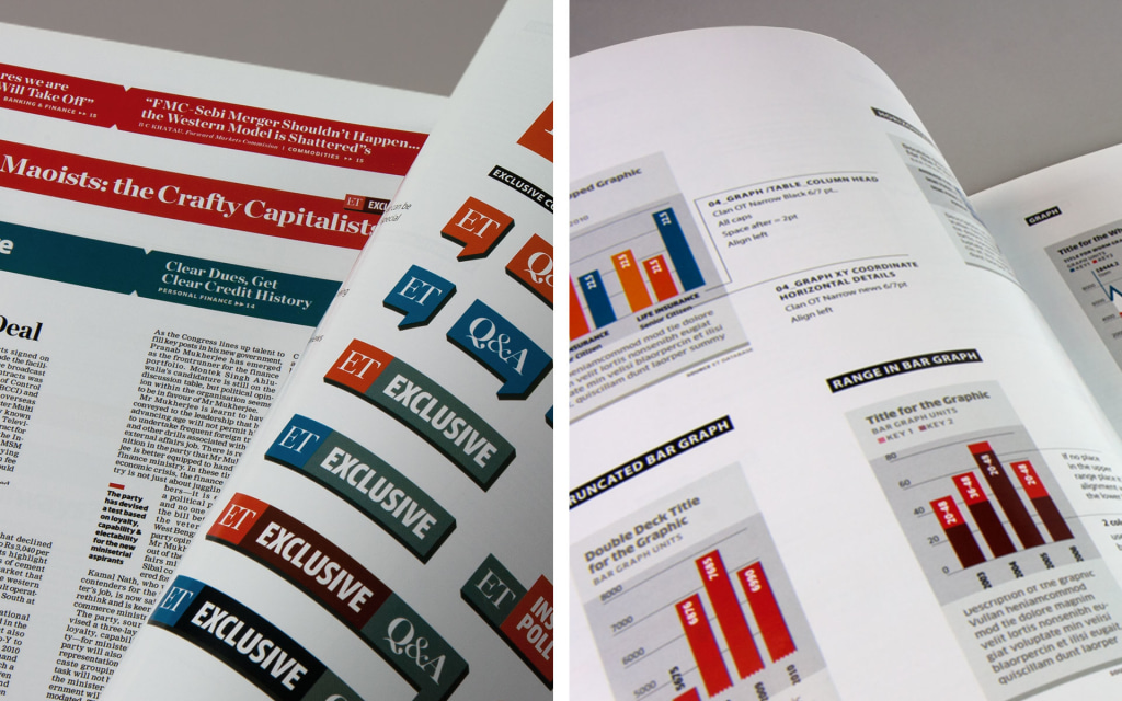
Principal & Creative Director Itu Chaudhuri | Art Director Richa Bhargava | Design Development Richa Bhargava, Varghese Mathew | Webpage Photographer Parikhit Pal | Project duration 1 year

