Background
Outlook Traveller, a travel industry veteran faces the same threat of internet disruption as its category peers—declining readership, influence, and relevance among a fast growing internet generation with unlimited access to images, information and opinions; blogs and social media, and easy clicks to travel platforms, OTAs, and sites.
With a desire to increase its relevance to today’s traveller, and to understand how they view their travel choices we were asked to redesign the magazine.
Strategy
With the disintermediation of the travel industry—travel magazines, too, look at an erosion of their position as the only source of pretty pictures and information; advising people what-to-see, where-to-go.
Now, travellers all over the world share views online, platforms like Tripadvisor narrow it down for relevance—location, holiday type, things to do. And travel influencers can be easily found and followed for local tips and where-abouts.
Today’s traveller isn’t chasing picturesque destinations, sterile transfers, and tourist-compatible stays, but unique experiences off the beaten path (aka ‘experiential travelling’).
The new Outlook traveller tapped into this worm-eye view of travel. Marking essentials that bring out the local flavour: ‘how to reach’, ‘where to stay’, ‘what to do, ‘where to eat’. Sharing local smarts on incredible finds; relevant to the tourist in sneakers as well as the family in AC coach.
So we went about making travel magazines cool again.
Brand
Brand changes from an authoritative brand to a collegial brand—more youthful, less authoritative. Meant for a backpack minded traveller—spontaneous, fresh, fun, travelling for experiences than sights.
Speaking the voice of a fellow-traveller; informal, street-wise, knowing local in-and-outs. Living the new brand tagline—it’s not where, it’s how.
Design
Typeface. The expressive ‘Beirut’ seems to hark back to an earlier, charmed world. Making the cover title, and headlines stand boldly and provocatively appealing to the unfettered spirit of travel. Meanwhile, the more functional ‘Vulf’ notes important insights and take-aways. Locked together in a mix of styles to awe and inform—prodding the traveller to read and explore more.
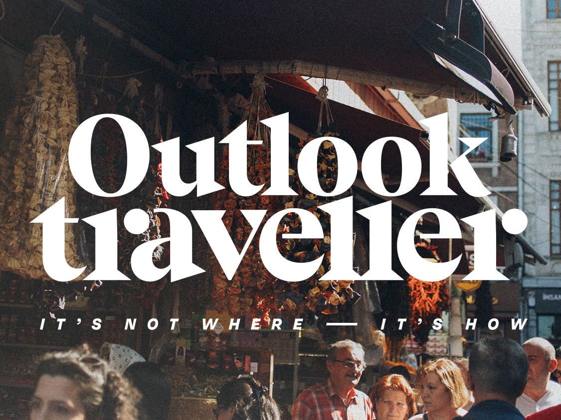
Cover. The cover presents views that are a part of the traveller’s journey. Instagram-ables taken along the way: busy streets, buildings, people, food, art, instead of iconic, static landmarks. Stories from inside the issue get featured on the cover to mark out these experiences.
Masthead. An idiosyncratic collection of sizes and shapes, celebrating the unpredictability and happenstance of travel. It rejects the cool sophistication that’s a rule in the category.
Style. An asymmetrical composition breaks the monotony of linear glancing with stylized nuggets of information that pop-out unexpectedly with local tidbits: fun-facts, travel tips, drawings, itinerary, and cultural anecdotes. A visually rich disordered blend of food, sights and activities, paints a vivid picture. Imperfect, hand-drawn illustrations, checklists add a personal touch—a page in a traveller’s journal. It makes the conversation intimate, and brings warmth and life to the travel stories.
it’s not where, it’s howWinner
Outlook Traveller, a travel industry veteran faces the threat of internet disruption—declining readership, influence, and relevance among a fast growing internet generation with unlimited access to information. With a desire to increase its relevance to today’s traveller, and to understand how they view their travel choices we were asked to redesign the magazine.


celebrating the everyday-ness, and unpredictability of travel
Views from the traveller’s journey make the cover: busy streets, buildings, people, food, art, instead of iconic, static landmarks. Titles and headlines stand boldly and provocatively appealing to the unfettered spirit of travel. The masthead uses an idiosyncratic collection of sizes and shapes, celebrating the happenstance of experiential travel, and rejecting the glossy sophistication of guided tourism.


a visually rich disordered blend of food, sights, and activities makes the conversation intimate
Stylized nuggets of information pop-out unexpectedly with local tidbits as stories unfold: fun-facts, pro tips, doodles, itinerary, and cultural anecdotes. Imperfect, hand-drawn illustrations, checklists add a personal touch—a page in a traveller’s journal, bringing warmth and life to the travel stories.

a worm-eye view of travel for the traveller in sneakers
Marking essentials that bring out the local flavor, sharing local smarts on incredible finds: ‘how to reach’, ‘where to stay’, ‘what to do, ‘where to eat’. The brand changes from an authoritative to a collegial voice—youthful, and spontaneous. Meant for a backpack minded traveller—travelling for experiences than sights.
Partner-in-charge & Creative Director Itu Chaudhuri | Design Concept Itu Chaudhuri, Niloy Kundu, Sonal Singh | Design Development Niloy Kundu, Sonal Singh | Project duration 3 months