studio diaries
Secret Temptation Soap
 icd studio / 8 August 2021 / studio diaries
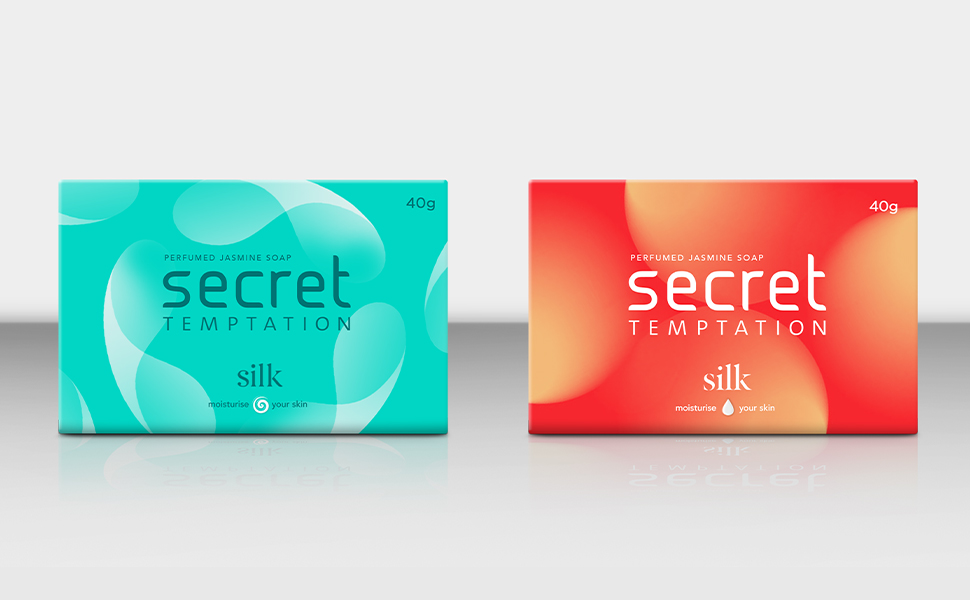
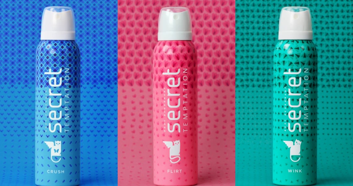
 We are designing a pack for a beauty soap for young ladies. Playing around with colours, shapes and symbols. Take a look at the goings on:
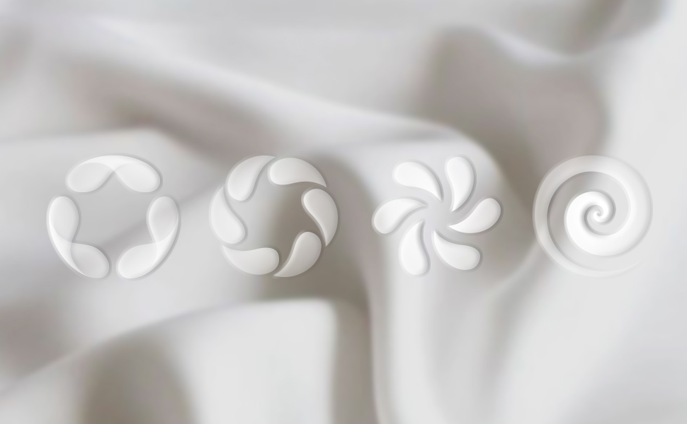
Playing around with visual depictions of softness and moisturising.
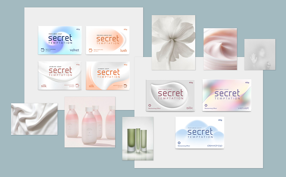
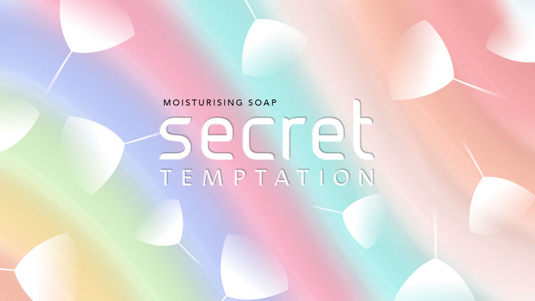
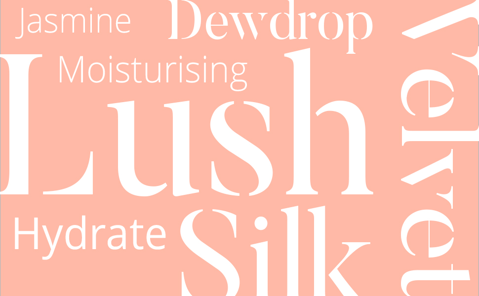
Mood board compilations of visual cues incorporating keywords like soft, subtle, light, serene and feminine.
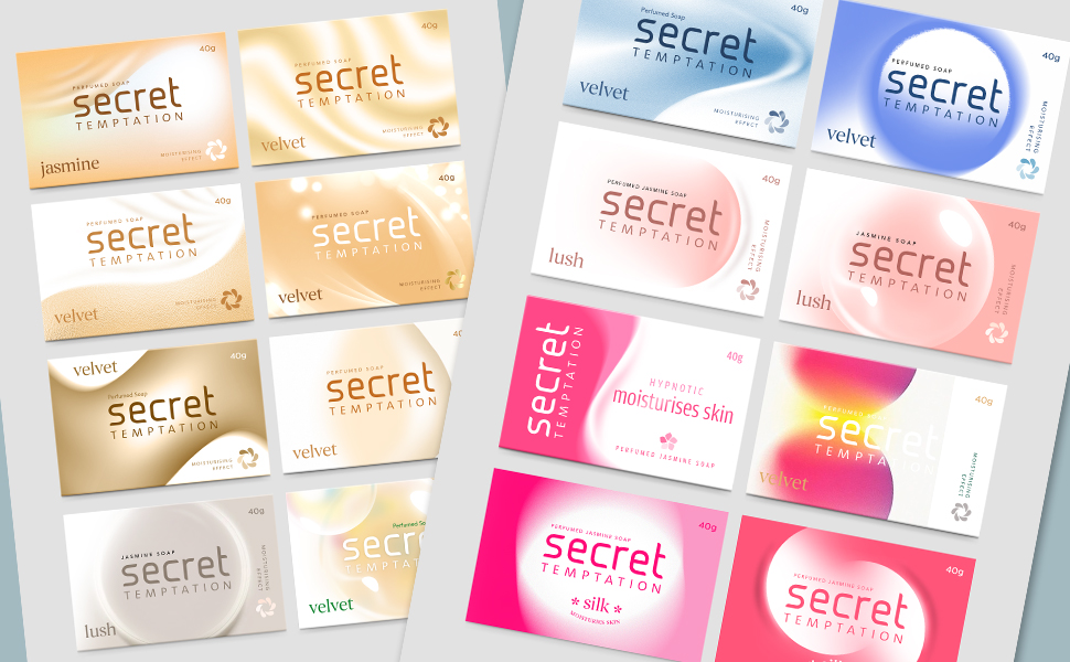
In-depth explorations of colors, gradients and forms to bring out the functionality of the product elegantly. We also explored names and appropriate mnemonics to go on the pack.
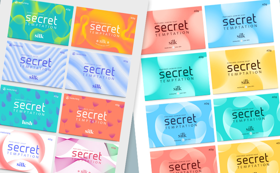
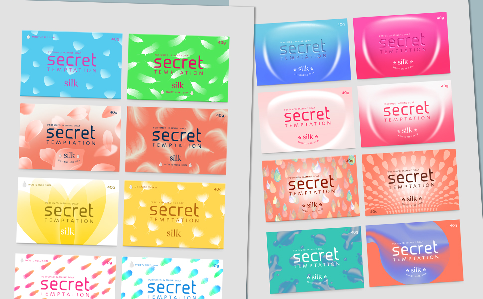
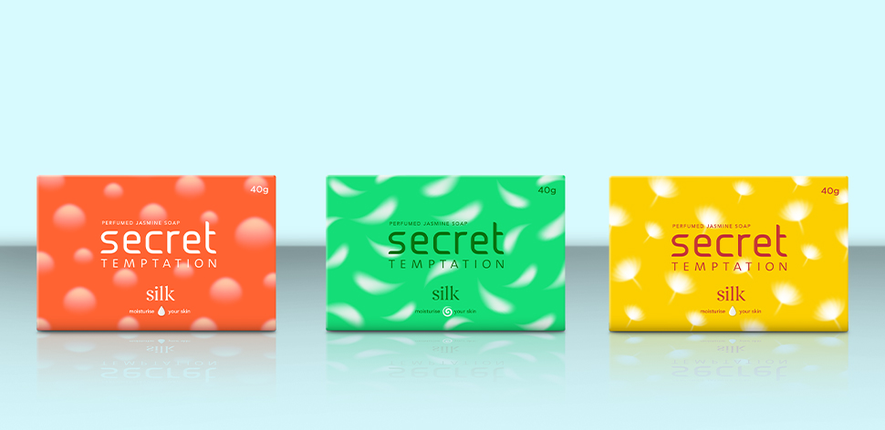
As we moved towards closure, visual elements like feather, smooth gradation became key visual elements