Background
Secret Temptation is a range of grooming products for teen-to-21 girls. The brand’s fragrances, design language and marketing communication revolve around the liveliness of a girl’s still-carefree manner, even as she experiences a nascent awareness of her attractive power.
With the approaching summer season, Secret Temptation decided to introduce three new fragrances to its deodorant range.
Brief
The new variants were to evolve the Secret Temptation range, and signal newness without being a point of departure.
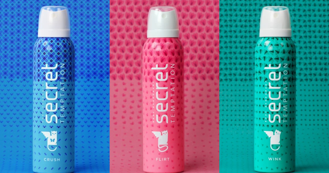
Consumers ask for deo variants mostly by colour, rather than by name; so colours needed to be distinct, memorable and unambiguous (the “pink can” for example).
Design
The existing range was most identifiable by its linear patterns, two toned colour breaks, and sometimes, the progression of element density.
The new design eliminates the colour breaks, making identification by colour easier. With the trendy colour choices, and the patterns—flowers, moths, lips!— the result is a breezy, light feeling. A sense of movement is created by varying the density of elements.
The variant names Crush, Wink and Flirt evoke the excitement of young love, in a light, rather than intense way, about butterflies in the stomach, or a loves-me, loves-me-not game.
when a young girl’s thoughts turn lightly to love
Secret Temptation is a range of grooming products for teen-to-21 girls. With the approaching summer season, it decided to introduce three new fragrances to the existing Secret Temptation range, to signal newness, but without being a point of departure.

existing range followed linear patterns, and two toned colour breaks
The new design eliminates the colour breaks, making identification by colour easier. And brings along a sense of movement by varying the density of elements.


flowers, moths, and lips!
With the trendy colour choices, and the patterns, the result is a breezy, light feeling. It evokes the excitement of young love, in a light, rather than intense way, about butterflies in the stomach, or a loves-me, loves-me-not game.


Partner-in-charge Itu Chaudhuri | Creative & Art Director Richa Bhargava | Design Concept & Development Ananya Khaitan | Production Avi Agarwal | Webpage Photographer Palash Jain | Project duration 3 months