Intended impact
A business of BookMyShow’s scale cannot transform itself completely in a short time—implementation and business complexities need time to resolve and design cannot hasten this.
The intention of this work and ideation, along with their team’s daily input and deep knowledge, is that it will act as an idea generator and subtle nudger towards a more personal experience and reveal more over time. BookMyShow and ICD, came together to build a repository of ideas and implementation recommendations that can be deployed over time, with regular A/B testing and refining or dropping ideas accordingly.
Background
BookMyShow is India’s premier entertainment platform, most well known for its entertainment discovery and ticketing services.
But BookMyShow has a lot of entertainment to offer beyond movies and live events as just a ticketing aggregator—an ambitious streaming service (BookMyShow Stream), live events & activities, comedy shows, theatre, weekend plans and beyond. However it primarily is seen as a ticketing platform by 80% of its users.
This perception change is WIP and BookMyShow was determined to give more for less to its users.
A project to build an experience on the app basis discoverability that allows the user to plan and book for more than just movie tickets was commenced with ICD, to use the app as a go-to destination for planning and engagement. A collaborative effort towards thinking and designing the user experience and interface to enhance this discovery and personalise BookMyShow’s smorgasbord of entertainment offerings is what was undertaken.
Strategy
To heighten visibility of options and awareness about its entertainment universe beyond movies was an area that needed the light to be shone on.
For this, design had to work with business, marketing and development teams to plan the showcasing of the whole entertainment catalogue to the user, generate interest and progressively personalise and reward the experience with each click.
Discoverability can lead to improved personalisation for all users—be it loyal users or drifters. Old timers and new ones.
Regular, loyal users can be rewarded with more personalisation and shown highly relevant offerings as they spend more time on the app. New users need to be led on a journey of discovery and exposed to choices, to pique their interest.
If done successfully, this experience had the potential to change BookMyShow’s impression in their minds, which could lead to a change in the user behaviour—more engagement, more transactions.
UX Thinking
The app experience had to be tailored for two major user types—the loyal, BookMyShow’s ‘booker’ and the lurking ‘looker’ who uses the app to derive a plan without making a purchase, but is a valuable prospect.
Booker
Based on data collected, the booker’s location is known and his preferences can be derived from his past purchases. Both teams began with putting this data to work and creating a curated experience for the booker. A personal experience would make them feel rewarded for spending their time and money and encourage further interactions, transactions and loyalty. Design to boost frequency and convert a WAU (Weekly Active User) to DAU (Daily Active User) if possible.
Looker
Not much is known about the ‘looker’, except his location and some behavioural patterns. We chose to make the best of the available data, and use the vast repertoire of entertainment options to nudge the ‘looker’ and turn them into a ‘booker’. Try and convert a MAU (Monthly Active User) to a WAU.
The ask from the development team was to record their preferences and movement, overtime to progressively make the app experience more personalised by nudging.
Design for discovery
The first step towards true personalisation was discoverability, more options lead to more choices. The more choices a user makes, the more we learn about them and reflect relevant events more accurately.
Here, the challenge was to show both, the booker and the looker a little more of what BookMyShow brings to the table (and much much more than just the current movies in town) and acknowledge each user’s need, aid him, impress him, nudge him and make him purchase.
For the booker, based on past records, we decided to acknowledge him by his name, push the best derived guess event/movie ticket purchase option upfront and create FOMO (Fear Of Missing Out) simultaneously. His preferences in one genre of entertainment would be used to cross-recommend him offerings from other verticals.
Given that the familiarity is less with the looker’s choice as compared to the booker, apart from mapping his movement on the app, BookMyShow can use widgets that are designed to capture his preferences in a playful manner without triggering a flight response (gamifying to elicit preferences).
Personalisation
Once enough is known about the users, true personalisation can begin. The experience for every user gets tuned to their preferences with each click.
According to McKinsey’s Next in Personalization 2021 report, personalisation helps companies grow faster and fast-growing firms derive 40% of their revenue from personalisation in comparison to their slower growing counterparts.
Personalisation improves the click to reward ratio in the user’s mind. The attempt was now two fold — one to reduce the ratio between MAU:DAU and two to make the user feel ‘looked after’.
An element of acknowledgement and familiarity makes users feel cared for, and increases relevance and chances of conversion.
It was based on preferences, more of what he likes is shown from the BookMyShow Stream vertical, live entertainment vertical (online and offline) and ofcourse from the movie vertical. Thus, tailoring his app to his preferences. All this, while we wished to learn more about him and his entertainment preferences vis-a-vis gamified widgets.
Widget Design
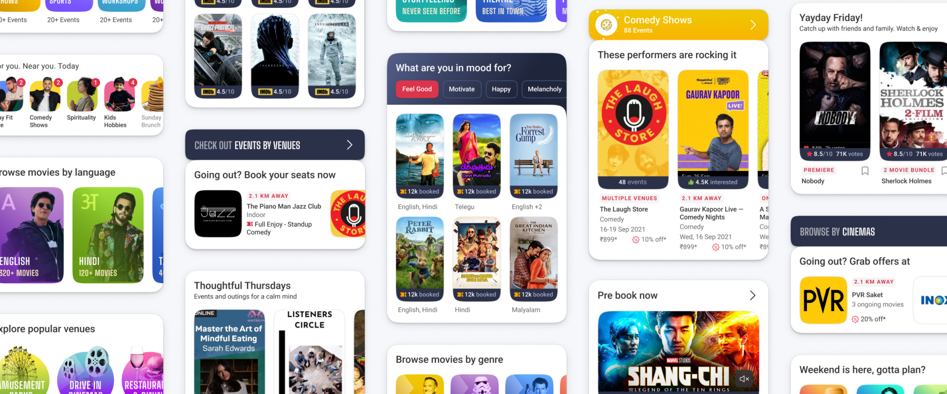
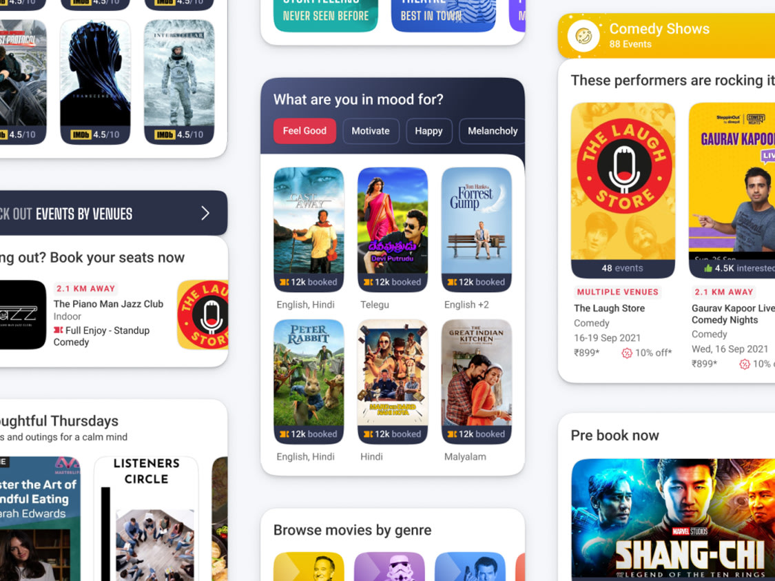
Widgets are a powerful UI UX device and can be used to show relevant and timely content to the user. For BookMyShow, elements of discovery and personalisation were embedded into the widgets and can be used to show content and products to all users.
To expose all users to more, we worked with BookMyShow to plan many discovery and personalisation widgets at the right intervals with different UX and UI to catch the user’s attention.
These will allow BookMyShow to showcase a wide variety of events under various categories and more movie options from BookMyShow Stream.
All this, combined with planned FOMO widgets and nudges (how many are engaged in ongoing events, how many bought tickets to specific events, how many watched what, how many participated, liked, showed they were interested in, rated, reviewed, etc), nudge widgets (day-of-week-plan options, co-audience of last event are now watching… ).
Added to these widgets were two more BookMyShow ‘identifiers’. These were named, and given a subtle identity for higher registration and memorability.
One is SHORTCUTS — right on the home screen, all new and latest events under various categories of interest, near the user’s location will be pushed. Each user would see a different set of events based on their location and interest—personalisation and discoverability being tackled simultaneously.
And as the user interacted with this widget, the more personalised it would get.
The second is UNMISSABLES. This hosts the big, marquee events of the year, with more real estate, more tempting images/videos and USPs chalked out upfront for higher conversion.
All widgets were designed with modularity and reuse in mind. The same widget structure could be used in different cases in multiple places in the app. Thus aiding business to plug and play with discoverability widgets as deemed necessary on a day-to-day basis.
Microcopy
The microcopy will aid the design in promoting discoverability and giving the user a personal flavour.
Custom salutations, time of the day and weekend-specific greetings give a friendly, conversational air to the design.
The microcopy also took on the role of a nudger in the custom widgets, helping the user pick up from where they left. Nudging to complete a purchase, draw attention to events of interest. Create a sense of FOMO. Words became an intimate part of design, each becoming indistinguishable from the other
However, care was taken to not trade joviality for clarity. Clear communication was prioritised over everything else.
Navigation
The navigation bottom and top bar are now put to hard work to make all of BookMyShow’s offerings available throughout the app journey to the user. The bottom navigation will now have Home, Movies, Live Entertainment, BookMyShow Stream and a hamburger menu, available to jump and reach favourite categories in one click. The top will have Shortcuts, which will be personalised for each user to reach their favourites instantly. 3 clear verticals, 3 clear category accessibility. In future ‘Live Events’ can be replaced with one big multi city, multi dates, multi venue group events like IPL 2022, or Lollapalooza 2022, thus giving a big event a landing page and the works.
BookMyShow: look, hook & book
BookMyShow is India’s premier entertainment app but it is primarily seen as a ticketing platform by 80% of its users. While BookMyShow has a dominant 90% market share in the ticketing vertical, it has a lot of entertainment to offer beyond movies—an ambitious streaming service (BookMyShow Stream), live events & activities, comedy shows, theatre, weekend plans and beyond. It was as a part of a larger effort to change this perception that ICD was approached to develop a repository of user experience and interface design interventions to improve discoverability and personalisation on the BookMyShow app.
Discoverability is where personalisation starts
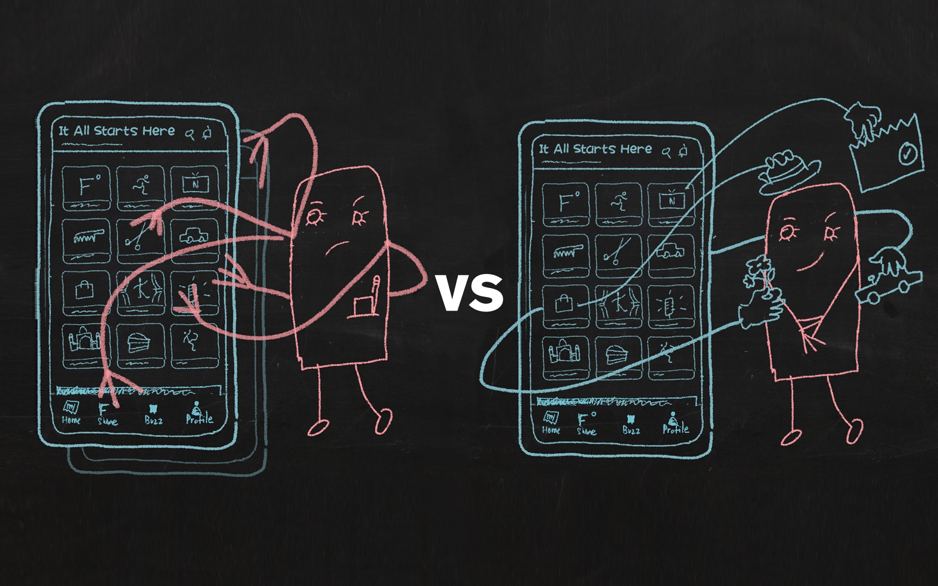
The design had to open up BookMyShow’s world of entertainment to users. Progressive personalisation could then start.

Shortcuts and Unmissables: brand identifiers to highlight entertainment
The Shortcuts widget will be curated for every individual as per her preference, highlighting shows of interest and refreshing them regularly. Unmissables—prime real estate to marquee events—book now—check out.
Turning lookers into bookers
The app experience had to be tailored for two major user types—the lurking looker and the loyal BookMyShow booker. Learn more about the looker. Show more to the booker. Improving the conversion rates with discovery and personalisation.
Preventing dropoffs in the user’s journey to booking
Gentle nudges, single step checkouts on Shortcuts, movie listing page, Unmissables and other widgets to plug leaks and ensure higher transactions on the app.
Making space for BookMyShow Stream
User preferences from other verticals were used to bolster recommendations from BookMyShow Stream. Based on general preferences, more of what she likes is shown from the BookMyShow Stream vertical.

Envisioning our ideas in action
The goal of this work and ideation, along with BookMyShow team’s daily input and deep knowledge, is that it will act as an idea generator and subtle nudger towards a more personalised experience and gradually introduce the ideas conceptualised in this exercise.

Partner-in-charge and Creative Director Lisa Rath | UX & UI Concept Ritu Kumari, Arpit Sharma, Sreeja Chatterjee | UX & UI Development Arpit Sharma, Sreeja Chatterjee, Anshika Sharma | Illustrator Prashant Gaikwad, Rohit Taitwal, Anshika Sharma | Animator Saumya Dalal | UX Writing Lisa Rath, Ayushmaan Agarwalla, Nitasha Basu | Project duration 7 months.
