Background
Sip wants to appeal to the consumer who feels overwhelmed and shackled in because of the current process of buying alcohol in India.
Alcohol faces friction from more than shops—there are more restrictions—logistical and societal. And it is much more so if the consumer is a woman.
Indian society still disapproves of alcohol buying and consumption. It is a closeted indulgence.
Even in progressive popular culture depictions, it is bought sneakily, wrapped in old newspapers and always consumed on the terrace, never in drawing rooms.
All of these factors have led to a broken market.
Sip wants to enable free, responsible and safe exploration of the world of drinks.
It will offer choice and convenience, both factors currently missing from the picture.
We were approached by the Sip team to help them with the identity and branding of this service. The identity’s job was to assist in changing the culture around alcohol purchase and consumption.
Strategy
‘Booze drinking doesn’t have to feel like an offence’, is where we started our thinking about alcohol buying and drinking.
The design and the branding needed to help Sip establish and claim this position.
Creating a universe for Sip, one where Alcohol is not treated as a sober subject was an approach that looked promising.
Introducing a dose of charm and humour could disarm and normalise the act of buying alcohol.
Initially, this would help Sip ‘liberate’ the consumer from the older regime by giving us distinctive brand assets that are noticed and are attractive.
And later, help in developing the product experience and communicate the benefits of delivery, superior choice and other information relevant to brand building.
The design’s primary job was to give a light-hearted permission to the drinker. To put them at ease.
Design
In the Sip world, alcohol is no longer deep, dark and mysterious.
The design makes light of alcohol drinking. It reduces, rather elevates it to an innocent pleasure.
There is a permission to explore the wide and wondrous world of beverages, all set in a light, airy, quaint atmosphere.
The Sip logo consists of a bird carrying a bag, the bag of goodies—another representation of the light-heartedness that’s deeply embedded in the design.
The bird is in flight and can have many wing positions.
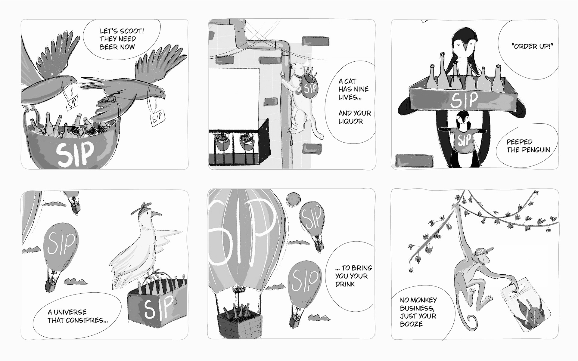
And as in every universe, here as well, there are supporting characters—the bird has friends—a mischievous monkey, a slinky cat, a peppy penguin among others.
All conspiring to deliver booze and delight to Sip’s customers.
The Sip landscape is balmy and easy. Very un-whiskey. Very un-wine. Very un-serious.
It invites the customer to roam around and discover.
Illustration style
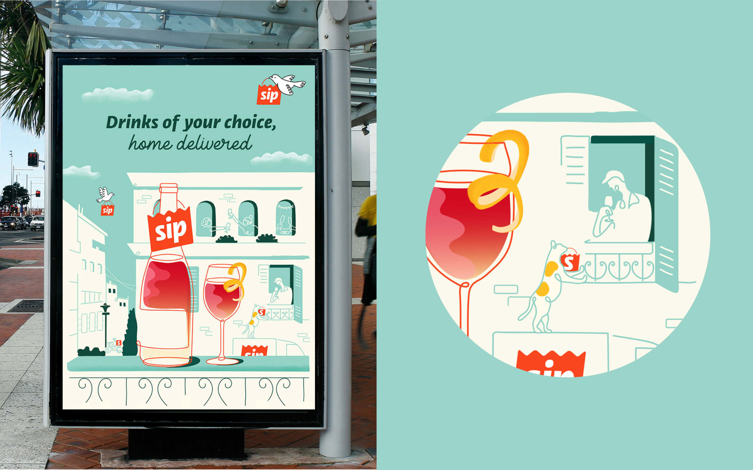
We developed two distinct illustration styles—monochromatic and multicoloured. Gradients are used only as a bottle fill in illustrations.
A single line drawing style is used. The lines are not overly neat, they appear hand drawn, connected in loops.
Over detailing of elements is avoided. Imperfection works best.
Typography
We chose ‘Libertad’ by Tipo Type as the primary typeface, for its balanced regulars with dynamic italics which makes it active, playful and impactful. A perfect match for the Sip universe.
‘Lie to me’ by Misti’s Fonts is the secondary font, supporting Libertad. Lie to me has a handwritten, scripted look, adding to the sprezzatura effect of the design.
Brand in action
The Sip identity will have many applications across the digital and real world.
We visualised and specified guidelines for each application case.
From app icons and landing pages to social media promotions on the screen.
In the physical world—packaging, posters for OOH and in-store promotions. And delivery bags, uniforms and IDs tags for delivery personnel.
The goal was to preserve brand consistency and prevent dilution or dissonance in the minds of the consumer. It goes a long way in building a consumer brand in a nascent market.
conspiring to deliver your drink
Sip, an AlcoBev delivery platform will deliver alcohol of your choice, to your doorsteps across India now. A much awaited business and delivery platform deserved a unique and celebratory brand idea and approach. ICD creates a memorable, distinct and a delightful brand position, to catch the troubled consumer’s (alcohol shopping = woe in India) attention. Shop—ship—sip, now always in peace!


Brand in action: building recognition and memorability
The Sip bird, we call her Sippy, changes her posture or stage in flight depending on the brand application. The primary deep green signifies the pleasure of classy bars and wine bottles. The lighter colours add a balmy effect. The two typefaces, Libertad by Tipo Type, a mix of humanist and grotesk styles, isthe primary one and ‘Lie to me’ by Misti Fonts as the supporting typeface complement Sip’s casual cheerfulness.

Exploring new characters for future brand stories
Delving deeper into the universe, we explored and developed a cast of supporting characters who can come into the picture later—a mischievous monkey, a slinky cat, a peppy penguin among others. We delivered this set to the brand, so that it can introduce them as the story develops, to deliver more delight and booze, of course.
Promotional collaterals for a flying start
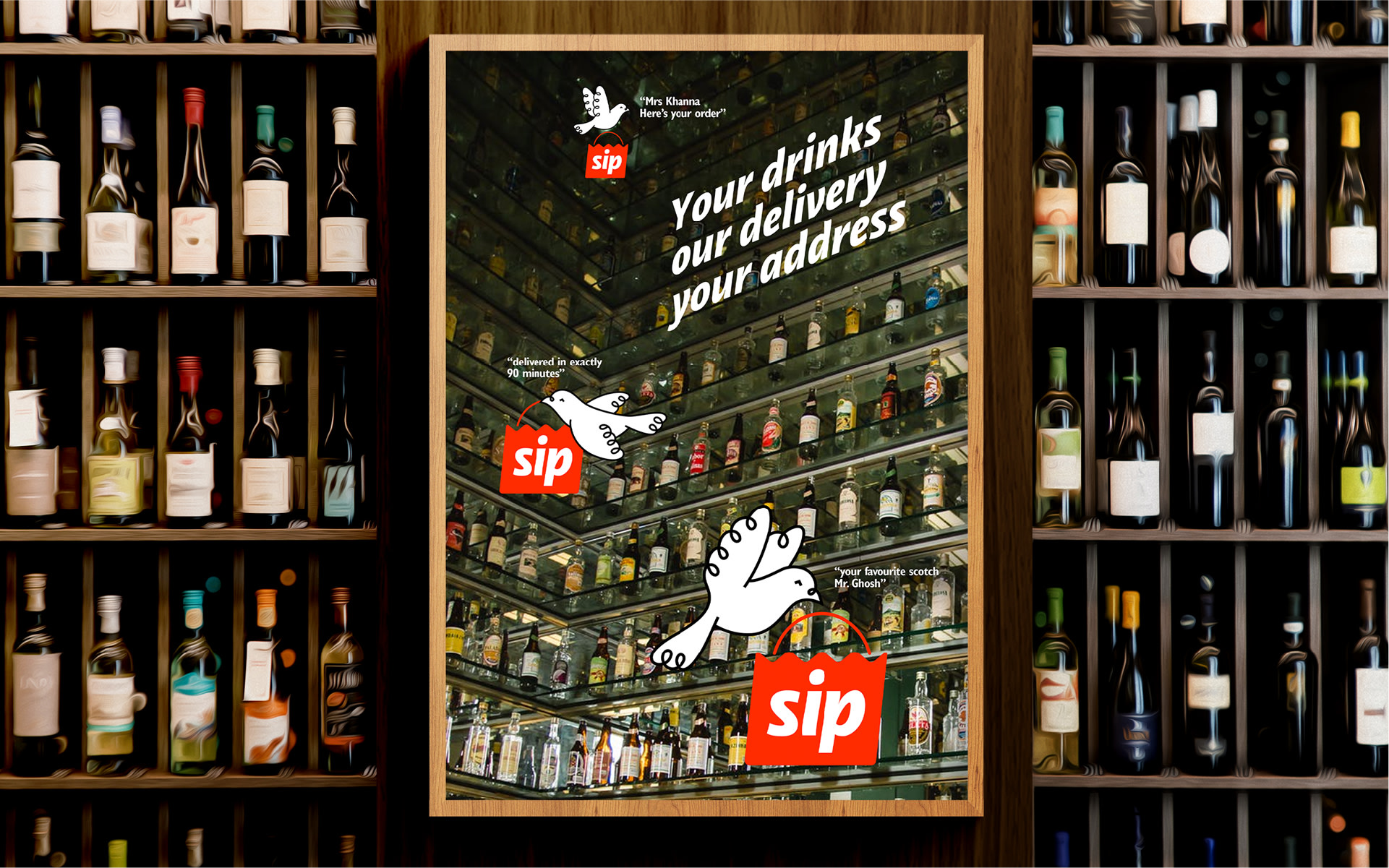
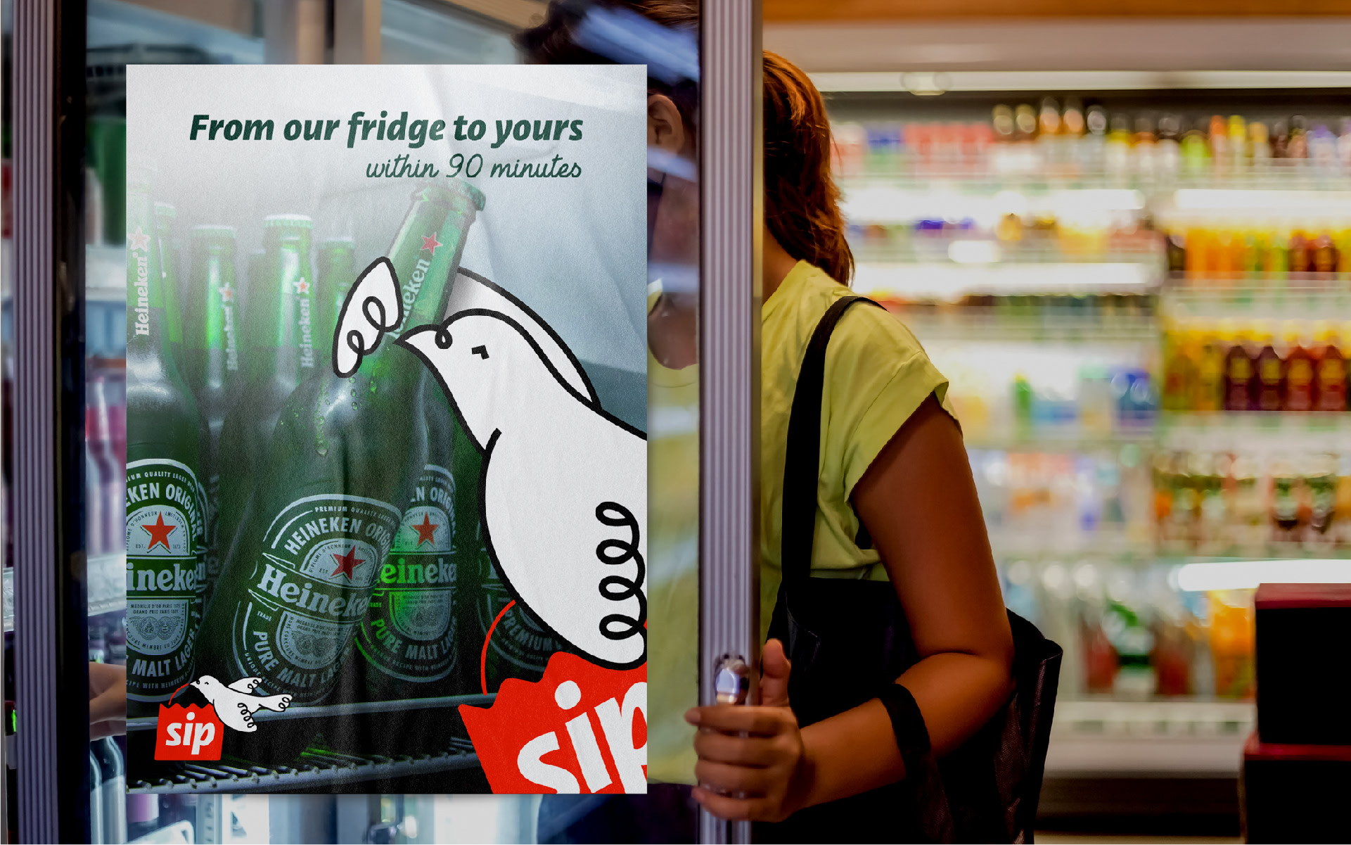
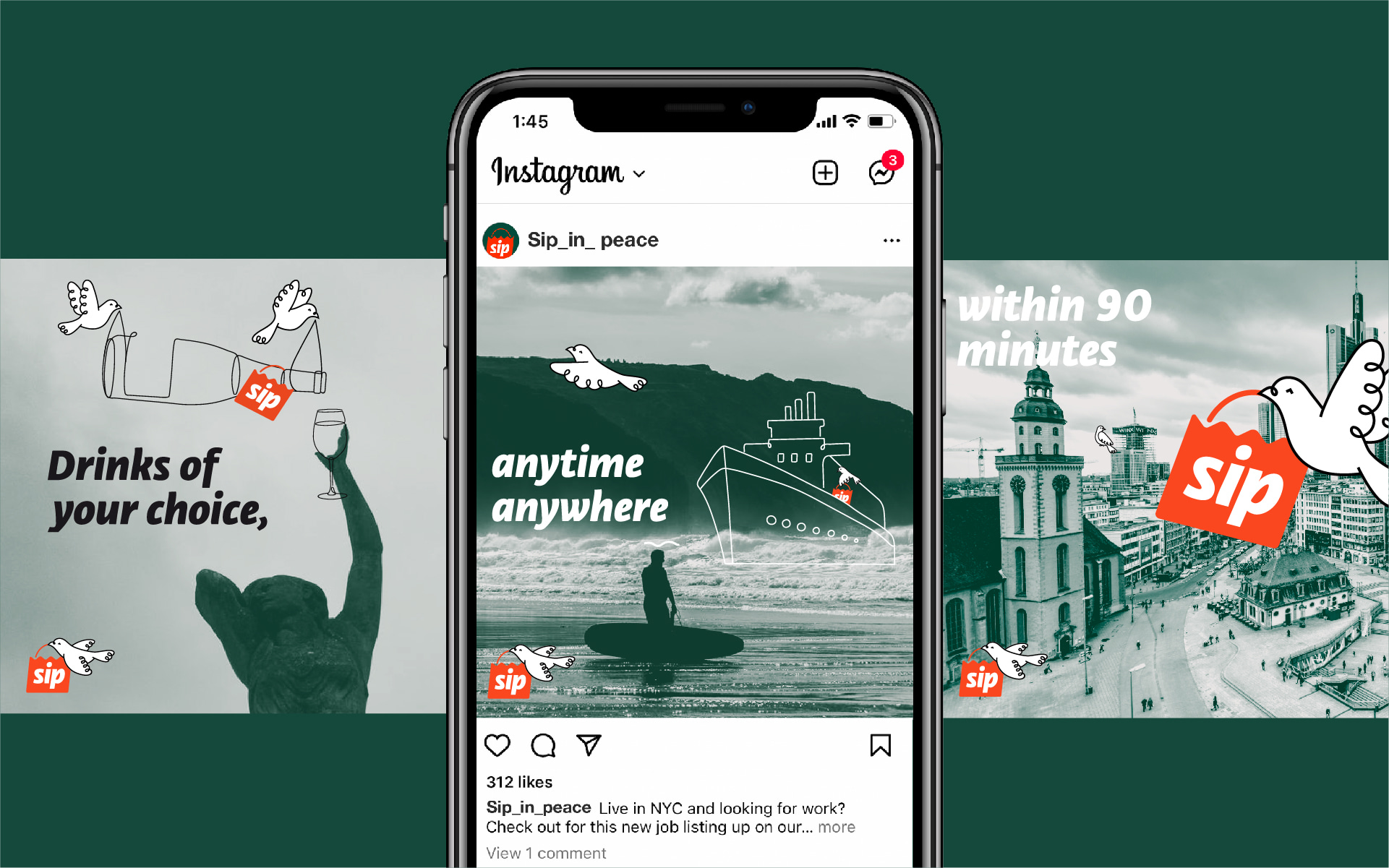
A host of promotional creatives for the launch were developed with the Sip bird at the centre of the story, to help establish it in the customer’s mind.


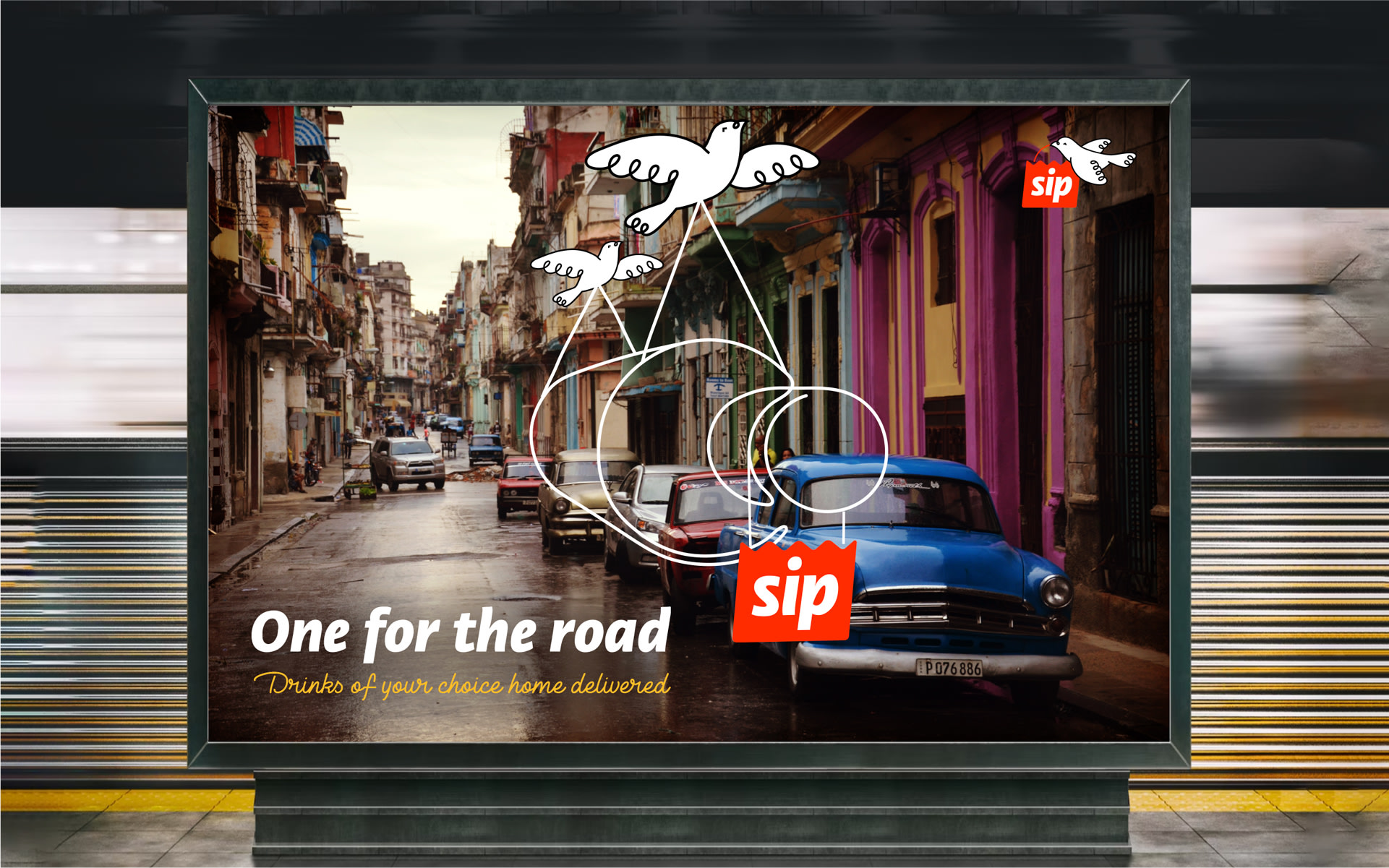

Making alcohol shopping delightful
The design makes light of alcohol drinking. It reduces, rather elevates it to an innocent pleasure. There is a permission to explore the wide and wondrous world of beverages, all set in a light, airy, quaint world.
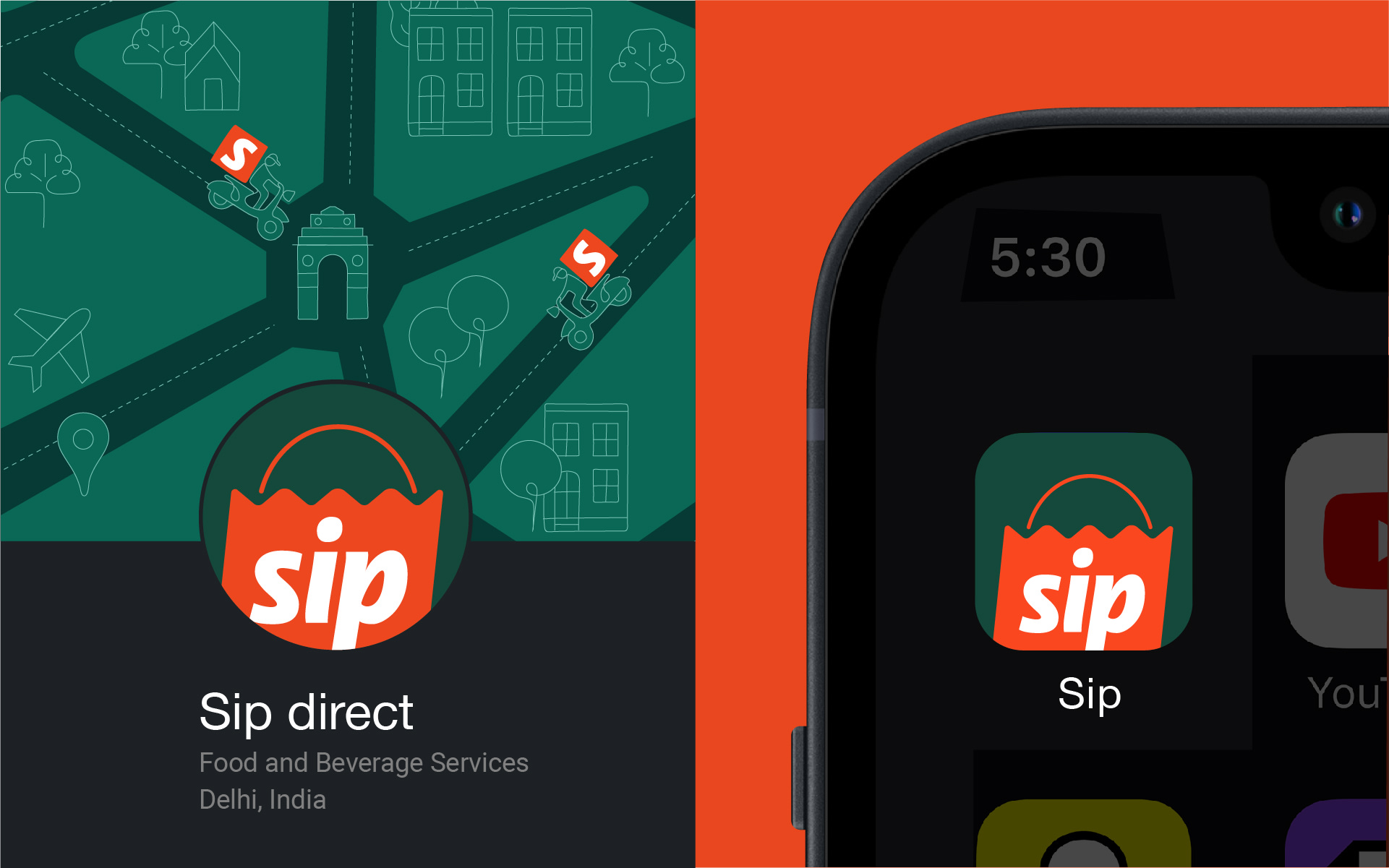
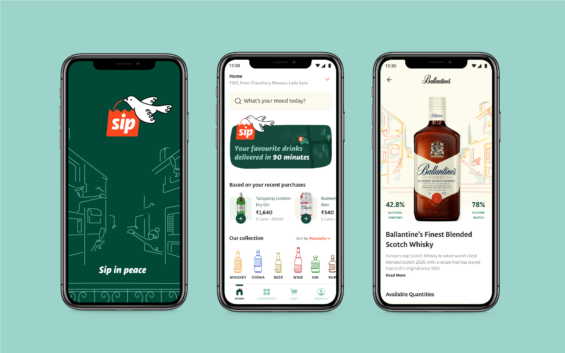
app to social media, the Sip identity is consistent across channels
For consistent identity, we designed and specified guidelines for digital applications. App screens, favicons, landing pages and social media guidelines were developed within the larger branding exercise.
Partner-in-charge & Creative Director Itu Chaudhuri | Design Concept Itu Chaudhuri | Design Development Ritu Kumari, Saumya Dalal | Website & App UI Arpit Sharma | Alternate Design Concept Anshika Sharma, Sneha Mahajan, Pradyut Nath, Ritu Kumari | Writer Itu Chaudhuri, Akhoury Abhishek | Project Duration 5 months


