Background
One of Asia’s biggest HR Tech players, PeopleStrong, wanted to help their clients and HR teams to manage people, processes—the overall employee experience—all from one app. They had previously launched India’s first HR Tech App which was already ruling review rankings, and now wanted to redefine SaaS for HR. An ambitious goal of an equally ambitious client.
PeopleStrong collaborated with ICD to unify all of its HR solutions under one roof with the mandate of simplifying and improving the experience for users at all points of the corporate ladder—from the CEO to the new recruit.
“Let’s get working on one SuperApp”, said the Chief Product Officer, Vishal Saha, and Ankur Goel, Deputy Chief Product Officer, PeopleStrong.
Strategy
Work apps shouldn’t be complicated, boring and unattractive. An app should allow your company’s identity to flourish while making the modules user friendly.
We, together with Peoplestrong, defined our overall design goals in two statements:
‘Maximum information in minimum clicks’
‘Efficiency needn’t be boring. Efficacy needn’t be painful.’
PeopleStrong defined their vision for the app very aptly and crisply by saying — “We want to create a singular, seamless employee experience, which is an aid not a hindrance.”
UX Research
A research into whatever little was openly available of similar apps and tools in the market, confirmed our guess—HR and enterprise apps suffered from unnecessary complexity, overload of features and poor navigation paths. Users were treated poorly and the work app felt laborious and punishingly painful to use. To substantiate our claims, here are a few reviews of many such HR apps on the Play Store:
-“Awful app. Finding anything is difficult.”
-“…absolutely terrible user experience. Can’t access anything useful. Everything is so unbelievably confusing and hard to navigate.”
-“Nearly impossible to do/view things highly important/relevant e.g., change the way you receive paychecks & view days & times of hours worked.”
Comments reflected that these SaaS products had —
-clunky interfaces, confusing navigation. A daily annoyance.
-clumsy navigation—finding a pay stub to download felt like a treasure hunt one did not sign up for.
-attendance punch-in punch-out tucked away deep behind 5 clicks.
-frequented features required memory to locate everyday.
An application built to simplify your workday shouldn’t complicate things unnecessarily. Radical simplification and efficiency was the only way to go
Intended User Experience
We worked out with the PeopleStrong team what we should aim for—
-make powerful functionality intuitively accessible
-leverage PeopleStrong product expertise to reimagine user journeys
-create experiences for both—the millennial users & expert administrators
-redesign an intuitive user experience, thinking about employee experience
Each unique user will have unique requirements from this app. The user journey should be so designed that by the third visit she should be able to identify and bookmark all her go-to-modules and submodules and enable her personal one click journey to her core work. That would be the real success.
The design process
At the heart of our design truly lies the philosophy of ‘One SuperApp, infinite possibilities’ for everyone.
From a new young joinee to the CEO, everyone’s needs are catered by the same app and navigation system. As the employee moves up the ladder in the organisation, she doesn’t have to relearn the app and its functionalities thus making it a companion for her entire life cycle in the company.
Each widget design is adapted for C-suite members vs mid managers vs junior associates. Our design thoughtfully addresses multiple personas and includes a host of smart features, while relentlessly solving for navigational complexity. The same widget displays different information for different users in the enterprise. For example, the attendance widget that a mid manager sees will show him the attendance of all his reportees, apart from his own.
Colour and value
We strongly advocated that if done right and pursued, the app allows a client company’s identity to flourish while making the modules user friendly by colour coding them and giving each module equal prominence. With time, subliminally the user will start connecting with the colour scheme of her modules and recognise a pattern of colour to aid her identify work without having to read each line of the widget. This will help ease pressure and increase productivity.
Colours psychology was applied to map cerebral connection for each module that would aid the user. We deployed colour theory carefully to gain better engagement and help put the user in a relaxed space—an important part of empathy mapping in any product design.
Integrating the design
The app, together with the company’s in-house developed, all powerful AI chatbot, Jinie, is poised to aid the app’s adaptability and success ten-fold for certain.
Intelligent prompts from Jinie, like doc filing reminders and the likeliness of your leave being approved based on how many from your team are on leave that day, aid decision making.
Connecting with the team, updating and closing tasks is easier by being housed under one tab. An overall haul to the app UI with ease of content accessibility ensures greater positivity in user mood. Colour palette, correct typographic decisions, better layouts, repeat location of common widgets and hierarchical information structuring will result in happy hours at work. Being wished and wishing is now an even more joyful experience.
Overall, we designed a natural experience that becomes exactly like your physical workspace—familiar, comfortable, easy to navigate and reassuring.
Impact
Today, the PeopleStrong ALT Worklife app has 1 million+ downloads on Play Store and a 4.7 rating. 2 million+ users across 500+ enterprises in 10+ countries are using it. Feedback from all quarters has been overwhelmingly positive. Peoplestrong app on App Store.
super hr app: maximum information in minimum clicks
PeopleStrong is a major player in the HR tech industry in Asia. They have served the HR ecosystem with tech solutions at scale and launched India’s first HR tech app. PeopleStrong now wanted to serve the needs of their client’s HR teams in a single app.
The SuperApp is the answer to all requirements of the HR system, helping manage people and processes. PeopleStrong collaborated with ICD to unify all of its HR solutions under one roof with the mandate of simplifying and improving the experience for users at all points and functions in an organisation.
radical simplification in the app experience of all users, from CEO to new recruit
A user experience that works for every professional in an organisation—from new recruit to the CEO—enabling them to perform at full efficiency. Everyone’s needs are catered by the same app and consistent navigation system. As the employee moves up the ladder in the organisation, she doesn’t have to relearn the app functionalities.
upskilling for growth made accessible and pleasurable to use
A dedicated learning module was designed, with the nature of on the job learning, in mind—easy to establish a regular cadence for trainees, team-level tracking and growth analysis by managers. The key learning functions were upfronted and designed for high visibility and easy access

performance tracking at team and individual level through synoptic cards and in-depth viewing
The app design allows managers to measure efficiency and track growth, a major HR function in any organisation. On the home page, synoptic cards can give the manager a fairly accurate bird’s-eye view of the team’s performance, which can be analysed in detail inside the performance module. The same functionality is also available to individual users to track and measure their own performance.
an enterprise app that’s ownable by peoplestrong’s clients
We strongly advocated that if done right and pursued, the app allows a client company’s identity to flourish while making the modules user friendly by colour coding them and giving each module equal prominence. Use of colour theory builds connections with tasks and modules in shorter durations.
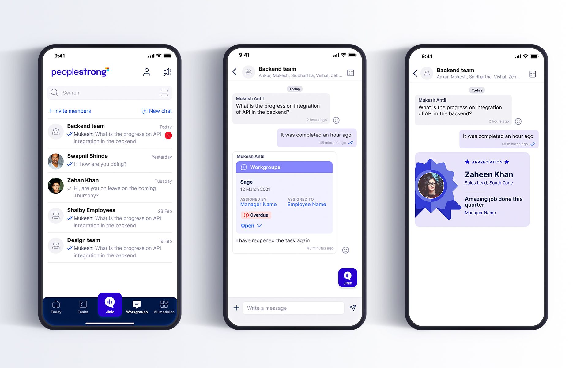
identity design for Jinie, peoplestrong’s AI talent coach and chatbot
The identity for Jinie, the company’s in-house developed, all powerful AI chatbot, was designed to be consistent with the app’s visual language. The symbol, a soft dialogue box, reflects Jinie’s nature, ever-present and uber helpful.

High impact at scale for businesses, with design
Today, the PeopleStrong ALT Worklife app has 1 million+ downloads on Play Store and a 4.7 rating. 2 million+ users across 500+ enterprises in 10+ countries are using it. Feedback from all quarters has been overwhelmingly positive. Check the PeopleStrong app on App Store.

partner-in-charge lisa rath | ux & ui concept lisa rath, sreeja chatterjee, mohammad zerik | ux & ui development sreeja chatterjee, mohammad zerik, arpit sharma | ux research lisa rath, sreeja chatterjee, mohammad zerik | case study visuals abhishek ghosh | project duration 6 months