background
Rungta, a tea manufacturer with a strong presence in tier 2 and tier 3 cities, wanted to expand their segments. ‘Dhamaka’ a flavourful, pocket friendly blend was introduced to cater to newer markets.
strategy
Dhamaka is an entry level blend, sitting at the intersection of two distinct segments, between lower end loose tea and more expensive, packaged offerings. We used the name, ‘dhamaka’, hindi for explosion, to connote an explosion of taste in a low end tea variant, a shock, promising more bang for the buck.
design
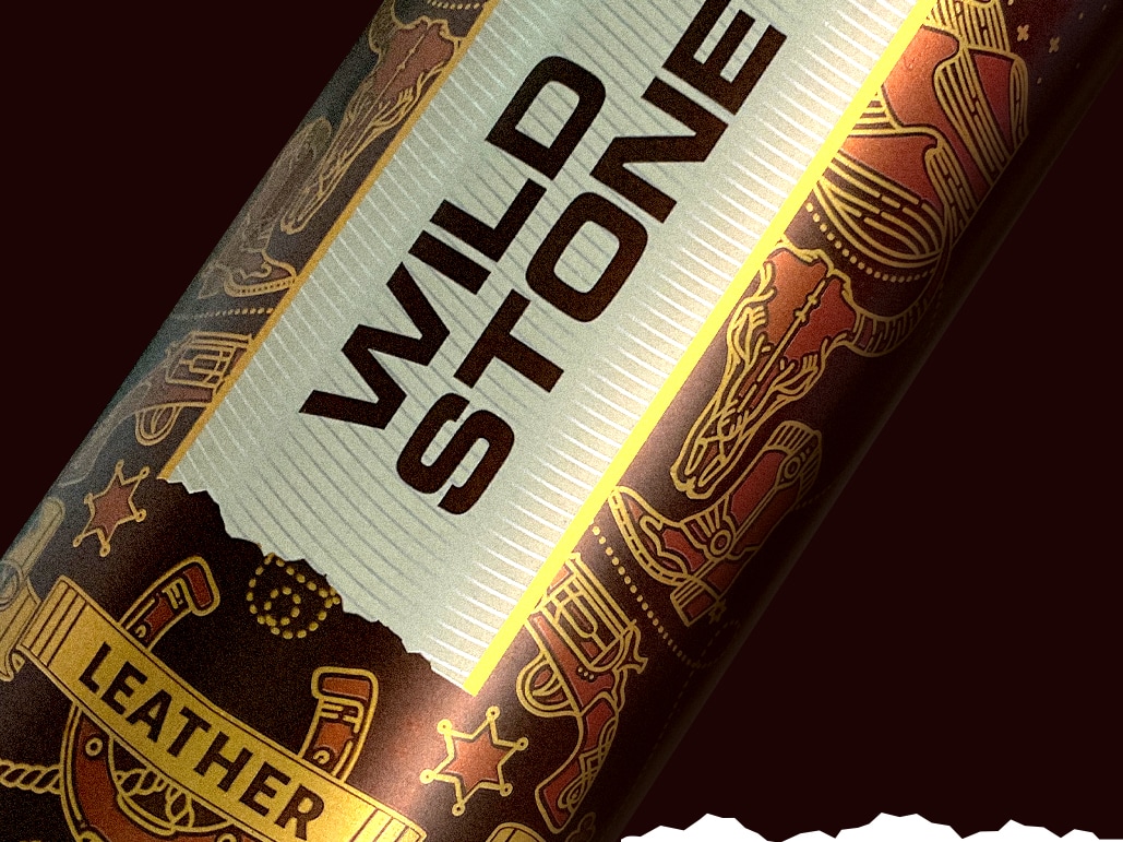
The cover is loudly colorful, ornate and exciting, almost synesthesiac–like a boisterous Indian festival; celebratory and chaotic. Dhols and firecrackers don’t seem far away.
Dhamaka is lettered in a font reminiscent of old indian signboards and truck art. The shaky, stirred up tea cup promises potent, power packed flavour. Bold statements are made on the front and back in Hindi. Liberal use of gold is characteristically Indian.
Rungta’s dhamaka: a blast of flavour
Dhamaka is rungta’s second offering as part of their budget range of teas. ‘Dhamaka’ is hindi for ‘a bang’, something sensational, an explosion. We gave ‘Dhamaka’ a deservedly loud personality using Indian popular art references in the fonts and patterns, placing a popular strong chai variety in an ambience of traditional festivity.


Partner-in-charge & Creative Director Itu Chaudhuri | Art Director Richa Bhargava | Design Concept & Development Sonal Singh | Design Options Richa Bhargava, Sonal Singh | Devanagari Logo Aadarsh Rajan | Print Supervision Sonal Singh | Project Duration 6 months