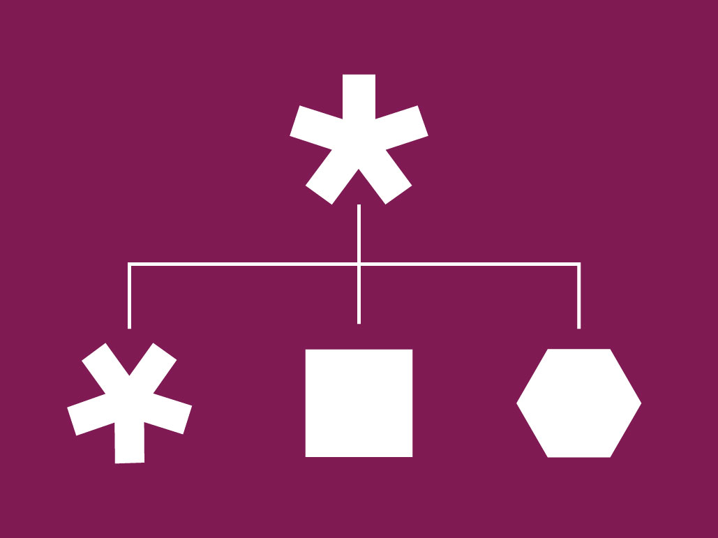
Background
Shakti Sustainable Energy Foundation is an NGO that works in the advocacy space. It argues for low carbon solutions, lobbying with and assisting government and industry to adopt more sustainable energy usage, via low-carbon alternatives and technologies.
Brand considerations
Shakti’s desired image is as a trusted advisor on sustainable energy matters. It is a catalyst in the true sense: it provokes and accelerates a course of action without operative involvement in the process. So trust and neutrality are crucial, more so as it is receives funding from multinational corporations.
Identity
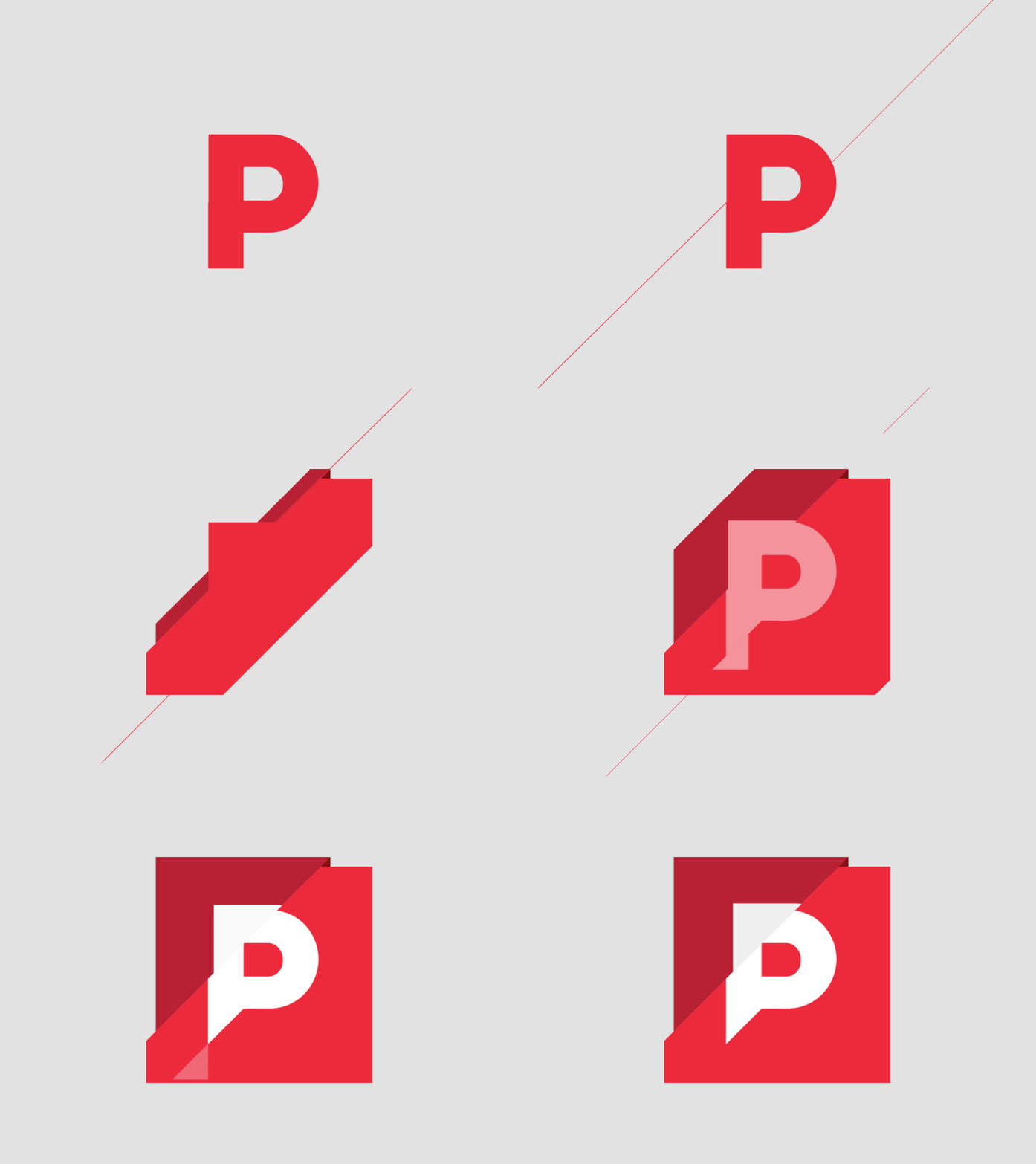
A letter mark, whose symmetry and monumental nature ensure its calm, rational and trustworthy personality as a constructive, durable presence. (Research shows symmetrical symbols are perceived as the most trustworthy. The letter S offers dynamic symmetry (as opposed to a simple reflective or mirror symmetry). The halves of the S interlock, leading the eye to its center, and engendering feelings of Partnership and nurturing. When placed on an application, the mark appears to endorse the contents rather than draw attention to itself.
Extension
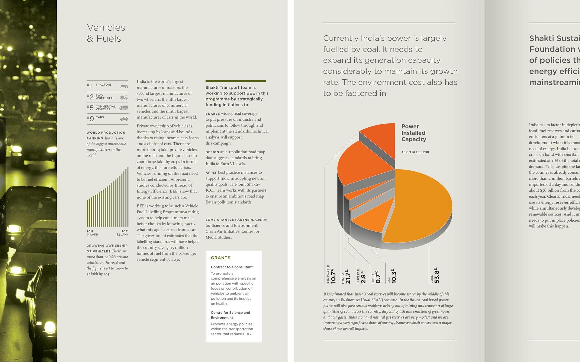
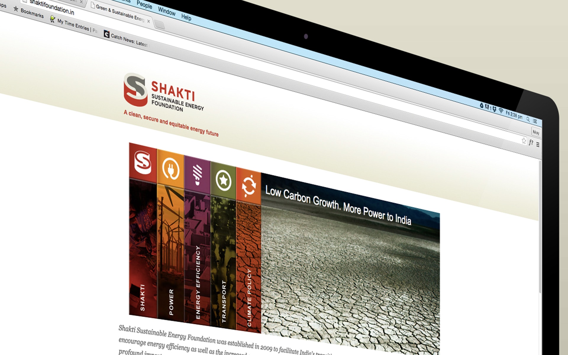
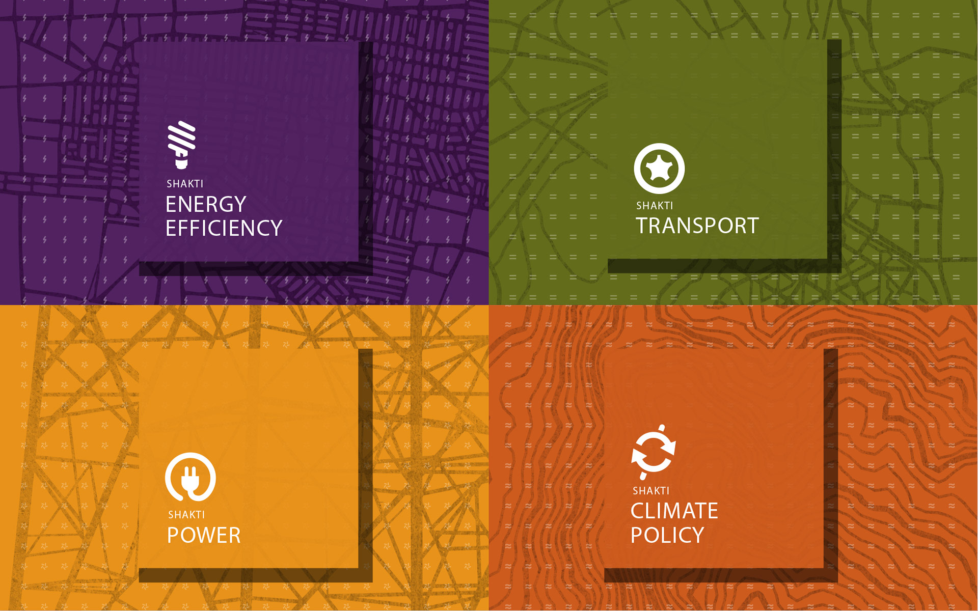
The branding is extended into its four verticals of operation: power, energy efficiency, transport, and climate policy. A design language is developed and used consistently across print collaterals and a website.
a low carbon, high integrity, long-sighted catalyst for cleaner energy
Shakti Sustainable Energy Foundation is an NGO that works in the advocacy space. It argues for low carbon solutions, lobbying with and assisting government and industry to adopt more sustainable energy usage, via low-carbon alternatives and technologies.
the letter mark represents shakti’s constructive, durable presence
Its symmetry and monumental nature ensure its calm, rational and trustworthy personality. The letter S offers dynamic symmetry, and the halves of the S interlock, engendering feelings of partnership and nurturing.
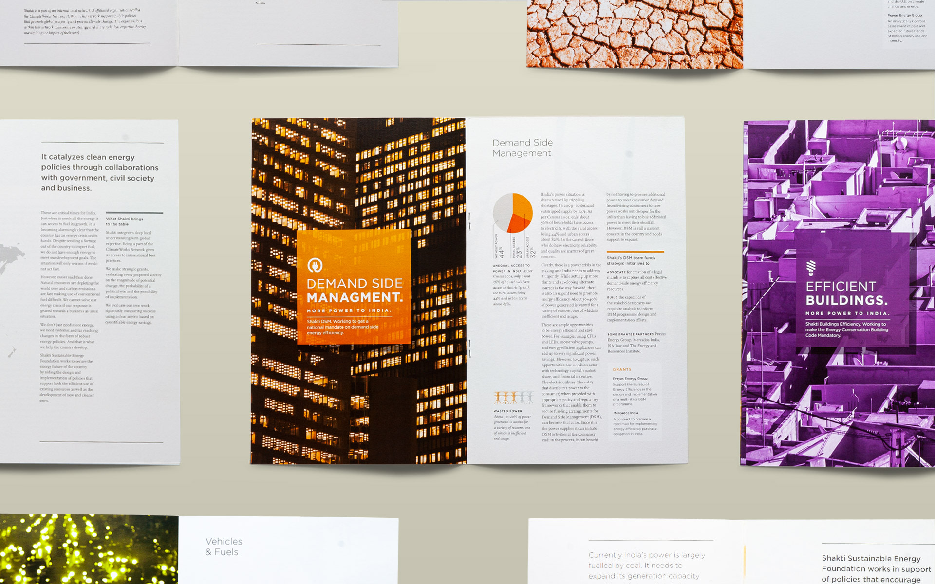
extending the branding into its four verticals of operation
The language is developed and used consistently across print collaterals and a website. When the identity is placed on an application, the mark appears to endorse the contents rather than draw attention to itself.
