preparing a software services firm for the future
Prodapt is a software services firm from Chennai, India. It writes, runs and maintains the software systems telcos need to function. It also automates and digitizes their processes. Prodapt wanted to acquire bigger clients and bigger contracts, and attract the best talent. We were approached to help them enter this better league through a rebranding exercise.
Switch on the world
‘Switch on the world’ is how we put this new position into words. We expressed the new Prodapt brand through a corporate website, an onboarding portal, a corporate video and a brand book.

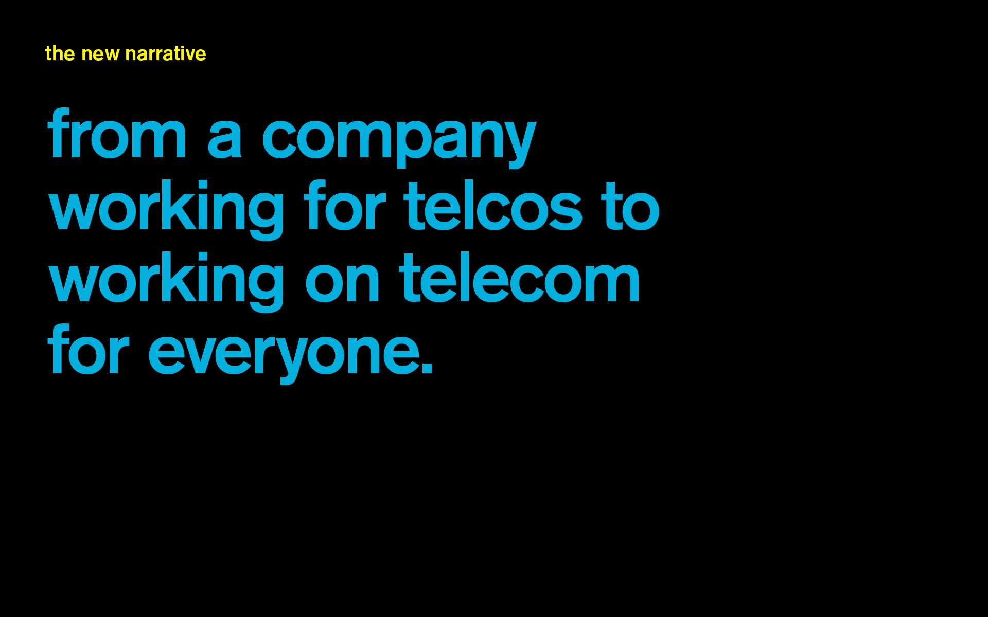
A better speak
The website homepage is completely rewritten, dominated by broad, business level messages. Telecom-specific terminology is demoted to inside pages. Selected success stories and insights have also been rewritten, with focus on downplaying on-ground mechanics and amping up the business outcomes enabled. The core idea is to talk about the end-effect of the work, rather than the specifics of the work itself. Writing workshops were held where a team of writers within Prodapt were coached on this new style. .


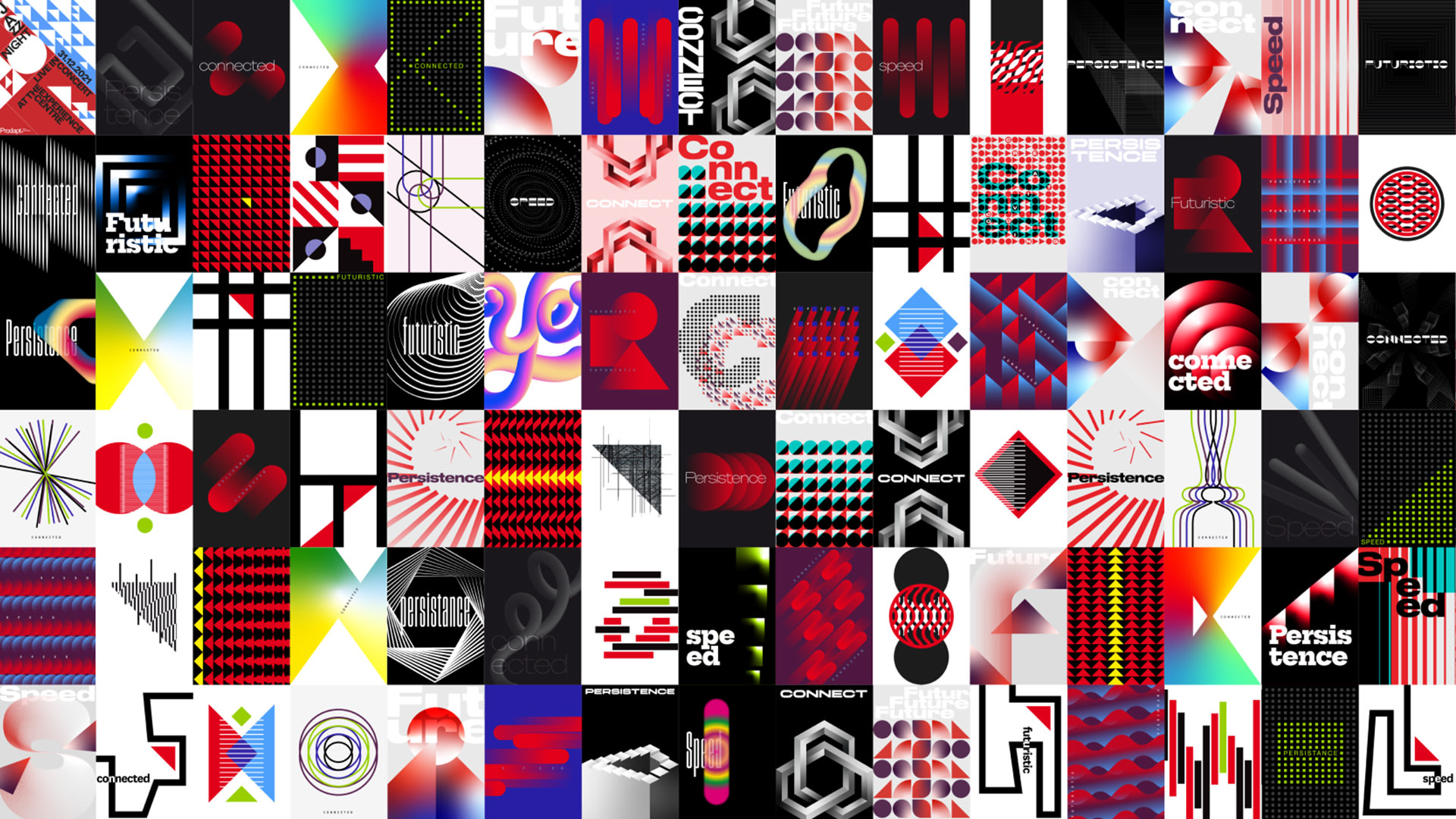
A fresh look
The Prodapt triangle generates a grid, which along with the Prodapt red, forms the heart of the visual style. A modern typeface with a mechanistic flavour suits this kind of company well. Prodapt’s people shot in realistic settings lend authenticity.
A corporate video
A smart corporate video speaks to all businesses presenting Prodapt as a decidedly forward-thinking company, sure of its capability and impact on the world and the everyday.


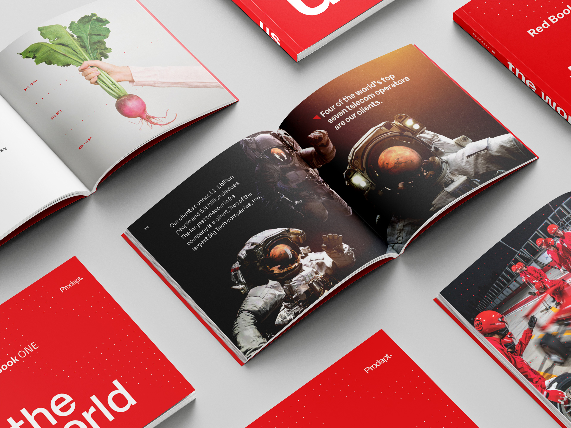
The Red Book
The Red Book is a primer to Prodapt that distills Prodapt’s services, impact on clients’ businesses, competitive advantage and vision into a box set of two pocket-sized books. Lucid and economical writing combined with thematic images makes for a rewarding read.


Employer branding
Attracting talent is addressed by a separate microsite that speaks to candidates in a relaxed, open manner about what Prodapt has to offer. It brings Prodaptians to the centerstage, and highlights the impact of their work on everyday life of people. Visually, it carries forward the corporate site’s language.

Partner-in-charge Creative Director Itu Chaudhuri | Art Director Itu Chaudhuri | Brand Concept Itu Chaudhuri, Akhoury Abhishek | Design Concept Ritu Kumari | Design Development Ritu Kumari, Ashok Dey, Pradyut Nath, Saumya Dalal | Alternate Design Concept Ashok Dey | Writer Itu Chaudhuri, Akhoury Abhishek | Animation Ritu Kumari, Abhishek Ghosh | Project Management Akhoury Abhishek | Project duration 12 months