background
Kohler Experience Centres (KECs) are Kohler’s exclusive product showcase spaces where the full range of bath products are displayed in an immersive, luxurious space, designed to inspire trade professionals, project leaders and retail consumers alike.
KECs display the Kohler range with full functionality, including running water, so that the product can be a live experience. They are designed in close collaboration with leading architects and interior designers, who also form a critical part of their clientele.
This KEC at Bengaluru follows just two others in India, at Delhi and Mumbai.
As these complex spaces house a variety of dedicated display and collaboration spaces within a single roof—artist area installations, new product lines, collaboration zones—the need for an expert to develop and detail the graphics, signage and installations was felt.
ICD collaborated with the brand team on the project as the graphic design consultant, to develop graphic solutions to signage, information graphics, thematic graphics, conceptual installations, suites and exhibits.
Challenges
The project came with a unique set of challenges. The space’s dimly lit, cave-like ambiance, makes graphics challenging under different lighting and colour themes. Materials and lighting techniques were worked out in close coordination with multiple vendors and on-site testing.
Multiple textures, surfaces, materials and finishes posed further challenges to consistency.
Demarcation requirements meant we were designing for many mini spaces within one roof.
360° visibility in multiple sections of the space.
A host of materials—brass for plates and letters, canvas & chiffon for artist capsule display, etched powder coated plates for product descriptions and dimension drawings had to be tested and fixed in a tight timeline of 3 months.
Finally, Kohler’s type and signage guidelines, which we owned, allow little room for adjustment.
Design
The KEC space is spread across two floors, each floor needing slightly varying treatments based on the product and spaces it contains.
The ground floor houses ‘artist editions’—signature limited edition product lines styled by renowned artists and pitched as functional artworks.
Extending the product’s space
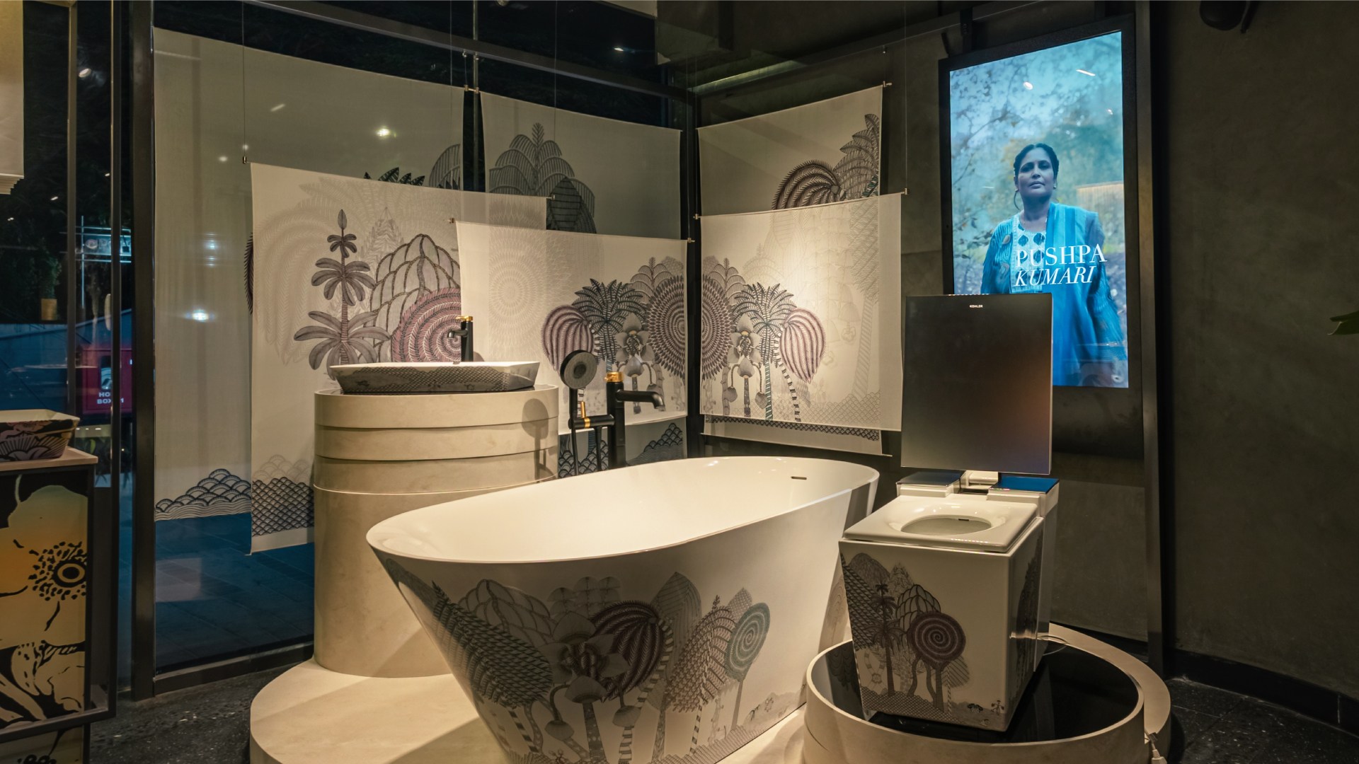
A display concept using elements of the artwork to expand the space occupied by the product added a layer of expression with artwork skins wrapped around the frame of the display. This extended the artist’s signature and gave the surrounding space their signature.
In addition to these, there was a dedicated spotlight area, called the ‘microenvironment’, which would showcase one artist’s work and style in greater detail, going beyond just the product or the collaboration.
Adding a layer of expression
An art installation inspired style was developed for the artist capsule. Using artwork prints in special materials and an interplay of light and shadow, a holographic effect was achieved. It worked well for outside-in viewers too, as the ‘art capsule’ sat next to the window.
Making tastemakers accessible
Architects who specify Kohler are makers of public taste. They are a key audience. The ground floor houses six ‘architect suites’ which serve as models of inspiration. Kohler invited select architecture studios of India to compose a space with Kohler products. ICD recommended and designed digital displays which placed the design in context with the architect’s practice and the use of Kohler products. Accessible, conceptual text was created for the task.
Product posters for variant discovery
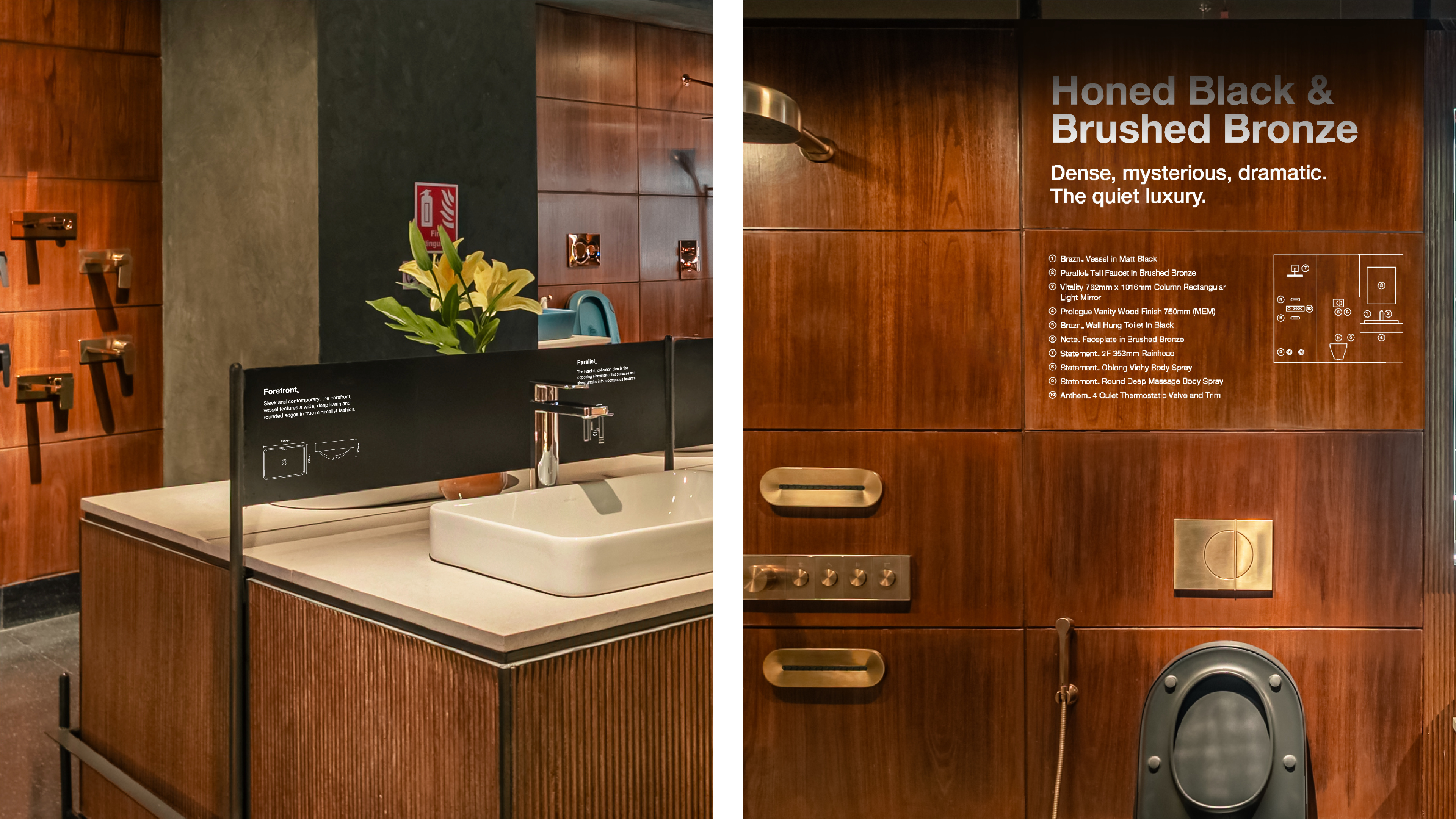
The problem of poor variant discovery was solved by using variant posters which described alternate variants right above the displayed product. This ensured that customers viewed the full product line.
Adding character with signage: warehouse and live area
Influencing the perception, and intended use of the spaces were the major outcomes. A KEC warehouse is Kohler’s meeting and collaboration space for architects, customers and salespeople. The ‘live’ area is where products with water supply, heating, are presented to be experienced. Increasing the propensity to use them was the challenge we took on.
Signage development and naming was used to establish a character for the two sections occupying this floor. The signs provide textual nudges to promote the use of the space for brainstorming and design sessions. Similar, encouraging, nudges to use the products were deployed for the live area.
The current, past and future: trends wall and Kohler’s timeline
A trends wall creatively expresses the bath design trends in vogue. Textures, content and the products themselves were used to compose a monumental wall of high fashion, for bath implements in various finishes. A timeline showing the company’s 150 year past to its vision for the future was developed.
Creating territories within the same space
A special zone with products from Kallista, Kohler’s luxury brand was differentiated from the rest with prominent identification signage.
Inheriting, owning and extending a system
Inheriting a set of typeface and diagram guidelines for in-store signage, we realised that a standard style, informed from previous spaces won’t fit the requirements here.
We designed a serial number based labelling system for product ensembles. Dimension drawings were extensively tested on different materials to find the right fit for the live area.
Seeing it through
Throughout the project, ICD worked closely with the production and on-site teams to ensure zero-error implementation of all ideas and solutions.
Impact
The centre is one of 3 in India and only 13 globally. It underscores India’s importance in Kohler’s view of the world.
The store opened with leading architects from the southern region in attendance, marking Kohler’s position as a major player and market maker in the world of bath design.
Kohler experience centre: retail display detailing and enhancement
Kohler is a global leader in the mid to luxury bath & kitchenware fittings. Kohler Experience Centres (KECs) are their exclusive, luxury experiential retail spaces. KEC Bangalore is their third such space after Delhi and Mumbai. ICD collaborated with the Kohler brand team on the project as the graphic design consultant, to develop graphic solutions to signage, information graphics, thematic graphics, conceptual installations, suites and exhibits.
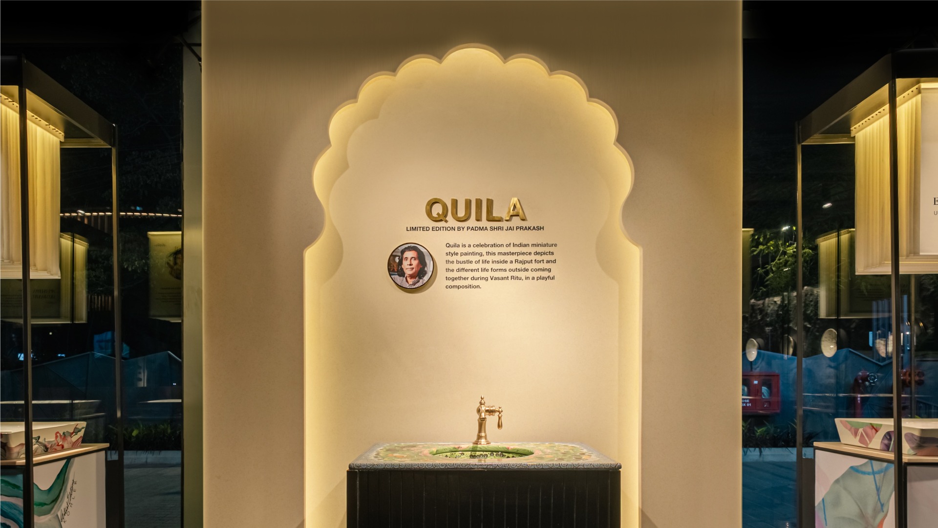
Enhancing the retail viewing experience for artware
An art installation inspired style was developed for the capsule. Using artwork prints in special materials and an interplay of light and shadow, a holographic effect was achieved. It worked well for outside-in viewers too, as the ‘art capsule’ sat next to the window.
Product posters that don’t leave questions unanswered
Customers shouldn’t need to look for information, it is visible and consistent. Product variant posters describe alternate variants right above the displayed product.
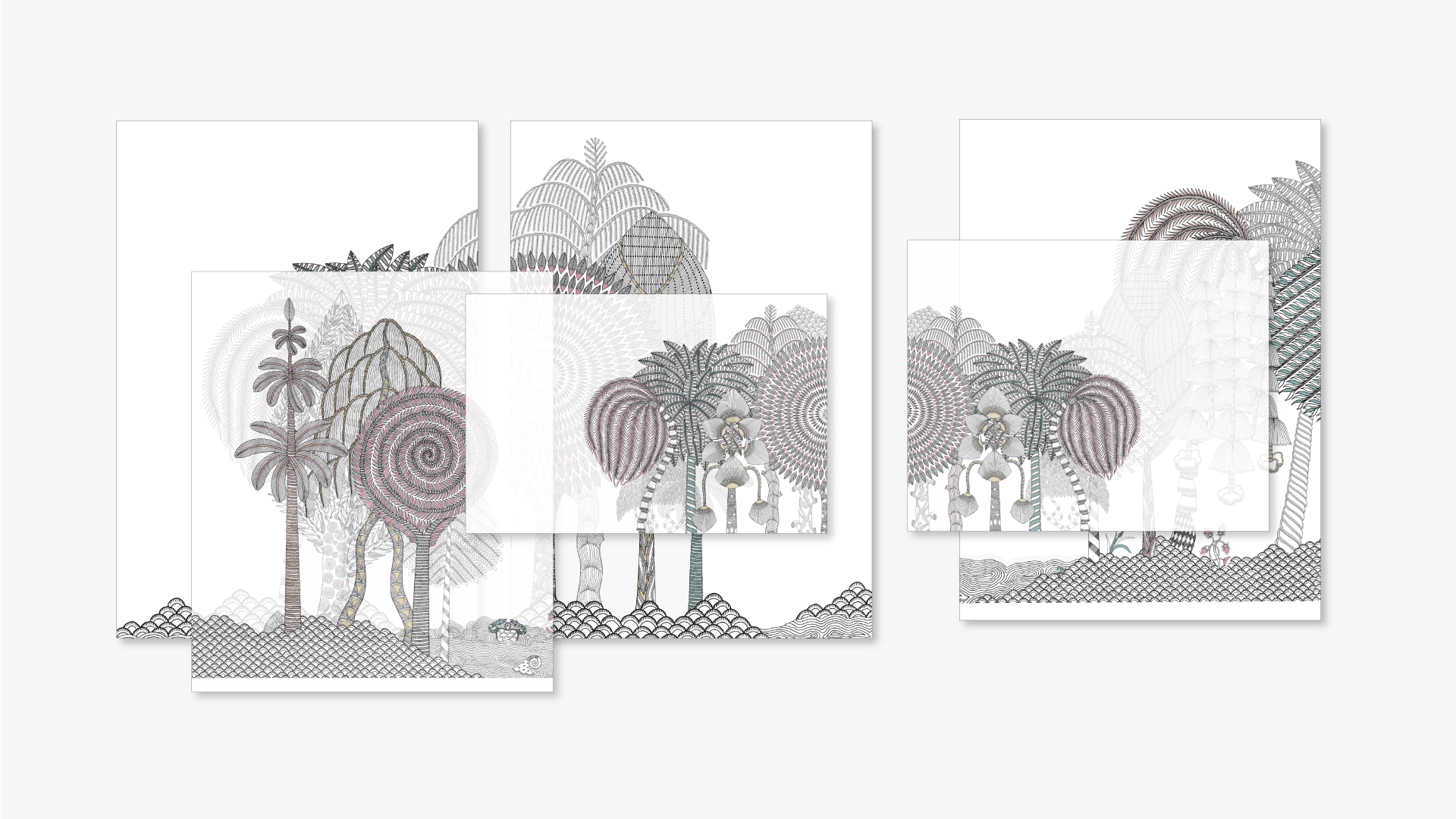
Enhancing the art of retail: artist capsule compositions
An art installation inspired style was developed for the artist capsule. Using artwork prints in special materials and an interplay of light and shadow, a holographic effect was achieved.
Expert taste, decoded simply
Kohler invited select architecture studios of India to compose a space with Kohler products. ICD recommended and designed digital displays which placed the design in context with the architect’s practice and the use of Kohler products. Accessible, conceptual text was created for the task.

Trends wall: a monument to style
A trends wall creatively expresses the bath design trends in vogue. Textures, content and the products themselves were used to compose a monumental wall of high fashion for bath implements in various finishes in style.


Warehouse and live areas: driving action and interaction
The signs provide textual nudges to promote the use of the warehouse space for brainstorming and design sessions. Similar, encouraging, nudges to use the products were deployed for the live area.

partner in charge lisa rath | creative director lisa rath | design concept saumya dalal, abhishek ghosh | design development saumya dalal, abhishek ghosh | content writing & editing ayushmaan agarwalla | production supervision lisa rath, saumya dalal, abhishek ghosh | project duration 5 months


