background
Sunstone Eduversity is a VC backed education startup trying to create a space for itself in the management education landscape of India. Looking at rapid growth and scale in the near term, they wanted to ensure that Sunstone adopts a new, consistent identity as its reach and interactions with the world expands.
We were approached to brand them and help discover the right set of messages the brand could own and amplify.
strategy
We talked to their students to better inform our brand thinking. The typical Sunstone student is a hopeful riser from a tier 2 or 3 town, probably the first in their family to go for a higher education. Our conversations revealed interesting truths about what an MBA meant for them. A career kickstart, employability and job skills stood out as prominent motivations.
Our conversations with Sunstone’s recruiters helped us understand their expectations from higher education institutions at Sunstone’s level. They want well-trained people who can hit the ground running, especially for frontline roles and they want the talent quality to be consistent throughout the country.
Sunstone is doing precisely that and we felt if the communication and design can respond to that, it will create relevant talking points for both recruiters and students.
The MBA landscape is divided between elite, highly selective B-schools and their weak imitators. The ‘muddled middle’ is populated with MBA colleges who try to project notions of antiquity generally associated with the elite institutions. They lack the academic rigor to back themselves.
We wanted to show Sunstone’s focus on employability and practical skills as a key differentiator. It is a modern institute with laser-like focus on employable, in-demand skill development. With the same quality of students everywhere, from a small town in West Bengal to Bangalore. An institute for the informed, capable up and comer who wants to get ahead in life.
voice and tone
Sunstone’s stance is exhortative with a sense of assurance in its voice.
It seeks to move people towards a better future—one fuelled by their own skills and employability. It also promises a smooth ride, and commits to take care of everything after the first step. Excitement and trustworthiness sit together comfortably.
It’s never authoritative like the typical management colleges with a top down approach to education. The tone is collegial with a candid take on everything, much like an equal elder or a college senior.
design
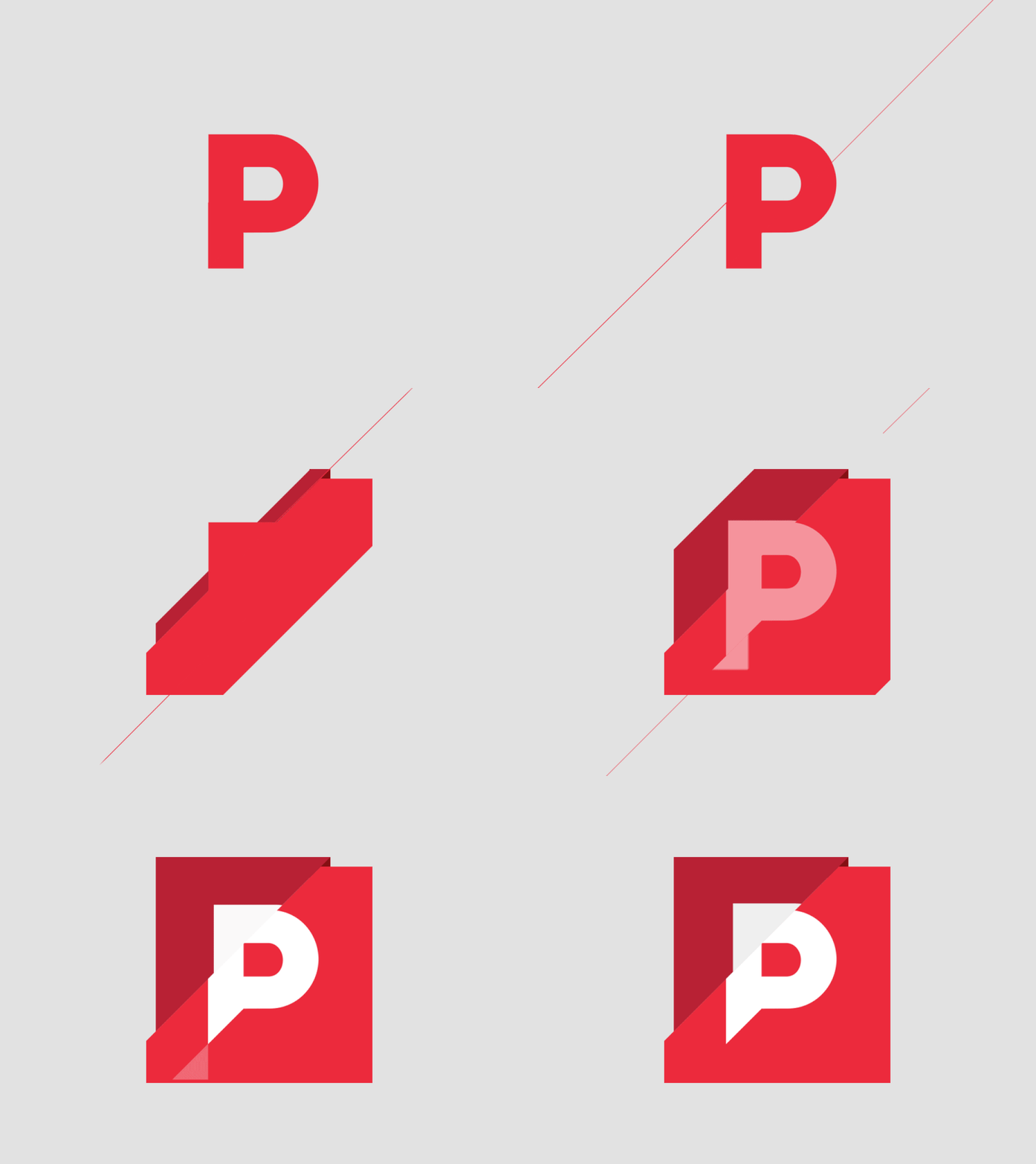
The Sunstone visual story starts with its new logo. It is the principal carrier of the brand. A reminder of its character and values. The resemblance to a set of steps signal Sunstone’s commitment to progress and independence. A neutral typeface and unicase lettering convey the right mix of collegiality and assertiveness in the logo. The image of the institution and its idea is always preserved, even in the compact versions, with only one version swapping the “edu” for an ‘e’.
The result is a determinedly modern design. Distinct from the dozens of MBA colleges in the ‘muddled middle’ with their emblems of fake antiquity and legacy.
The mixed tints lend vibrancy to the brand. Hinting that the eduversity is the first of more things to come in the education cum training universe that Sunstone inhabits.
The sunstone colours—blue and yellow were chosen to be academic, with the right balance of prudence and freshness. Typical of smart, sharp uniforms we are all familiar with.
Diagonal motions and bold shapes are used to give shape to the visual language. Blocks and steps are manipulated to create diagonal layouts that form the brand’s visual landscape.
brochure
Sunstone had two brochures, one each for the students and recruiters. We combined the two into a single brochure that does two things together: an informative prospectus for students and a clear presentation deck for the potential recruiters.
The balance between glanceability and granularity was maintained throughout. Taking the reader into greater detail, gradually. Each page also follows the same flow, with the headline explains the broad idea and the page subsequently gets into the granularities of each topic.
New elements like infographics on insightful metrics, testimonials on every page give a sense of a place that is energetic and bustling with activity and action.
The Sunstone photography style is realistic, shows scenes from life, people studying, and working in real environments. The focus is always on people, not the facilities.
impact
Sunstone has rapidly grown since our engagement with the brand. Scaling up its presence to 24 campuses in 14 states. We are now working on a new website to take forward their new identity and communication to the digital space.
making the mba job ready
Sunstone Eduversity is an education startup offering practical, job focused management programmes to help students to join the corporate workforce. We were approached to define the brand and help discover the right set of messages the brand could own and amplify.


sunstone’s charging voice stirs people into action. the reassuring tone builds trust
Sunstone exhorts people to change their lives, setting them on a path to employment and growth with the assuring promise of assistance along the way. The brand typeface Public Sans has a friendly, but no-nonsense demeanour. The typeface is meant to be neutral and legible, reflecting Sunstone’s clearly stated objective of an employment focused education.


the visual story is a story of progress
The Sunstone visual story starts with its new logo. The resemblance to a set of steps signals Sunstone’s commitment to growth and independence through management education.

partner-in-charge & creative director itu chaudhuri | brand concept itu chaudhuri, nitasha basu | design concept itu chaudhuri, niloy kundu, pradyut nath | alternate design concept ashok dey, prashant gaikawad, mitul grover | writer itu chaudhuri, ayushmaan agarwalla | page animation pradyut nath | project duration 5 months


