Background
Sheela Foam Limited is India’s largest foam manufacturer. It is a $2 billion listed enterprise which owns a host of brand’s including Sleepwell, a household name for mattresses in India.
The management felt that an identity exercise would help Sheela Foam appropriately reflect its size and stature. We were approached to design a new identity for the company.
Problem
The old identity focused too much on the symbol ‘S’, much more so than the name of the entity, taking focus away from the Sheela Foam.
The name also suffered from inconsistencies, ‘Sheela Group’ and ‘Sheela Foam’ were being used indifferently and interchangeably—it was apparent that there was a lack of a central guideline.
There were inconsistencies in the usage of other elements as well—the 50 year commemoration unit, the continent names.
Strategy
Sheela Foam needed an identity that reflects its presence appropriate to its status as an industry leader.
And to achieve that, along with the redesign, systematising these inconsistencies was equally important.
Using the identity as a vehicle, we want to bring out Sheela Foam’s character—a blend of modernity and maturity.
We felt that a company of Sheela Foam’s size and stature needed a suite of distinct, ownable assets— a new logo, a custom lettering, commemoration unit and continent lock-ups.
Design
The existing symbol, the gradient fill, the unassuming lettering for Sheela Group, needed a stamp of memorability and modernisation. It appeared inconsistent and lacked the assuredness of a leader.
The solution was to redraw the symbol and focus on the lettering to position the company authoritatively in the domain of their business.
The new design and custom lettering reflect modernity balanced with maturity. Solidity with an element of grace. Crispness with a touch of softness. It is distinct and ownable.
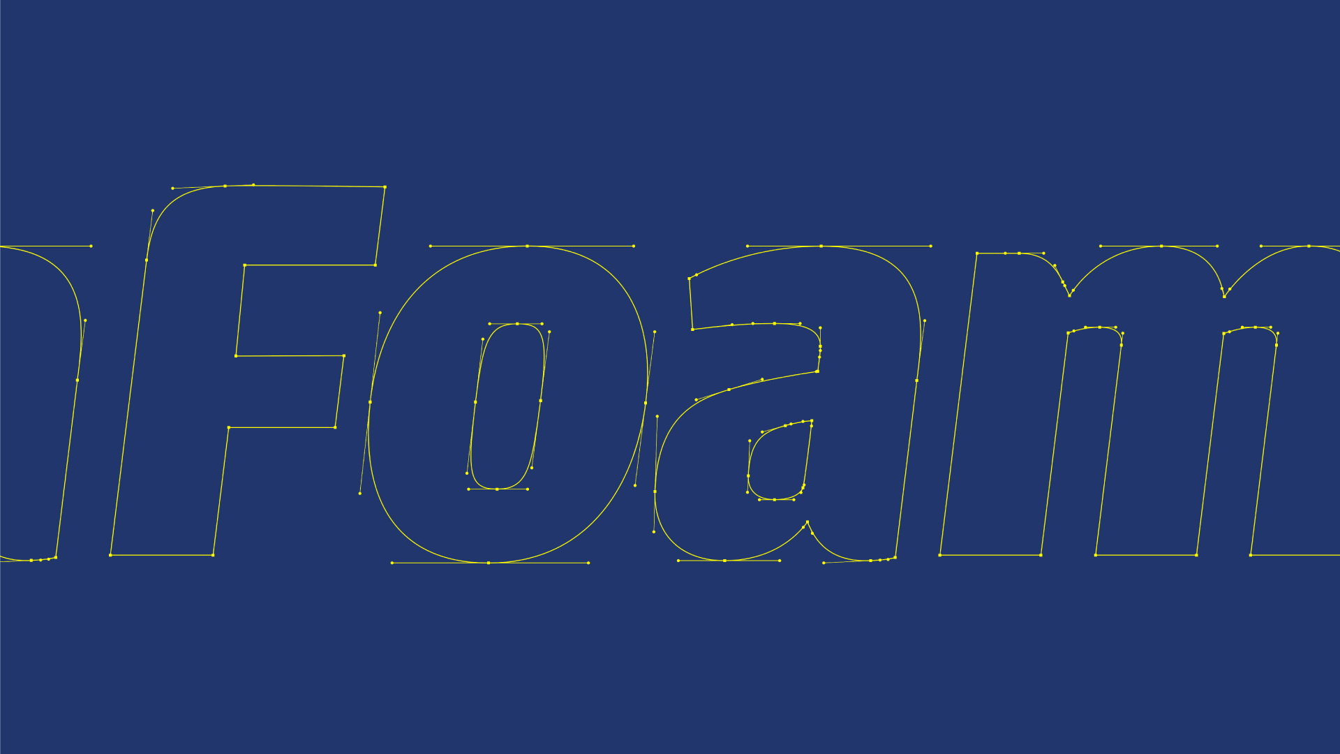
We developed a customised lettering style for Sheela Foam, on top of Amplitude, a Sans Serif typeface.
We wanted to carry Sheela Foam’s heritage forward but also stand apart as a modern enterprise, working at the cutting edge of technology.
Sans Serifs are modern, more functional and minimal. These are on the industrial and functional side of the spectrum—lean, sharp and more business-like.
The letters were squarish and heavy in shape and form—stable and robust. But they had a softness built into them with rounded corners and tapered terminals.
Again, the balance between crispness and the soft touch of comfort was carefully calibrated.
Also, look closely and you will spot how the letters mimic the shape of carved blocks of foam. There is a certain fullness or fluffiness if you will.
A special unit commemorates 50 years of excellence and leadership in the comfort business. It has moved with the times, from being a competent manufacturer to a mature but dynamic industry leader.
The Sheela Foam world map lays out its global footprint and scale, from Australia to Europe.
The colours, blue and gold work together to express Sheela Foam’s character—assured solidity with graceful humility.
Impact
The renewed identity was rolled out with clearly defined usage instructions across communications, retail and regulatory use cases.
It gave consistency to Sheela Foam’s communications, helping it interact more assuredly and consistently with its own people and the world at large.
Sheela Foam corporate identity
A leader’s story of progress and experience. Sheela Foam Limited is India’s largest foam manufacturer. A publicly listed corporation, it owns the well known consumer brand Sleepwell. It was time for Sheela Foam to appropriately reflect its size and stature in its identity. We were approached to design it for the company.
a memorable wordmark, a modernised symbol
The existing symbol, the gradient fill, the unassuming lettering for Sheela Group, needed a stamp of memorability and modernisation.


custom lettering and legacy imagery
The Sheela Foam lettering is carefully crafted on top of the amplitude typeface to make the identity distinct and ownable. Its clean and crisp forms with soft curves and subtle tapered terminals provide the perfect balance of industrial competence and luxury of comfort.


a commemoration unit: ownable assets
Sheela Foam is a 50 year old modern enterprise with operations that span 3 continents. We designed a special unit to commemorate 50 years of excellence and leadership in the comfort business. It has moved with the times, from being a competent manufacturer to a mature but dynamic industry leader.
Putting Sheela Foam on the world map
The renewed identity was rolled out with clearly defined usage instructions across communications, retail and regulatory use cases. It gave consistency to Sheela Foam’s communications, helping it interact more assuredly and consistently with its own people and the world at large.


Partner-in-charge & Creative Director Itu Chaudhuri | Design Concept Pradyut Nath | Design Development Pradyut Nath | Alternate Design Concept Pradyut Nath | Project Duration 3 months