Background
The Almirah store sells clothes, bedding and accessories for children. We helped extend their physical store onto the digital platform making sure it was a perfect representation of their brand which believes in contemporary design with an ‘Indian edge’.
Objective
The Almirah website was built to be true to its brand personality, built on a gentle, childlike authenticity and charm.
Equally, to promote a view of a good e-commerce experience that not need be faceless and mechanical.
User Journey
The user journey from entry to checkout, via exploration is in character: reflecting the innocence and playful essence of its products.
A consistent design language enlivens the journey. The simple navigation experience is matched by a ‘handmade’ interface featuring irregular stitching lines, embroidered icons and messages.
Staying in Character
For Almirah, even the routine is delightful, irregular and playful, a chance to express its personality and build a relationship.
So even the Contact, Press, Store Locations and Log In/Sign Up pages are a chance to greet and charm; and the wash/care instructions avoid the mandatory, arcane technical symbols in plain, human words and a smile. Headlines complete the tone of voice.
Inducing purchase
The product/category pages with its irregular display stand out (because children don’t fit in grids!), yet the products are glorified.
Each category has its own unique icons and elements, which celebrates the idea of childhood and the Indian edge that the brand’s design is built on.
After its success within the first year of their launch, Almirah has managed to open two more outlets and expand its business worldwide with the help of the site. The true recognition came when it was invited to present to Prince William and the Kate on their visit to India.
An e-commerce stepping away from the usual norms
The Almirah store sells clothes, bedding and accessories for children. We helped extend their physical store onto the digital platform keeping intact the brand’s uniqueness: contemporary design with an ‘Indian edge’.

an experience built on a gentle, childlike authenticity
The Almirah website was built to be true to its brand personality, built on a gentle, childlike authenticity and charm. Equally, to promote a view of a good e-commerce experience that need not be faceless and mechanical.
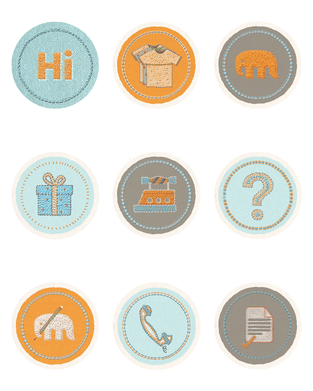
handmade interfaces, embroidered icons
The user journey from entry to checkout, via exploration is in character: reflecting the innocence and playful essence of its products. The simple navigation experience is matched by a ‘handmade’ interface featuring irregular stitching lines, embroidered icons and messages.


even the routine is delightful, irregular, and playful
Contact, Press, Store Locations and Log In/Sign Up pages are a chance to greet and charm; and the wash/care instructions avoid the mandatory, arcane technical symbols in plain, human words and a smile.

irregular displays, and glorified products
The product/category pages with its irregular display stand out yet the products are glorified. Each category has its own unique icons and elements, which celebrates the idea of childhood and the Indian edge that the brand’s design is built on.

Partner-in-charge & Creative Director Itu Chaudhuri | Art Director & Design Concept Richa Bhargava | Design Development & Production Richa Bhargava, Anoushka Garg | Project duration 6 months


