Background
Healthy Planet started as the Early Years programme at Noida’s Nehru World School. Soon, the research based Healthy Planet programme became popular with parents and children with demands for a full fledged programme based on the Early Years ethos.
Owing to the success of the programme, the founders decided to launch the Healthy Planet programme into a group of schools in Noida.
With the first campus starting soon, the founders approached us to help build a website to express their philosophy of education and talk to the Healthy Planet parent.
Thinking
Our idea of schooling and education found expression in the phrase we articulated for the Healthy Planet, “It takes a school to raise the world”, which went on to be a rallying message of the school itself.
The Healthy Planet programme combines the best of education—time tested education principles and a school programme based on the latest pedagogical research that gave us direction on the kind of parent they would like to talk to.
We defined the Healthy Planet parent as thus—young, aware and with equal belief in first principles and the cutting edge.
The website had to express the school’s philosophy to this parent more than anybody else.
Design
The Healthy Planet architecture is a core expression of the school’s idea of quality education.
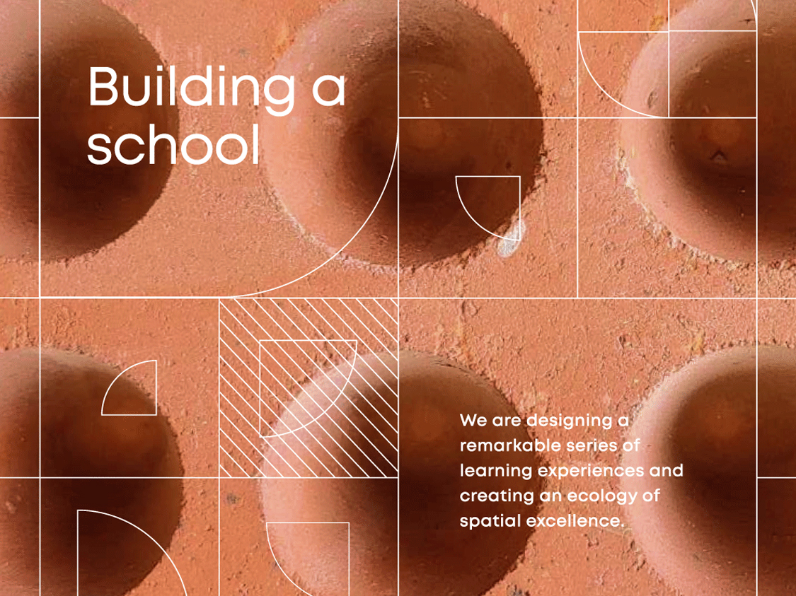
The first building in Noida is built in exposed red brick. The layout that stimulates the child to explore and learn about the environment.
Inspired by first principles ourselves, we started with the brick. The brick’s geometry became the basis, the gene, of the entire website.
We built grids based on the brick, one for each of the 26 pages of the website. Basic shapes or ‘Primitives’—triangles, circles, squares and rectangles formed the foundation of the design, lending a scholastic character to the design.
Primary colours gave further meaning and bright character to the pages. Colours and shapes were further used to differentiate their four programmes—Early Years, Primary, Secondary and Senior schools.
Communication and writing
Starting with the dedicated Architecture page, which was crafted and written after multiple sessions with the founders and the architect.
Every page of the website was given a message, structured and written in close consultation with the school team. Consistent message and clarity added to the vividness of the website.
Moving away from the facility focused messaging. The narrative highlighted the child’s development, the teacher’s dedication and focus on the individual child.
Photography
Photographs were integral to the design. We specified each image and worked with the photographers to get the right shots, directing photoshoots.
Kids are shown in their element. Playing, learning and getting messy—the right conditions for a love for learning to blossom.
Website for a school built from the Earth
Healthy Planet started as the Early Years programme at Noida’s Nehru World School. Soon, the research based Healthy Planet programme became popular with parents and children with demands for a full-fledged Healthy Planet school programme based on the Early Years ethos—instilling a love for learning. With the first campus starting soon, the team approached us to help build a website to express their philosophy of education and talk to the Healthy Planet parent.
First principles thinking in education expressed with primitives
The Healthy Planet idea of education starts with first principles. The school strives to develop curiosity, critical thinking and a love for learning in their students.

On the Healthy Planet website, play is taken seriously
The child is central to the school. Elements and objects that allude to the spirit of play are employed to create a playroom like experience.
Grids inspired by jaalis of the Healthy Planet architecture
The Healthy Planet architecture is a core expression of the school’s idea of quality education. Ideas of sustainability, openness and a love for exploring the world are embedded in the building. We adopted the uniquely Indian jaali of the Healthy Planet building and extended it to grids for each page, using our basic shapes library.

A day in the student’s life at school—kids in their natural habitat
A school is more than classrooms and books. The kid’s life at school is eventful, engaging and not too neat.
A new alphabet: playing to learn and create
The first things a student learns in school are letters and numbers. These form the base of all education. We created letters and numbers inspired from the many shapes and structures of the Healthy Planet architecture.

Partner-in-charge & Creative Director Itu Chaudhuri | Design Concept Itu Chaudhuri | Design Development Anshika Sharma | Alternate Design Concept Prashant Gaikawad, Rohit Taitwal, Anshika Sharma | Tech Lead Vikrant Gupta | Developer Alok Joshi, Shivani Verma | Writer Itu Chaudhuri, Ayushmaan Agarwalla | Project Management Ayushmaan Agarwalla | Project Duration 12 months

