background
Sunstone offers job focused undergraduate and postgraduate programmes to underserved students, in collaboration with universities around the country.
Sunstone’s guarantee of a job and placement linked fee terms are what differentiates it from a host of others who offer MBA and other post graduation programs.
Post a branding exercise where we helped them discover a set of messages to own and amplify, Sunstone approached us to design their website.
problem
The existing website suffered from information and design problems typical of rapid growth.
On the information side there was missing branding communication, haphazard addition of new sections and confused content hierarchy.
Responsiveness compromised the view on mobiles. Sticky items and CTAs, instead of helping in discovery, came in the way of accessing information and made it appear ‘pushy’, like a sales product.
Announcements and important information were getting lost due to unprescribed font and size usage.
Overall, the key messages about the brand got buried under the weight of unorganised information.
design
We made the case for a mobile first design and made each component responsive for optimised tablet and desktop views. The rationale was simple, 80% of the website’s traffic came from small, basic smartphones.
We approached the problem from two sides—information architecture and UI UX design. Though both facets are intimately intertwined, we separated them for the initial stages to simplify the goals for each.
The architecture was re-structured for clear information flow and navigation across the pages, for key personas. The goal was to bring the key brand messages and student propositions to the fore. The new design has more accessible navigation buttons and anchors which link to important sections across the website.
An always available sticky button allows users to select options which would otherwise be one click away. Considered usage of brand elements, colours and typography schemes give the website coherence. Simple conversational writing explains the courses, opportunities and payment terms with a consistent cadence.
impact
The new website will act as a digital admissions guide for students across the country and allow Sunstone’s growth to be consistently and clearly reflected online.
a high performing, digital career counsellor
Sunstone offers job focused undergraduate and postgraduate courses to students through a partner network of institutions across the country. It is helping students join the corporate world with its affordable programmes and flexible payment terms.
Post a branding and identity exercise with us, they wanted to translate their new messages and brand personality on a performance website. We were asked to design this website.
mobile first accessibility
Around 80% of the traffic on the website is from mobile devices with 360 pixel width (the smallest smartphones). Our design has a mobile first information architecture and UX to allow easy accessibility from basic smartphones.
opportunities for the underserved
Sunstone wants the next generation of students and corporate executives to come from the largely underserved group of ambitious students in tier 2 or 3 towns. The website acts as an empathetic counsellor that guides students through the first steps of their higher education journey.
100% responsiveness for all mediums
The website transitions seamlessly between mobile, tablet and desktop. Every component scales up and down in predefined ratios, preserving the architecture and form completely, irrespective of device or screen size.
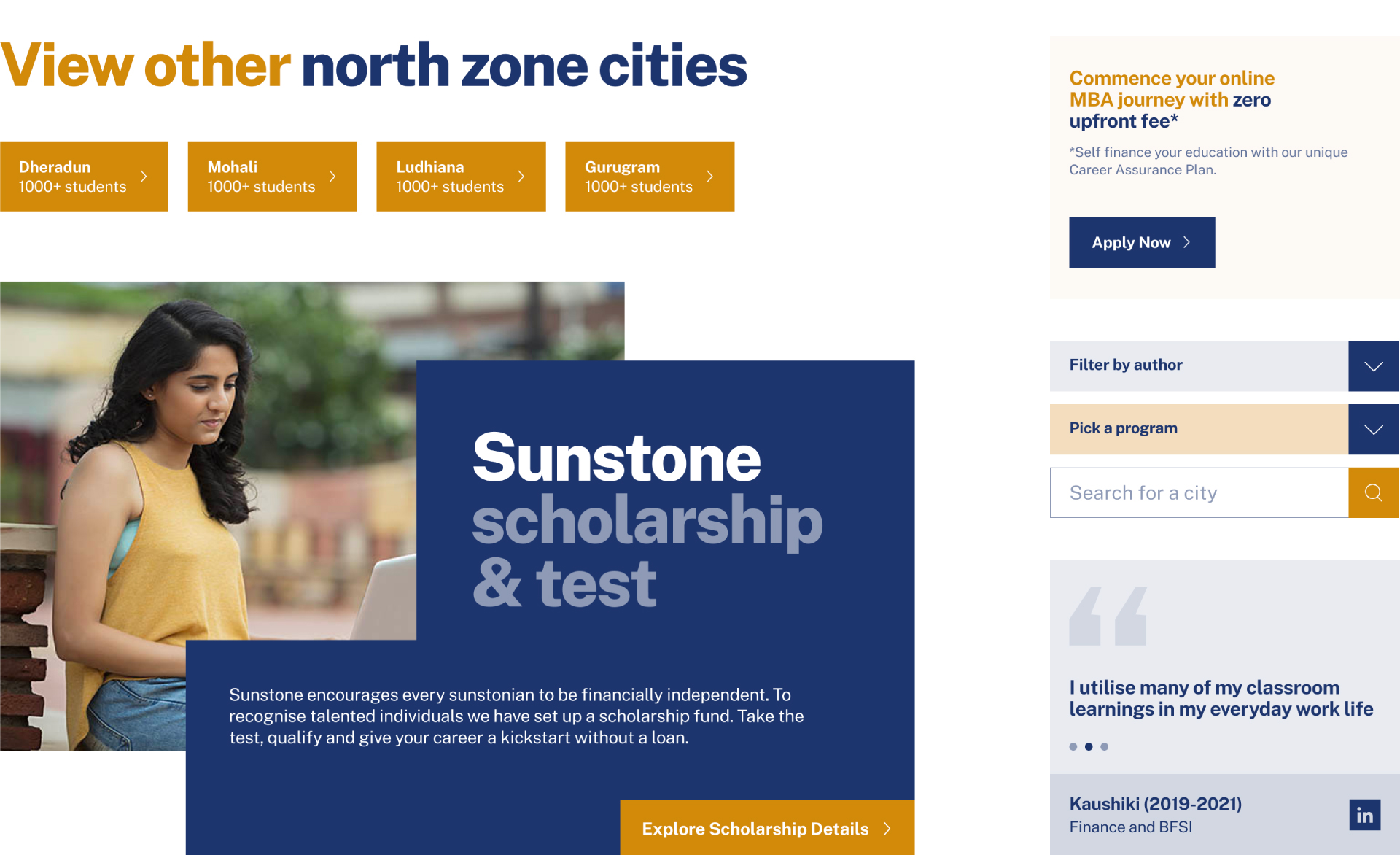
from branding to functional communication
After the branding, we wanted to translate the brand onto a working piece of communication. The Sunstone Website is functional, dynamic and extendable. It carries the colours, the logo and overall character of the Sunstone Brand.
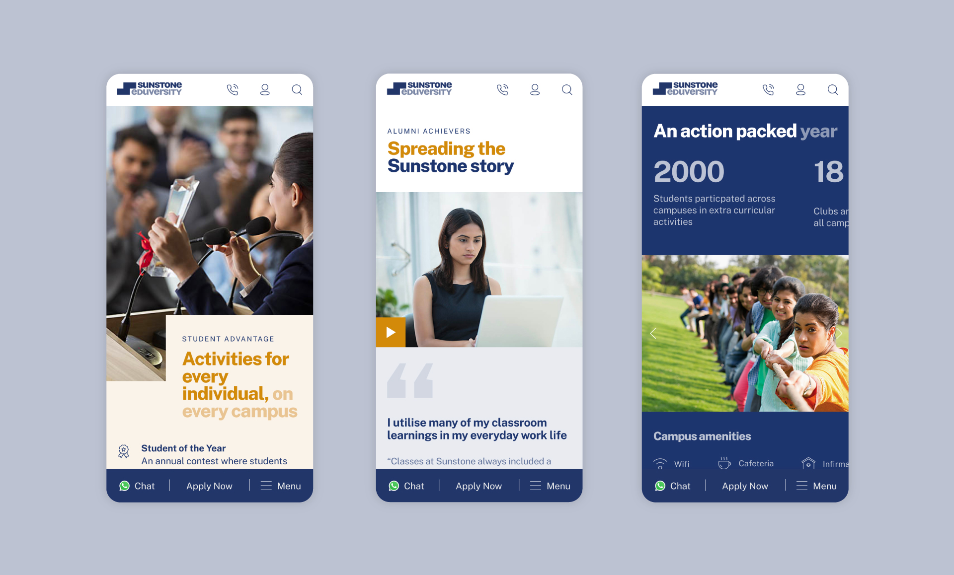
easy to understand language and messaging
The website will serve as a first time introduction to the processes of application and admission for the majority of students with Sunstone in their consideration set. Key concepts like placement linked payment terms had to be explained with clarity and zero margin of confusion. The language had to be familiar, clear and precise. The copy therefore, was written in simple and clear English at a primary grade reading level.
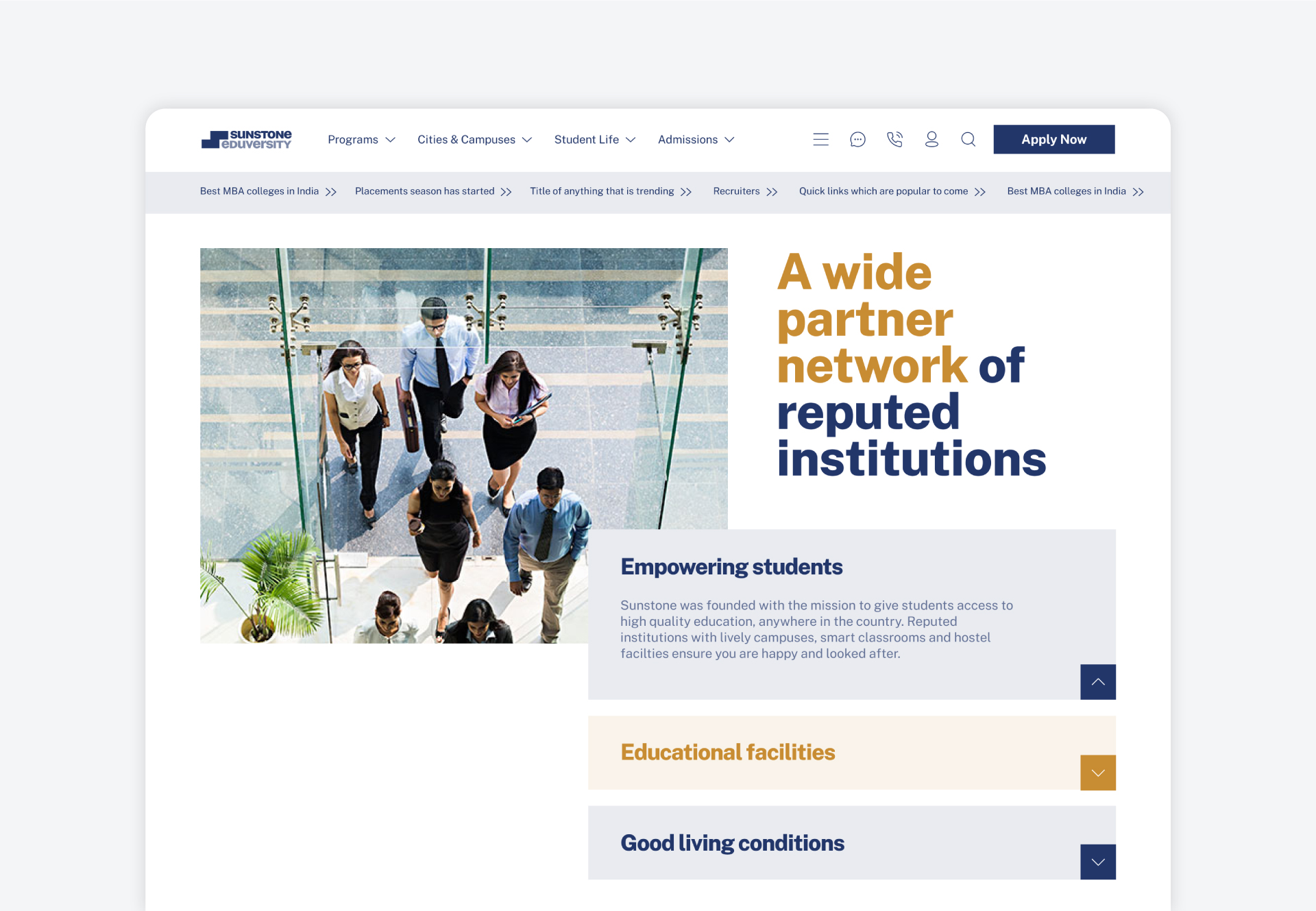
Partner-in-charge & Creative Director Lisa Rath | UX & UI Director Lisa Rath | UX & UI Concept Lisa Rath, Pradyut Nath, Saumya Dalal | UX & UI Development Pradyut Nath, Saumya Dalal | Writer Lisa Rath, Akhoury Abhishek | Tech Lead Vikrant Gupta | Development Alok Joshi, Tanaya Wankar | Project Management Akhoury Abhishek | Project duration 6 months


