
Background
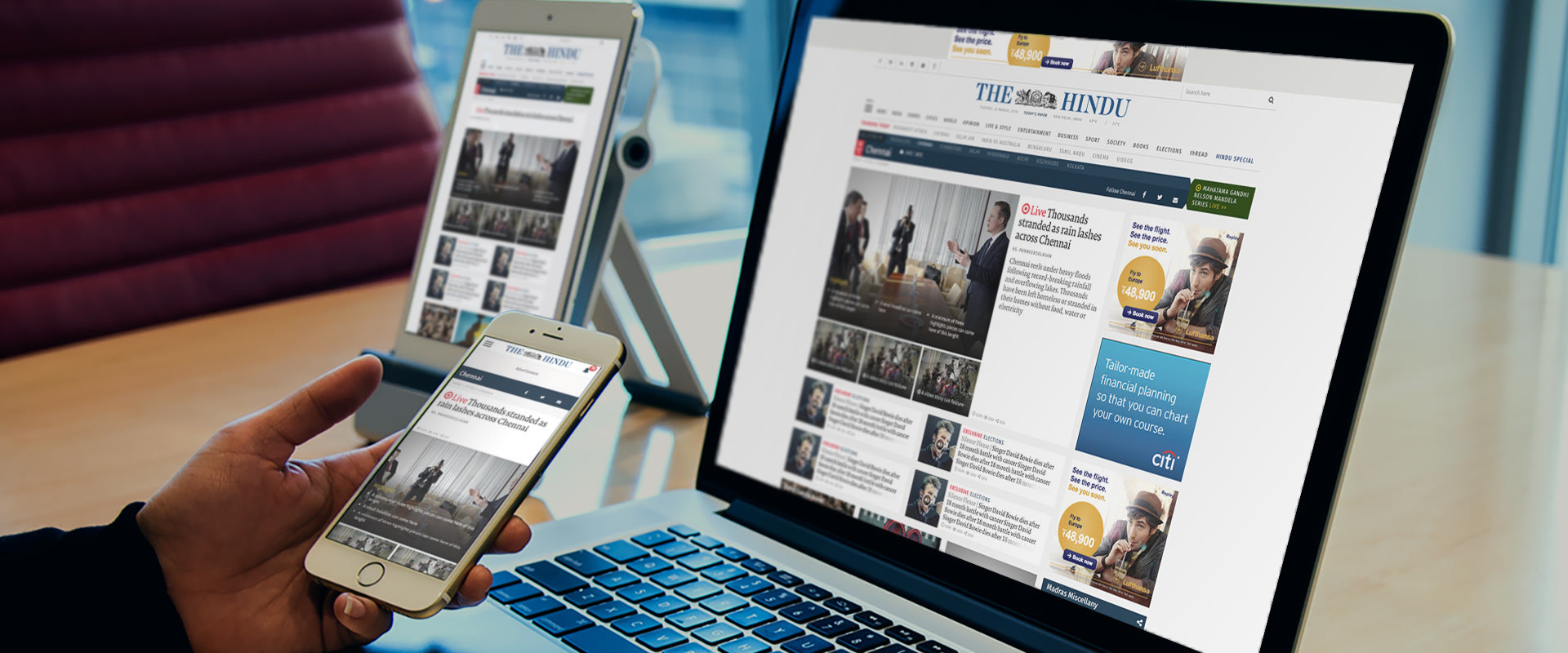
The 138 year old Hindu, is among India’s most venerated dailies. An early adopter of the web, the old site no longer reflected its younger reader’s idea of a newspaper’s web front. A more contemporary, and capable site was needed, to work as well on mobiles as on larger screens.
In close collaboration with the editorial team we set about understanding The Hindu’s unique connect with its readers, and why it occupies such a key place in the news landscape.
Our Approach
The path to renewed relevance obviously passed through modernisation, but it was not an easy one. Long time loyalists’ preferences had to be negotiated alongside the expectations of a younger reader for whom the Hindu is a valued, but not exclusive read.
The Hindu offers an extremely rich bouquet of content, from archived material to developing stories; statistics, sports features, city-specific content (it has 16 editions) and the like, each of which has distinct uses for sets of readers. Our goal had to be to make this visible, drawing the eye to it without derailing the scanning process.
Second, a large number of content vehicles were designed to contain each kind of news, a backbreaking task, across several screen resolutions.
Our visual approach balances energy and stability, ensuring that this valuable and reliable content is bolstered by contemporary design, multimedia value additions, smarts technology and easy readability via good typographic and graphic decisions and easy findability by devising smarts widgets.
Process
The first things to keep in mind were the analytics results and extrapolate information from them about user behaviour.
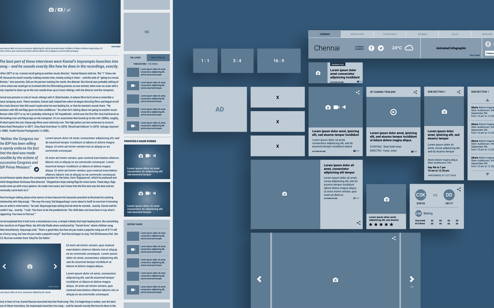
The second was to plan and design an extensive new information architecture (IA) for the site, which made finding information easy and predictable.
After extensive discussions and finalisation of the IA we moved to designing a detailed wireframe of every page to map the user flow, simplify navigation, making sure that the reader gets value for his two clicks and increasing page / site stay with the right editorial and design interventions.
Content
Key sections were identified for better personalisation possibilities in future and new ones were added accordingly.
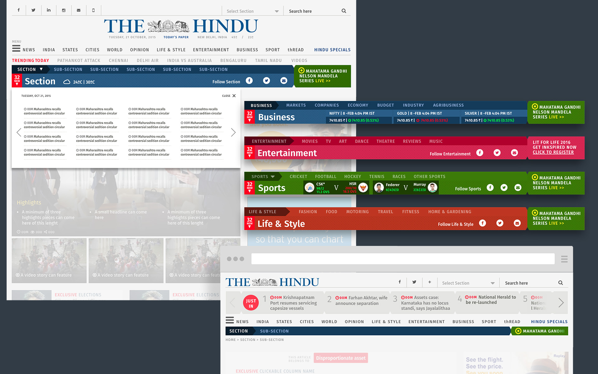
The entire site was devised in horizontal sections to give a reader a distinct feel of zone and allows the reader to hide, follow or go to a more detailed landing page of the that section right away.
Handy navigation via sticky header, correct placement of subscription requests and proper placement of the social media sharing options will ensure that while the reader is on the page, any of these impulses are quickly catered to. Therefore making personalisation and social media referrals more active and probable.
Home everywhere
Section pages, topic pages and artsicle pages were treated and given the same importance as the home page. Since now a reader encounters a site from either social media, email referrals or by organic search, each page and section were designed and planned to be a complete experience.
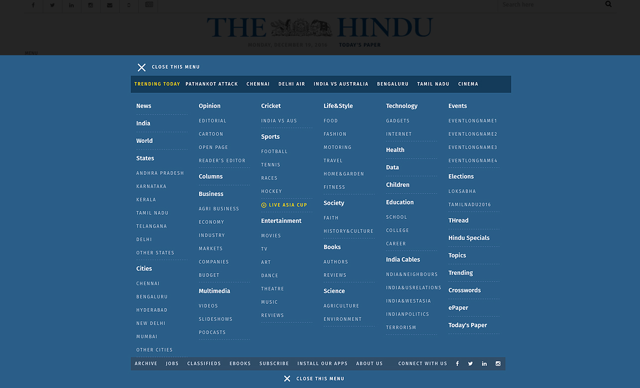
The main masthead is designed to help a reader access any material on the site in a neat, predictable and very accessible manner. It also allows the editorial team to highlight a key trending topic, which has special coverage for a reader to be attracted and informed.
As more and more readers come from social media or email referrals to an artsicle, the same masthead in articles pages also now allows all the JUST IN artsicle headlines to appear. This makes the page give a complete 360 degree view of the site content at a glance.
Form follows content
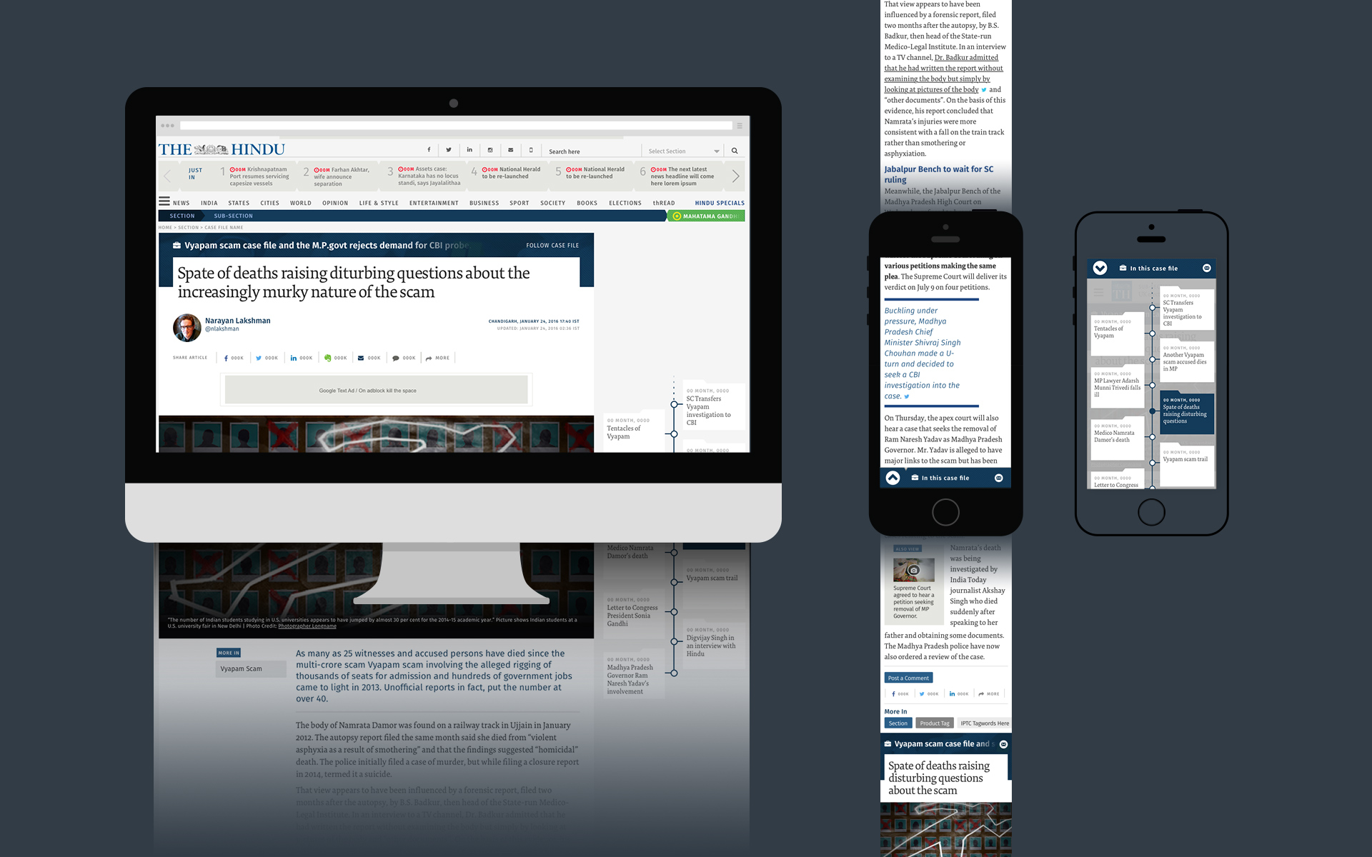
To help The Hindu establish itself in the minds of new readers and old patrons as a creator of superior, diverse content, we devised a section called Hindu Specials. it will house four types of special content that the old site failed to highlight and display. Packages, Series were old specials, to which we proposed, and added Case Files and a Microsite.
These specials will allow a reader to choose a longform topic being investigated and subjects of cultural importance to follow and get all news related to it in one place. It cements the reader’s loyalty to the site for its content, and the value the site puts on its information display.
As The Hindu is a paper of record for elections and data, microsites would attract readers, researchers and advertisers looking for current and accurate news in one place.
The same template should be used for big happenings across all categories like sports, entertainment, environmental, social issues.
Visual Design
Cardified news headlines and lede text approach, where each headline has the possibility of being individually shared on social media, makes it a compelling design.
The specials are treated differently to draw attention and stand out. The right hand side column houses the more important articles, trending and editor’s choice of the certain section, making the whole horizontal section, rich, complete and satisfying as a unit for the reader.
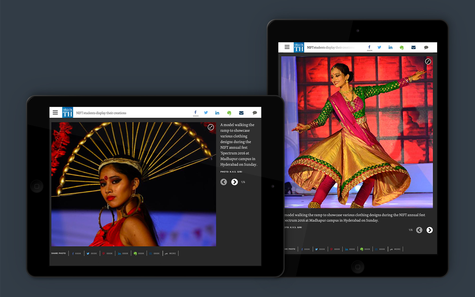
The mobile view was simplified for better navigation and user engagement while keeping the key decisions same across devices.
Engaging widgets for stories were device and entertainment and sports were given a livelier look by colour change and dynamic carrousel design.
Typography
Two fonts were chosen to balance the Hindu personality with the need to cue change. Fira Sans and Modern Sans serif typeface was chosen to highlight current and happening news. Larger font sizes, bolder and the occasional use of colour are signals its new relevance for new Hindu readers.
This was juxtaposed with Tundra, a serif font, designed lately for great reading experience for the web and mobile devices. Its larger x-height and yet the humanist touch of old school serif fonts made it the right choice for this site.
All font decisions across the site were taken after testing and keeping in mind great readability on desktop and mobile both.
Given the constraint of designing within a 1000 px width the right choice of typeface was crucial to allow great throw and a smooth reading experience.
energising the online presence of India’s most trusted daily newspaper
The 138 year old Hindu is among India’s most venerated dailies. An early adopter of the web, the site no longer reflected its young readership’s idea of a newspaper web front. A more contemporary and capable site was needed to work well across devices: on mobiles, the choice of medium for the young, as well as on large screens.
content discovery is a key design goal
We along with the editorial team, plotted the new IA and UX for the site, allowing easy and intuitive ways of content discovery. Doing justice to The Hindu standards of reportage and content meant detailed user flows and effective navigation to reward the reader with relevant content at every click. This eventually resulted in an increase in page and site stay.
amplifying different types of content
New sections were introduced to amplify Hindu’s rich bouquet of content. ‘Hindu Specials’ was created as a curated section of editorial articles with a longer shelf life. Packages, Series, In Depth and Microsites were given special treatment and visibility to enhance reader engagement. Entertainment and Sports sections were made livelier by a change in colour, dynamic carousel design and engaging widgets for stories
every page a Home Page
Each page allows a 360 degree view of the entire site’s content, attracting the reader’s attention and nudging him to explore further. The masthead area highlights key trending topics for instant access. Navigation via sticky headers, appropriate placement of subscription requests and social media sharing responds to reader’s impulses. The design is planned and developed to work seamlessly from a desktop to a mobile.
Partner-in-charge & UI/UX Director Lisa Rath | Tech Lead Vikrant Gupta | UI Concept Kshitij Tembe | UI/UX Development Kshitij Tembe, Niloy Kundu, Avi Agarwal | Developer Vikrant Gupta, Salman Raza | Backend development & Maintenance Escenic, The Hindu | Alternate Design Concepts Niloy Kundu | Project duration 10 months