Background
The clients’ offer is corporate training for leadership development. They help teams of top management to function better in terms of realizing how interpersonal relationships and positive psychology can improve business outcomes.
Problem Space
The clients’ excellent reputation as trainers was anchored on their experiential methods, using the outdoors as a training ground. But this business which focuses on top management which required consulting skills with a different flavour. A new brand was needed.
Solution space
The brand would have to leverage the known strengths of the promoters but ignore their outdoors past. This re-invention took the form of an identity and an initial, defining piece of communication.
Naming
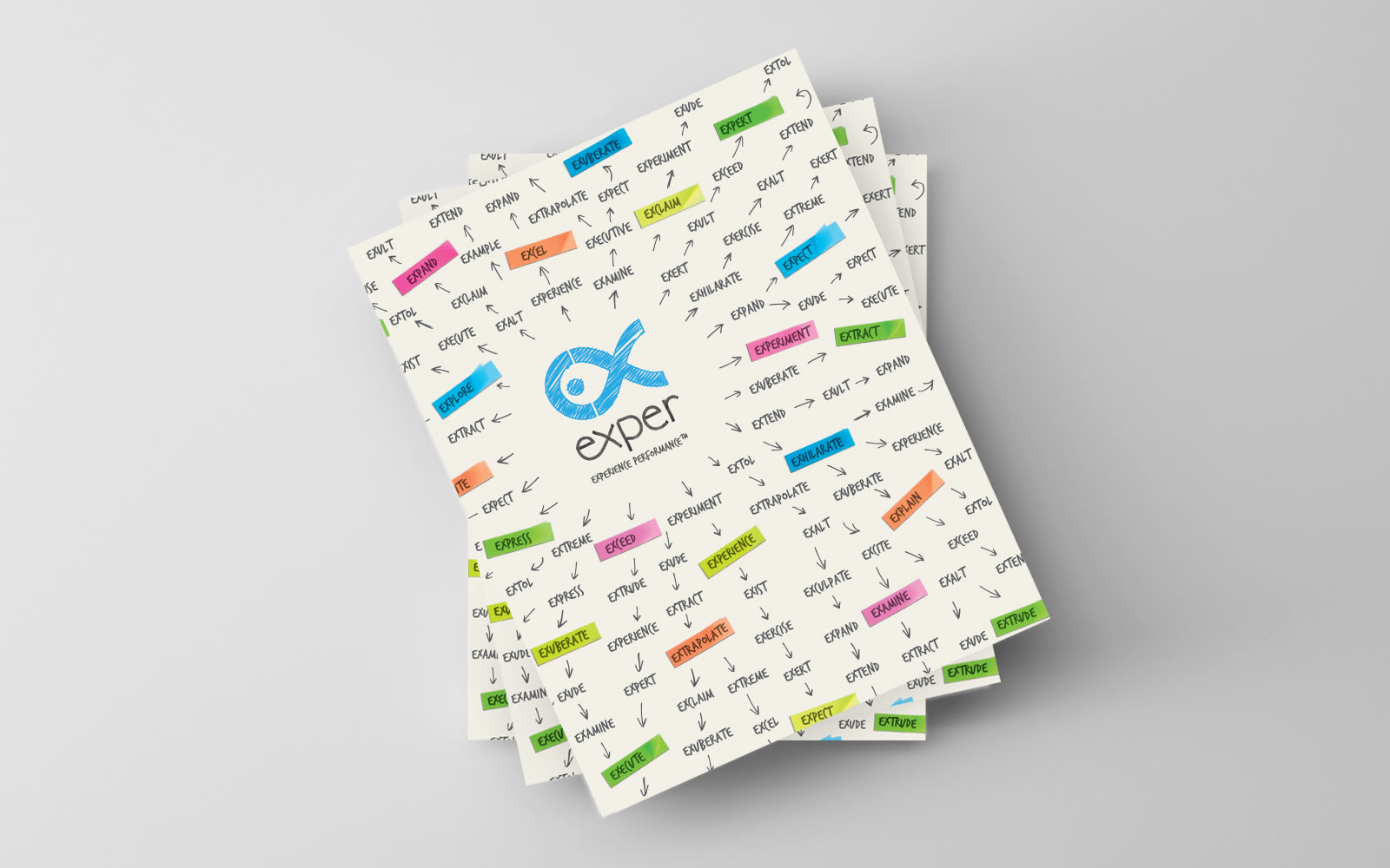
We developed the name Exper. It’s a word fragment common to many words: expertise and experience being among them. The line “Experience Performance” captures the proposition. Phonetically, its short length and vowel ending give it the lightness of touch that’s in keeping with the training style espoused by the client.
Visual Identity
The symbol visually spells out “ex” and an incomplete infinity. The suggestion of a fish hints at the outdoors, but can be narrated as the individual in a shoal of colleagues. The wordmark also carries a hint of the symbol’s flavour so that it can be used independently in certain defined cases.
Communication
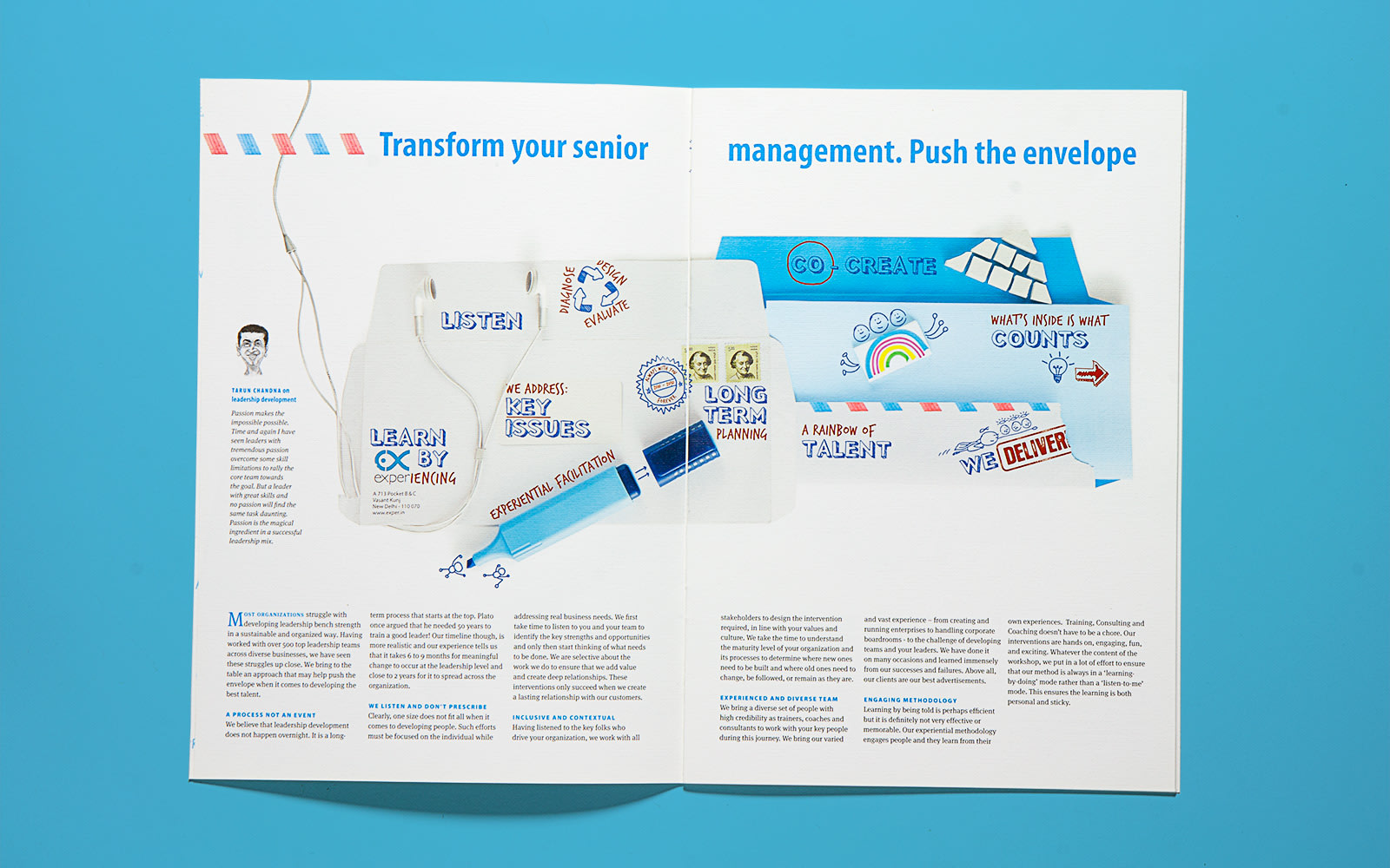
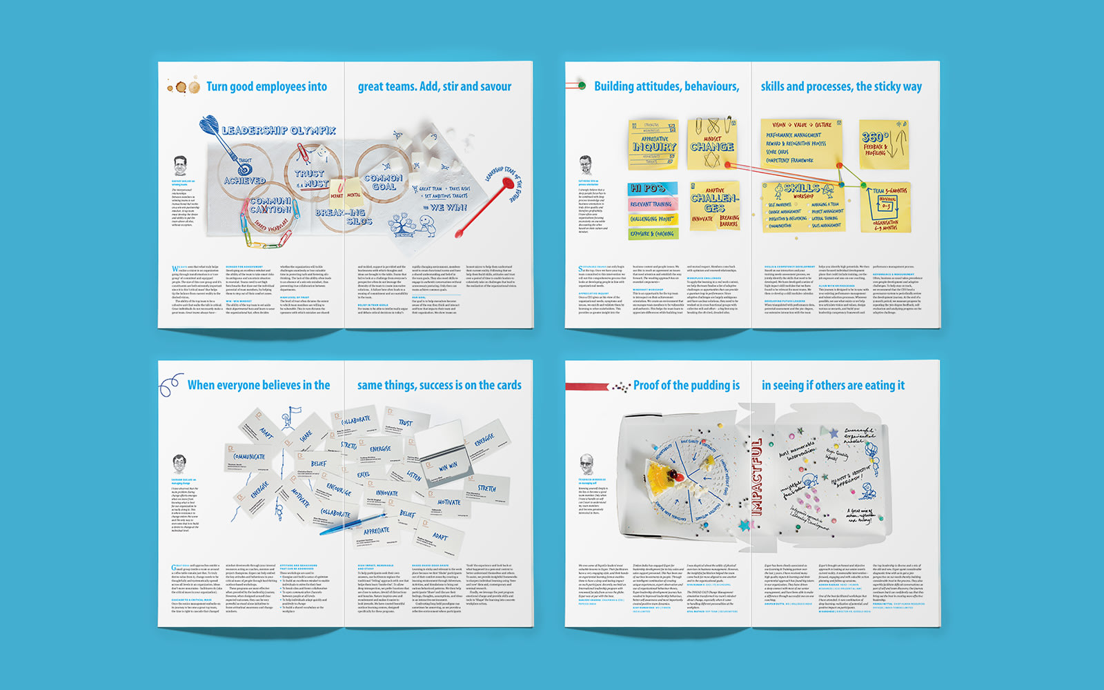
A defining brochure lays out the new value proposition and product offering. It goes deep into the subject of team functioning, using stationery from the office desktop as vehicles for handwritten text and sometimes as metaphor for dysfunctions, benefits, goals and methods. People sense the authentic personal style of the team, which dispenses with the authoritative tone beloved of consultants, preferring a human, non-academic and a sleeves-rolled-up attitude to work.
experience, expertise and a light touch. Performance is a people thing
The client is in the business of corporate training for leadership development, anchored on their experiential methods, using the outdoors. Introducing a new programme focussed on top management, it required consulting skills with a different flavour. And a new brand was created.
known strengths, without the outdoor past
Created the name Exper. A word fragment common to words like ‘expertise’ and ‘experience’. The line “Experience Performance” captures the proposition. The symbol visually spells out “ex” and an incomplete infinity. Suggestion of a fish hints at the outdoors but can be narrated as the individual in a shoal of colleagues.
authentic personal style: human, non-academic
The brochure lays out the new value proposition and product offering. It goes deep into the subject of team functioning, using stationery from the office desk as vehicles for handwritten text. Dispensing with the authoritative tone beloved of consultants, preferring a human, non-academic and a sleeves-rolled-up attitude to work.