background
Ashima-Leena are a well-regarded bridal couture duo, with a reputation but without branding. The need for it arose with the entry of the next generation into the business, and the resulting need to brand a new pret line. Ashima Leena’s expertise is the incorporation of applied textile elements in the traditional wedding apparel design of India.
The new label was a modulation of the ‘mother’ brand. It promoted a more classic version of the same aesthetic, but also drew on other Asian themes to create a composite aesthetic with a new, modern-minded woman in mind. Because the new brand would be in retail and therefore more visible, it would amount to a new identity for the whole enterprise. Thus two related brands were envisaged.
naming
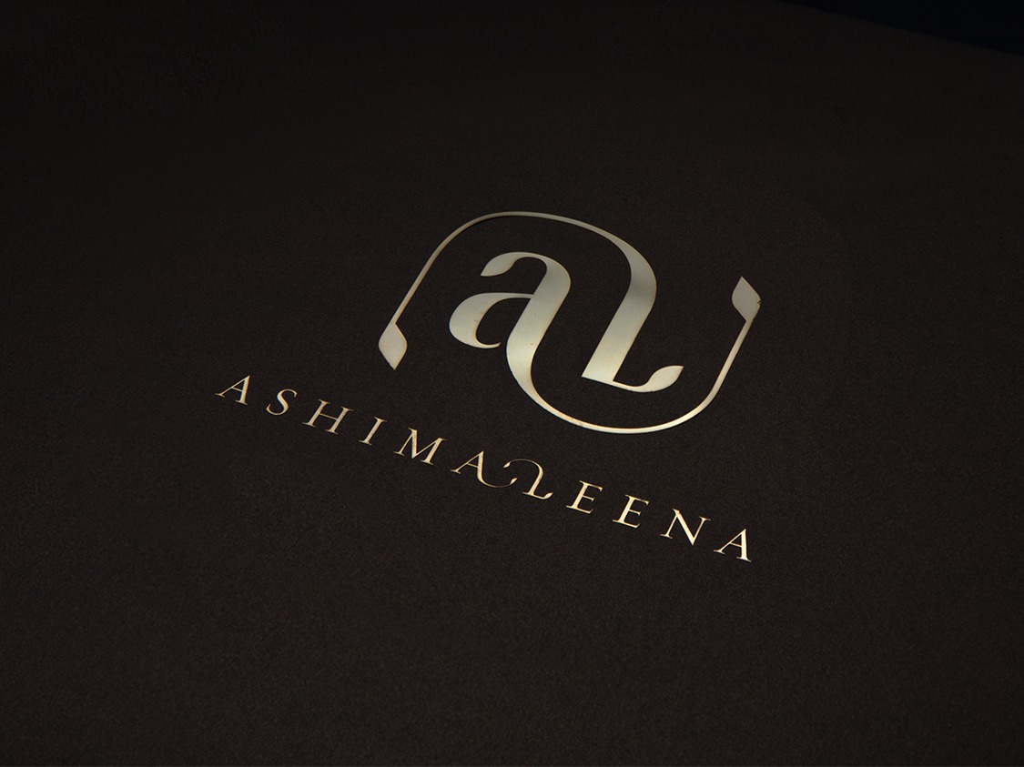
We used the abbreviation ‘AL’ for Ashima-Leena, as a root, naming the pret business ‘Alias’. The name signals the Ashima-Leena connection in a witty way via the name (the pret line is alias of the original in spirit and name but not in form).
design
AL stands out as a label whose aesthetic is based on Indian fabric tradition, but in its pret form has a contemporary silhouette. The design simply expresses this.
The design is built around a leaf motif leaf drawn from the Mughal fabric tradition, which is predominant in North India. The motif propagates into a multitude of forms, These forms abound as if in a garden, in sales materials, collaterals, interiors and stationery. Their culmination is in the tree of life on the floor of the store.
fashion gets fusion; mother brand gets a daughter brand
Ashima-Leena is a well-regarded bridal couture duo. Ashima Leena’s expertise is the incorporation of applied textile elements in the traditional wedding apparel design of India. With the entry of the next generation into the business, there arose a need to brand a new pret line.

the new label: a modulation of the ‘mother’ brand
A more classic version of the same aesthetic but drew on other Asian themes to create a composite aesthetic with a new, modern-minded woman in mind. Because the new brand would be in retail and therefore more visible, it would amount to a new identity for the whole enterprise.
‘al’ for ashima-leena, as a root, we named the pret business ‘alias’
The name signals the Ashima-Leena connection in a witty way via the name (the pret line is alias of the original in spirit and name but not in form).


design draws on indian fabric tradition with a contemporary silhouette
The design is built around a leaf motif leaf drawn from the Mughal fabric tradition which propagates into a multitude of forms. These forms abound in sales materials, collaterals, interiors and stationery. Their culmination is in the tree of life on the floor of the store.


partner-in-charge & creative director itu chaudhuri | art director lisa rath | design concept richa bhargava | design development lisa rath, richa bhargava, neha wahi | production richa bhargava, neha wahi | space design studio lotus | webpage photographer parikhit pal, lakshman anand | project year 2007 | project duration 6 months