Background
PeopleStrong, a human resources technology company had recently started on its mission to be a true product, rather than a services company. But PeopleStrong’s strong recognition in recruitment, a service-model business stood in the way. The recruitment business was a substantial contributor to revenues, and depended on the PeopleStrong name, but its association with services hurt the prospects of its HR software Alt, often marketed to the same clients.
We were called in to assist with restructuring the brand architecture to give clarity to PeopleStrong’s offerings and allow the software product business to express itself.
Brand Architecture
A clear architecture allows customers and other audiences to readily associate the names they encounter—brands, families, sub-brands, and the like—with product or services attributes. Associating two products under one name, or under two separate brands, have advantages and disadvantages. The process required us to understand the customer’s relationship with each PeopleStrong entity and analyze the implications.
Strategy
Our primary goal was to unshackle the product business, while giving existing RPO products their due. At the same time it was essential to preserve the PeopleStrong name—it held considerable weight in the HR industry—and protect its image as a true blue product company.
Solution
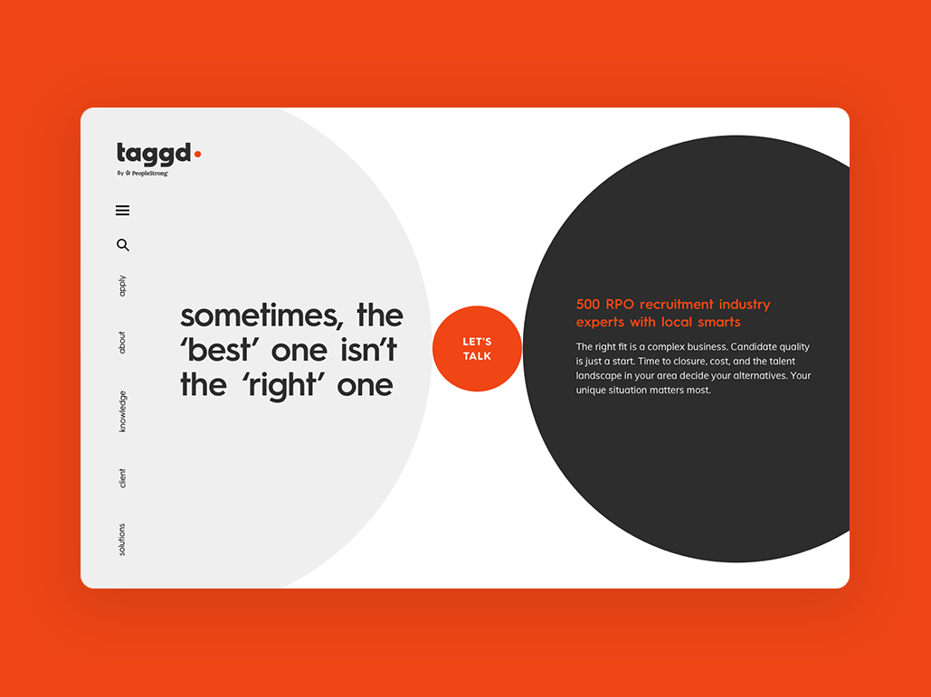
A brand architecture specifies the relationships between PeopleStrong and Alt and other brands. It specifies which names dominate in communication, how they appear visually, when they are spoken of together and when not; and what communication resources they share. PeopleStrong appears as the signatory to Alt communications, as an endorsing parent. All communication for Alt led with ‘PeopleStrong’ monicker. The company website, peoplestrong.com, refers to the corporate brand while also hosting a product website on PeopleStrong Alt. The site would eventually house future tech divisions and products. The recruitment business appears under its own new name, and its own communication resources, with a weaker endorsement from PeopleStrong.
new brand architecture for an HR tech company
PeopleStrong recently started on its mission to be a true product, rather than a services company. But PeopleStrong’s strong recognition in recruitment, a service-model business stood in the way. We were called in to assist with restructuring the brand architecture to give clarity to PeopleStrong’s offerings and allow the software product business to express itself.

plotting the relationship between PeopleStrong, Alt, and the other brands
It specifies which names dominate in communication, how they appear visually, when they are spoken of together and when not. A clear architecture allows customers and other audiences to readily associate the names they encounter—brands, families, sub-brands, and the like. The process required us to understand the customer’s relationship with each PeopleStrong entity and analyze the implications

unshackling the product business, while giving existing RPO products their due
We discovered it to be our primary objective, but at the same time it was essential to preserve the PeopleStrong name—it held considerable weight in the HR industry—and protect its image as a true blue product company.

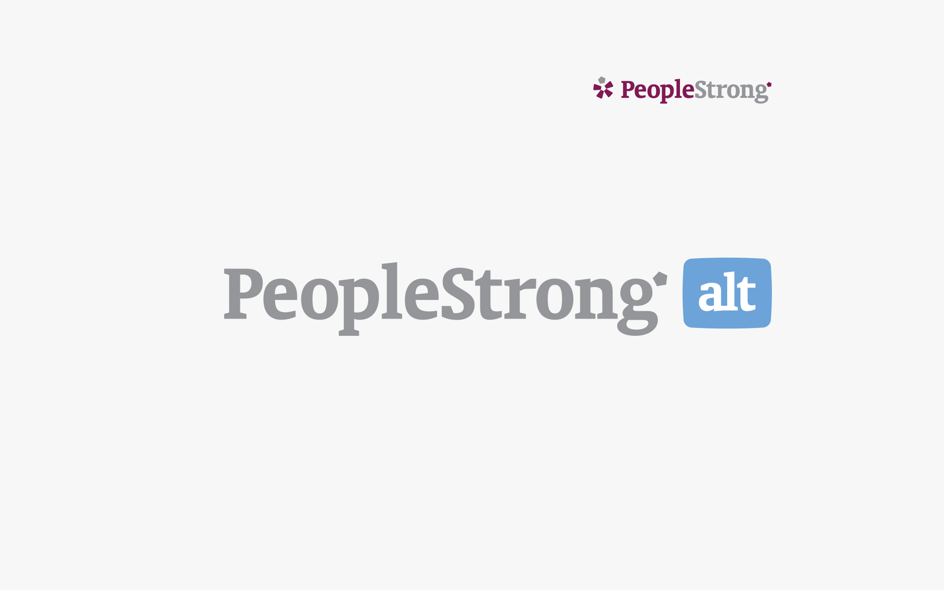
brands with a product character carry PeopleStrong tag, and a weaker link with RPO
PeopleStrong appears as the signatory to Alt communications, as an endorsing parent. Peoplestrong.com refers to the corporate brand while also hosting a product website on PeopleStrong Alt, and would eventually house future tech divisions and products. The recruitment business appears under its own new name, and its own communication resources, with a weaker endorsement from PeopleStrong.


