
Background
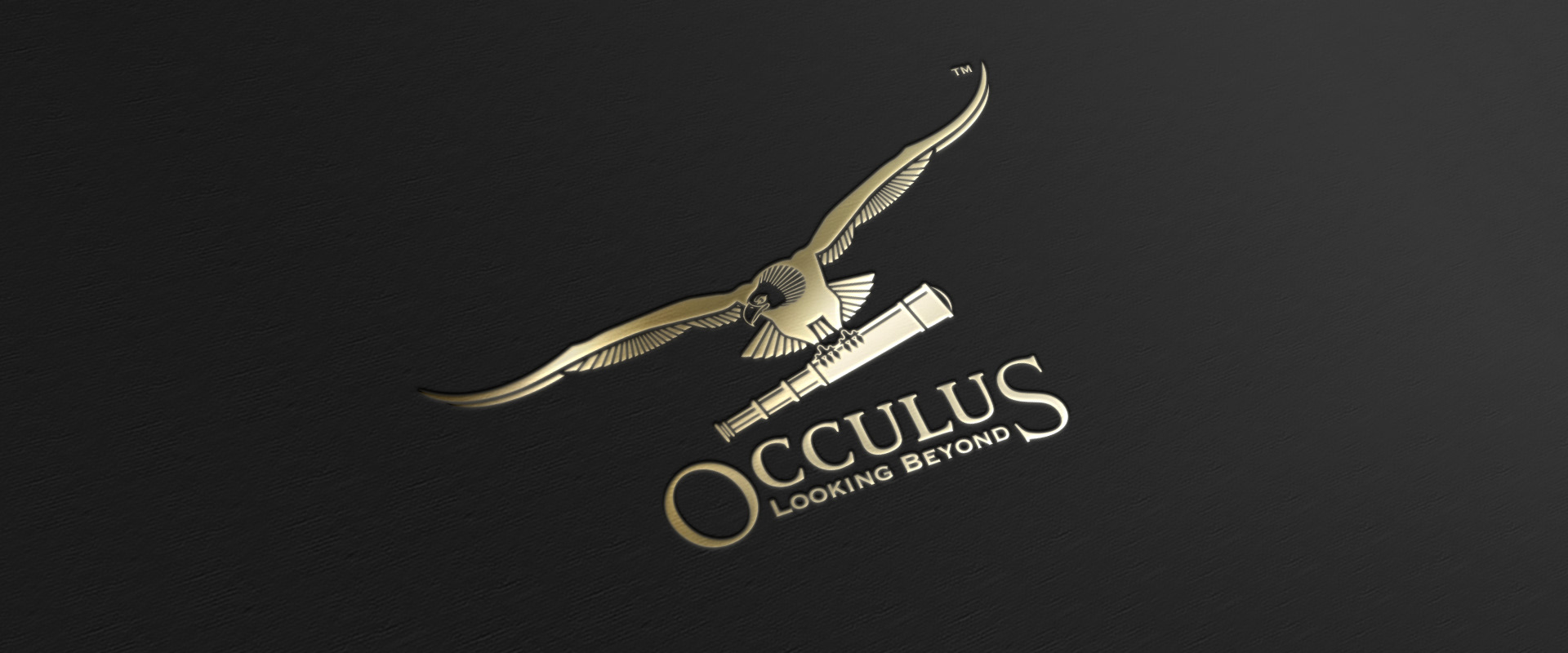
Occulus is a Singapore-based coal trading company, and is the second such firm from the promoter’s stable. As with the first, management is highly concentrated in the promoter’s hands and its personality is dictated by the promoter’s personal style, which is unpredictable and eclectic.
Discovery
Occulus is open to any business where change can bring profit to the company and to society. It is thus a pure corporation, driven only by its entrepreneurial values rather than those of a business domain. Thus its visual identity was to have no connection to coal. A second requirement: incite curiosity and stoke a memorable conversation.
Strategy
Occulus is an altered spelling of ‘oculus’ (a round or eyelike opening; in Latin, an eye). The name confirms the promoter’s belief in the power of a broad, yet vivid vision. We interpreted the company’s entrepreneurial style to yield the brand idea ‘Opportunity’. It resonates well with the name, in the sense of ‘seeing opportunity everywhere’.
Solution
The final solution achieves coherence with the promoter’s business ideal and personal style. The symbol creates a memorable talking point. In contrast to the bland way the contemporary diversified corporation is imagined, Occulus is quirky and individualistic, even a touch mysterious, as seen from its classic, somewhat retro personality via rendering, colour and typography.
Seeing opportunity everywhere, and why the diversified corporation doesn’t have to be boring
dictated by the promoter’s personal style, which is unpredictable and eclectic, ‘occulus’ is open to any business where change can bring profit to the company, and to society. A pure corporation, driven only by its entrepreneurial values rather than those of a business domain. The identity is meant to incite curiosity and stoke a memorable conversations

the power of a broad, yet vivid vision
We interpreted the company’s entrepreneurial style to yield the brand idea ‘Opportunity’. It resonates well with the name, in the sense of ‘seeing opportunity everywhere’. The symbol creates a memorable talking point. Occulus is quirky and individualistic, even a touch mysterious, as seen from its classic, somewhat retro personality via rendering, colour and typography.

Partner-in-charge & Creative Director Itu Chaudhuri | Art Director Richa Bhargava | Design Concept & Development Kshitij Tembe | Alternate Design Concepts Niloy Kundu, Saumya Kharbanda, Kshitij Tembe | Project duration 2 months