Background
Haldiram’s (sometimes called Haldiram’s North as a result of a family division) is a Rs 1500 crore iconic brand that pioneered the packaging and distribution of bhujia and traditional savouries. It has played a huge role in modernizing this category, changing the consumption and purchase patterns among urbanizing Indians. The packaging kept them fresh longer, while its restaurants served these street delights with hygiene and comfort.
Business need Since 2002, Haldiram’s has been seeking to expand its product portfolio. It thus needed to expand its audience, and aim at a different mindset from the one they already addressed. The search was for the more urbanized and international-minded families.
Problem
Space Haldiram’s were defined by their core product: 70+ varieties of traditional savouries. They were seen as authentic and traditional (in a positive way), but their ornate, garish personality didn’t address the rapidly urbanizing audiences. The task at hand was increased engagement with the existing customer base with an updated offering while also catering to the increasing urbanisers who sought modernity along with the traditional.
Solution
Space Evoke the unrestrained pleasure of these foods in a new and contemporary way, completely repackaging Haldiram’s decades old heritage. For their new audiences, Haldiram’s to project modernity, innovation, smartness and even fun. Since 2004, we worked with Haldiram’s on extending their portfolio beyond their prototypical products. We undertook naming, identity and design. The branding mapped to the architecture in four ways.
> Generic naming: Familiar, typical Haldiram’s foods: core portfolio (not tackled by us), Chips, Papad, chaats, Roasted Nuts, sweets
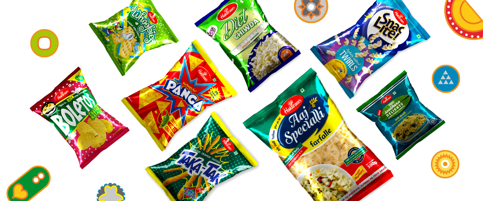
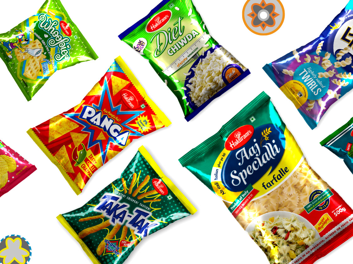
> Distinct brand names: Innovative extruded products, with clear personalities: Boletos (reticulated chips), Panga (Indian nachos), Whoopies (shaped fries), Fingos, Ready to Eats
> Descriptive names: Familiar Indian products but not parts of prototypical Haldiram’s portfolio with distinct sub-cultural markers: Southern Delights (South Indian savouries), Baked Bites (biscuits with an Indian bakery touch), Summer Coolers
> Sourced non-traditionals: Aaj Specialli (Italian cooking pasta for the Indian housewife), Take 3 (popcorn), Royal Temptations
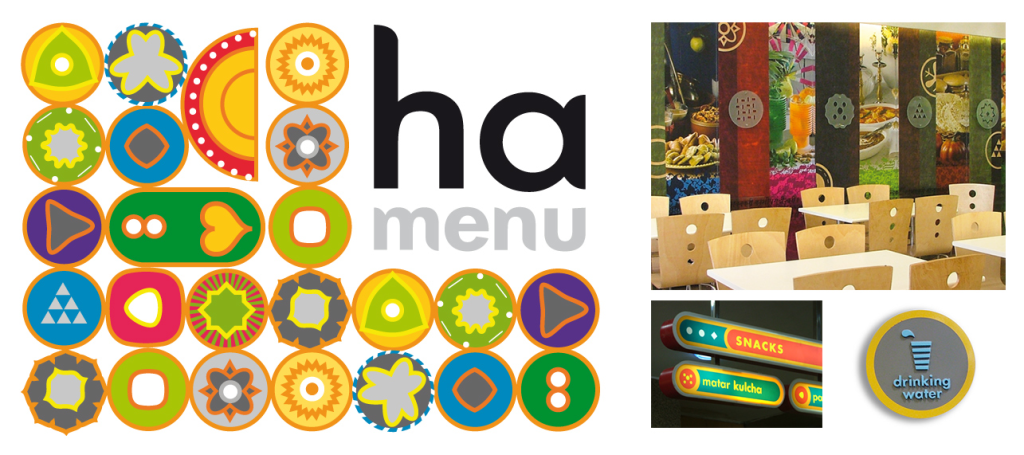
We also worked on the restaurant identity to depict the new character of the brand. We depicted them in a playful, abstract, intensely colourful, and seemingly endless set of graphics. The system allows for various families of products to be recombined in random ways. The identity was devised with bespoke lettering which was used to create the signage system.
taking haldiram’s to a new phase of its brand journey
Haldiram’s is a Rs 1500 crore iconic brand that pioneered the packaging and distribution of bhujia and traditional savouries in India. Since 2002, Haldiram’s were seeking to expand their product portfolio by addressing a new set of audiences, more urbanised and international-minded families.
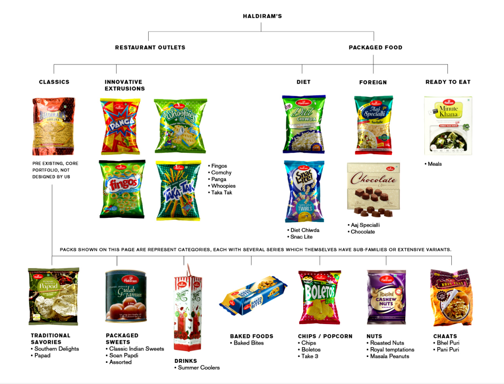
repackaging haldiram’s decades old heritage
Haldiram’s was defined by their core product—70+ varieties of traditional savouries. But their ornate and garish personality didn’t address the rapidly urbanising audiences. Haldiram’s had to project modernity, innovation, smartness, and even fun. Since 2004, we worked with Haldiram’s on extending their portfolio, through naming, identity and design.

generic naming, and distinct brand names
Generic naming: Familiar, typical Haldiram’s foods—core portfolio (not tackled by us), Chips, Papad, Roasted Nuts, chaat, sweets. Distinct brand names: Innovative extruded products, with clear personalities—Boletos (reticulated chips), Panga (Indian nachos), Whoopies (shaped fries), Fingos, Ready to Eats

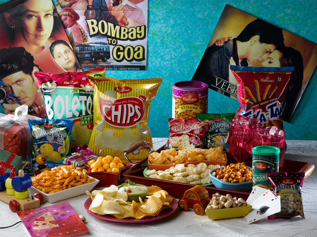
descriptive names, and sourced non-traditionals
Descriptive names: Familiar Indian products with distinct sub-cultural markers—Southern Delights (South Indian savouries), Baked Bites (biscuits with an Indian bakery touch), Summer Coolers. And Sourced non-traditionals: Aaj Specialli (Italian cooking pasta for the Indian housewife), Take 3 (popcorn), Royal Temptations
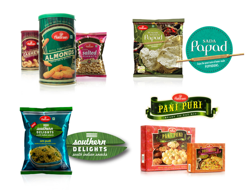
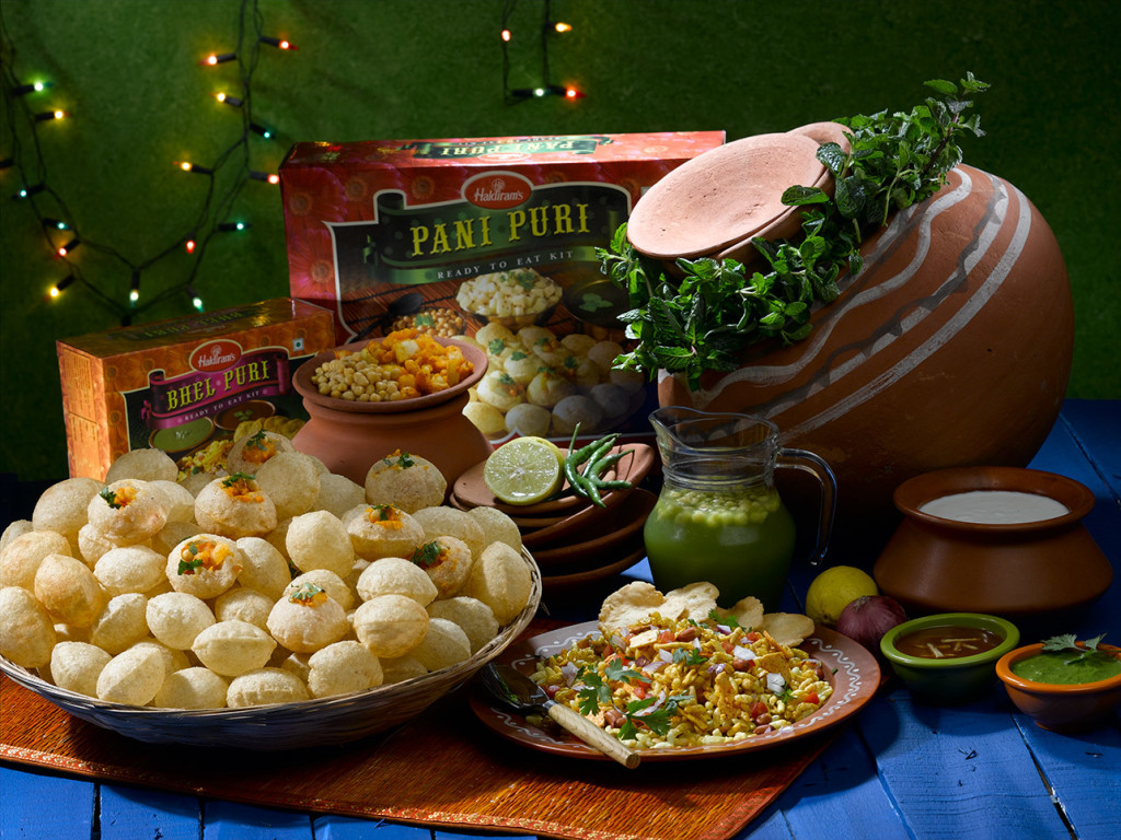

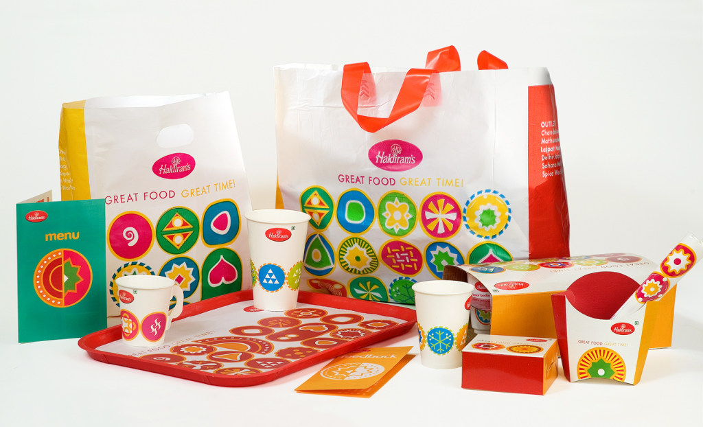
playful, abstract, and intensely colourful
A new restaurant identity to depict the new character of the brand. The system allows for various families of products to be recombined in random ways. The identity was devised with bespoke lettering that was used to create the signage system.
Partner-in-charge & Creative Director Itu Chaudhuri & Lisa Rath | Design Concept, Development & Production Manav Rastogi, Amisha Khemani, Geetika Arya, Richa Bhargava, Simrat Singh, Avantika Agarwal, Neha Wahi, Anjana Nair
