Background
Inme is a pioneer in outdoors based learning, delivered though 16 countrywide summer camps. Since 2006, 29,000 children have been on one or more.
Inme started to face competition from adventure companies, who provide activities without the wholesomeness that is Inme’s hallmark. The muddy comparison posed a risk: a loss of identity. When meaningful differentiation became a necessity, Inme approached us to showcase the INME way.
Strategy
At INME, the outdoors is not a retreat but a learning experience. It’s built on principles of experiential education combined with the power of outdoors to make children ‘Life Ready’. At Inme, participants experience varying degrees of graded danger, and realize the ingredients of success lie “in me”. It’s about experiencing of “I did it” moments not the activities per se.
Contrary to the “summer camp” practice of simply using location and activity images with a calls to action in our communication, we adopted the voice of a child. This voice—spontaneous, busy, even messy—marks the experience as owned by the child, not the parent.
Design
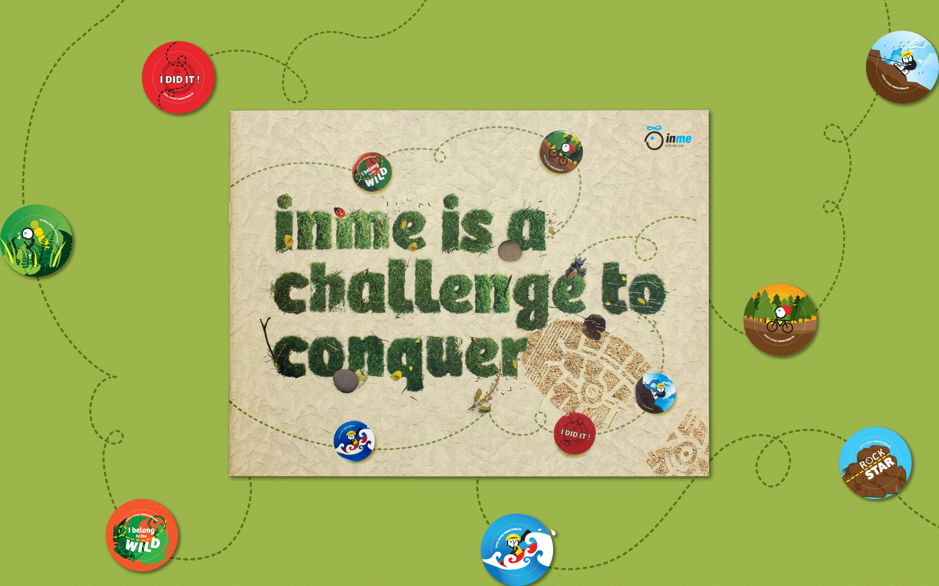
The inme style emphasizes the rawness and unpredictability of the outdoors, an experience that creates the emotional arousal necessary for permanent learning. The visual treatment of the brochures is an ode not only to the outdoors, but also to the joy of doing.
It’s tactile, textured, craft oriented, hand-made, and real— with an irregularity that evokes the ordered chaos of the outdoors. The distressed, rugged look given to typography, images and textures complemented by hand drawn illustrations vivify INME’s spirit of doing, evoke a thirst for adventure, the joy of exploring and the thrill of discovery.
Pictures of locations and action shots of participants, when used, are real, unposed, shot by outdoor instructors, often on mobile phones. They are interrupted with active, busy graphical devices. The ‘boing’, as the inme logo-figure is affectionately called, joins in the fun.
The brochures ask parents to break the mould of synthetic, packaged living. They challenge them to visualise a life of physical engagement for their wards— not as tourists but as a child immersed in the outdoors.
Impact Vivid yet Informative, the brochures effectively complemented the in-person sales teams. They highlight INME’s offerings, inspire, reassure and help make informed decisions. Most of all, the result clearly distanced INME from the competition, giving it an inimitable difference.
marketing communication for outdoor learning programs
Inme promises personal development through outdoors-based learning, for 9-17 year olds. In its 10th year, other outwardly similar ‘adventure camps’ threatened to blur Inme’s difference in the market. When meaningful differentiation became a necessity, Inme approached us to showcase the Inme way.


making children ‘Life Ready’
Outdoors is not a retreat but a learning experience at Inme. Built on principles of experiential education; participants experience varying degrees of graded danger, and realize the ingredients of success lie “in me”. We adopted the voice of a child—spontaneous, busy, and even messy—marks the experience as owned by the child, not the parent.


an ode to the outdoors, and the joy of doing
The Inme style is tactile, textured, craft oriented, hand-made, and real— with an irregularity that evokes the rawness, unpredictability, and ordered chaos of the outdoors. The distressed, rugged typography, images and textures complemented by hand drawn illustrations vivify INME’s spirit of doing, a thirst for adventure, the joy of exploring and the thrill of discovery.


not tourists, but immersed in the outdoors
Pictures of locations and action shots of participants are real, un-posed, shot by outdoor instructors. Interrupted with active, busy graphical devices. The ‘boing’, Inme logo-figure, joins in the fun. The brochures ask parents to break the mould of synthetic, packaged living and to visualise a life of physical engagement for their wards.

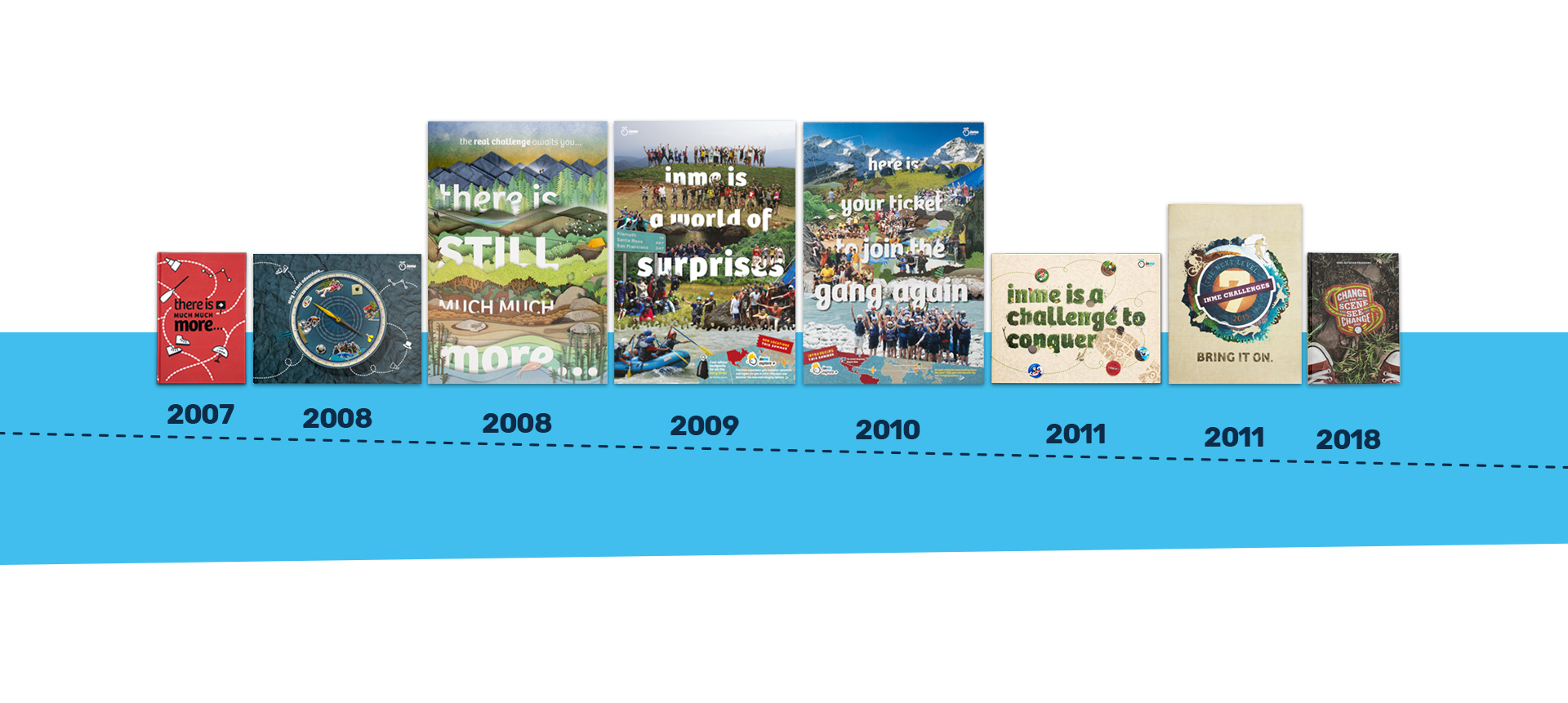
(2007) partner-in-charge & creative director itu chaudhuri | design development neha wahi, anjana nair, lisa rath
(2008) creative & art director itu chaudhuri | design concept & development neha wahi, richa bhargava
(2009) creative & art director itu chaudhuri | design concept & development neha wahi
(2010) creative & art director lisa rath | design development joyita banerjee
(2011) creative director itu chaudhuri | art direction richa bhargava | design concept richa bhargava | design development vrinda bhageria, richa bhargava
(2018) creative director richa bhargava | design concept aashim raj | design development sonal singh, aashim raj | writer richa bhargava | alternate design concepts sonal singh, aashim raj