project-leadproject-lead
Prodapt website
projectProdapt website
clientprodapt solutions pvt ltd

background

Prodapt provides software services to the world’s biggest telecom companies. It writes, runs and maintains their systems. It also automates and digitizes their processes.

In the future, it wants to expand its client base beyond telcos to include digital service providers and tech businesses.

We were asked to give Prodapt a new voice that would enable this aspiration.

strategy

In the words of founder and CEO Vedant Jhaver, “make us look bigger than we are” to prospective clients; and “make us look cool” to prospective talent.

For that, Prodapt needed to talk about itself in an elevated manner. To appeal to companies beyond telecom, it would have to talk about the broader concerns of businesses, and people at large. It will have to move away from the language of technology.

Once crafted, this new voice should inform every aspect of Prodapt’s communication to both external (prospective clients and talent) and internal (employees) audiences. It should be woven into all major points of interaction between Prodapt and its audience, starting with its corporate website.

design

The slogan ‘Switch on the world’—a powerful statement of Prodapt’s place and purpose—kicks off the website. Prodapt connects the world of users to the world of services. It makes Prodapt immediately relevant as a strategic partner to an array of tech businesses.

The Prodapt triangle generates a grid, which along with the Prodapt red, lies at the heart of the visual style.

A modern typeface with a mechanistic flavour suits this kind of company well.

Thoughtfully picked images that allude to but never directly depict the nature and impact of Prodapt’s work add another element of interest.

service architecture

Prodapt needed to complement its new look with a new way of thinking about its services.

Prodapt’s service architecture has been understood and rationalized in consultation with sales and marketing teams. A group of five core services (renamed), with descriptions graspable by even a domain outsider, is the result.

We have rewritten case studies and white papers with a focus on de-jargonizing, and addressing broader business outcomes rather than tools, techniques and simple metrics.

Also, as a significant intervention, we have coached writers within Prodapt on how to stay true to this new way of writing about software.

employer branding

Attracting talent is addressed by a separate microsite that speaks to candidates in a relaxed, open manner about what Prodapt has to offer.

It brings Prodaptians to the centerstage, and highlights the impact of their work on everyday life of people. It tells stories of Prodaptians’ growth and character. It humanizes leadership. It leaves the candidate with a sense of awe.

Ultimately, it amps up Prodapt’s desirability as an employer.

impact

The change is much more than just cosmetic. This exercise has transformed Prodapt’s self – image and set into motion a cycle of positive change in how the company thinks and talks about itself.

Prodapt website

projectProdapt website
clientprodapt solutions pvt ltd

Based in Chennai, India, Prodapt provides software and services to the world’s biggest telcos and network equipment providers. Prodapt wanted to sell to a better class of clients, win larger contracts and attract the best talent. We were asked to give Prodapt a new personality for this journey, and to express it in a new corporate website. We were approached, in the client‘s words, to make them “look cool” to talent and “to make us look bigger than we are”. The new website would be the vehicle to express this new personality.

A higher purpose

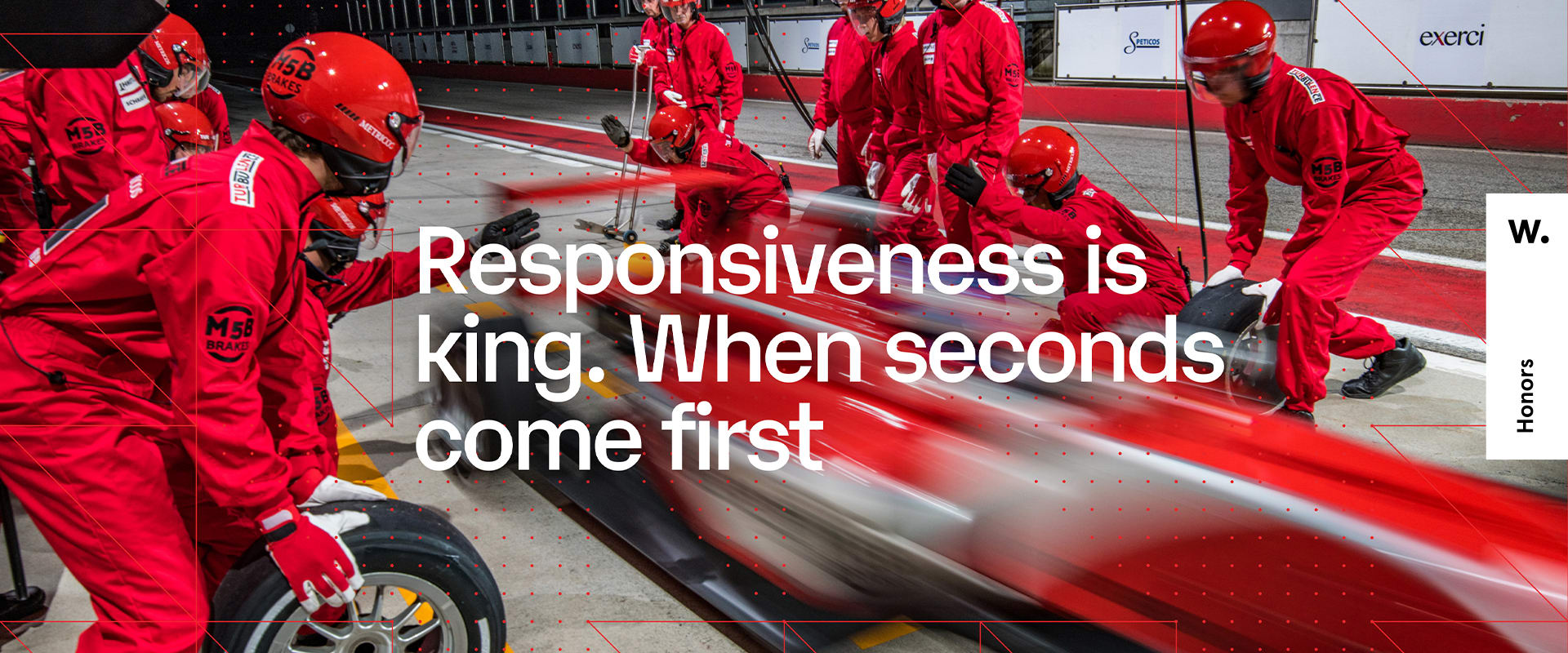
First, Prodapt needed to capture its aspiration in a narrative. We came up with ‘Switch on the world’. It immediately places Prodapt in a new light—a company that connects digital service providers to end users rather than just servicing telcos.

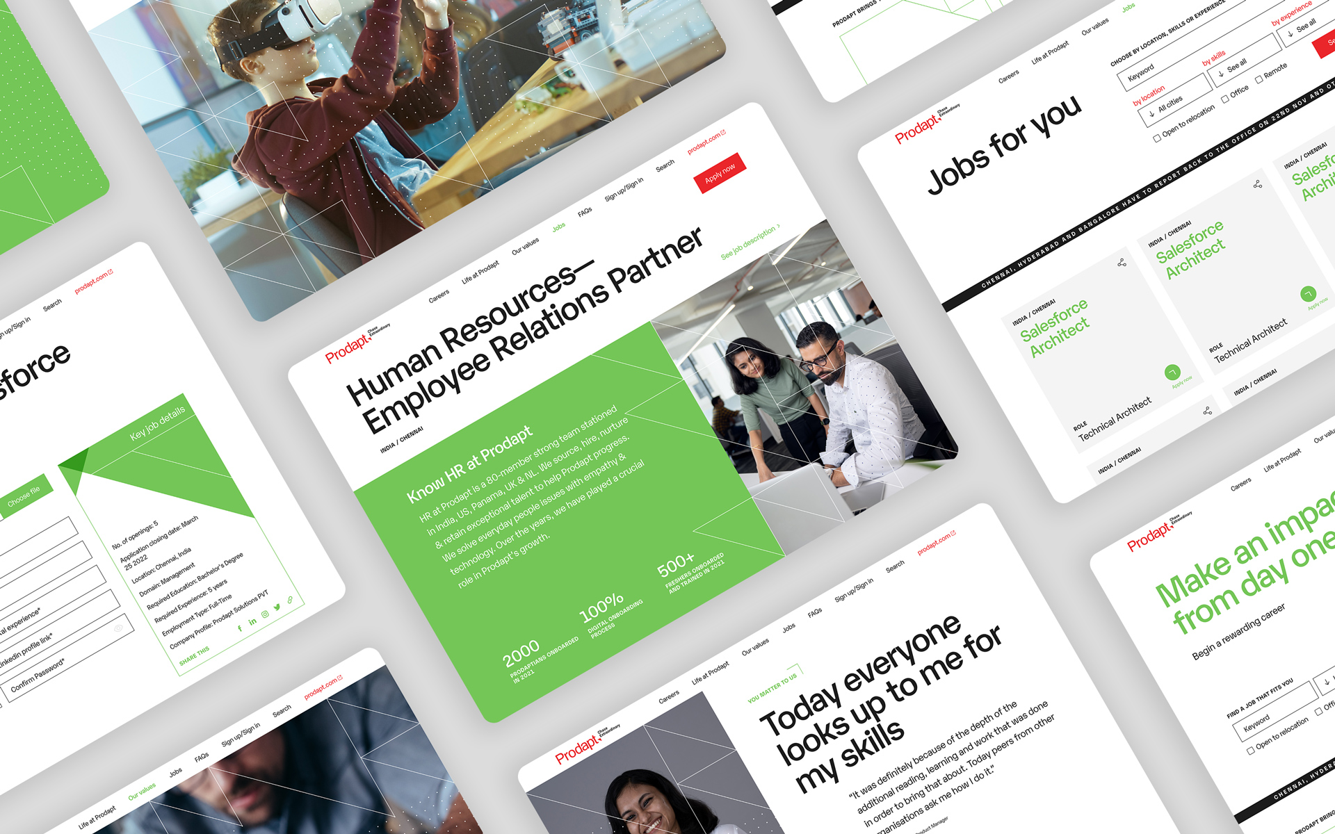
A sharp, self-assured character through visual design

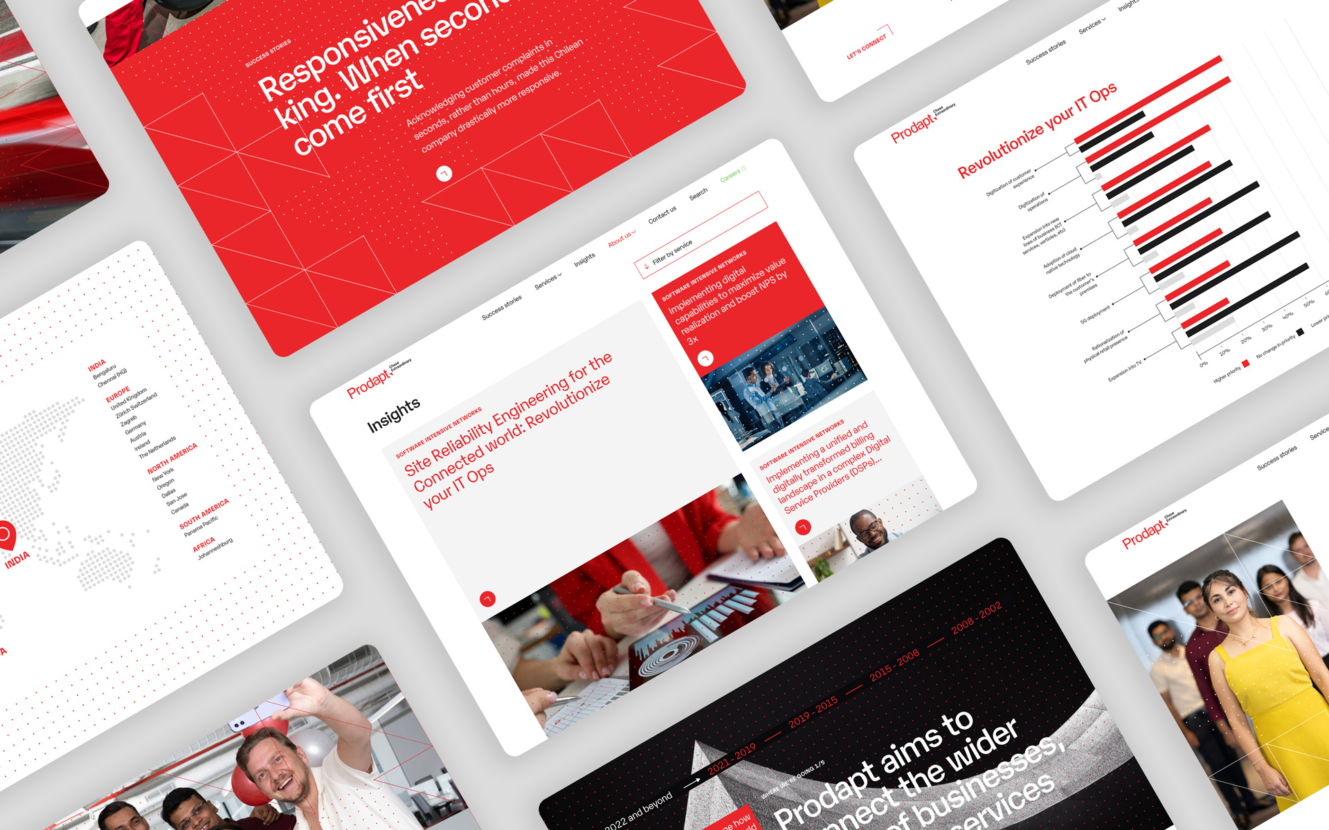
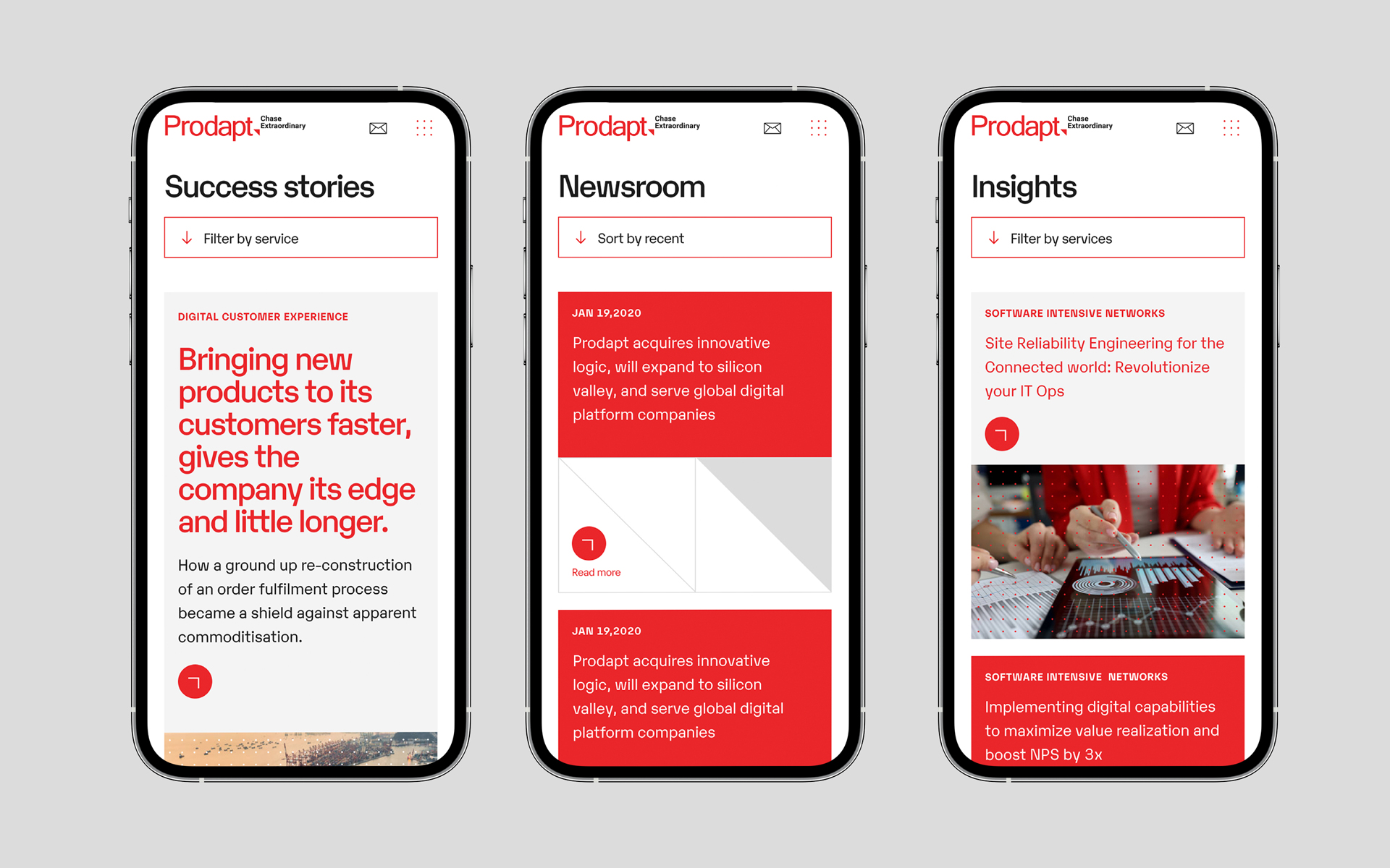
The grids signal order and reliability. Red imparts the spirit of a challenger. Built in micro-animations make for a smooth, rewarding scrolling experience. Applied, this language gives Prodapt the personality of a confident and ambitious leader, with an edge. The site also fully adapts to mobile and other devices of different sizes.

Writing about software for a wider world

Prodapt’s writing about its services was heavy on technical detail and jargon. It primarily addressed industry insiders. We rationalized their service architecture and renamed their core services. We then wrote descriptions that spoke of business benefits rather than on-ground mechanics.

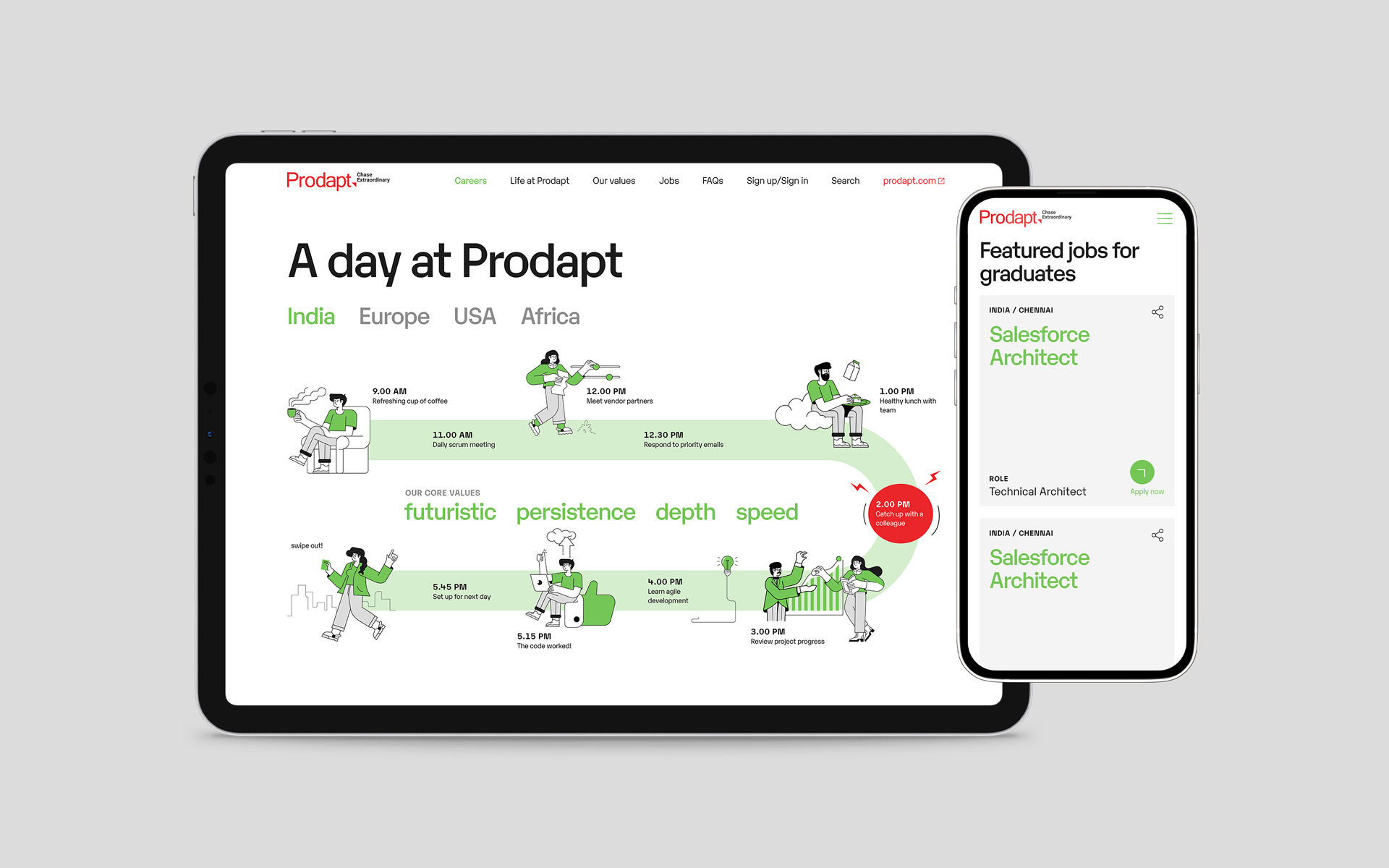
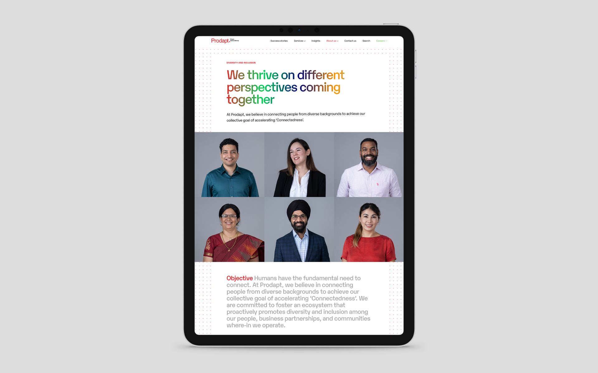
A position as a coveted employer

Prodapt wanted to consolidate its position as a leading employer in the industry. A new microsite speaks to candidates in an authentic and transparent way about life inside Prodapt, growth opportunities and benefits. It celebrates the value Prodaptians bring to the real world with their work. The visual language of the corporate site was carried forward with a different colour treatment. Green gives a fresher, lighter feeling to a platform designed for a predominantly young audience. It is also distinct from the red and gives the viewer visual relief.

team

Partner-in-charge Itu Chaudhuri | Creative Director Lisa Rath | Design Concept Ritu Kumari, Ashok Dey | Design Development Ritu Kumari, Ashok Dey | tech lead Vikrant Gupta | developer Alok Joshi, Shivani verma | Copywriting Akhoury Abhishek | Project Managment Akhoury Abhishek | Project Duration 5 months

see all