Background
Post the learning app development, our client had plans for live corporate classes to be introduced as an appended module to the enterprise learning app already designed by us. As the discussions proceeded they felt that it could be also spinned off as a future standalone product—a live video learning app for online classrooms, for the online education market at large.
A feature packed platform to set it apart from the competition, it needed an UX and an UI to enable easy and quick access to the packed features while conducting the class.
Faced with the challenge of designing an app within an app, we merged the live section to complement the main app for the company’s immediate need while keeping its standalone product integrity intact, thereby transforming it into a powerful online learning platform.
Strategy
After experiencing zoom, skype, teams, byju’s, we decided to take this live teaching/learning section as close to a real life learning space with technological benefits added to make it a richer, wholesome experience for both the mentor and the trainee, found missing in most video enabled learning apps.
A ‘classroom’ where mentors and trainees meet to learn, get evaluated, get one on one time, raise doubts, keep pace with peers, compare trainee performance, congratulate, invite co-mentors, bunk class, get nudged or share learning material, all, in one space.
The app has two deep sections and user experiences. One for the mentor and one for the trainee. A mentor has many tasks before and after a class. She needs access to teaching material, needs multiple data points to keep track of the trainees’ attendance, progress, performance— ensuring learning goals are not only met but enjoyed and understood. The video format ensures high interaction levels— the mark of every successful classroom.
What would a trainee do in a class? A trainee would want to focus on the class, with minimum distractions. So, the learner section was kept minimal. Basic but essential features were added to help them engage with the class and keep track of their progress.
This product will add on to the app’s learning format by introducing elements of live, interactive learning into the mix. Encouraging corporate learners to take some time out from their busy schedules and focus on learning and growth. Every big corporation has a phenomenal amount of onboarding training to take newcomers through. Post sales, pre sales, communications standards, methods, off site workshops need to be held periodically with a large group.
UX Design
The mentor’s end has many features—letting them create and conduct classes with ease. Keeping the role of a mentor in a classroom in mind, we introduced a host of monitoring functionalities for them to keep a check on and engage the trainees in a fruitful manner.
The mentor can start a new class with a few clicks. Sharing materials and setting-up prerequisites in a matter of minutes. The courses can then be shared with trainees, groups. Information about the trainee’s background helps the mentor get to know them better. Real time activity and performance updates let the mentor oversee the trainees’ performance during the class. The summary section helps the mentor judge and review class performance. The mentor or the corporate trainer can order the class into groups and devise breakout discussions too. All of these features keep the mentor in control of the class.
The trainee’s section has minimum actions available to help them not be distracted during the course. They can raise doubts privately or publicly, keep a track of their own and their peers’ performance, perform online small tests, join groups and submit work without being disturbed by the peer group’s action.
Classroom Engagement
An engaged classroom is a productive classroom. We realised that the onus is on the mentor to keep engagement levels high—trainees don’t enjoy a monologue. With this product, the mentor has a host of features to prevent that from happening.
The mentor can see trainee queries with the raised hands feature and choose to address them—they can do that by inviting the trainees onstage where the class sees the trainee and interacts with them.
The class can be divided into discussion groups—mimicking real life workshops and conferences. The mentor can choose to create a single group or multiple groups. All class functionalities remain available within groups. The mentor can enter/exit any of the groups—aiding the discussion in each group.
The mentor can invite other co-mentors from within the system—adding the possibility and freshness of joint or guest classes. Other common tools like live polls and whiteboards help further drive up engagement in the class.
UI Design
A dark themed UI was also adopted for Live—both desktop and app to maintain uniformity with the main app. Flexible grid cards and learning stats were introduced to make users feel welcome. Space was used intelligently to pack in more content in a single eye scan. Colours had to be perfectly toned to stand out and draw attention to them in a dark landscape.
Mentor’s End
The mentor’s section is desktop only— to accommodate the multiple features and easen it for the mentor to conduct classes.
The landing page changes to a mentor’s workspace leading with a small form to create a new course. Options to add trainees and details are available right there. Upcoming classes are shown on the landing page itself—the most recent on top. A prominent banner alerts them about the classes starting shortly. The mentor can also see the background and details of the participating trainees in the status icons before the class begins.
Once in class, the live platform video grid can fit 50 people at a time, including the mentor. We made a flexible video grid that uses the best possible video size possible for any given number of people. The status icons change to raise hands, low attention or message icons which the trainees can use to get the mentor’s attention.
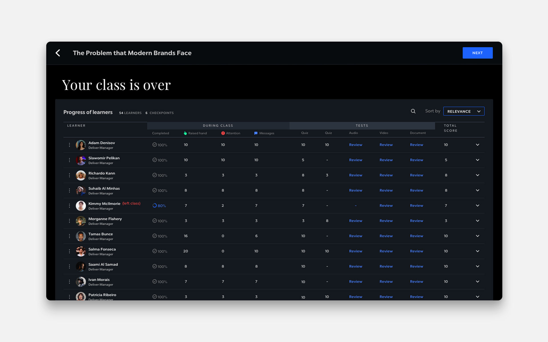
A bottom band lets the mentor share materials and deploy engagement tools like creating polls, inviting co-mentors, form discussion groups or invite learners onstage. The status icons again change into the class summary panel once the class is over.
Trainee’s Desk
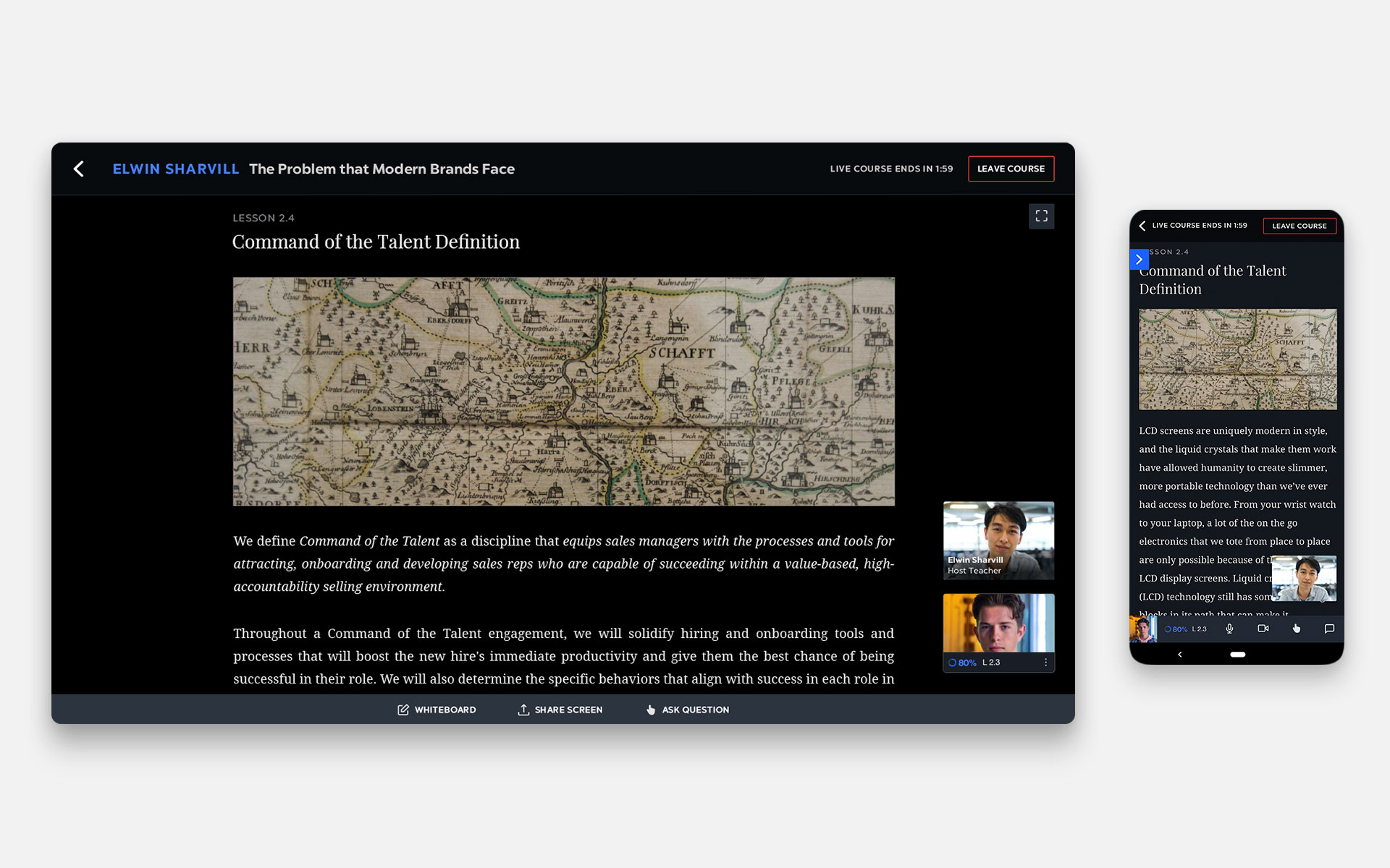
The trainee’s desktop landing page has a leaner interface. The mentor’s video or the course view has been made the centre of focus whether in the minimised or maximised view.
The status bar helps the trainee keep track of their progress at all times as well as those of his peers. The engagement features available to a trainee are the raise hand and chat box—both helping them interact with the class. Being the primary use case, chat is open at all times during a class.
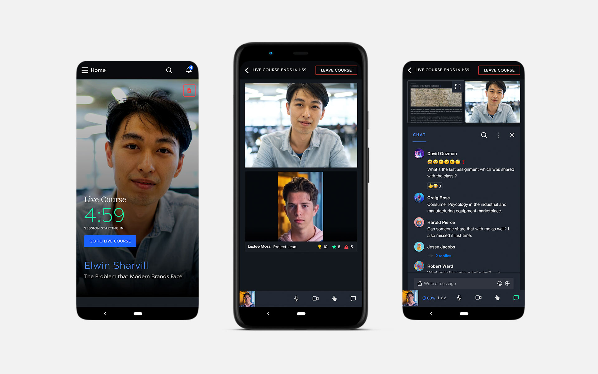
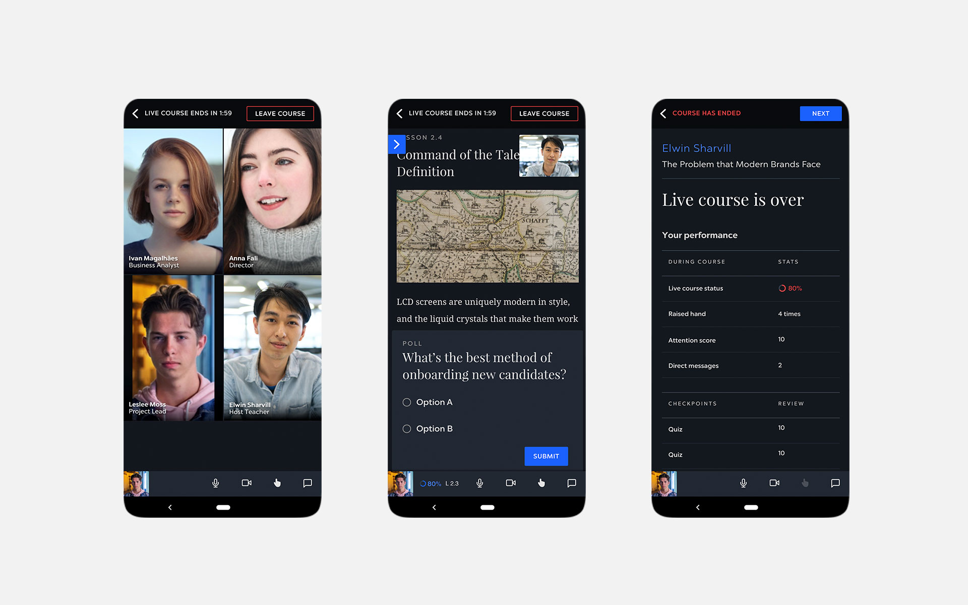
We wanted to make it accessible through mobiles for learners on the move. To keep the mobile view simple and clean only the most important features were retained. The course view focuses only on the current lesson with a floating window of the mentor. Self status and class duration can be checked from the bands. The chat and raise hand features are available in a separate window. Other functions like group discussions, polls and being brought on stage still work when enabled from the mentor end.
The learners receive performance feedback on completion of the course along with a chance to complete their assignments.
Impact
The live section together with the main app makes a powerful enterprise learning ecosystem. The client’s clients saw increased course participation from their learners on both sections after live’s introduction. A proof of concept that design interventions can improve learning outcomes.
virtualising the ‘classroom’ experience for a live learning app
We designed the live class app as part of a package of enterprise learning products for professional learning and development. Introducing live training into the mix, the app empowers mentors to get involved in their team’s learning journey directly. A ‘classroom’ where mentors and trainees meet to learn.
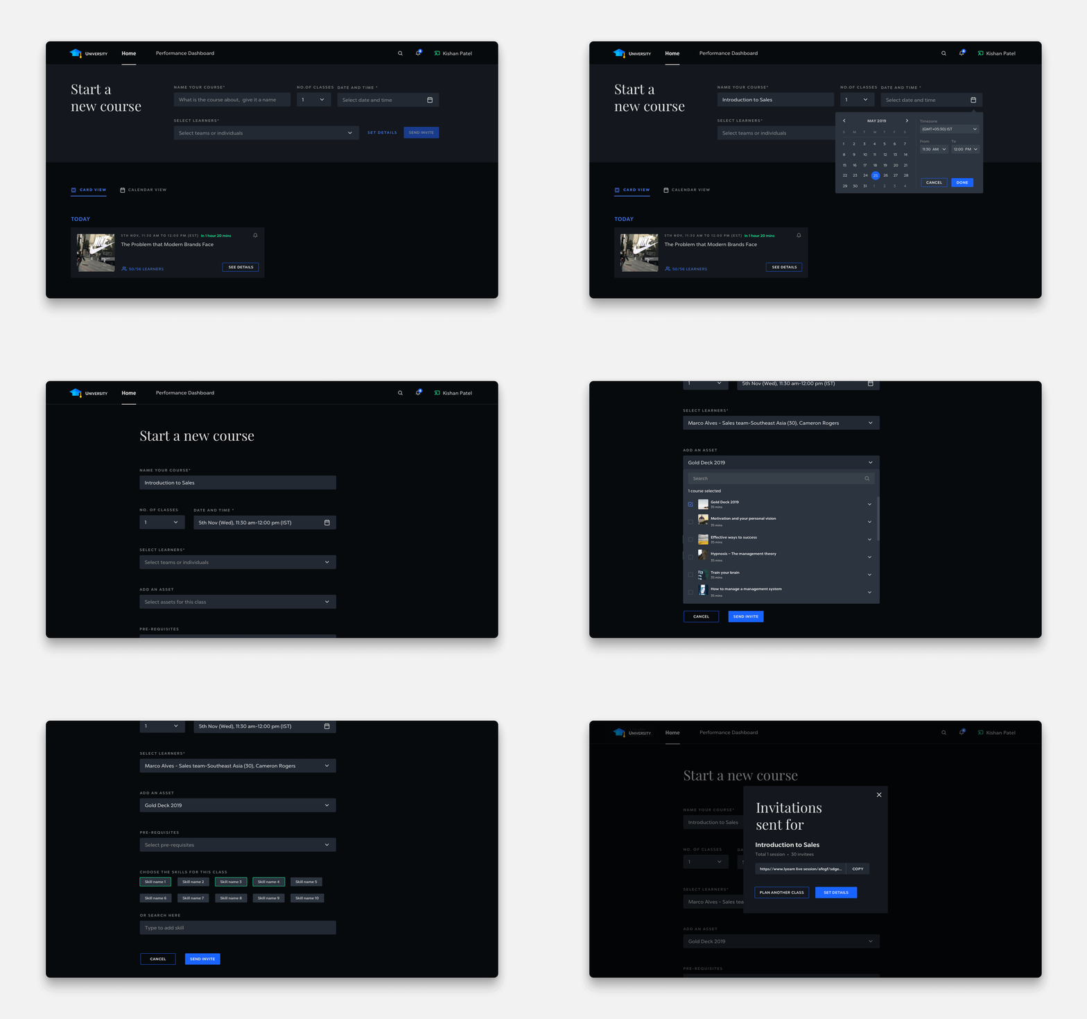
designed for immediacy with instant set ups, views, and alerts
mentors can set up classes with just a name and time in mind. Invite trainees from a dropdown or a simple link. Useful teaching aids to help them get to know the participants, check prerequisites and prep for their class.
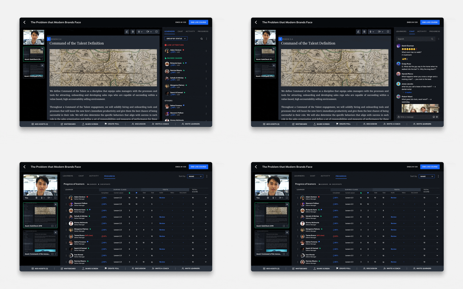
interactive features; onstage, polls, chats, guest lectures to spark class engagement
An involved classroom is where learning happens. We gave the mentor and the trainee many features to see and interact with each other. An intelligent video — making corporate learning enjoyable and interesting.
A distilled view for the mobile app with a single minded focus on learning
Learners have access to live classes on their mobiles—letting them learn anywhere. A clutter free environment lets them focus on the live class deeply. Other features are there but take a backseat to prevent distraction.
Partner-in-charge and UX/UI Director Lisa Rath | UX/UI Concept & Development Sreeja Chatterjee | Project duration 6 months


