background
Srijan started as a development company, 15 years ago, building content management system frameworks focussing on Drupal, an established, open source technology in that space. Presently, it operates in 7 countries, and is 250+ strong.
problem
But Srijan’s success masked other problems. It was punching above its weight as a developing partner with strategy and consulting inputs, but not being rewarded. Its abilities were recognised by clients during projects but it found itself unable to convince prospects of its surplus during the dating stage. Change was needed but Srijan’s communication—explicit and implicit—remained focussed on simple executional capabilities (technical features, delivery time), resulting in being bracketed with eager, small-scale development companies, delivering low complexity development work.
To inspire confidence in its capabilities, and attract projects with strategy and consulting roles, we were to reposition the brand with a new identity and communication.
strategy
Conversations with stakeholders revealed that the quality of a tech service work product is driven by technical expertise but is intricately linked with delivery. Product success lies beyond code, it relies on invisibles like people’s behaviours, attitudes, and values. And, the challenge became to link Srijan’s outstanding human and technical properties to work outcomes that the client values.
brand
Drawing from Srijan’s shared work principles and values with design: agility, co-partnership, craftsmanship, iteration, exploration, questioning, and care—we branded its work style as the ‘the design way’, a set of principles reflected in its processes, people and interactions.
Coupled with a change in terminology, vividly linked with design: a tech studio, design workshops, designer leads, sketches, and the like. In communication, we led the programme with a three-layered plan—moving from technical assurance to exhibiting higher-order thinking. Achieved through communicating a perspective on the client’s problem, industry or product, and consequently signalling a transformative change for the business.
design
A fresh, colourful yet clear visual design coupled with a language that relentlessly stresses on business level benefits presents Srijan as an intelligent builder, designing work products. Clearly distancing it from its execution led competitors, without entering the space of pure consulting firms.
Minimal use of gestures, an economy of features dominate the Srijan visual style, drawing from principles of good engineering—modular, systematic, and ingenious. The colon becomes the primary element expressing modularity and continuity, played in multiple ways. A primary colour set of black and white conveys clarity, and strength, and a geometric typeface brings out its progressive, and modern pulse.
brand book
Apart from a visual rebrand, we also defined a new way for Srijan to interact with clients, and amongst each other, and a new message for the world.
The brand book captures the new behaviours needed to amble Srijan to be seen as a consultative expert. These rest on mindsets, attitudes and beliefs to internalise and enact.
The book is a training resource for HR, senior managers and new employees. It is also a marketing/communications/brand resource for agencies. It’s a 30 min read. Extreme simplicity is the aim. the points exhort Srijan people to see their work in the context of their client’s business; to discern the connections between the two; and articulate it for all to see. This is the essence of a consultative relationship.
Its messages are illustrated using the Srijan design language: an ultra-sparse vocabulary of bold circles and thin lines.
impact
Srijan’s new identity coupled with the brand book allows it to live its brand every day at work and build on it in the years ahead. It is a stimulus to change into a journey to being seen as a firm higher up the value chain, a position with clear financial consequences.
a new code for an engineering company with a creative pulse
Srijan’s role as a development partner often included strategy guidance to clients. Its surplus realised during projects was undermined during sales where it was often bracketed alongside small-scale execution led development firms. To inspire confidence and distance itself from lower-end development firms, ICD was approached to reposition the brand with a new identity and communication.
identity follows principles of good engineering
It’s modular, systematic and ingenious. It flies the flag for beauty in engineering, in logic, in order, in systems, and the colon becomes the central element. The black and white primary logo stands for clarity, and strength and geometric typeface brings out the progressive, and modern pulse of the company.
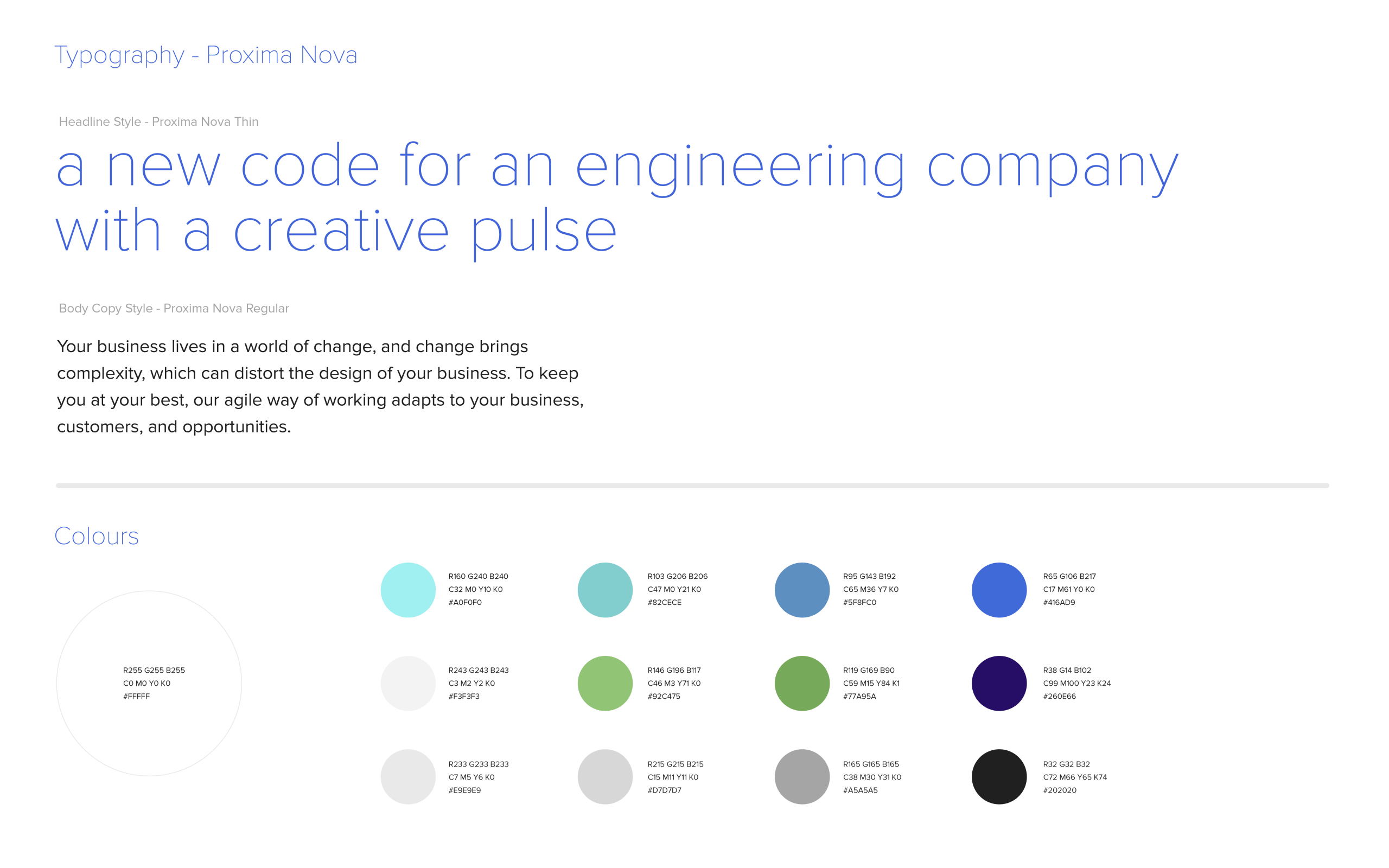
minimal use of gestures, an economy of features dominate Srijan’s visual style
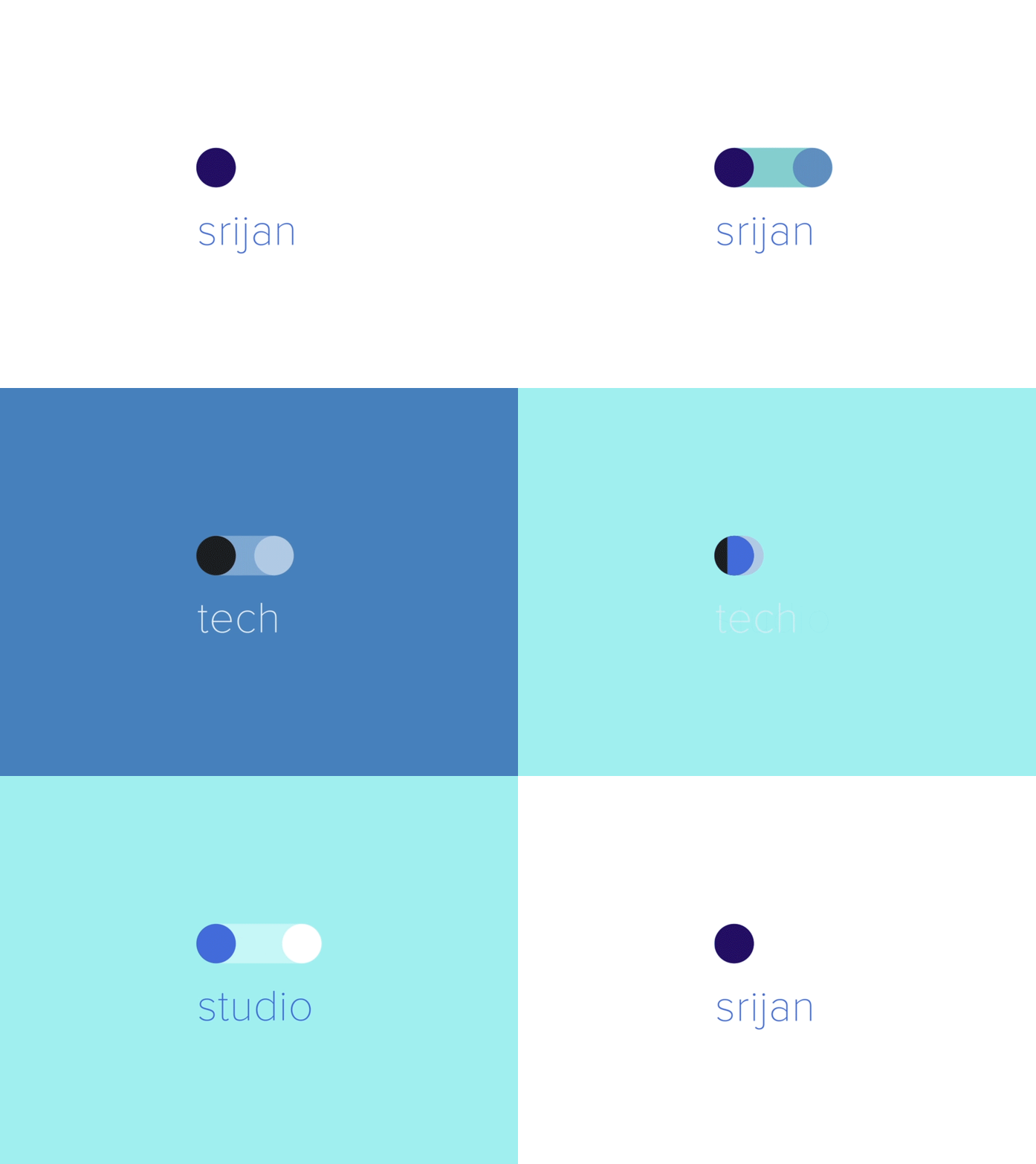
Its personality is minimal, simple and clear. The visual style is dominated by white for simplicity and clarity while the blue hues respond to the creative pulse of the tech company. The two dots combine in multiple ways to create different shapes and variations, bringing in ordered playfulness.
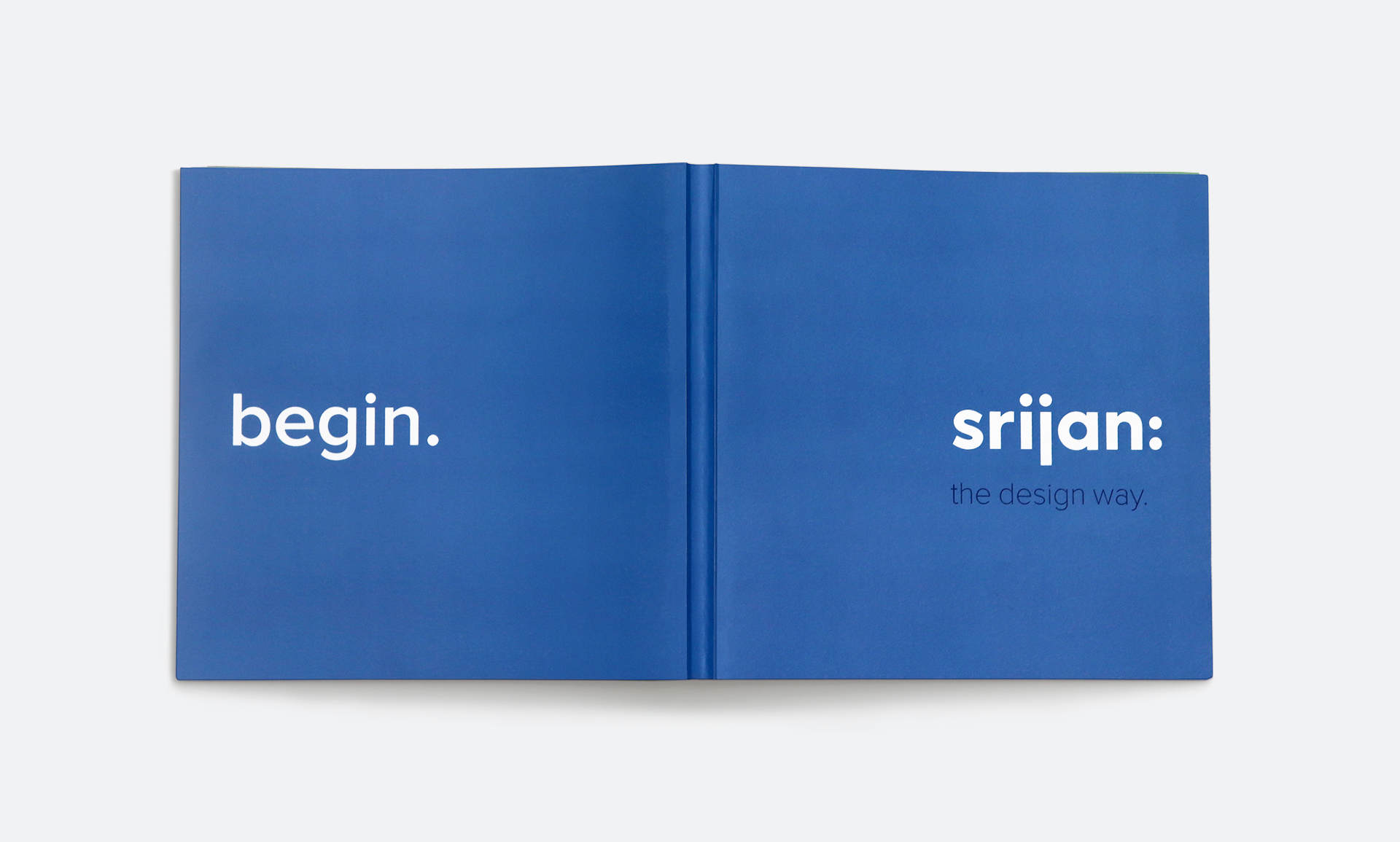
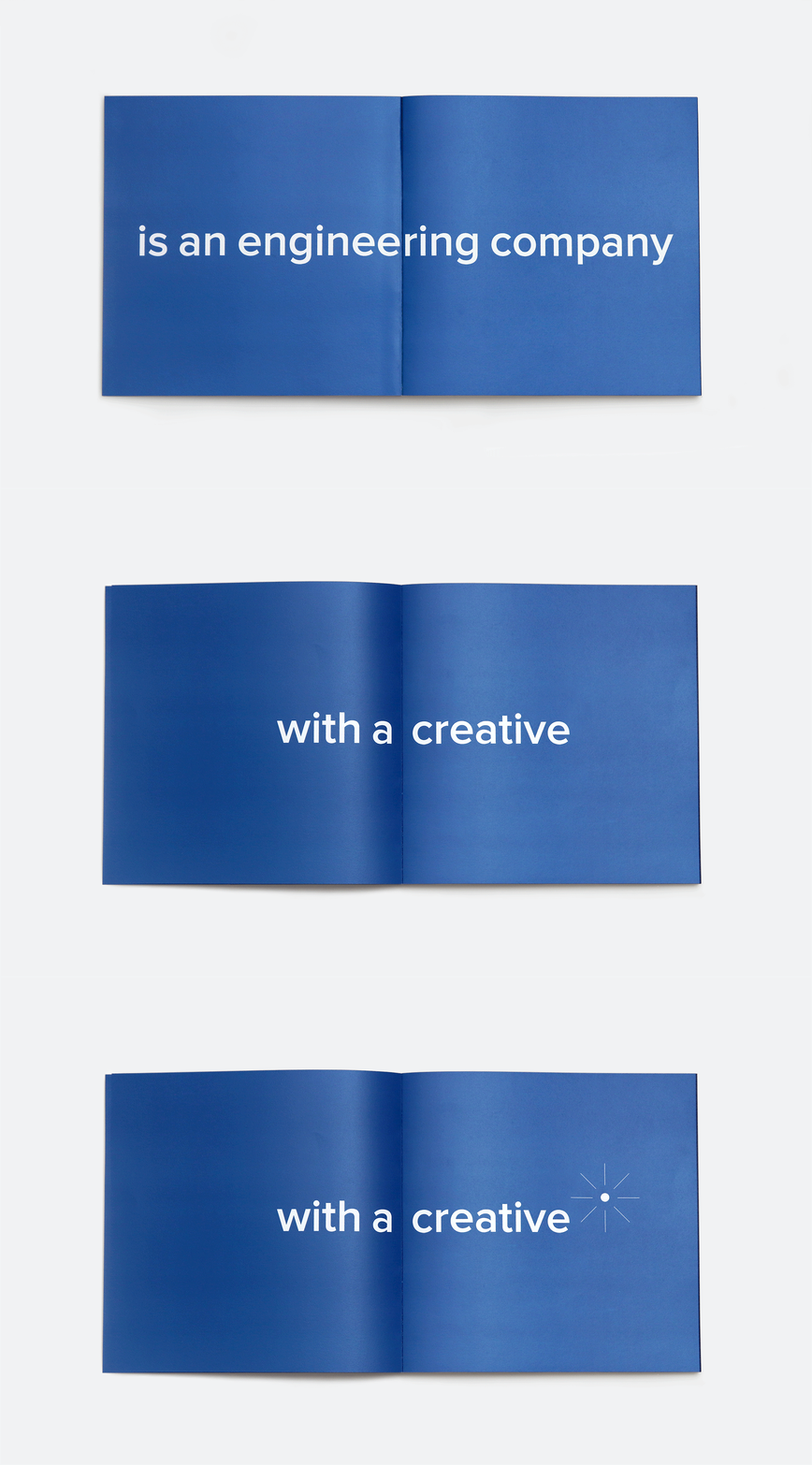
srijan brandbook: a new codex for an engineering company with a creative pulse
the srijan brandbook captures the new behaviours needed to amble Stijan to be seen as a consultative expert. These rest on mindsets, attitudes and beliefs to internalise and enact everyday, ‘the design way’.
verbal and visual lexicon to express better
srijan’s messages are illustrated using the Srijan design language: an ultra-sparse vocabulary of bold circles and thin lines. It also replaces the technical talk that was aimed at their counterparts (like Chief technical Officers), with a new speak aimed at CEOs.
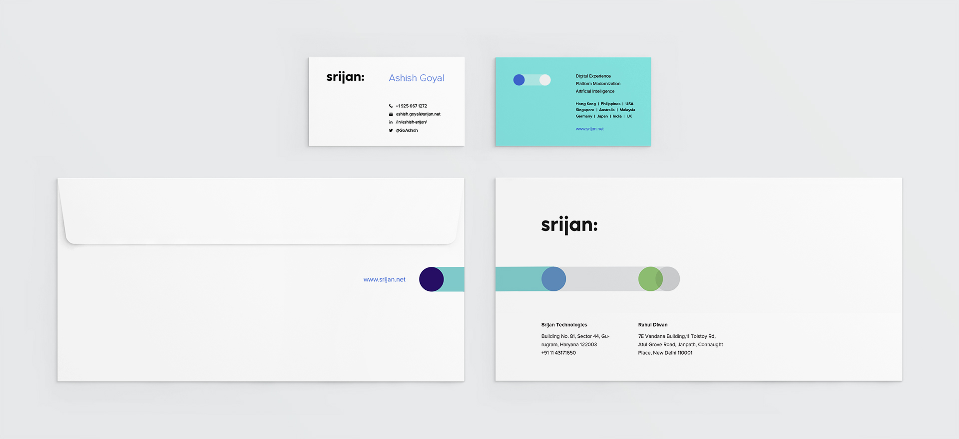
an intelligent builder, designing tech products
a language that relentlessly stresses on business level benefits presents Srijan as an intelligent builder, designing tech products. Clearly distancing it from its execution led competitors, without entering the space of pure consulting firms. Design and communication strategy plays out on its site: www.srijan.net
Creative Director Itu Chaudhuri | Brand Concept Itu Chaudhuri, Nitasha Basu | Design Concept Itu Chaudhuri | Writing Itu Chaudhuri, Nitasha Basu | Design Development Prashant Gaikawad, Niloy Kundu | Alternate Design Concept Niloy Kundu, Sonal Singh, Anoushka Somani | animator Pradhyumn Kag | Brand Book Writing Itu Chaudhuri | Illustrations Prashant Gaikawad, Niloy Kundu

