background
Srijan is a respected technology company with deep engineering and development capabilities. It has been in the business for 15 years, building content management system frameworks focussing on Drupal, an established, open source technology.
The new website development and design was part of a wide repositioning exercise for Srijan.
problem
Srijan’s website struggled to reflect its creative and consultative capabilities — weighed down by project focused, text heavy landing pages.
Technical vernacular aimed at the CTO further obfuscated its value as a business partner — it did not appeal to the CEO. The crowded, deep stack interface pushed back its core message.
strategy
Srijan’s goal is to underscore its consultative capabilities and be seen as a creative leader with a sharp business perspective
If the website could speak to and interest the CEO by discussing her business, its results and how they connect with technology, this problem would be solved. The conversation would move from the CEO to the CTO, not vice versa.
The aim should be to rescue the underlying promise of Srijan by scraping off all the layers of technical detail that it is full of. It would then be a consultative company, not one focussed on efficiency (the speed and cost of execution).
content design
We adopted a three pronged approach to redesign Srijan’s content — first was to lead with Srijan’s successful projects to establish its image as a capable organisation.
Second, to eliminate descriptive tutorial style pages which were encumbering the overall narrative.
The third point was to center the conversation around business level benefits as opposed to the earlier focus on technical conversations.
The new, categorised content reflects higher-order thinking skills — a core Srijan capability — courtesy its experience, bandwidth and people.
visual design
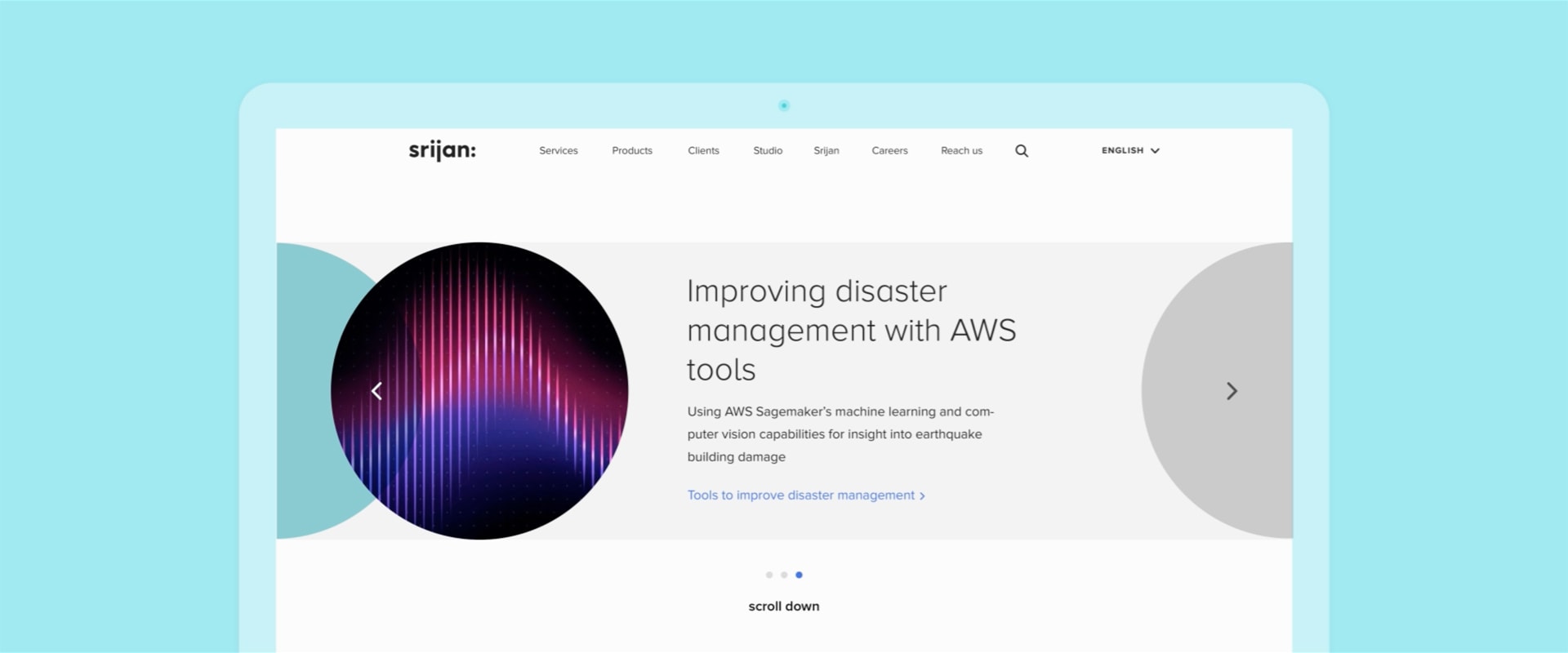
The visual design follows Srijan’s new design language.
The language derives itself from the infinitely extensible Srijan logo; giving it a minimal, yet expressive vocabulary of bold circles and thin lines. This economy of elements and gestures eliminates fluff and turns the spotlight on Srijan’s expertise.
The style is collegial, contemporary and non-technical. The focused design is lively and monochromatic — brings out the beauty and creativity in engineering — giving the website a hip, inviting ambience.
impact
Srijan’s website is a component of its new avatar, one which stresses on business level benefits and projects Srijan as a thoughtful partner. It places Srijan at the upper end of the development firm spectrum — a position with major financial and growth prospects.
a new space for a new voice
Srijan is a technology company that has been in the business for 15 years, building content management system frameworks focussing on Drupal, an established, open source technology. The srijan website design closely followed the new website development and design was part of a wide repositioning exercise for Srijan.


roadmapping for clearer user journeys
guiding the user from successful projects to business-level benefits, all serve to project higher order thinking skills—a core srijan capability

brand molecules create a coherent system
The visual language is derived from the infinitely simple and extensible Srijan logo; the brand molecules: bold circles and thin lines creates a glitch-less, fluid system
Creative Director Itu Chaudhuri | Brand Concept Itu Chaudhuri, Nitasha Basu | Design Concept Itu Chaudhuri, Prashant Gaikawad | Tech Lead Vikrant Gupta | Writing Itu Chaudhuri, Nitasha Basu | Design Development Prashant Gaikawad | Developer Vikrant Gupta and Pawan Kumar | animator Pradhyumn Kag | Brand Book Writing Itu Chaudhuri | Illustrations Prashant Gaikawad | Project duration 4 months
