Background
In 2010, Wild Stone explored an aggressive brand personality built around its provocative iconography of scratch marks. It helped define a brand that’s amongst the top players of the Indian deodorant (and fragrances) industry.
Over the same period, the brand expanded to occupy the full gamut of grooming products, centred on its unique fragrances. In this setting, the brand’s ‘dangerous liaisons’ approach seemed too explicit and created a barrier to openly displaying attachment.
Wild Stone approached us to redesign their identity and packaging in line with this elevated brand aspiration, which would resonate with the customers’ life journeys and project itself as a fragrance-led grooming brand.
Objective
The Wild Stone consumer is the young adult in early career, or his twenties: men, not boys. The intent to re-frame the brand was to present a more urbane version of male attractiveness. Its advertising graduated from being centred on instant gratification as a sole male goal to the ‘Kunal’ campaign to make it part of a better life, along with socialising, civility and good grooming.
The task for us was to communicate these new conceptions of the brand.
Brand Approach
We realised that the scratch marks, emblematic of the brand’s obsession with the unplanned encounter also needed to be tuned for urbanity. To define a language, we placed it on a new point on the spectrum of formality, convention and danger.
Design
The rebranding represents a huge shift in image. With the scratch mark now taking a backseat, the brand needed a new projection of itself for users to remember. The scratch marks allow recognition of the brand but there may be more to continuity than that, beyond commercial reasons, or being recognised to the trade and on the shelf.
The new character brings in social acceptability but can escape the confinement of convention. This allows the insertion of a more nuanced, lingering sexual attraction. But the promise at its deepest core remains. It’s muted and made more inclusive. The scratch marks are retained to reassure the brand faithful.
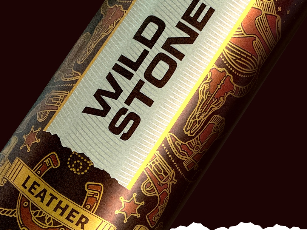
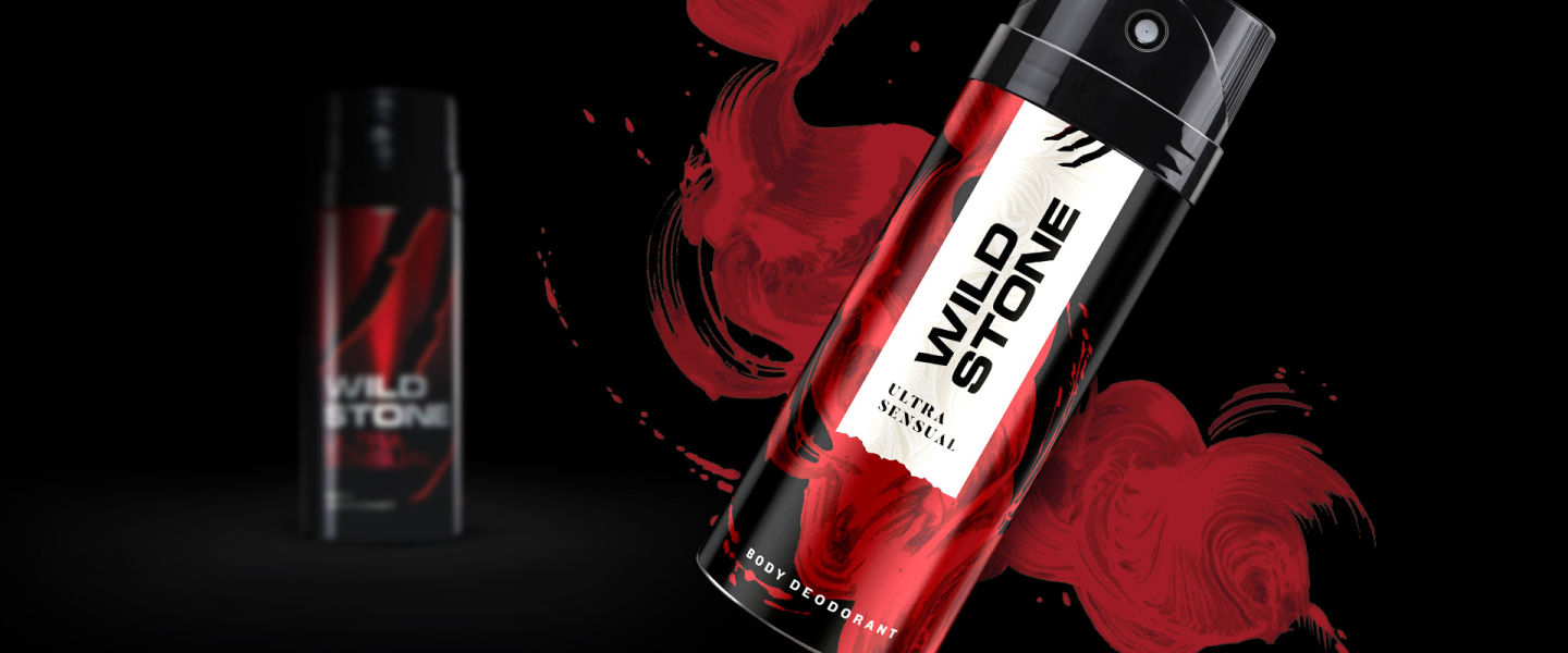
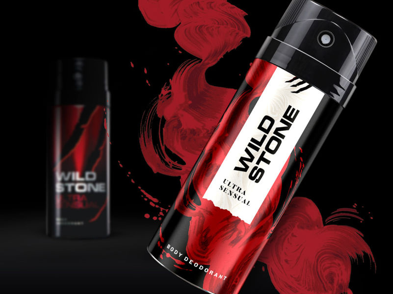
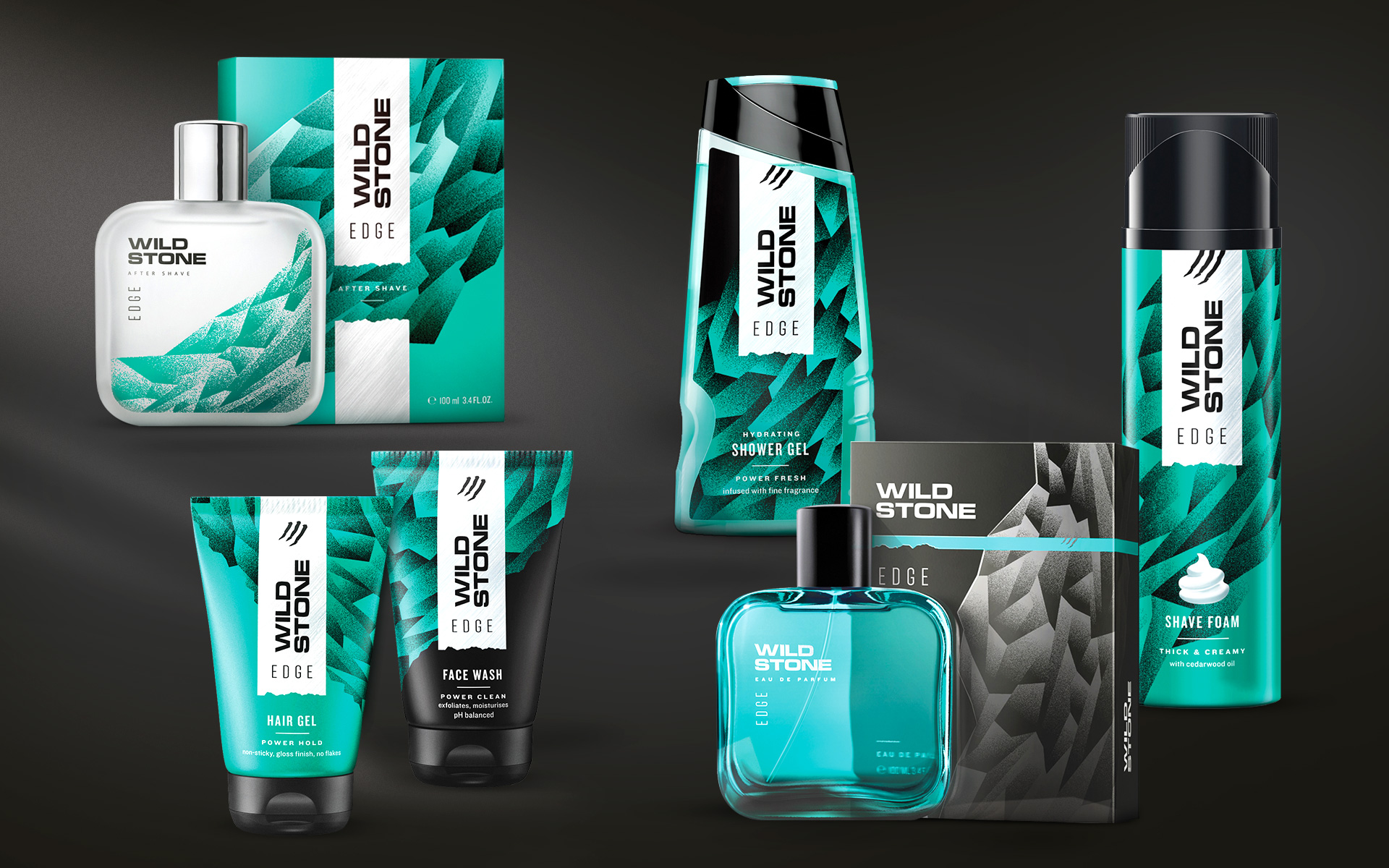
The new packaging identity was a new graphic device, the torn label. This solves several problems together. First, labels signal sophistication, being a format linked with pedigreed products. Yet the tear leaves in the possibility of a spontaneous escape, a tell-tale mark of excitement that lies just beyond the social zone.
Third, it sets up a memorable brand-wide identifier. It guarantees a safe zone for the brand, leaving each individual product or variant, free to assume any imagery it needs, without fear of dilution. A canvas for versatility is established.
The layer behind the label becomes the universe of each variant and its mood. The background graphic stays abstract, with at the interplay of the untamed and the suave. A luxurious fluid brush stroke or a craggy rock are all possible. The label itself has subtle textures, as an expensive fabric might.
The vertical brand lettering unit retains the older typeface for continuity, but allows for greater throw and a modern dynamism, to signify a directional change.
The redesigned packaging is a balance of the classic and the spontaneous, even funky, and comes together like the new Wild Stone story. The label unifies it as a grooming brand – the background graphic captures the individual fragrance line/ theme – the degrees of variation within each theme differentiates the product category: together building the breadth of the brand.”
a new label for manly groomingWinner
In 2010, Wild Stone explored an aggressive brand personality built around its provocative scratch marks and went on to become one of the top players of the Indian deodorant market. In 2019, its core audience were seeking new codes of manhood and the brand was moving towards a grooming positioning. We were approached to rebrand Wild Stone as a fragrance-led grooming brand.


scratch-marks retained for continuity but tuned for urbanity
The new character brings in social acceptability but can escape the confinement of convention. It allows an insertion of a more nuanced, lingering sexual attraction. But the promise at its deepest core remains. It’s muted and made more inclusive, and is placed on a new spectrum of formality, convention, and danger.

label brings formality and sophistication
Labels are linked with formality, and signal sophistication being a format linked with pedigree products. The tear leaves the possibility of a spontaneous escape, a tell-tale mark of excitement that lies just beyond the social zone. A memorable brand-wide identifier, it guarantees a safe zone for the brand, leaving each individual variant free to assume any imagery, without fear of dilution.

the story behind the label conveys individual variant universe
The background graphic stays abstract, with at the interplay of the untamed and the suave. A luxurious fluid brush stroke or a craggy rock are all possible. The label itself has subtle textures, as an expensive fabric might. The vertical lettering retains the older typeface for continuity but allows greater throw to signal a directional change.

partner-in-charge itu chaudhuri | creative director richa bhargava | design team niloy kundu, aashim raj, sonal singh, prashant gaikawad, archie parikh | project duration 1.5 years