Background
“Edge” is a new line of men’s grooming products from the house of Wild Stone, a fragrance-led men’s grooming brand. We were approached to design the packaging for this range.
Objective
A deodorant, an eau de parfum, face wash, hair gel, shaving foam and shower gel make up the Edge line. We needed a design which could do two things at once—unify this wide range and establish its presence as the newest member of the Wild Stone club.
Design
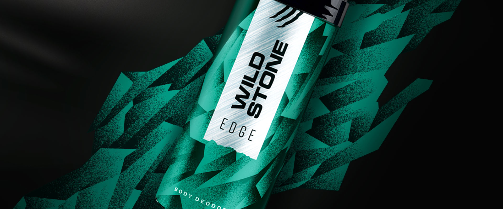
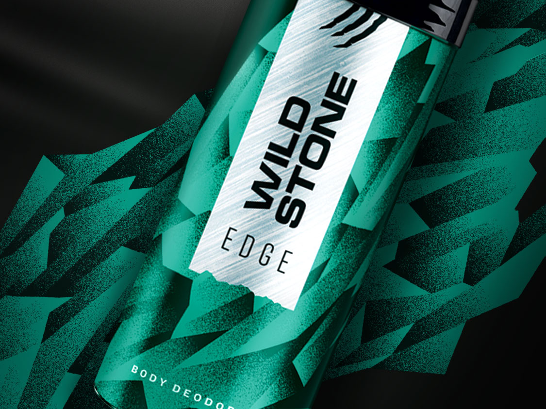
Sharp and unexpected—our interpretations of “Edge” guided the approach. The colour, teal, was determined by the gel in the transparent shower gel bottle.
Ice shards make up the dominant graphic for the line— underscoring the sharp suavity and cool factor of Edge. The background colour switches between white, black and teal—hinting at the mysterious landscapes that the Wild Stone universe is known for, where a breakout, in stylistic terms, conventions or an amorous interlude is never far away.
Clear mnemonics and text differentiate the products of the range at first glance whilst listing out features and technicalities.
The Wild Stone torn label scheme assures the brand a distinctive asset, thus leaving the background free for exploration of new range specific themes.
Impact
The modern flavour of the fragrance and the packaging design quickly made “Edge” one of the company’s best sellers in modern format retail and online.
living dangerously—in style
Edge is the latest range of men’s grooming products from Wild Stone. It needed a new pack design for the line which could set it apart and blend it in in equal measure within Wild Stone’s family of products.

sharp, mysterious and unexpected
The sharp ice shards, the cool teal colour, the alternating background colours—all achieve a mysterious landscape, where the unexpected is to be expected, Wild Stone’s promise.


mnemonics, text and graphics—unify and differentiate
Clear mnemonics and text differentiate the products of the range at first glance whilst listing out features and technicalities. The background colours—teal, white and black add variety. The ice shards and the textured torn label unify the range and the Wild Stone family.

partner-in-charge itu chaudhuri | creative director richa bhargava | design concept itu chaudhuri, niloy kundu | design development niloy kundu