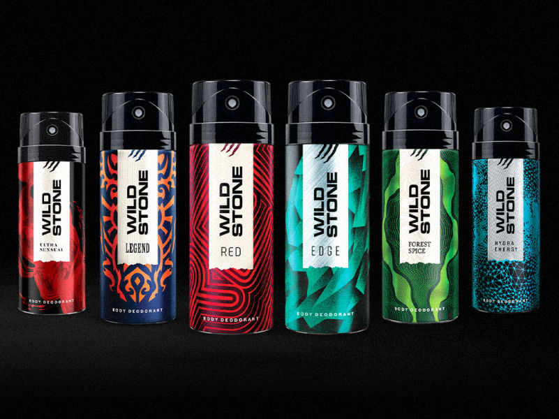
Background
The deodorant market of 2016 witnessed a new premium-ising influence: hybrids that combine the value of aerosol deodorants and pricier pump-based containers of liquid perfumes (albeit in aluminium cans). An attempt to ride two horses: value and the intangible promise of a fine fragrance. Into this market arrived Wild Stone’s Code, with its superior, designed-in-France fragrance.
Brand Thinking
With Code, the Wild Stone brand takes a step back from portraying primal aggression to claim the refinement associated with more perfume-like deodorants. The packaging aimed to resolve the contradiction while retaining Wild Stone’s core equity of a quiet but intense masculine magnetism.
Design
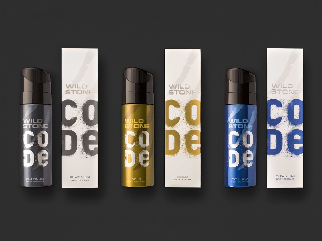
We took a bold move to break the convention by creating an all-white pack in a sea of black. It cues its premium character and heightens differentiation by standing out on a shelf dominated by the gentlemanly blacks and deep colours of the competition.
We created a “panelled effect” through the ‘Code’ lettering, which extends beyond the front of the pack and onto the two adjacent sides. This affords retailers to display the packs in a way that reveals the entire lettering and also increases the products’ prominence by providing relief from the visual clutter of a modern retail shelf.
Wild Stone insiders will note the downplayed scratch marks, now distantly respectful of its lineage but no longer dominant. A shift for the brand, in a more energetic direction that allows it to venture into a new brand thought.
charming and enigmatic—a shift for Wild Stone for its most premium range
The deodorant market of 2016 witnessed a new premium-ising influence: hybrids that combine the value of aerosol deodorants and pricier pump-based containers of liquid perfumes. Into this market arrived Wild Stone’s Code, with its superior, designed-in-France fragrance.

an all-white pack in a sea of black
It cues its premium character and heightens differentiation by standing out on a shelf dominated by the gentlemanly blacks and deep colours of the competition.
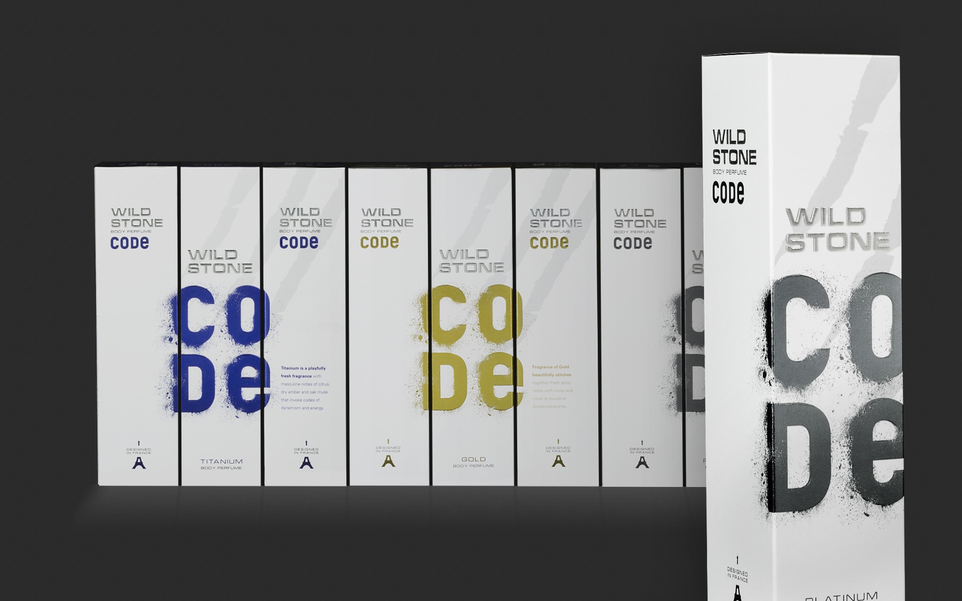
a “panelled effect” for increased prominence
The Code lettering extends beyond the front of the pack and onto the two adjacent sides. This affords retailers to display the packs in a way that reveals the entire lettering and also increases the products’ prominence by providing relief from the visual clutter of a modern retail shelf.
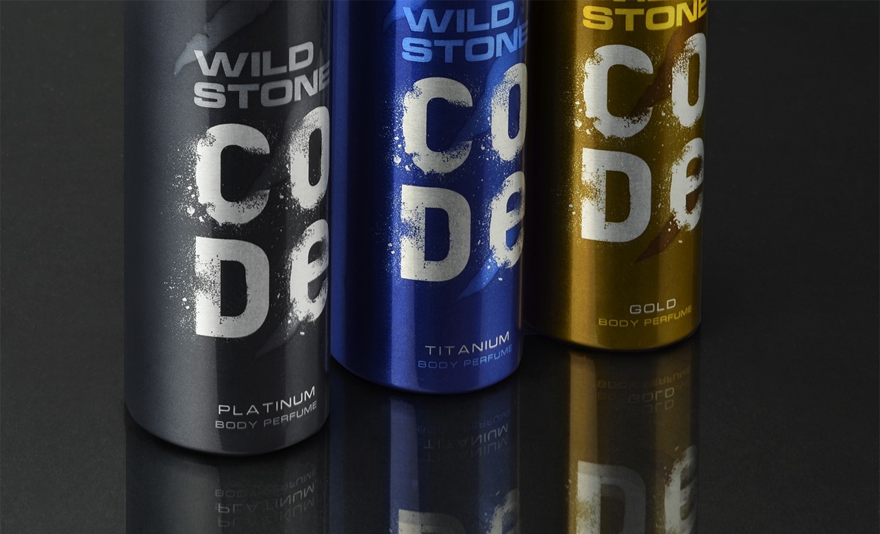
retaining wild stone’s core equity of a quiet but intense masculine magnetism
Code, steps back from portraying primal aggression to claim the refinement associated with more perfume-like deodorants. Downplayed scratch marks, now distantly respectful of its lineage but no longer dominant—a shift for the brand, in a more energetic direction that allows it to venture into a new brand thought.

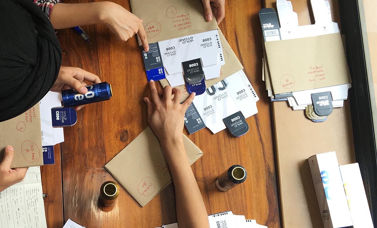
Partner-in-charge Itu Chaudhuri | Creative Director Richa Bhargava | Design Concept Palash Jain | Design Development Kshitij Tembe, Jasvinder Singh | Production Neha Bajaj, Jasvinder Singh | Webpage Photographer Palash Jain, Studio Fry | Alternate Design Concepts Kshitij Tembe, Niloy Kundu, Neha Bajaj | Project duration 5 months