Background
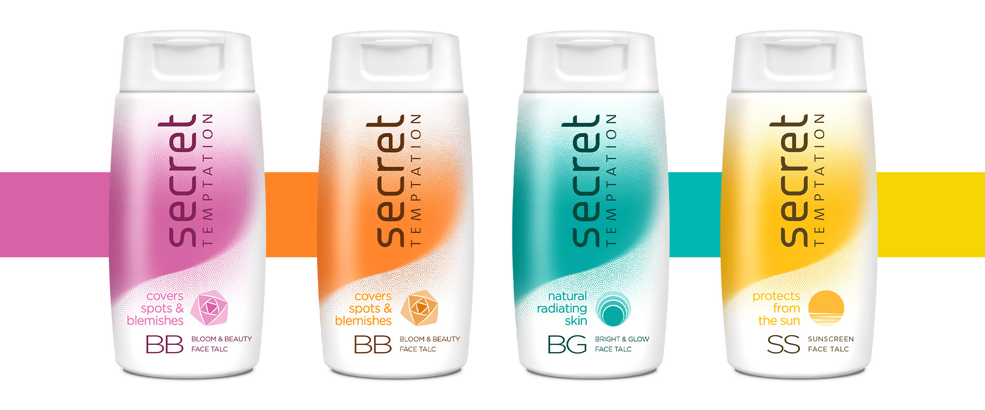
Secret Temptation Face Talc is a new range of functional face talcum powders from Secret Temptation, a young women’s beauty brand from McNroe, a leading manufacturer of grooming products in India.
There are three variants in the range with specific beauty functions. Bloom and Beauty-covering spots and blemishes, Brightening-a face whitening talc and Sunscreen Talc for sun protection.
We were approached to design the packaging for this new product range.
Strategy
This new range was different from general purpose talcum powders—each variant fulfilled a specific cosmetic need for the consumer. The design had to be both functional and feminine.
We drew from the visual language of more medicinal talcs to highlight the range’s functionality but care was taken to preserve the brand’s territory of femininity.
Design
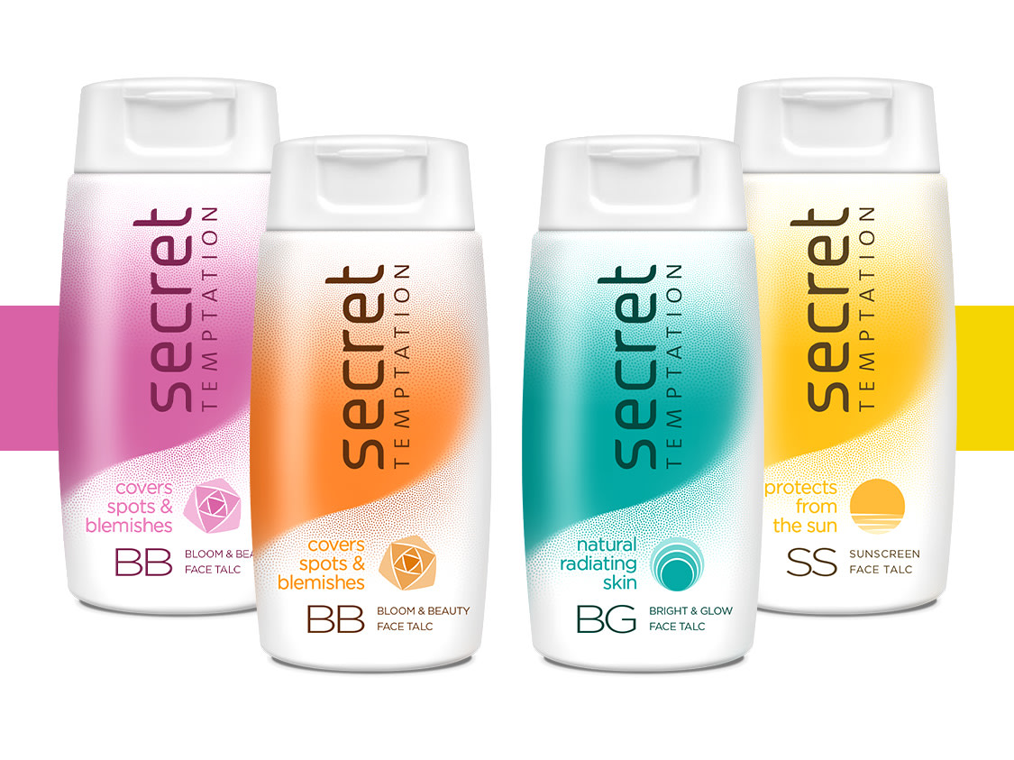
A white canvas was chosen as the background for the pack. Each variant uses a single colour and the balance of whiteness against the colour brings out the functional nature of this talc whilst preserving the promise of femininity.
The curve of the slender neck of a lady was the only visual element on the pack—the single representation of femininity on the pack, balancing functionality and beauty. The dotted texture mimics the act of applying powder showing.
We coined mnemonic initialisms and graphics for each variant—short and easy to remember. ‘Bloom & Beauty’ became ‘BB’ with a rose as its identifier, ‘Sunscreen’ turned into ‘SS’, with the sun as its symbol.
This made the variants distinguishable, explained their functions and clarified to consumers to think of them as more than just generic talcum powders.
Impact
Secret Temptation’s new pack marked an expansion. Taking it beyond girly flirtation to a more matured stance of functional beauty. Expanding the scope and reach of the brand.
functional cosmetics become feminine and elegant
Secret Temptation Face Talc is a new range of functional face talcum powders. There are three variants in the range with specific beauty functions. We were approached to design the pack for this new range.

minimalistic depiction of femininity
Pictorial elements were limited, the curve of the slender neck of a lady was the only visual element on the pack—the single representation of femininity on the pack, balancing functionality and femininity.

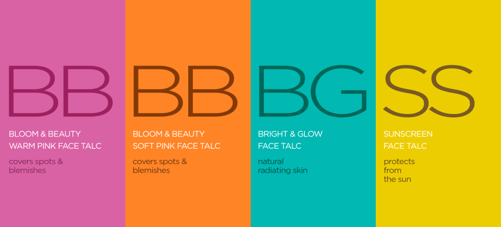
functional mnemonics differentiate and explain
Mnemonic Initialisms made the variants distinguishable, explained their functions and clarified to consumers to think of them as more than just generic talcum powders.
partner-in-charge itu chaudhuri | creative director itu chaudhuri | design concept ashok dey | design development ashok dey, pradyumn kag, rohit taitwal | alternate design development niloy kundu, prashant gaikawad
