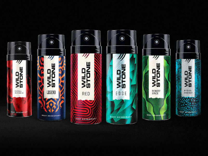
Background
The Forest Spice packaging redesign was a continuation of the Wild Stone rebranding. Wild Stone is a leading maker of mass-market fragrances. The colour green is critical to the identity of Forest Spice because of consumer memory of the variant and the associations inherent in the name.
Brand Thinking
The new brand language allows a more complex portrayal of the individual variant, pushing Forest Spice’s previously simplistic identity. The label establishes the brand’s suavity, while the tear permits an escape from it. As if by analogy, Wild stone contains and civilizes the wildness of the forest.
Design
Vetiver and Mahogany are the primary notes of Forest Spice: green, moist and woody. So the wavy patterns hint at meandering streams, swirly creepers entwining trees, transporting the viewer to a dense thicket. They vibrate, as if sending a distant scent from a place of darkness, primal and deep. Inviting the viewer to lose himself. A place for an unplanned encounter, as Wild Stone would have it. Adding interest for a closer glance, the denser dotted detailing of the graphic, borrowed from tribal traditions.
As always, the white label stands out smartly on the shelf, and underwrites the urbanity of the brand.
Forest Spice: More than just the wild
The Forest Spice packaging redesign was a part of the Wild Stone rebranding project. Variant continuity was preserved by a focus on green while adding layers to its personality through sweeping tribal art-inspired patterns.

curves mimic nature
The wavy patterns evoke meandering streams, swirly creepers entwining trees, transporting the viewer to a dense thicket, inviting him to lose himself. The dotted detailing is inspired by tribal art traditions, striking another primal note, while adding fine detail to arrest the eye.

green: the source of the scent
Vetiver and Mahogany are the primary notes of forest spice. Both notes fall on the green, woody side of the olfactory spectrum. The white label contrasts the green smartly, standing out on the shelf. In the Eau de Parfum, the label is minimally present as a thin silver band, encoding the same qualities.

Partner-in-charge Itu Chaudhuri | Creative Director Richa Bhargava | Project Lead Niloy Kundu | Design Concept Aashim Raj | Design Development Aashim Raj Archie Pareek | Production Aashim Raj