Background
Dr. Reddy’s Laboratories Limited (Dr. Reddy’s) launched Hervycta, a biosimilar brand of the oncological innovation Trastuzumab and an approved treatment option for HER2+ breast cancers.
In India, as well as most countries across the globe, the promotion and advertising of prescription medicines is heavily regulated. In several countries, laws prohibit the promotion of prescription drugs directly to consumers.
Dr. Reddy’s tasked us to create the branding identity and website of Hervycta within these restrictions.
Objective
Hervycta, a new entrant, was to be marketed to oncologists who had been prescribing the innovator drug for nearly 20 years. We reasoned that all doctors, not just oncologists, would want to be well informed about this cancer and its drug target. For example, gynaecologists, or trusted physicians who are likely to be the referring doctors and where the patient would turn to for advice even after consulting the oncologist.
If our identity could aid in remembering the drug’s mechanism of action, it would create a talking point, for sales reps, physicians and make the brand more visible for everyone.
Design
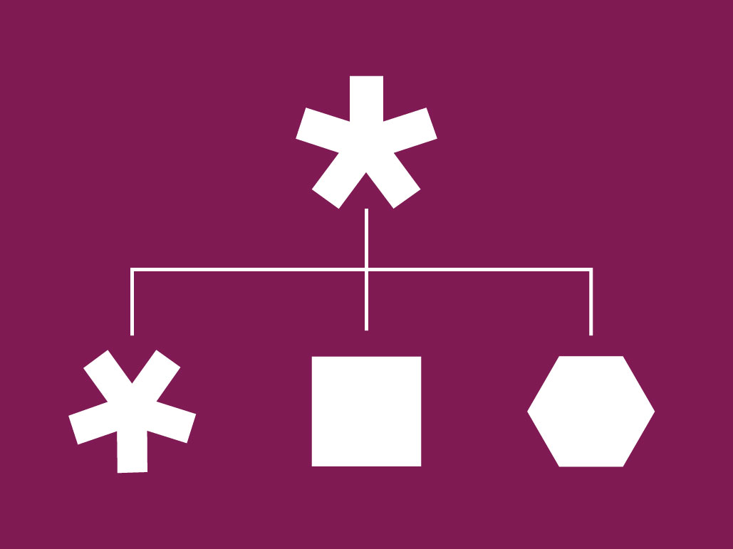
Our approach was to create an action-related identity which would make it easier for doctors to recollect.
The choice of colours, selected for their femininity, and structured geometry creates a visual link with the parent brand. The typeface communicates precision of clinical action, with a softening indicative of its target audience gender.
The brand language was expanded to use graphic elements of the identity – through grids and propagating patterns – that allowed for repetition/continuity with variety. Linking the same visual image and its elements with other branding opportunities, through packaging and literature, at places where the doctors would have the chance to keep seeing it, created more prospects for the new offering to leave an imprint.
We also created the tagline ‘Targeted for Her’, which captures the brand objective and keeps the tonality unbiased, relatable and real.
An identity for Dr Reddy’s cancer drug for HER2+ breast cancer

an action-related identity for doctors to remember
The choice of colours, selected for their femininity, and structured geometry creates a visual link with the parent brand. The typeface communicates precision of clinical action, with a softening indicative of its target audience gender.


making the brand more visible
We suggested expanding Hervycta’s scope of marketing beyond oncologists to address all doctors, for example gynaecologists, who are likely to be the first referring doctors for the patients. The identity aids recall for the drug’s mechanism of action, creating a talking point, for sales reps, physicians and makes the brand more visible for everyone.


‘targeted for her’
The brand visual style through grids and propagating patterns, continued with the identity elements but added variety. Its use in packaging, literature, and other marketing materials created a cohesive, strong brand visual imprint. The tagline ‘Targeted for Her’ captures the brand’s objective and keeps the tonality unbiased, relatable and real.

Partner-in-charge & Creative Director Itu Chaudhuri | Art Director Richa Bhargava | Design Concept & Development Kshitij Tembe | Project duration 2 months